- Capabilities
- Getting started
- Architecture center
- Platform updates
String Selector
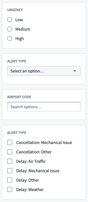
The String Selector widget can be used to display string options in various selection forms including a dropdown menu, as radio buttons, or a set of checkboxes.
Configuration Options
-
Label
- Sets an optional label for the widget. This text is displayed across the top of the widget.
-
Option generation
- Static: Select Add selector option to enter and reorder values. Options appear in the configured order; you cannot pin a subset while sorting the remaining values alphabetically.
- Dynamic: Select an existing or create a new string array variable to be used to generate options for the widget.
-
Selection
- The widget can be set to either allow for a single option selection or multiple option selections.
- Selected value: Output variable of the widget, storing the user’s selection. If the selection is set to Single, the output variable will be a string variable. If the selection is set to Multiple, the output variable will be a string array variable. The widget does not have its own default value setting; setting a default value for the output variable will result in the corresponding options being selected when this module is initially loaded.
- Selection display
- If the selection is set to Single, the widget may be displayed as either a dropdown or as radio buttons.
- Dropdown
- Disable clearing of dropdown options: Can be toggled on to disable clearing of the selected dropdown option
- Placeholder: By default, “Select an option...“ will be used as the placeholder text displayed on the widget when no selection has been made. A custom placeholder value can be defined via the Custom option.
- Radio buttons
- Radio buttons layout: The layout of the options can be set to display vertically, horizontally, or in a grid formation with a specified number of columns.
- Dropdown
- If the selection is set to Multiple, the widget may be displayed as either a dropdown or as checkboxes.
- Dropdown
- Allow creating new options: Can be toggled on to allow users to create new options to be added to the dropdown. Any user-created options will be italicized.
- Placeholder: By default, “Search options...” will be used as the placeholder text displayed on the widget when no selection has been made. A custom placeholder value can be defined via the ‘Custom’ option.
- Checkboxes
- Checkboxes layout: The layout of the options can be set to display vertically, horizontally, or in a grid formation with a specified number of columns.
- Dropdown
- If the selection is set to Single, the widget may be displayed as either a dropdown or as radio buttons.