- Capabilities
- Getting started
- Architecture center
- Platform updates
Use time series properties on objects in a Workshop module and Quiver analysis
The Workshop module built in this example ([Example] Time Series Properties on Objects | Delay TSP) is built on the aviation ontology in the reference ontology, which may or may not be available on your enrollment. For more information on the relationships between those objects, see the use case overview. This example module will be a reference for you as you configure your own Workshop module using time series properties.
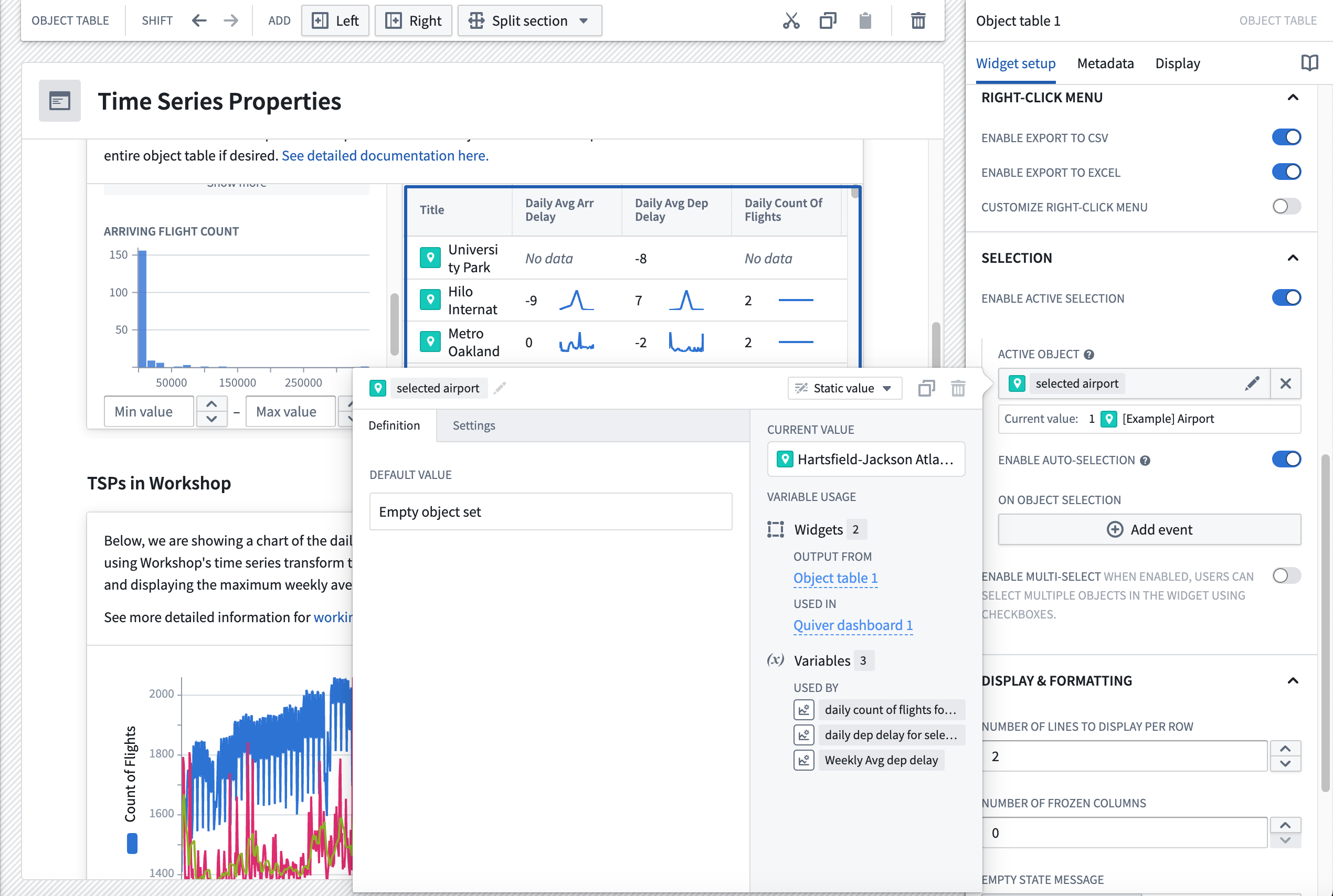
Select objects in Workshop
The Selecting an Object section of the module contains two standard Workshop widget features. A brief description of the widgets are explained below, and you can learn about general functionality in Workshop in our documentation. Follow the steps below to configure these widgets before adding time series properties to the module.
Part I: Add the Filter List widget
The Filter widget should take the Flight object set and apply filters based on the Airport properties. The filter widget should output an Airport filter that can be used in the Object Table widget.
- In your Workshop module, choose to + Add widget, then select the Filter List widget.
- In the right side configuration of the filter list widget, create a new variable for the Object set Input and name it "All airports". The Starting object set should should use the
[Example] Airportobject type.
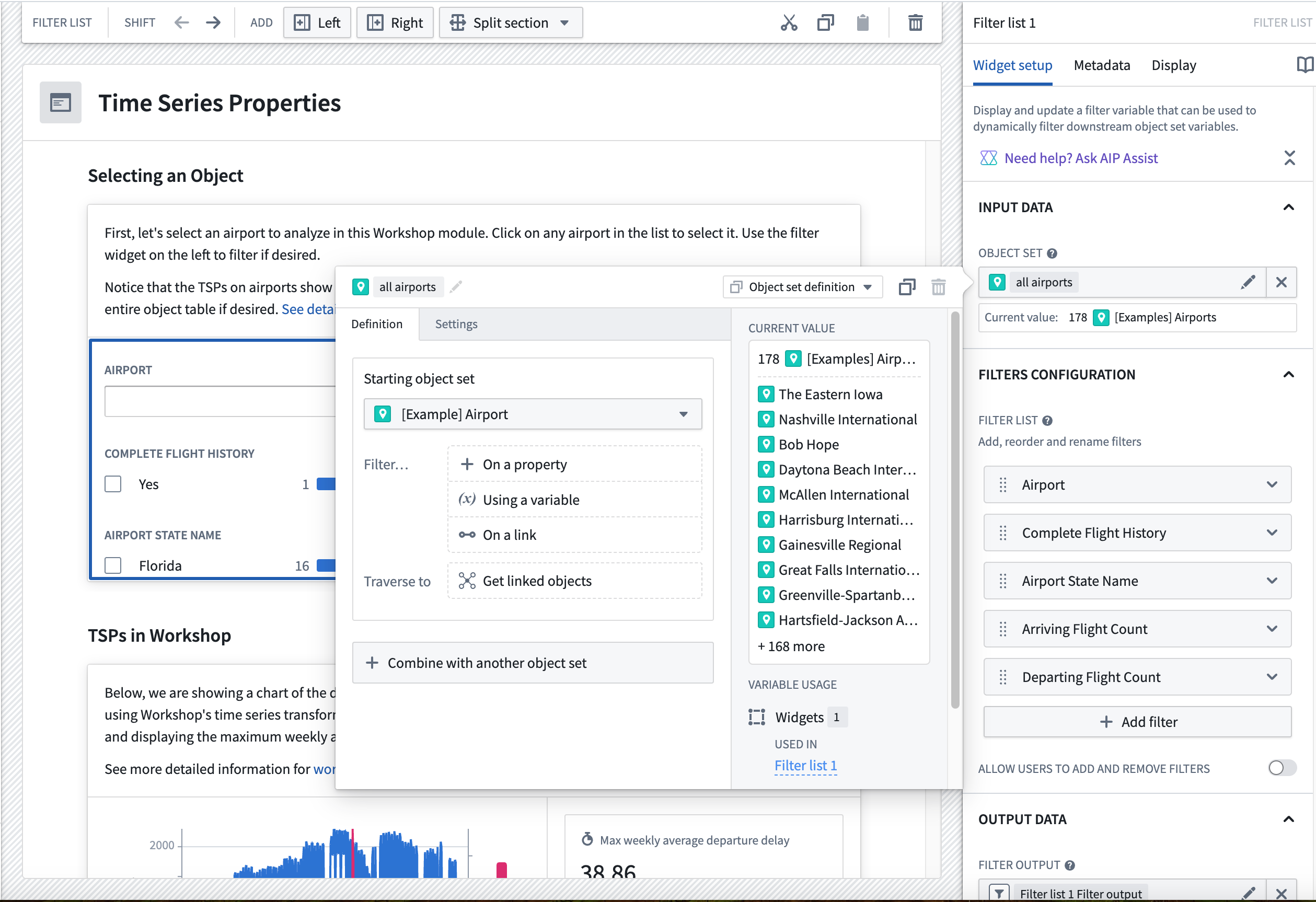
- Add the
Airport,Complete Flight History,Airport State Name,Arriving Flight Count, andDeparting Flight Countproperties by selecting the + Add filter button.
- Move down to the Filter output field, and you will see that a filter output has already been created for you. Give it a descriptive name like "airport filter"; no other configuration is required.
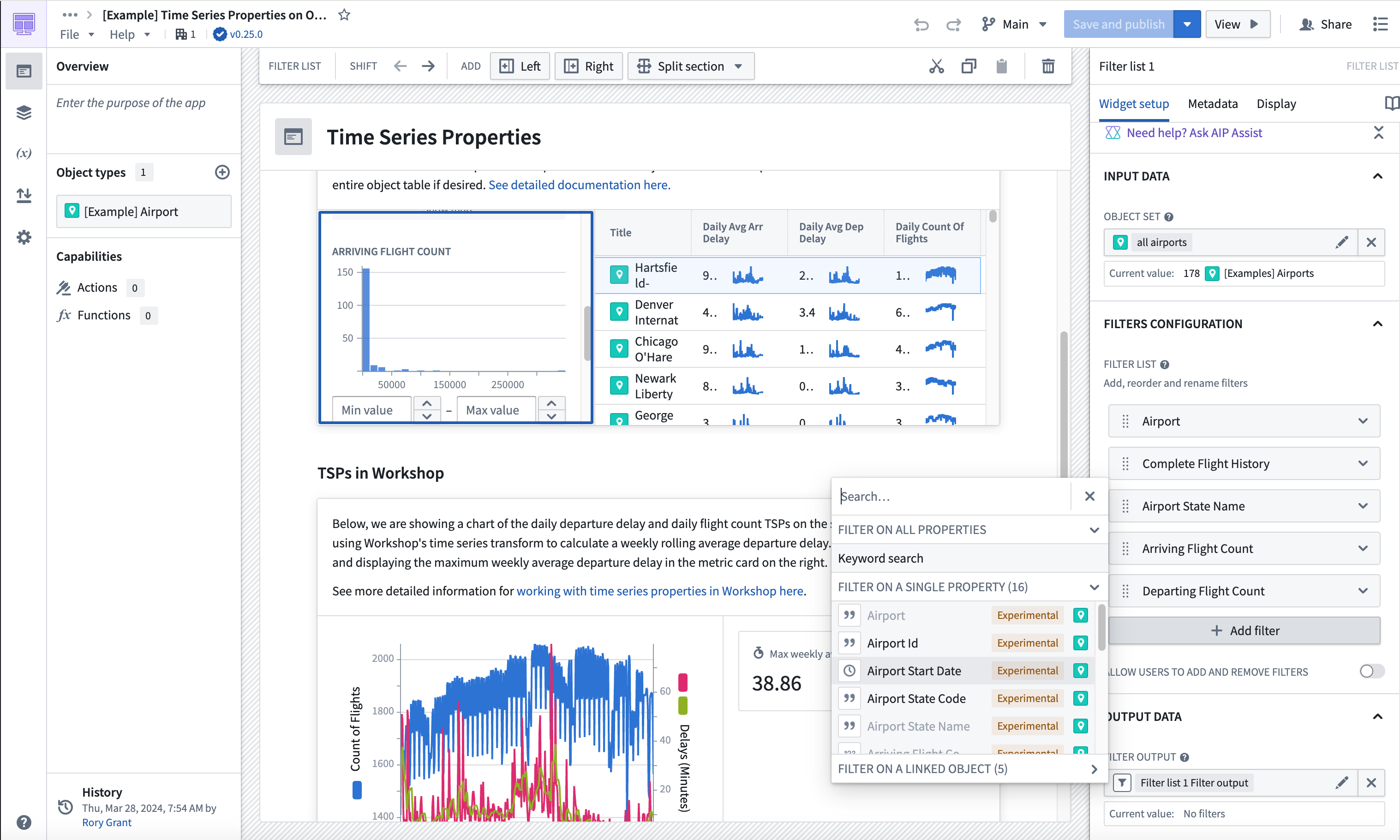
Part II: Add the Object Table widget
The Object Table widget will enable users to filter down on the object set and select an airport for further investigation.
- In your Workshop module, choose to + Add widget, then select the Object Table widget.
- In the Input data section, create a new variable and name it "filtered airports". Under Starting object set, select the Existing object set variable for
all airports.
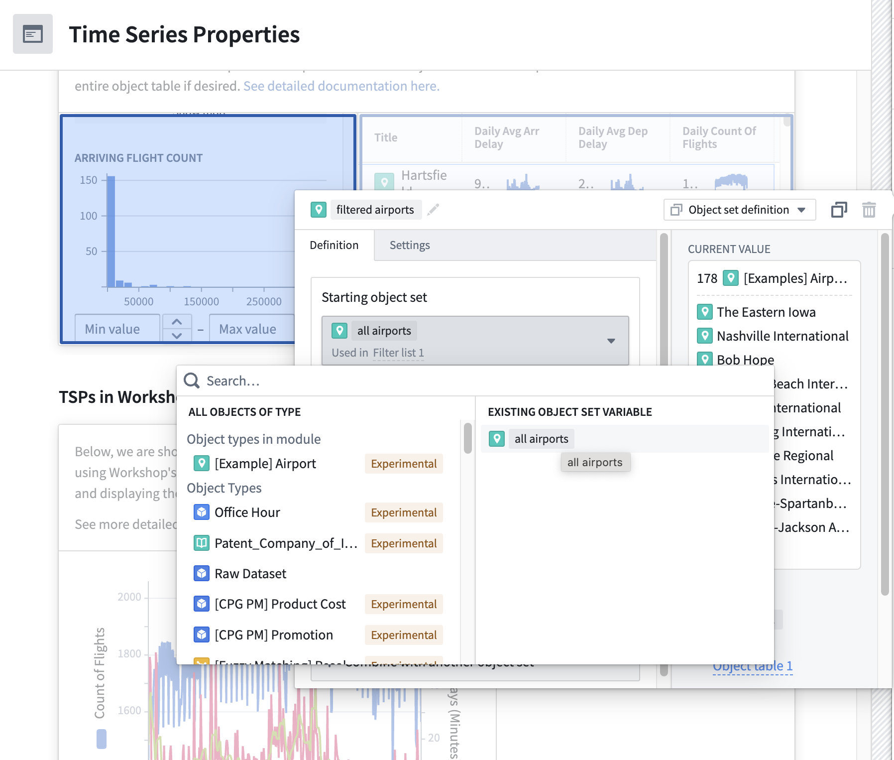
- In the Filter... section, select Using a variable and choose the
airport_filtervariable we created as an output for the Filter List widget.
-
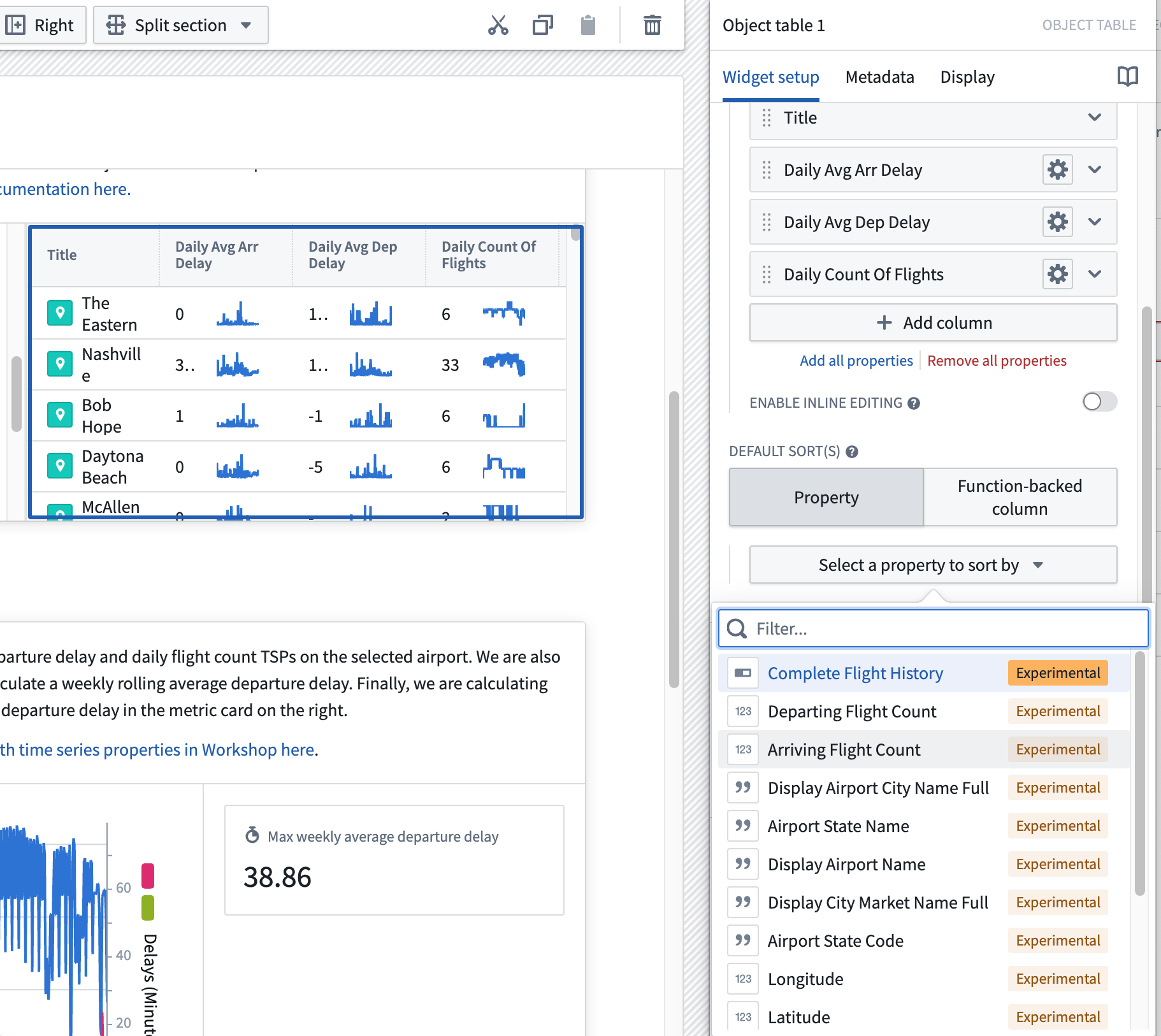
In the Column Configuration add the
Title,Daily Avg Arr Delay,Daily Avg Dep Delay, andDaily count of flightscolumns by selecting + Add column. -
Configure Default Sort(s) to be a property, and choose Select a property to sort by. Then, choose
Arriving Flight Count.
- Set up the output for the selected table in the Selection section of the Object Table configuration. Configure the output to run analysis on the time series properties of the selected airport.
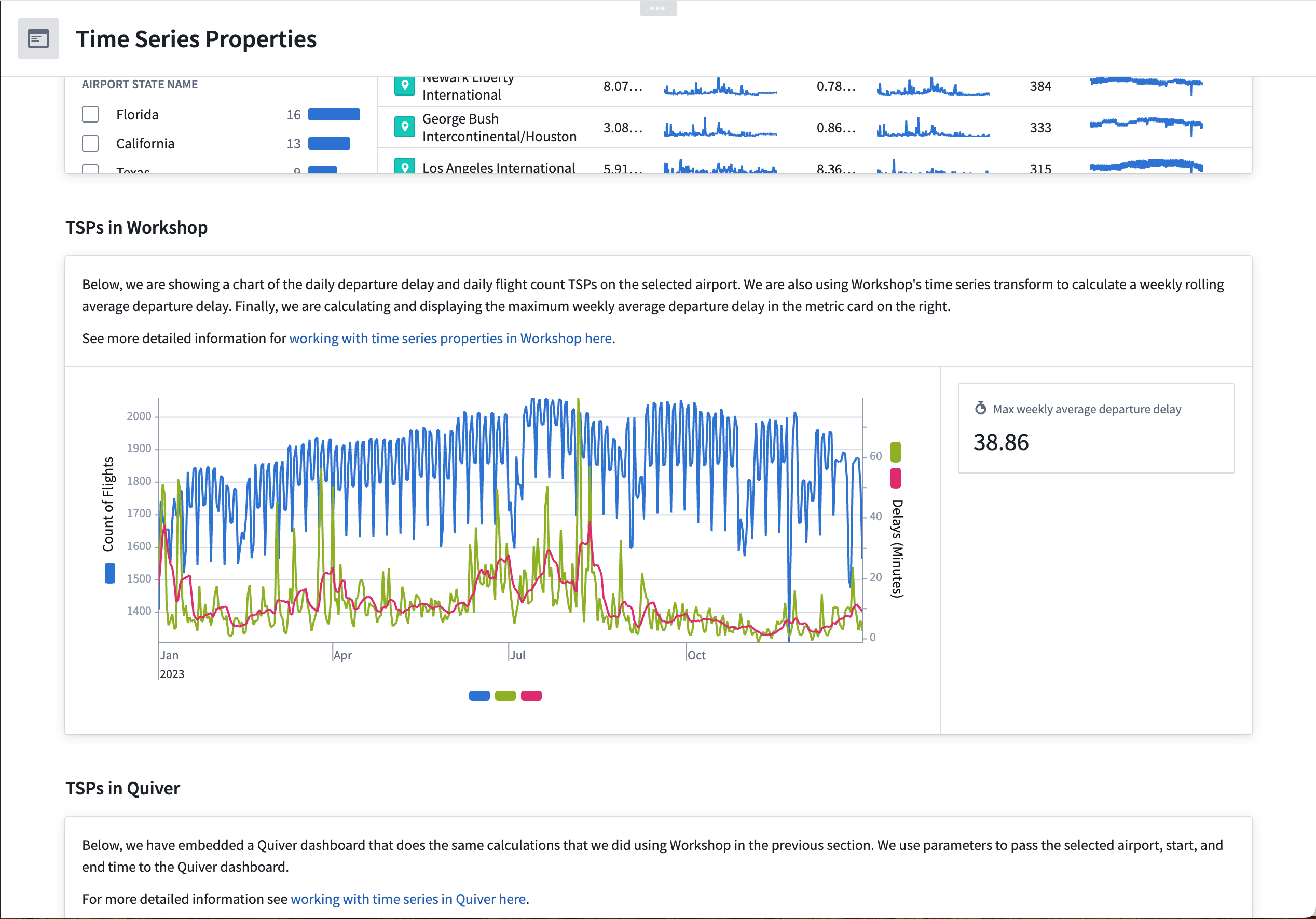
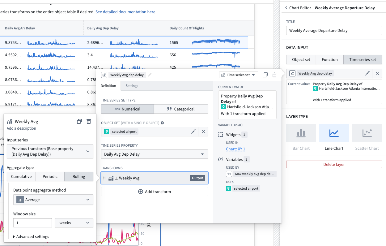
TSPs in Workshop
The TSPs in Workshop section of the module uses the available time series transforms in Workshop. Follow the instructions below to set up the Chart XY and Metric Card widgets shown in the dashboard.
Part I: Add a Chart XY widget
- In your Workshop module, choose to + Add widget, then select the Chart XY widget.
- In the configuration menu to the right, choose to add a plot layer.
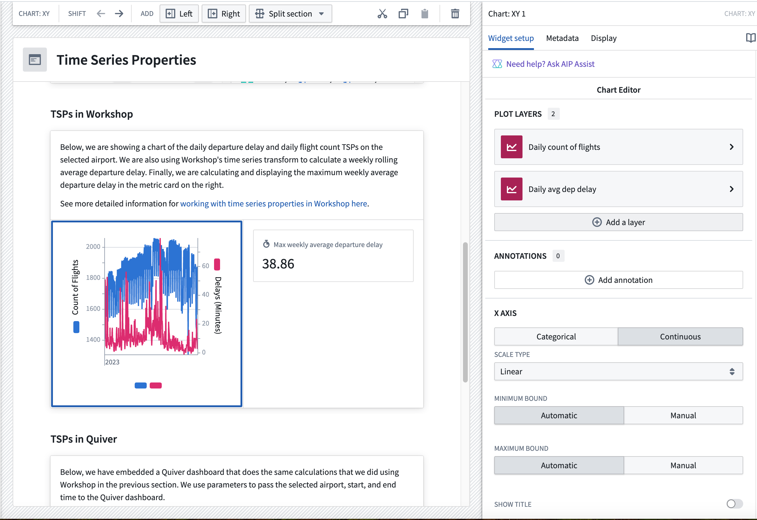
- Select the layer in the menu to configure the data input as a Time series set.
- Create a new variable that contains the
daily count of flights for selected airporttime series property, where the selected airport is the output variable from the Object Table widget. Be sure to give your new variable an understandable name.
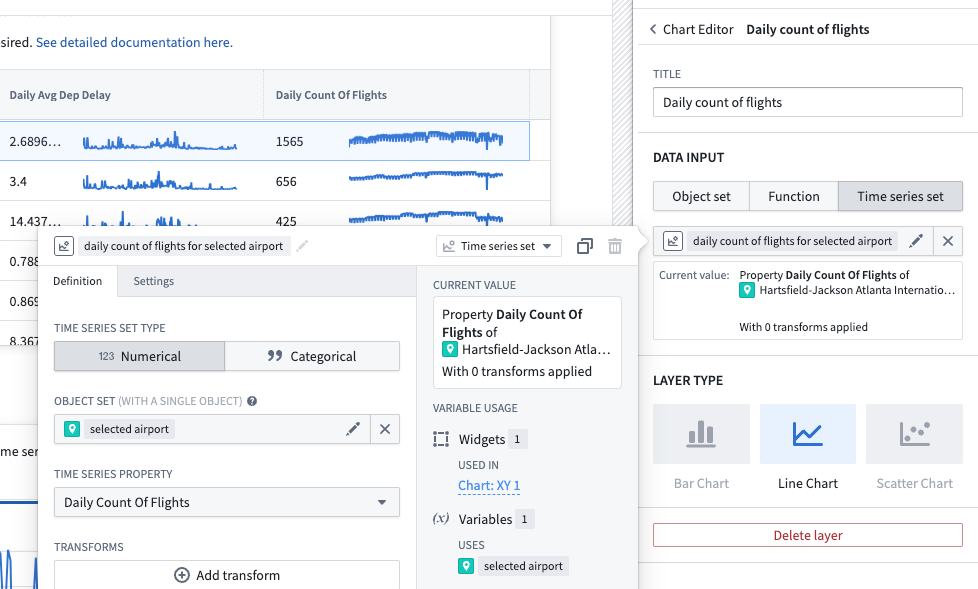
- Add another plot layer and variable for the
daily dep delay for selected airportTSP. - Add a third plot layer for the
Weekly Avg Dep delayproperty. This time, when setting up the time series set variable, choose to also add a transform. In the transform, select Rolling and then Average over 1 weeks as the aggregation method. Be sure to give your new variable an understandable name.
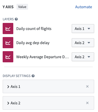
- Ensure the axes are set up so there is an axis for each layer. You can also select where the axis units appear for each plot layer (to the left or right of the chart).
Part II. Add a metric card next to the Chart XY widget
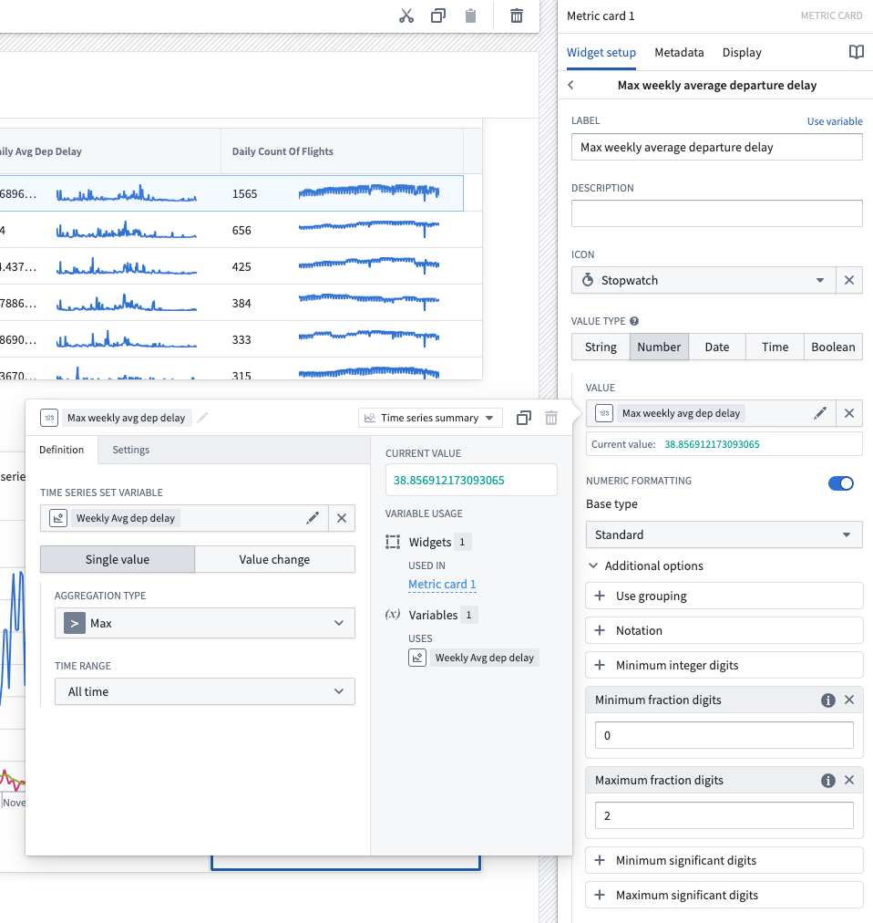
- Add a Metric Card widget.
- In the configuration menu, choose to either Add Metric or use the default that is created when you first add the widget. Then, hover over the metric to open further configuration options, and choose Number as the value type.
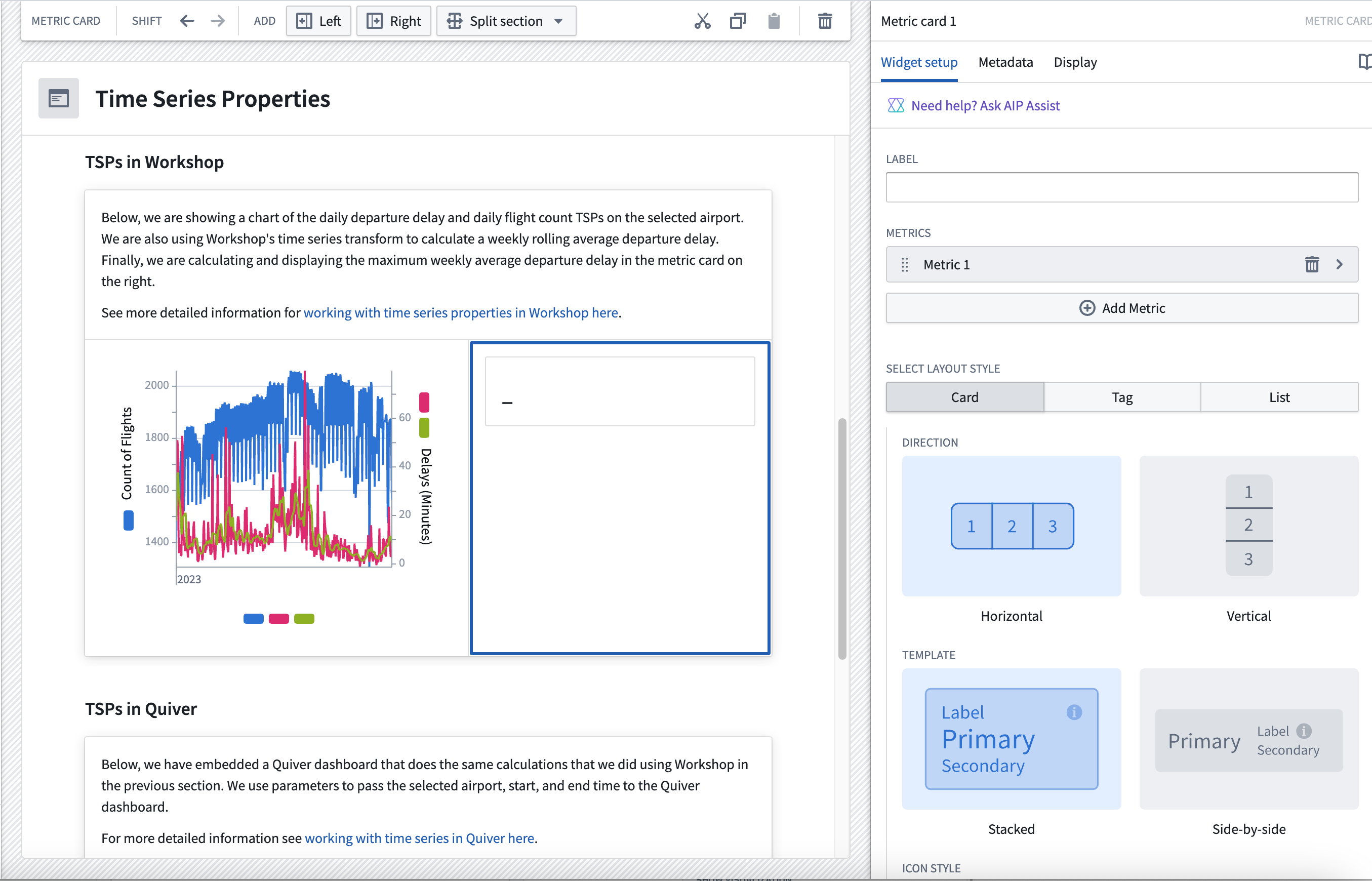
- Choose Select numeric value..., hover over New numeric variable, then choose Time series.
- Select the
Max weekly average departure delayvariable you created when setting up the third plot layer of your Chart XY widget. - Select the Max aggregation type over the All time time range as the single value metric. Be sure to give your new variable an understandable name.
- Set up numeric formatting as desired.
TSPs in Quiver
The following guidances assumes a basic knowledge of navigating Quiver. To learn more about general Quiver functionality, review our documentation.
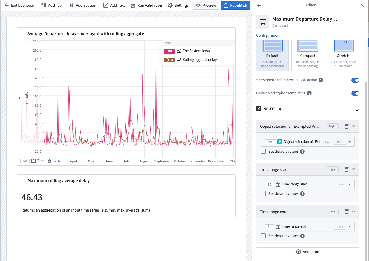
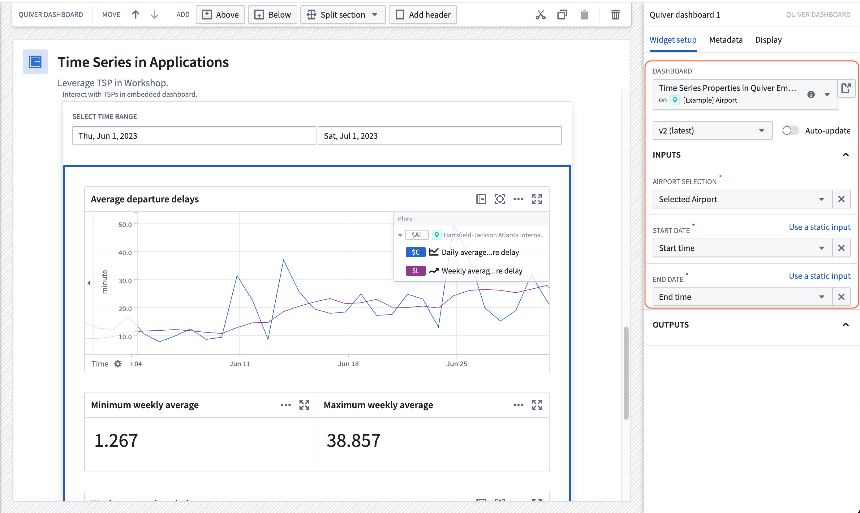
The TSPs in Quiver section of the example Workshop module contains an embedded Quiver dashboard. This Quiver dashboard performs similar calculations to the Workshop widgets discussed above. Follow the instructions below to set up the time series chart and metric card shown in the dashboard.
Once the following steps are complete, the resulting dashboard should look like the example below:
Part I: Set up a time series comparison in a Quiver analysis
-
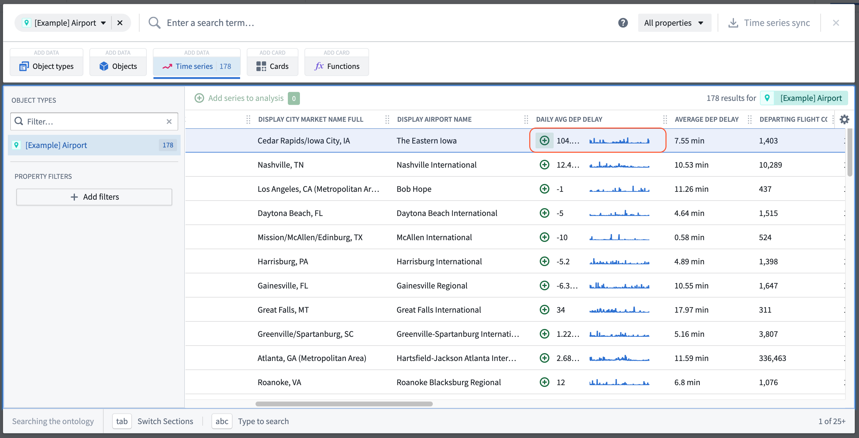
Create a new Quiver analysis and open the Time Series menu from the top bar.
-
In the top left, filter the results to the
Airportobject type and select the Daily Avg Dep Delay time series property from one of the objects.
- Configure the x-axis of the resulting plot to Fit to extent, this will ensure that the axis is scaled to the data's time range.
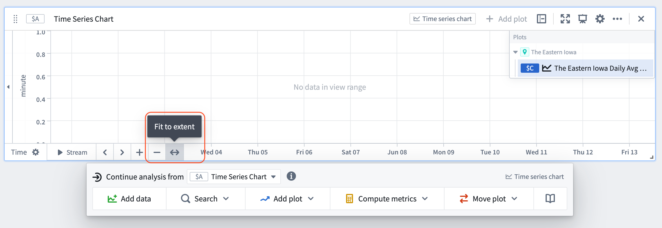
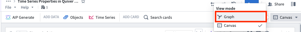
- Select Graph in the top right of the viewable content to enter the analysis graph view.
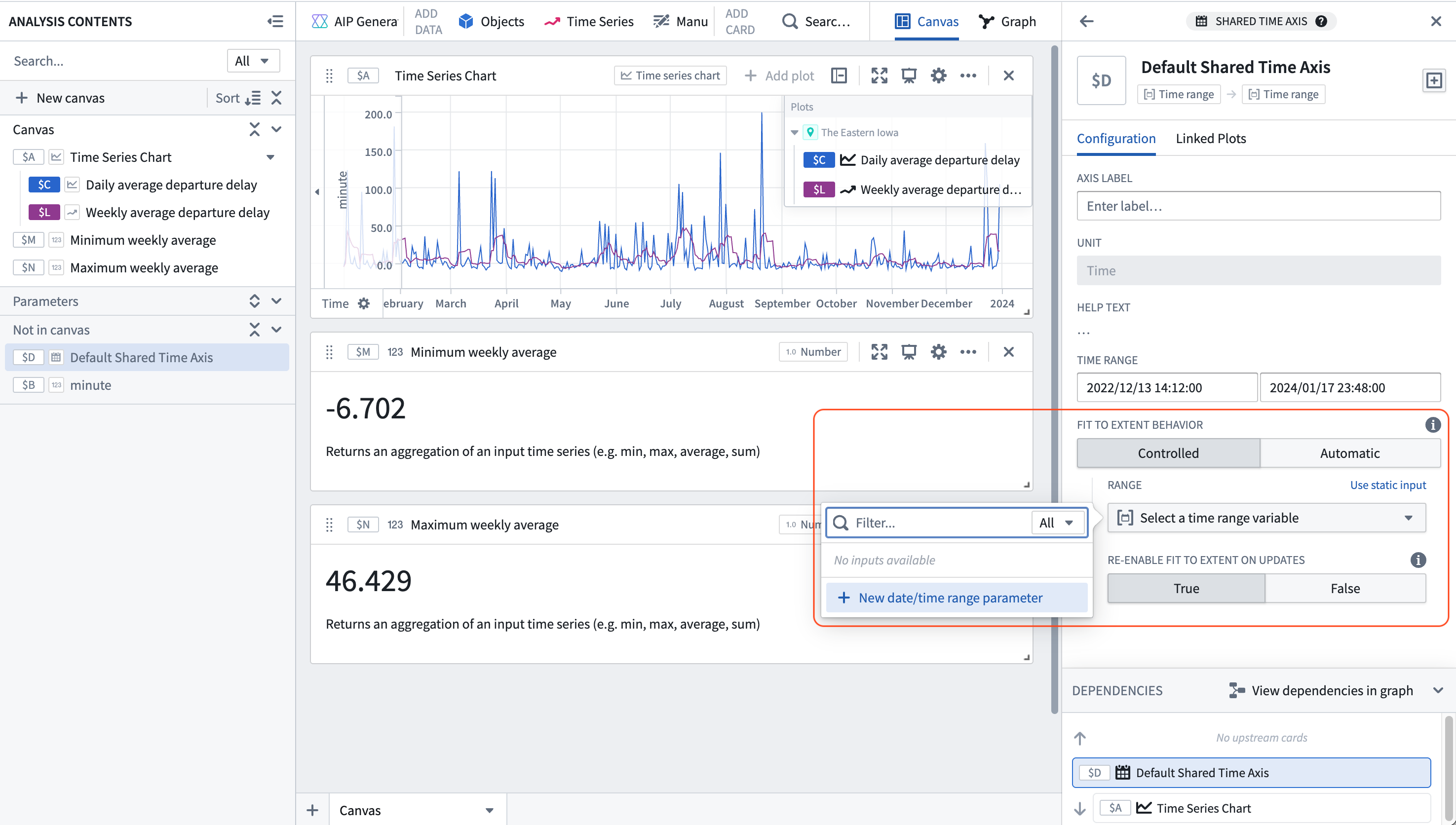
Note that by adding the time series property of an object, a time series chart, a numeric axis (unit), and a default shared time axis card were also generated.
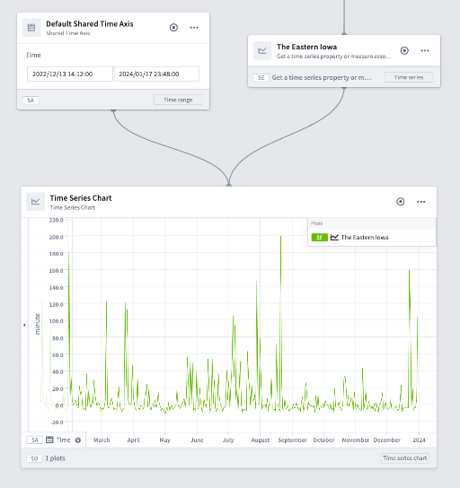
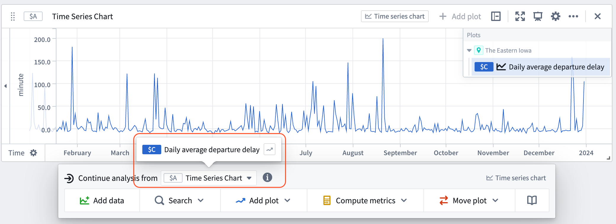
- Hover over the object's time series property card until the menu appears. From the next actions menu, select the time series property from the Continue analysis from dropdown.
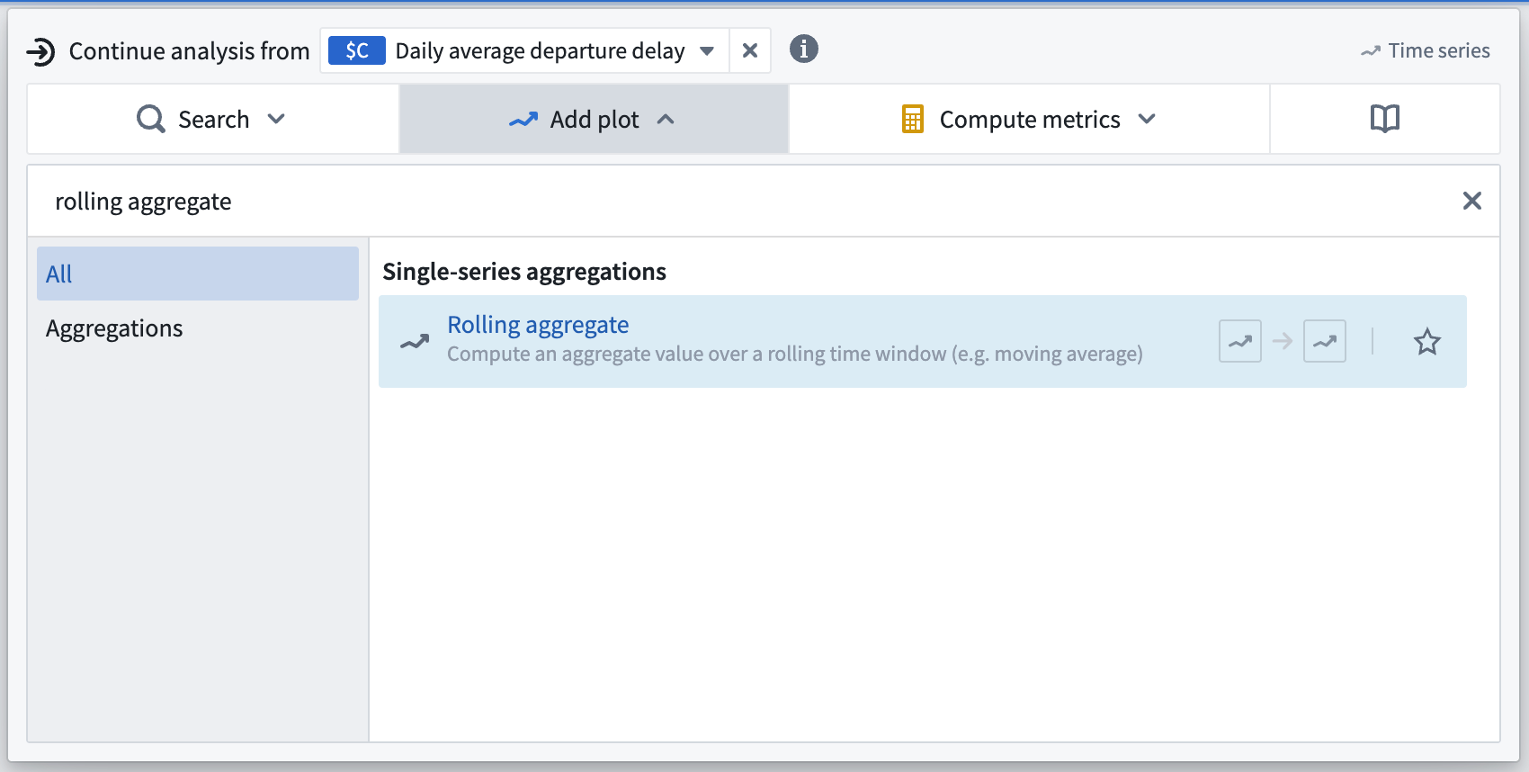
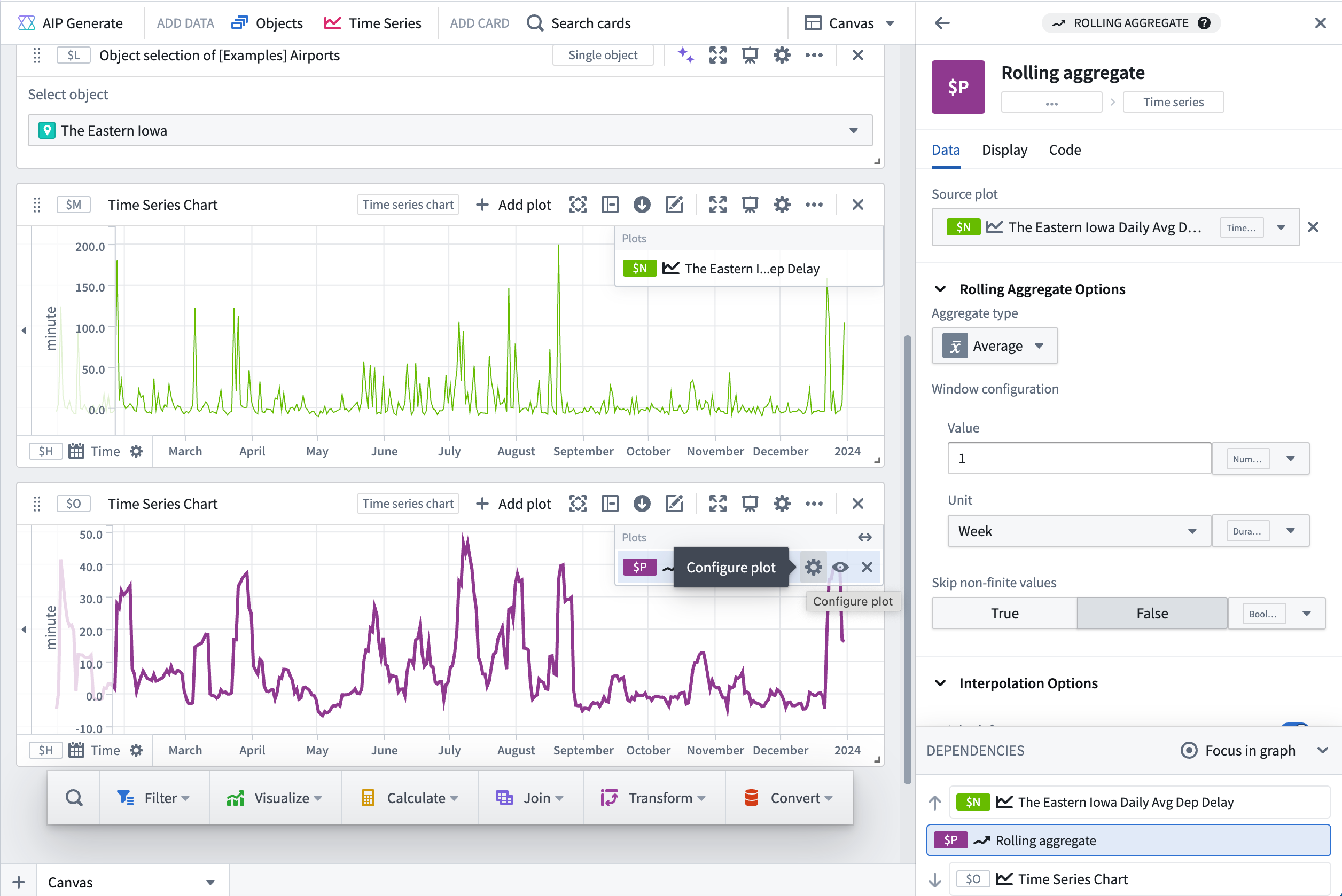
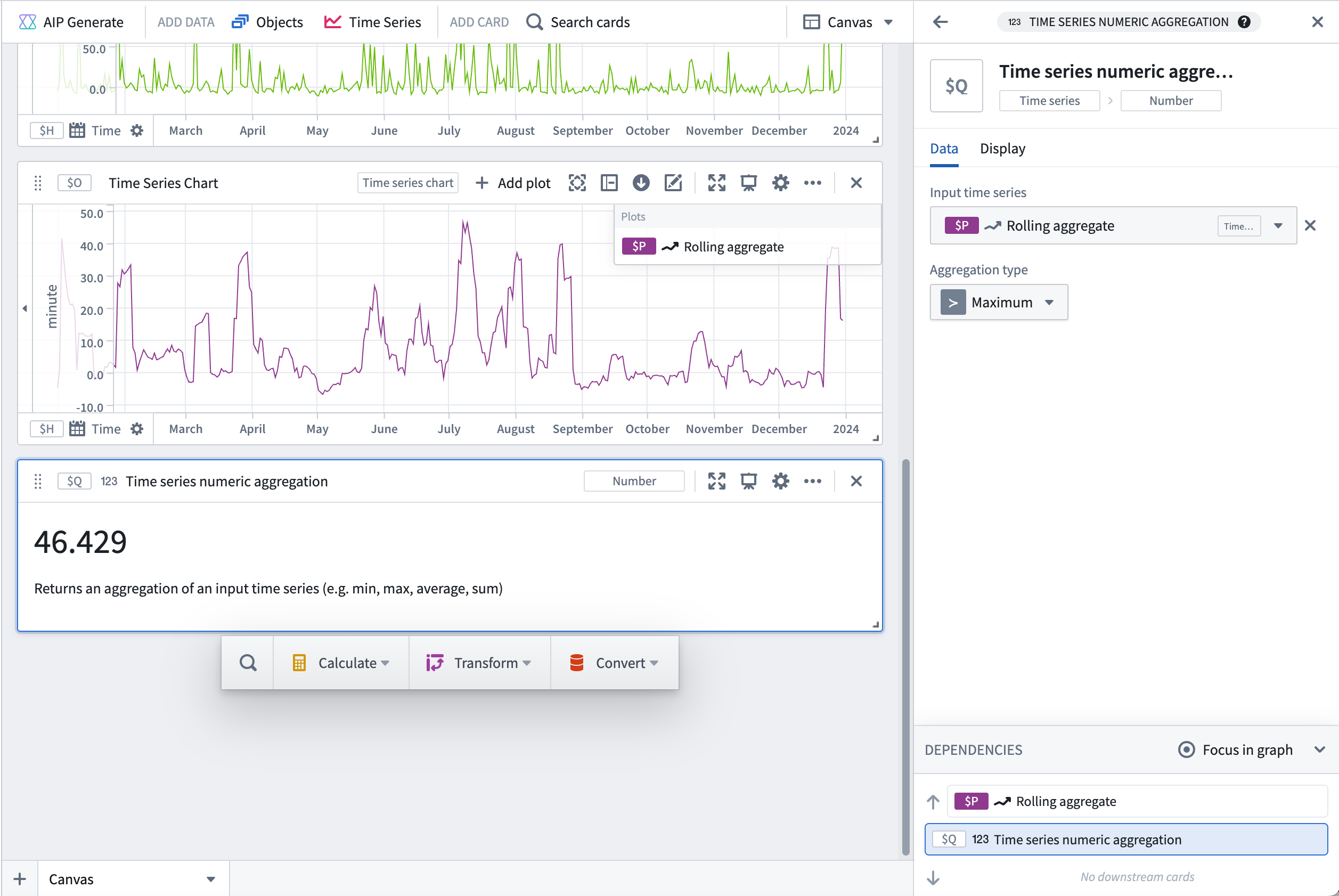
- Select the Add plot button and search for "rolling aggregate" to add a Rolling aggregate card to the canvas.
- From the settings menu on the plot in the upper right of the card, choose Average with a Value of 1 and a Unit of Week, indicating every one week.
- Hover over the plot until the menu appears. From the next actions menu, Continue analysis from the newly created rolling aggregate. Select Search and search for "numeric aggregation". In the numeric aggregation settings, set the Aggregate type to be Minimum. Repeat this step to add a maximum numeric aggregation card.
- In the Analysis contents panel, find the Default Shared Time Axis. In the configuration side panel on the right, toggle on the Controlled option, select Use variable input, and select New date/time range parameter in the Range dropdown. This will create a new date/time range parameter that will be used to control the time range of the shared time axis.
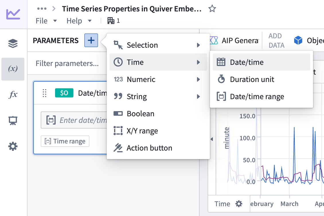
- In the Parameters panel you should see the newly created date/time range parameter. Create two date/time parameters, one representing the start of the time range and one representing the end of the time range.
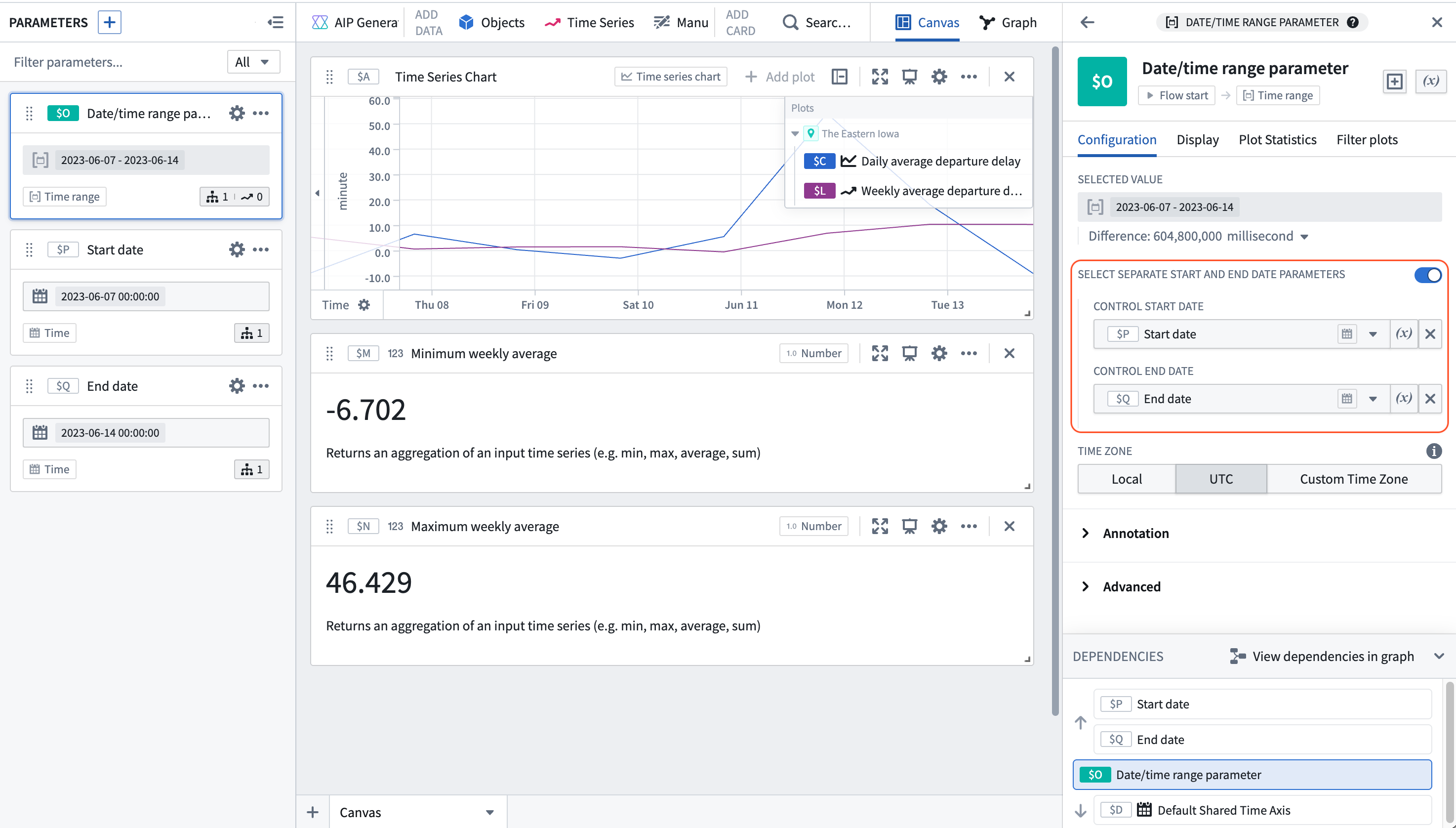
- Select the date/time range parameter created in step 9, and in the right configuration panel toggle on Select separate start and end date parameters. Then, select the start and end parameters created in step 10 from the dropdown menus. Now the time axis of the plots can be controlled by the start and end parameters.
- In the parameters panel, create a new Object parameter.
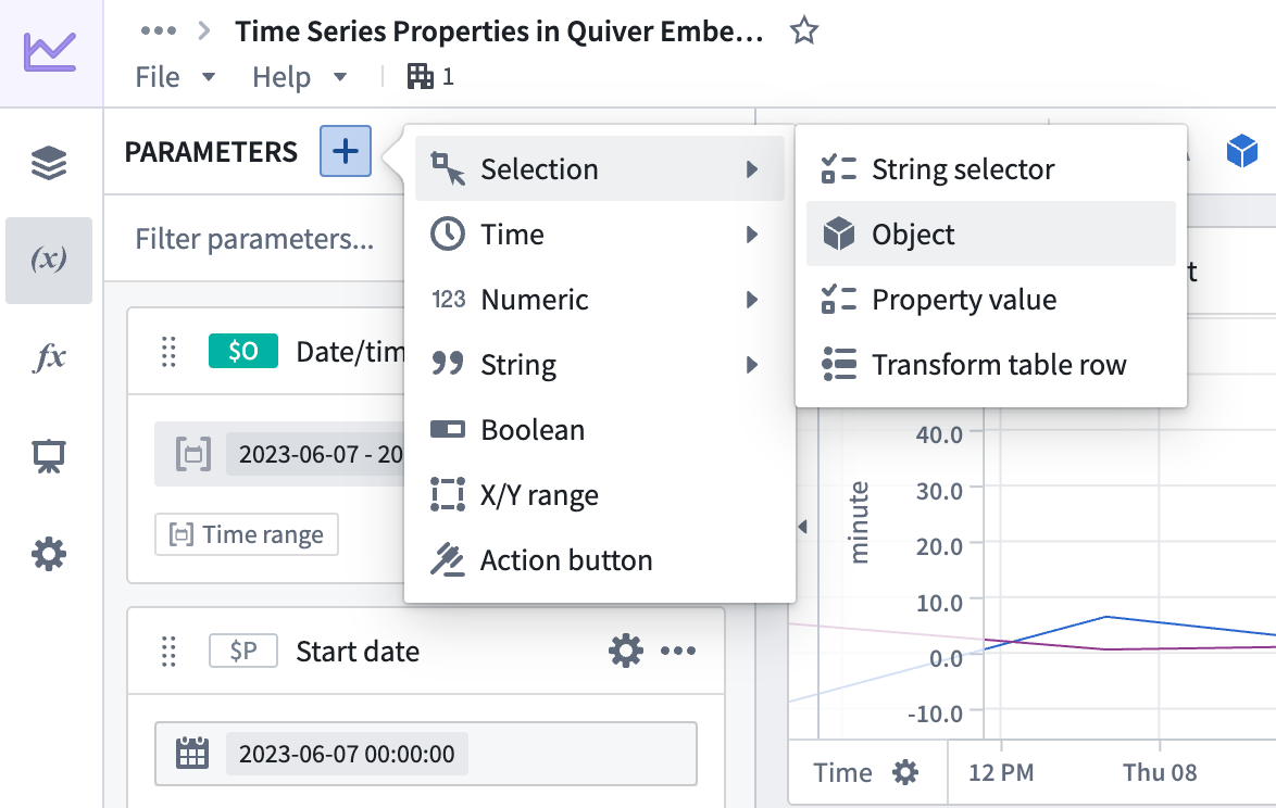
- In the right side configuration panel, select the
Airportobject type and select any airport from the dropdown.

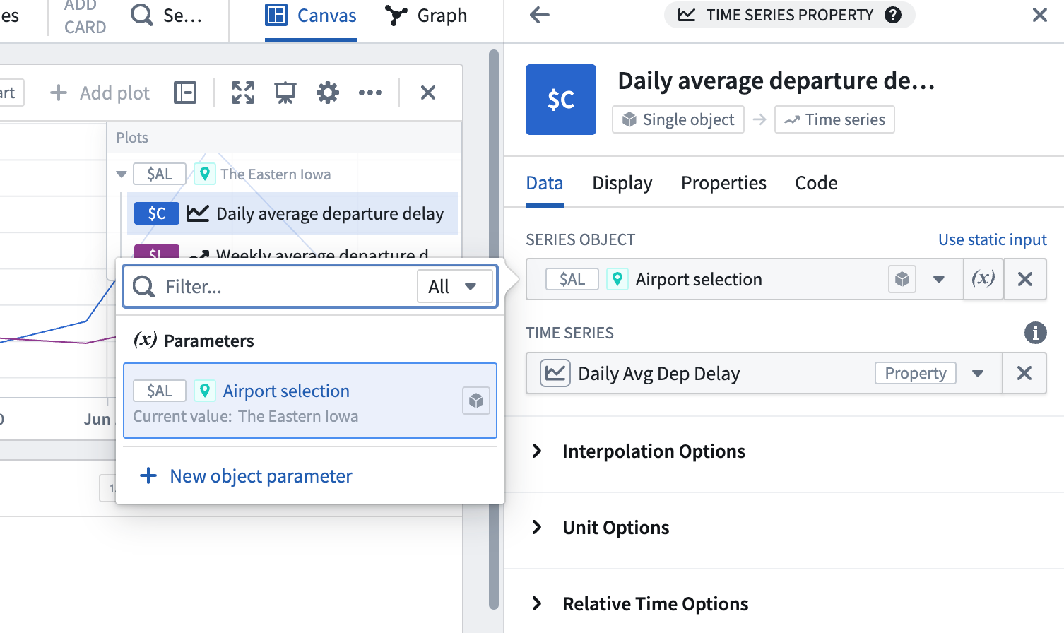
- Select the
Daily Avg Dep Delaycard that was created in step 2. In the configuration panel on the right select Use variable input next to the Series Object configuration and select the newly created object selector parameter. Now, the airport can be controlled, and theDaily Avg Dep Delaytime series will update along with all of our downstream operations.
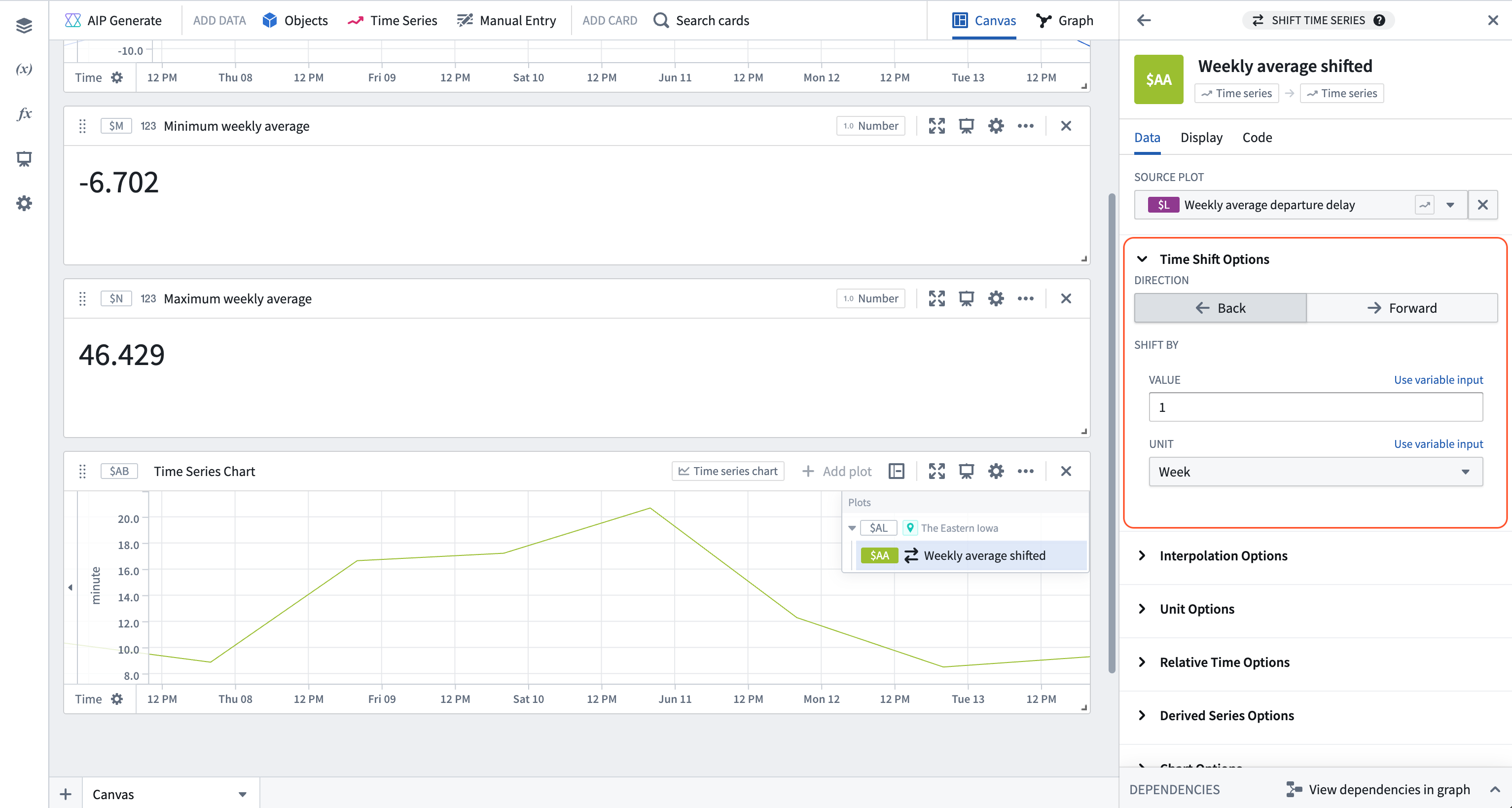
- Hover over the plot containing the rolling weekly aggregate and select the rolling aggregate from the Continue analysis from dropdown in the next actions menu, then search for "shift time series". Add the Shift time series card and configure it to shift the input series back one week.
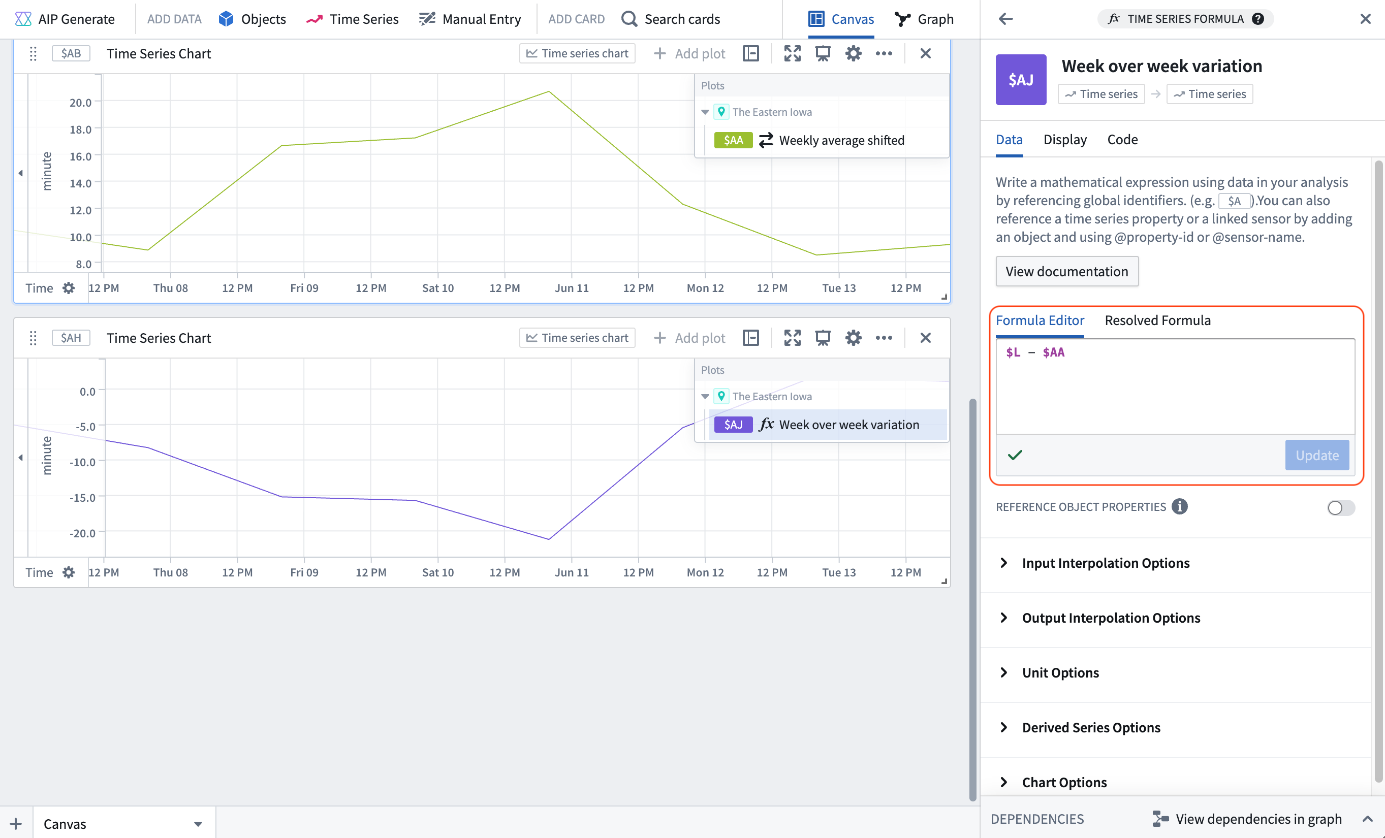
- Add another plot by hovering over the existing plot, and use the Search action in the next actions menu to search for "time series formula". Add the Time series formula card and add the following formula to the card configuration:
$L - $AA; where$Lis the weekly average departure delay, and$AAis the weekly average delay shifted back one week. The result is a week over week variation.
Part II: Set up Quiver dashboard
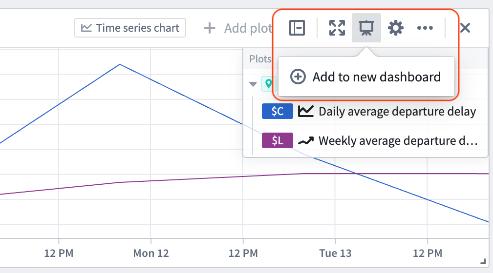
- Select Add to new dashboard from the top right corner of the time series chart containing the rolling weekly aggregate and the average departure delays for the airport.
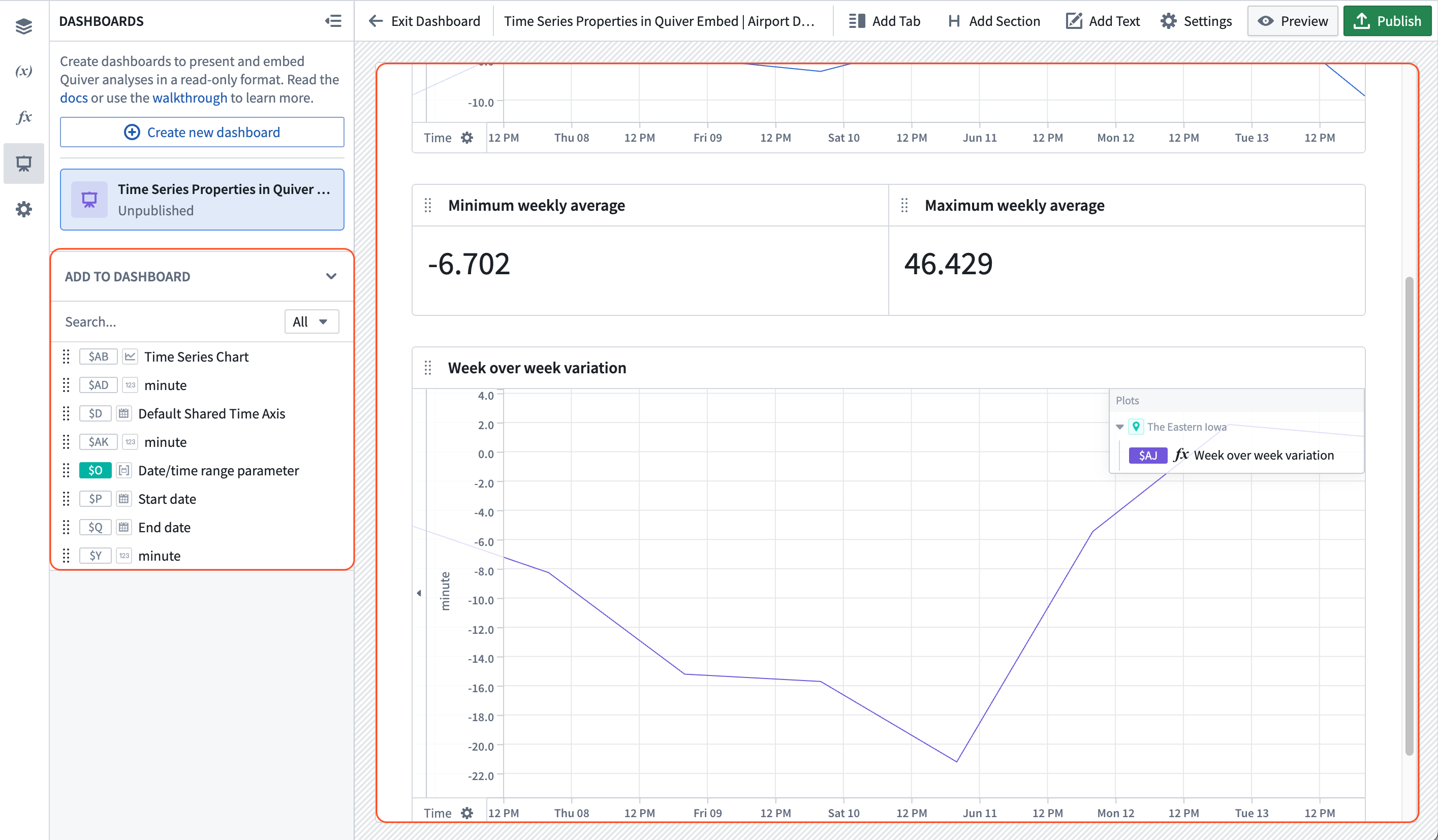
- Open your dashboard using the dashboard icon in the left sidebar. From the dashboard view, drag the numeric aggregations representing the minimum and maximum weekly average delay and the week over week variation from the left panel into the dashboard content.
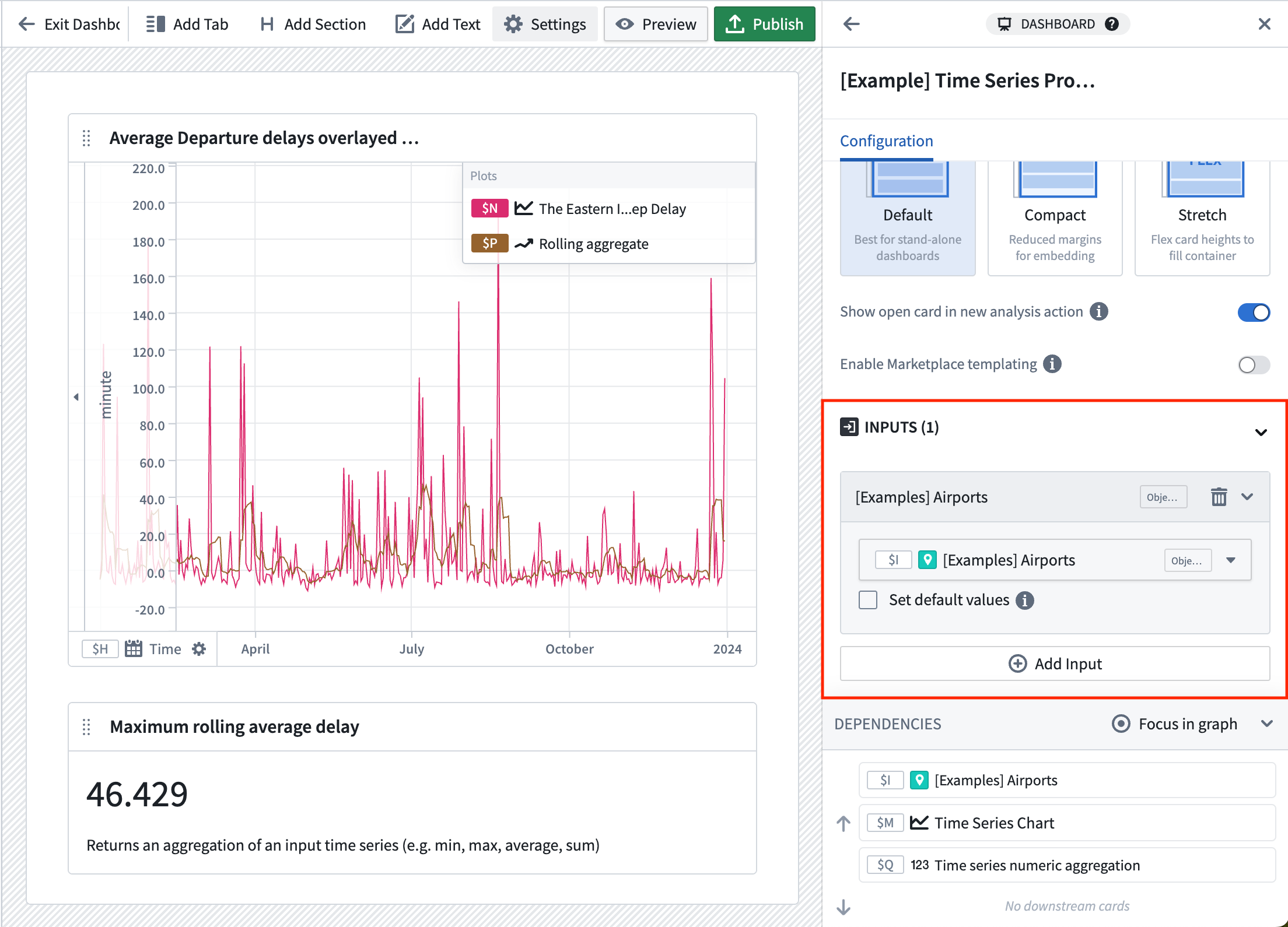
- In the Inputs section of the Dashboard settings panel on the right, add three inputs for the
Airportobject selector parameter, the start time parameter, and the end time parameter.
- Publish the dashboard.
Part IV: Embed your dashboard in Workshop
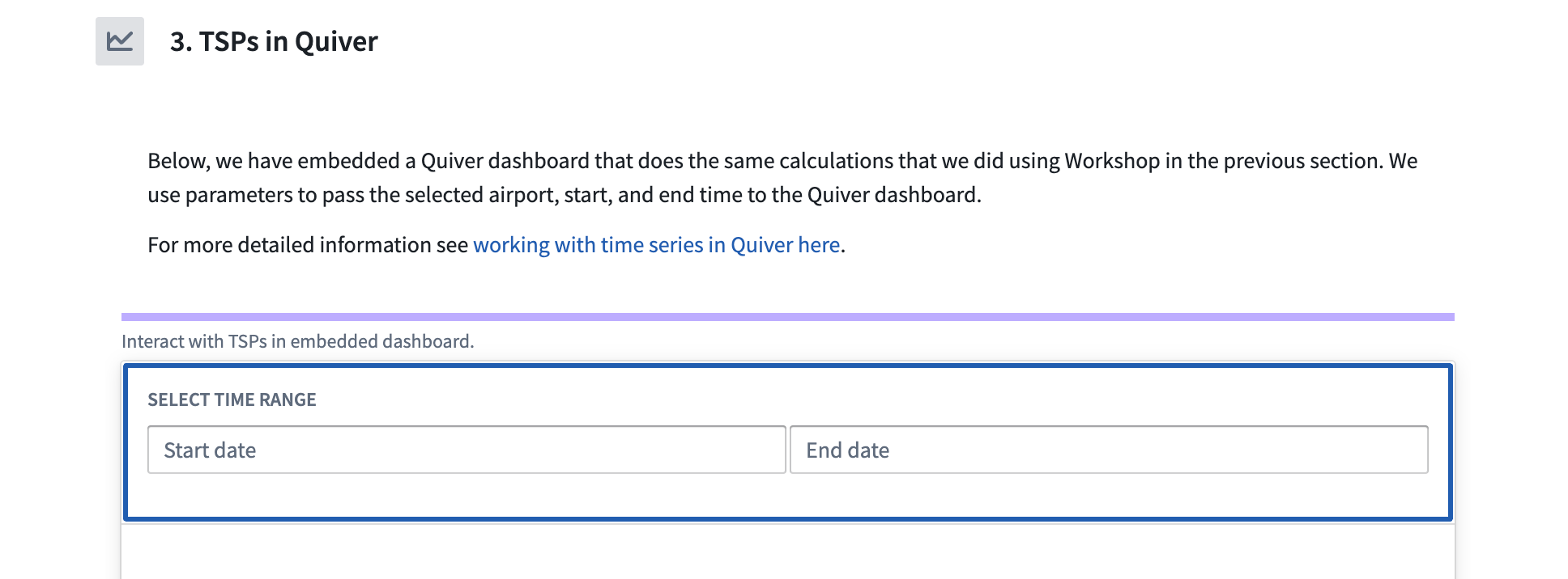
- Create a date range widget for controlling the start and end times.
- Add a Quiver Dashboard widget, then select your newly created dashboard. Additionally, wire up the workshop airport
Selected Airport,Start dateandEnd datevariables to the associated Quiver dashboard inputs.
Now, the selected Airport object and the configured time range in the Workshop module will be reflected in the Quiver dashboard.