- Capabilities
- Getting started
- Architecture center
- Platform updates
Visualization
Visualization widgets display data related to the current object in charts, pivot tables, timelines, maps, and other visualizations, including simple text and metrics. Visualizations created in other Foundry apps can be embedded as well - see the Apps and Files category to learn more about embedding Slate applications, Contour boards, Foundry reports, Fusion spreadsheets, and Quiver time series or charts.
Linked Object View
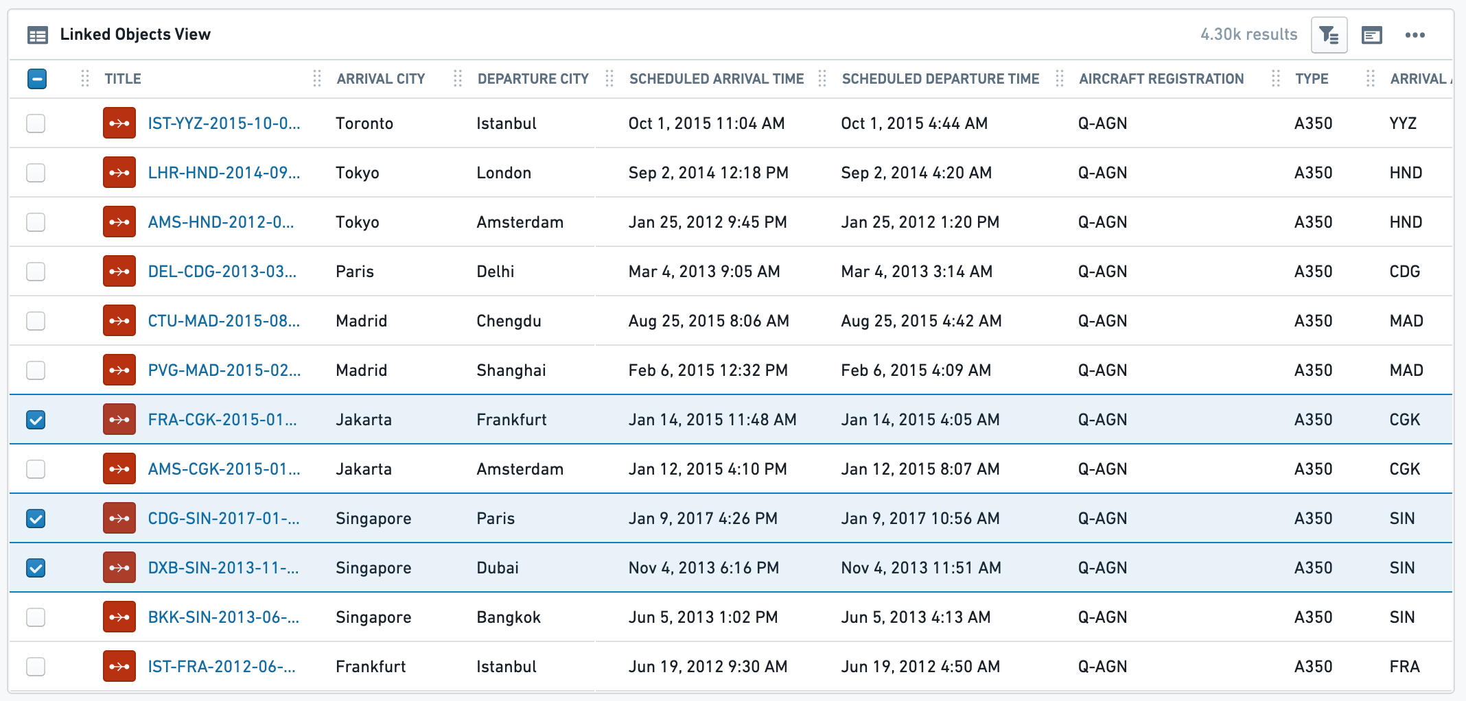
This widget is mainly used to display a table view of all Linked Objects of a certain type along with their relevant properties. The table also supports selection of subset of linked objects to open in other Foundry apps or perform configured Object Actions. In addition to a table view, a simple list view and a card view are also available.
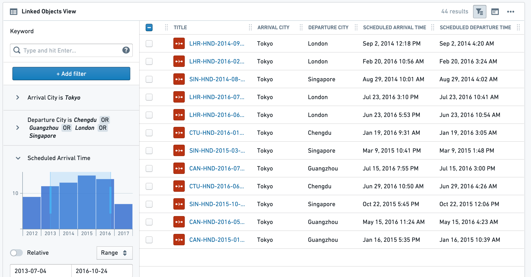
Example for Linked Object View (Table) without a Filter Sidebar, and with a Filter Sidebar:


Configuration
Settings tab
The configuration has 3 parts:
- Data
- Linked Object to display: Select the Linked Object you wish to display. The widget configuration offers objects that are linked to the current object as defined in the Ontology configuration. Choose either an object type either via a direct link or through a transitive link using an intermediate object type.
- Properties to display:
- All Properties - display all properties that are defined as Prominent or Normal, but no Hidden properties. Allows excluding a specific set of properties using the
Properties to Excludeselector (see below). - Prominent Properties - display only the properties defined as Prominent in the Ontology Manager. Allows exclusion of a specific set of properties using the
properties to excludeselector (see below). - Specific Properties - opens a multi-select dropdown with all properties of that Linked Object, to select between.
- No Properties - do not display any property.
- All Properties - display all properties that are defined as Prominent or Normal, but no Hidden properties. Allows excluding a specific set of properties using the
- Properties to Exclude: select which properties you wish to exclude from display. Available for All Properties and Prominent Properties options.
- View Options - choose which view type will be displayed to the end-user by default. The end-user can still change to the other 2 views in the UI (on the widget header).
- Table view - the most commonly used view, displays a table of all values, with quick filter search.
- Card view - a condensed cards view of each Linked Object, with properties (as selected on 1b). This option does not have the full functionality of the table view. For example, it does not support selection or Object Actions.
- Note: For the Card display option, there is a secondary configuration called “Card Width” which determines the visual density of these cards. It has no effect for the Table or List view options.
- List view - a simple list view of all instances of the chosen Linked Object, without any option of selection or any display of linked properties.
- Search and Filtering - add search and filtering capabilities to the table view
- Results limit - limit the maximum number of results to be shown. The more results you wish to display, the longer it would take the view to load. This, together with the minimum/maximum height configuration (see below on the Format tab) determine how much of the entire view this widget would take.
- Enable search and filtering - toggle on to have search and filtering functionality on the widget. This includes either basic or advanced search functionality:
- Basic - have a simple search bar for free text searches at widget header.
- Advanced - have a full filter sidebar with detailed filtering options, including a toggle to expand or collapse the sidebar by default to end-users. Unlike the basic free-text search, this search allows more complex filtering based on property type (free-text and multi-select for strings, date range for timestamps, numeric for double/integer). This search bar is based on the legacy Object Explorer functionality and UI.
Format tab:
Under the format tab within the widget configuration, aside from defaults of Title, Icon, Info and Layout, you can control the minimum and maximum height of the section (optional).
Common Issues and Notes:
- This widget is affected by filters from other widgets - if the toggle is on - but does not publish filters to other widgets sharing cross-filtering with it, even if the filter sidebar is open. In effect, internal filters are limited to the context of the object table widget.
- Conditional Formatting and Value Renderers - Values in the table can be rendered with conditional formatting and value renderers.
Timeline
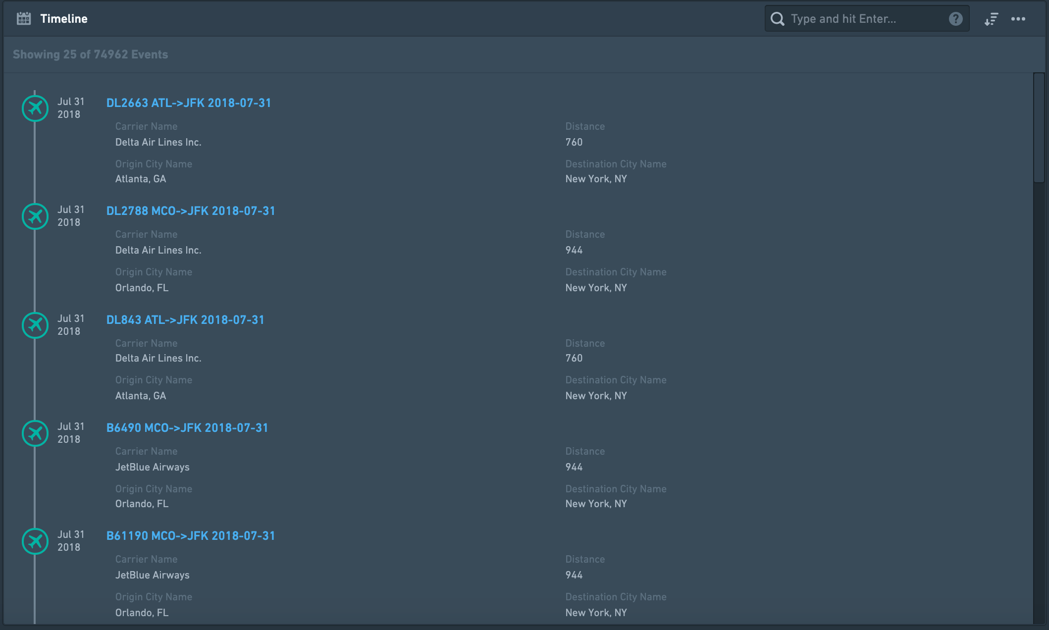
Create a chronological list of events, displayed top-down, sorted by date and time. This timeline is built of linked objects that must have at least one timestamp, and are usually events, that is an object with a start and end timestamp that define some duration. This widget can include one or more types of objects linked to the current object directly, or through a linked object. It can also display the same event by different date properties as in the examples below.
For a graph timeline, use the Grouped Events Timeline and Table widget.

Configuration
Settings tab
- Add one or more Linked Objects (event) - First, add at least one Linked object type that you wish to display on the timeline by clicking on “Add Event Type”. You can add many types of Linked Objects:
- Display different object types on the timeline, that are completely different events. Example: Linked Objects to an Aircraft that are both Flights events and Aircraft Maintenance events.
- Display events of the same Linked Object type, but by different date properties, or with different types of Links defined. Examples:
- Flight events linked to an Airport object displayed on the same timeline by different date properties: (1) “Planned Arrival Time”, (2) “Actual Arrival Time”, (3) “Expected Departure Time”. The timeline will display a chronological list of all flights, and each flight will appear up to 3 times in this case.
- An Airport object can have both Arriving Flights as well as Departing Flights that are linked to it displayed on the same timeline.
- Select the type of event object you wish to add - for each event object you wish to add, configure the details of that object type:
- Select a linked object type - either directly Linked Object or an Extended Link.
- Example of a directly Linked Object: current object is an Airport and you want to display a timeline of Arriving Flights and Departing Flights.
- Example of an Extended object (2nd degree): current object is an Airport, and you want to display a timeline with all Aircraft objects that are linked to Arriving Flights linked to the Airport.
- Select a linked object type - either directly Linked Object or an Extended Link.
- Define the date property used to sort events on the timeline - select the property of the Linked Object you wish to sort the events on your timeline by. This property has to be a timestamp / date, so the configuration only suggests such properties.
- Select which properties to display from the Linked Object.
- Select what properties you wish to display:
- All Properties - not recommended if the Linked Object has many properties, as it would be crowded and hard to navigate through the timeline.
- Prominent Properties - only the properties defined as Prominent in the Ontology Manager.
- Specific Properties - opens a multi-select dropdown with all properties of that Linked Object, to select between.
- No Properties - only the title of the Linked Object would be displayed on the timeline.
- Select which properties you wish to exclude - only available for the first two options of All Properties and Prominent Properties.
- Select what properties you wish to display:
- Select which title would be displayed for each event on your timeline. There are three options:
- Object Name as title (e.g. name of the event) - this is the most commonly used option and the default.
- Date Property name as title - this is useful if you wish to display events from a Linked Object using more than one property (e.g. “Planned Arrival Time”, “Actual Arrival Time”, “Expected Departure Time”, etc.). Reminder: in such a case, each link based on a different property, should be configured separately within the Timeline widget - see bullet 1 above).
- Custom Name - an option to add a free-text description for all Linked Objects of that type. E.g. if you link both Arriving Flights and Departing Flights under the same timeline, you may want to describe all Arriving Flights with the title “Arrival” and all Departing Flights with “Departure”.
Format tab
Under the format tab within the widget configuration, aside from defaults of Title, Icon, Info and Layout, you can control the minimum and maximum height of the section (optional).
Common issues and notes
- This widget is searchable and sortable (oldest first, newest first). However, it doesn't support filtering, so it is not affected by filters. For filtering functionality, consider using the Grouped Events Timeline and Table widget.
- If you wish to display events on a graphic timeline (and not just be a chronological list), consider using the Grouped Events Timeline and Table widget.
- If you wish to display a Gantt chart style timeline, there is a “Linked Objects Gantt Chart” widget. If this is not available, contact your Palantir representative for more details. This is relevant for displaying a smaller number of events, with distinct start and end dates, such as a project timeline.
- For Timeseries visualizations, contact your Palantir team for more details about Quiver, which can be embedded in an Object View. You can also use Charts widgets (or embed charts from Contour or Quiver charts), with a date/time property on the X-axis.
- Events with missing dates will not be displayed on the events list. There will be a message alerting the user about missing events.
- For performance reasons, only 50 Linked Objects are displayed by default. As the user scrolls down through the list, additional objects will appear, 100 at a time.
Grouped Events Timeline and Table
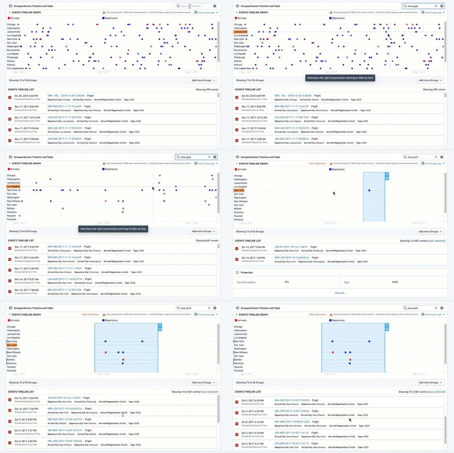
This widget includes two components: (1) a timeline of Linked Objects, and (2) a table listing the Linked Objects underneath. Linked objects can be grouped by properties and filtered by text, date range and external filters.
Grouped events are plotted on separate parallel lines, with each line including only events that have a property with a certain value, similar to a pivot table. In the example below, each city has a different line, with all flights that are arriving (red) or departing (blue) from that city on that line.
This widget can include one or more types of objects linked to the current object directly, or through a linked object. It can also display the same event by different date properties (examples below).

Configuration
Settings
- Add one or more Linked Objects (event) - First, add at least one Linked Object Type that you wish to display on the timeline by clicking on “Add Item”. You can add many types of Linked Object:
- Display different object types on the timeline, that are completely different events. Example: Linked Objects to an Aircraft that are both Flights events and Maintenance events.
- Display events of the same Linked Object type, but by different date properties, or with different types of Links defined. Examples:
- Flights events linked to an Airport object displayed on the same timeline by different date properties: (1) “Planned Arrival Time”, (2) “Actual Arrival Time”, (3) “Expected Departure Time”. Each flight will appear up to 3 times in this case.
- An Airport object can have both Arriving Flights as well as Departing Flights that are linked to it displayed on the same timeline.
- Select the type of event object you wish to add - for each event object you wish to add, configure the details of that object type:
- Select Linked Object - either directly Linked Object or an Extended Link.
- Example of a directly Linked Object: current object is an Airport and you want to display a timeline of Arriving Flights and Departing Flights.
- Example of an Extended object (2nd degree): current object is an Airport, and you want to display a timeline of all Aircraft objects that are linked to Arriving Flights linked to the Airport.
- Select Linked Object - either directly Linked Object or an Extended Link.
- Configure visual format options
- Max Number of Events - this option is currently not functional.
- Color - select the color for the all events under this item’s configuration. Use the Blueprint standard colors ↗ or basic color names - “Blue”, “Red”, “Yellow”, etc.
- Series Name - the description of all events under this timeline, which will be displayed on the legend of the graphic timeline.
- Define the date property used to sort events on the timeline - select by which property of the Linked Object you wish to use to display the events on your timeline. This property has to be a timestamp / date, so the configuration only suggests such properties.
- Group Events By - select how to group the events on the graphic timeline. Each group would be displayed as a separate horizontal line of events in the graphic timeline, stacked one on top of the other. There are two options:
- Constant - current item would be grouped on a single timeline, with a title defined as a free-text value. In this case, if you wish to add other timelines as separate lines, you must define additional items.
- Property - split the events to a number of separate timelines, with events grouped on each timeline according to the different values of that property.
- Example: displaying a timeline of all Arriving Flights of an Airport object, one could select the “Airline Name” property and have a separate timeline for each Airline with all flights of that Airline on its dedicated timeline. The list below would include a chronological list of all Flights events from all Airlines.
- Properties Displayed in List - select the properties you wish to display on the second part of the widget, the List:
- Select what properties you wish to display:
- All Properties - not recommended if the Linked Object has many properties, as it would be crowded and hard to navigate through the timeline.
- Prominent Properties - only the properties defined as Prominent in the Ontology Manager.
- Specific Properties - opens a multi-select dropdown with all properties of that Linked Object. Choose specific properties to display.
- No Properties - only the title of the Linked Object is displayed on the timeline.
- Property Filter - an optional toggle to add a filter based on a single property, to include only specific values. These values must be explicitly typed as case-sensitive free-text strings.
- Select what properties you wish to display:
- Additional configurations for the graphic timeline (these only apply to the timeline component and have no effect on
the table component)
- Groups Displayed by Default - how many timelines, or which ones exactly, should be displayed as separate lines in the timeline. In both cases, the user would have a multi-select helper with all other groups on it.
- Max Number - the maximal number of different groups and different timelines would be displayed in the graphic timeline, as a number (Value).
- Explicit List - write the exact list of values of the groups you wish to display (text, case sensitive).
- Sort Groups By - the timeline can have multiple horizontal lines, and this allows you to sort these lines by 1 of 3 ways:
- Configuration Order - the order in which you configured the different items
- Name - alphabetical order of all groups, from A at the top - to Z at the bottom
- Most Recent Event - the group with the most recent event at the top
- Max Graph Height - set the maximum height of the graphic timeline in the widget (in pixels). To set the height of the entire widget, see the Sizing options under the Format tab in the configuration.
- Groups Displayed by Default - how many timelines, or which ones exactly, should be displayed as separate lines in the timeline. In both cases, the user would have a multi-select helper with all other groups on it.
Format
Under the format tab, aside from defaults of Title, Icon, Info and Layout, you can control the minimum and maximum height of the section. Setting either is optional.
Common Issues and Notes
- The end use can filter the timeline using a free-text filter or a date range. Note that these filters are not published and do not affect other widgets.
- This widget is affected by other filtering widgets, if cross-section filtering is enabled.