- Capabilities
- Getting started
- Architecture center
- Platform updates
Configure tabs
A tab is the main method of navigation and grouping content within Object View. Each tab contains a Workshop module and has customization options for conditional visibility, filtering settings, and layout settings.
There are two types of tabs available to add to your Object View: Managed Workshop, and Standalone Workshop modules.
- Managed Workshop modules: We recommend using Workshop to build a new tab within Object View. This option allows you to develop more sophisticated views that can leverage the full power of Foundry's application building capabilities. Learn more about Workshop-backed tabs. Managed modules have their permissions automatically kept in sync with the Object View, and cannot be reused.
- Existing Workshop modules: You can embed modules that have already been built in Workshop directly into Object View tabs. You can use the same module in multiple Object Views.
Some tabs were built with the Legacy builder, which allowed you to create simple tabs with limited flexibility for layouts, widgets, and data options. New tabs using this builder can no longer be added, but existing tabs are still supported.
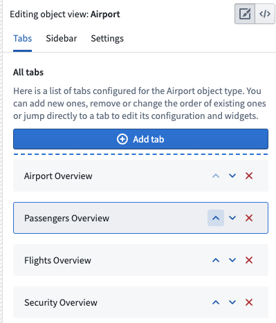
Manage Tabs
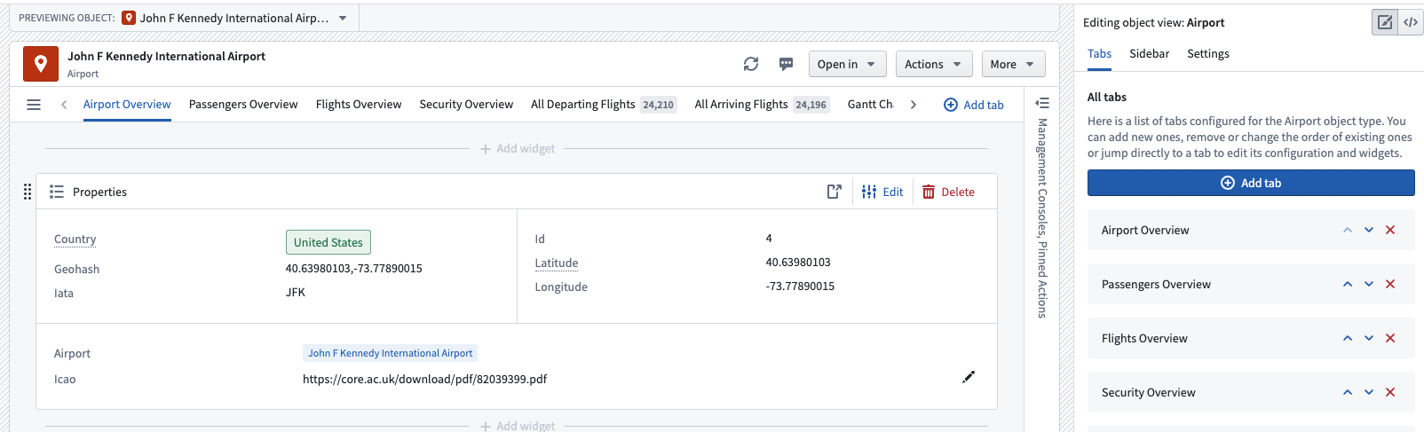
Add a new tab
You can add a tab from two places within the editor: the Tabs section of the Object View editor sidebar, or the Add tab button in the tab list on the Object View preview itself. Either option will allow you to select the tab type of your choice.
Delete a tab
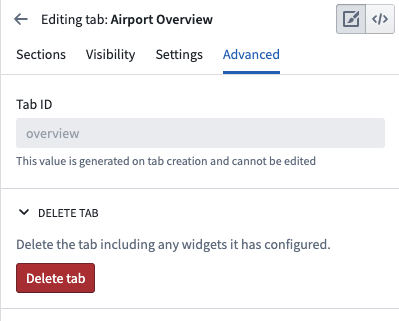
You can delete a tab from the list of tabs within the Object View editor sidebar. You can also click into the tab in the editor sidebar, navigate to Advanced , and click Delete tab.
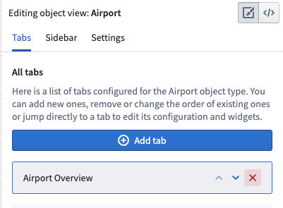
Move a tab
Move a tab using the Object View editor sidebar list of tabs. Click the up or down arrows to rearrange their order in the Object View preview.
Configure tab settings
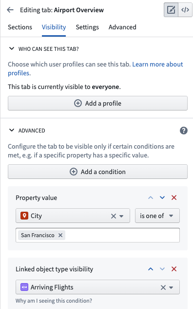
Tab visibility
A tab can be conditionally shown to viewing users in several ways. One method is through the use of configured Object Views and profiles. You can also configure a tab to be conditionally visible based on two other factors:
- Property values: This condition is fulfilled if the value of a property on the currently viewed object is equal or unequal to a given value. Property value conditions are useful when a tab shows content that is only relevant to an object whose value for a given property matches an expected value.
- For example, you may want to add a Regional View tab to an Airport object that only applies to Airports in a specific region. You may have a different Regional View tab with conditional visibility for other regions. Each tab could have different visual components.
- Link visibility: This condition is fulfilled if the user viewing the tab has permission to see the object type to which the currently viewed object may be linked. Link visibility conditions are useful when a tab shows content based on an object’s links, but the viewing user may not have permission to see the objects on the other side of those links.
Here is an example of how these conditions may appear:
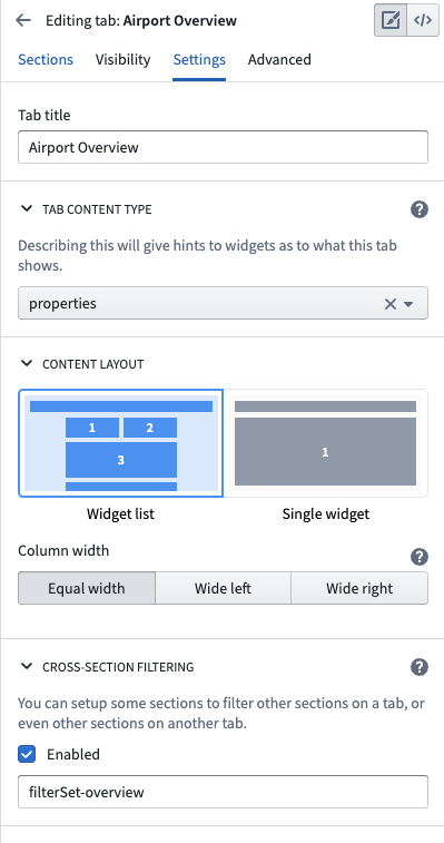
Tab settings
Other general tab settings that you may configure include:
- Title: The title setting controls the label shown in the tab list within the Object View. The tab title should be short and descriptive of the content.
- Content type: You can use this configuration to specify a link type or link that appears within the tab, if relevant. If you select the Link option, you will see a badge next to the tab title in the Object View which shows how many objects are linked to the currently viewed object.
- Content layout: All legacy tabs support a two column widget list layout which is activated when widgets specify that they should be aligned to a specific column. Use this configuration option to control whether or not the tab level columns should be equal width or have different sizes.
- Cross-section filtering: Enable this setting to allow widgets within this tab to publish and consume filters controlled by interactions with the widget. For example, you may want to select an entry within a chart and filter all other charts to only show related data. You can also customize the ID of the filter set and then use this same ID on other tabs in order to consume and persist filter across multiple tabs.
Here is an example of configured tab settings: