- Capabilities
- Getting started
- Architecture center
- Platform updates
Explore with charts
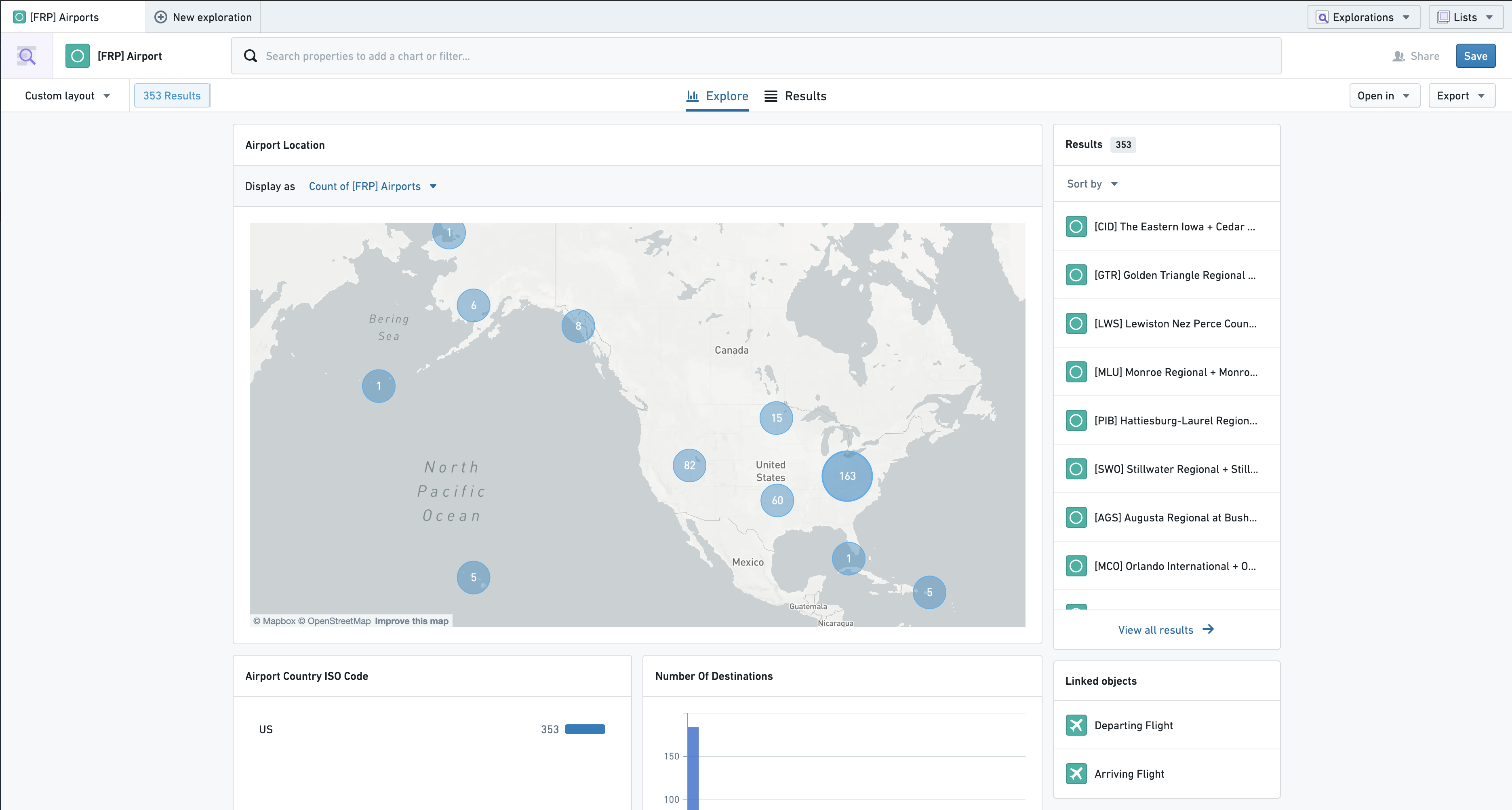
Once you have selected an object type to explore, the Explore perspective displays charts for search and filtering.
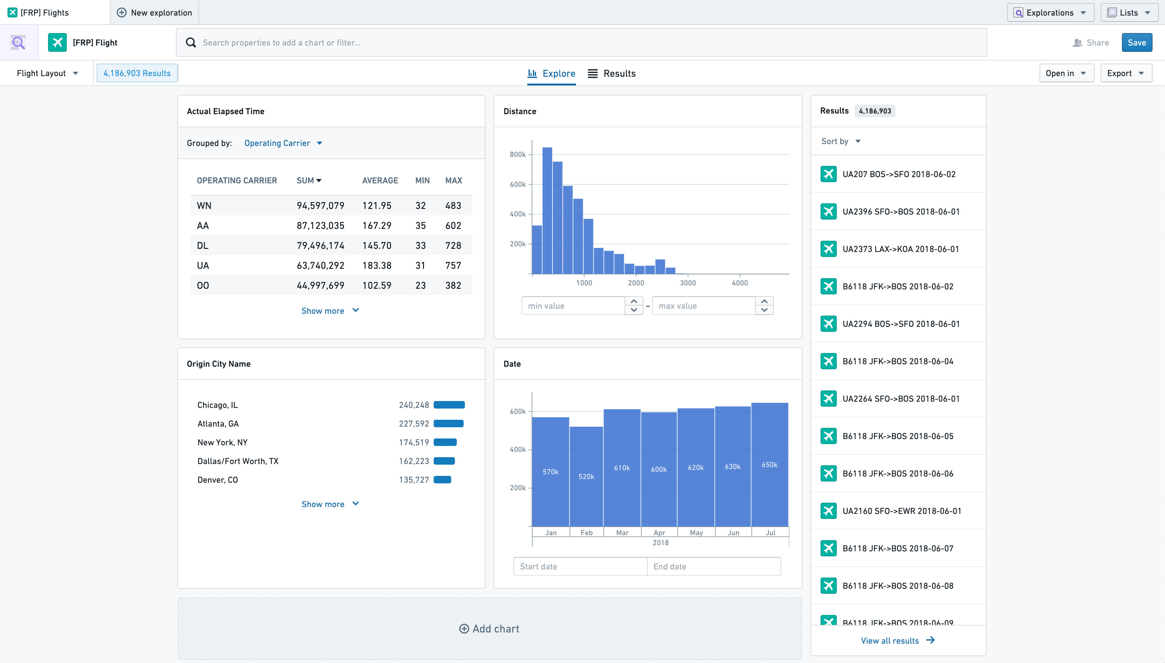
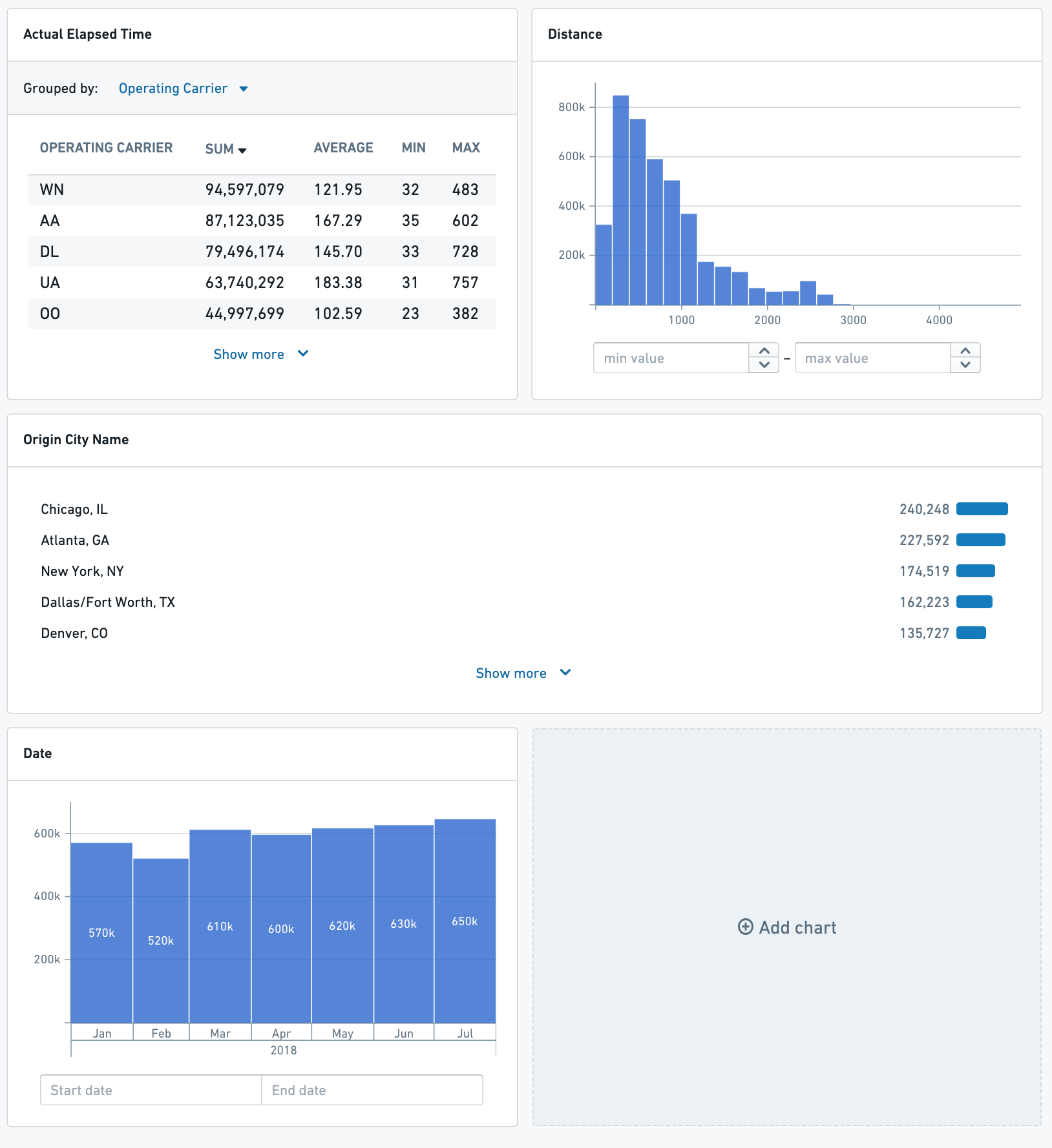
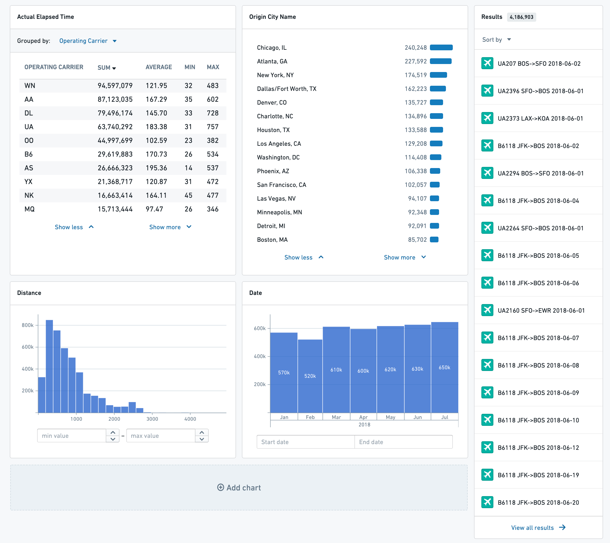
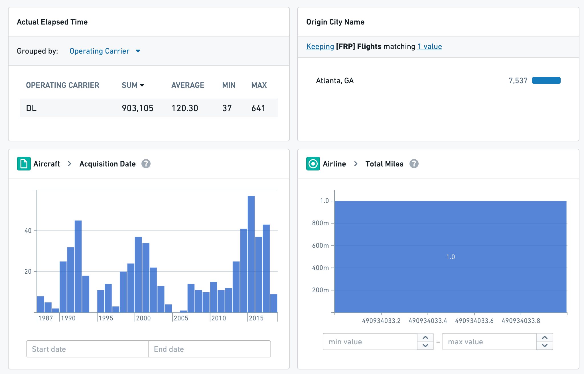
Charts
Charts are the main point of interaction for users filtering within Object Explorer. Each chart represents an aggregation of a property field on the main object type, or linked object types. By default, there will be one chart shown for each prominent property on the selected object type; however, users can customize and save their own default layouts, and administrators are able to save global default layouts for all users.
Adding, Removing, and Ordering Charts
Add a chart to your exploration by clicking the Add chart card at the bottom of your current view. This opens a search bar for properties on the selected object type and linked objects. After selecting a property to aggregate, the chart will appear on your exploration and the Add chart card shifts one position down.
Alternatively, a chart can be added from filters in the exploration’s search bar. While adding a new filter in the search bar, an Add chart to view button will appear. Selecting this adds the chart to the first position in your exploration layout.
To remove a chart, hover over its header in your exploration. An X icon appears: clicking this removes the chart from your view but does not remove any filters from your search.
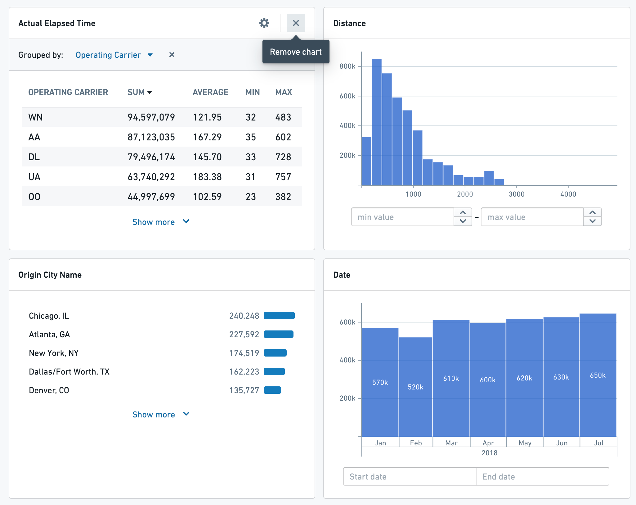
Charts can be reordered and resized by dragging and dropping. Click and hold empty space in the chart header to show the interface for reordering charts. Moving a chart in your layout will shift the others to fill its now empty space.
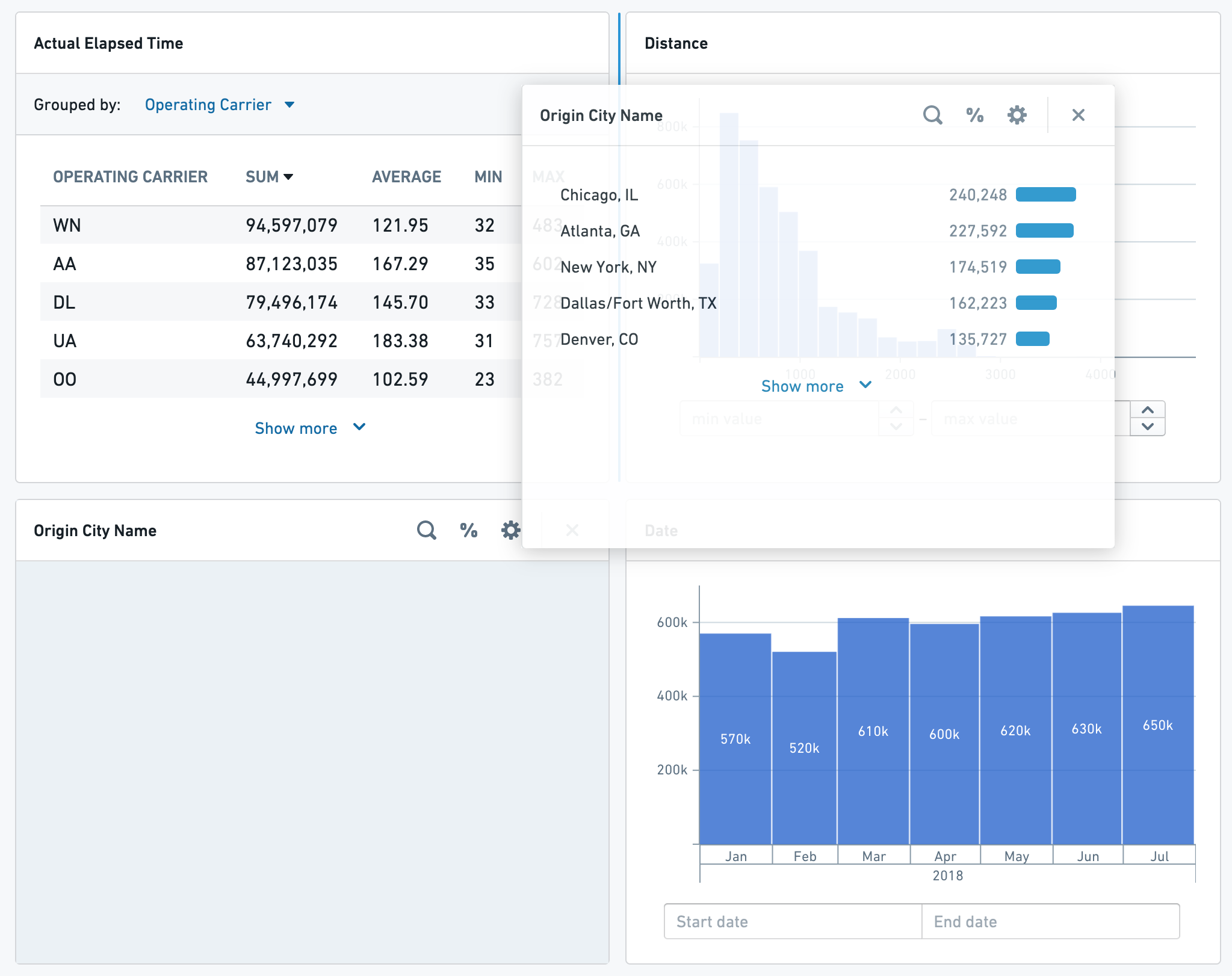
To resize a chart horizontally, click and hold on one of its edges and drag to shrink or expand it. Each chart can fill one or both of the columns in the exploration layout.
If a Listogram chart has more than five values, clicking Show more and Show less will resize the chart vertically.
Charts on Linked Objects
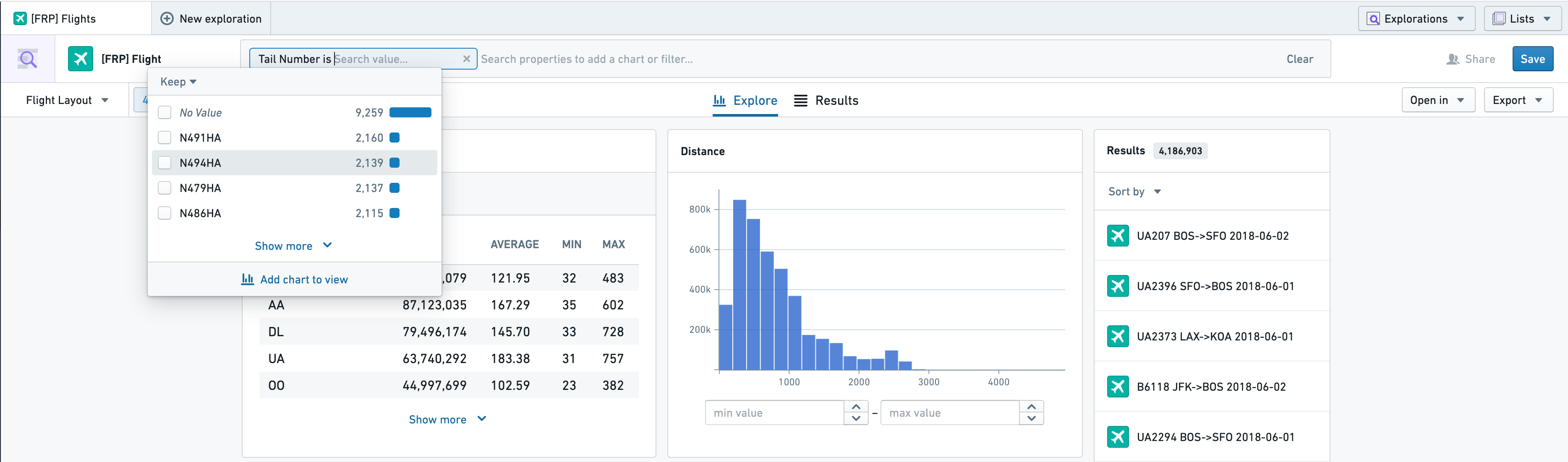
To filter on properties of linked objects, select a linked object type from the left hand side of the search menu.
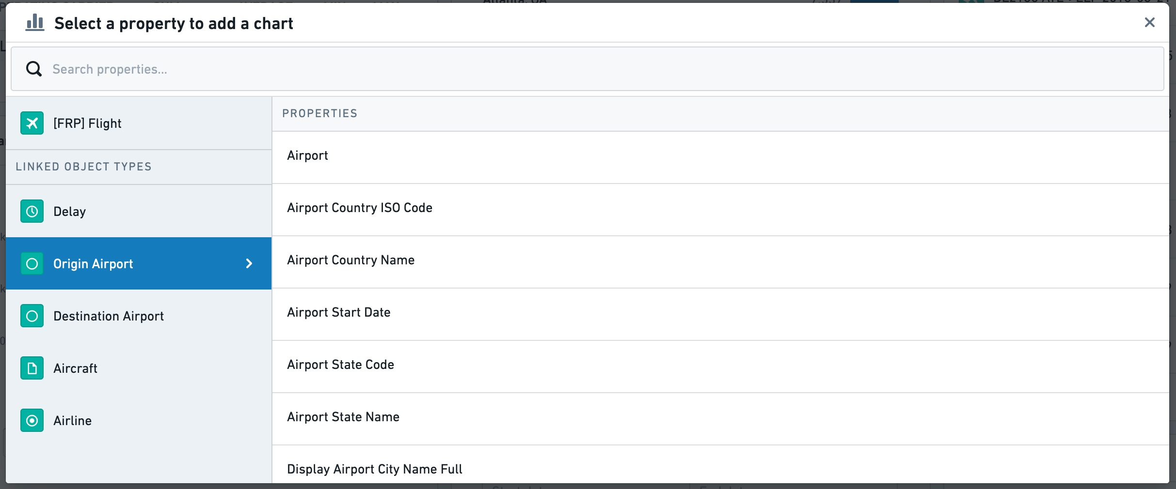
In the exploration view, the chart header will indicate that it is filtering on the properties of a linked object. In the attached example the top two charts filter on the properties of the selected type, and the bottom two filter on properties of linked objects.
Types of Charts
Object Explorer supports several types of charts for different property types. Below is a summary and example of each type.
Listogram
Listograms display aggregations on non-numeric properties. This applies to String, Boolean, and Array properties. In this example, the chart lists all First Names for Employees alongside the count of Employees with that first name.
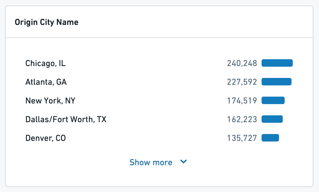
Listograms can also display properties with aggregations of numeric properties - for example, the average revenue of each franchise of a business by state.
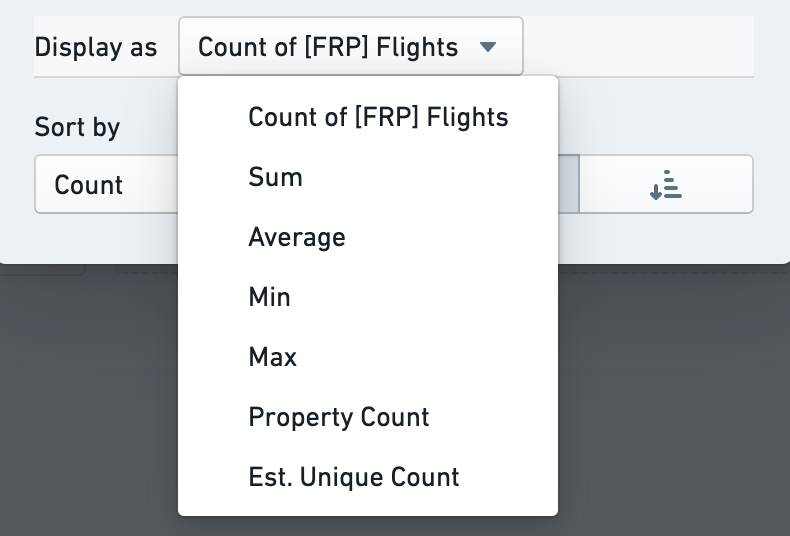
Configuration for a listogram includes:
- Aggregation type
- For example, instead of showing the number of *flights *for each airport, show the *average *of flight time
- Sort type and direction
- For example, sort by the count ascending, or sort alphabetically by the property values
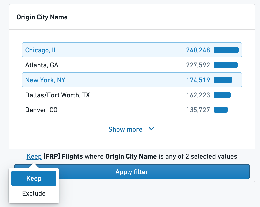
To filter on a listogram, click on the values you would like to filter. Selected values can be kept or excluded by using the dropdown at the bottom of the chart.
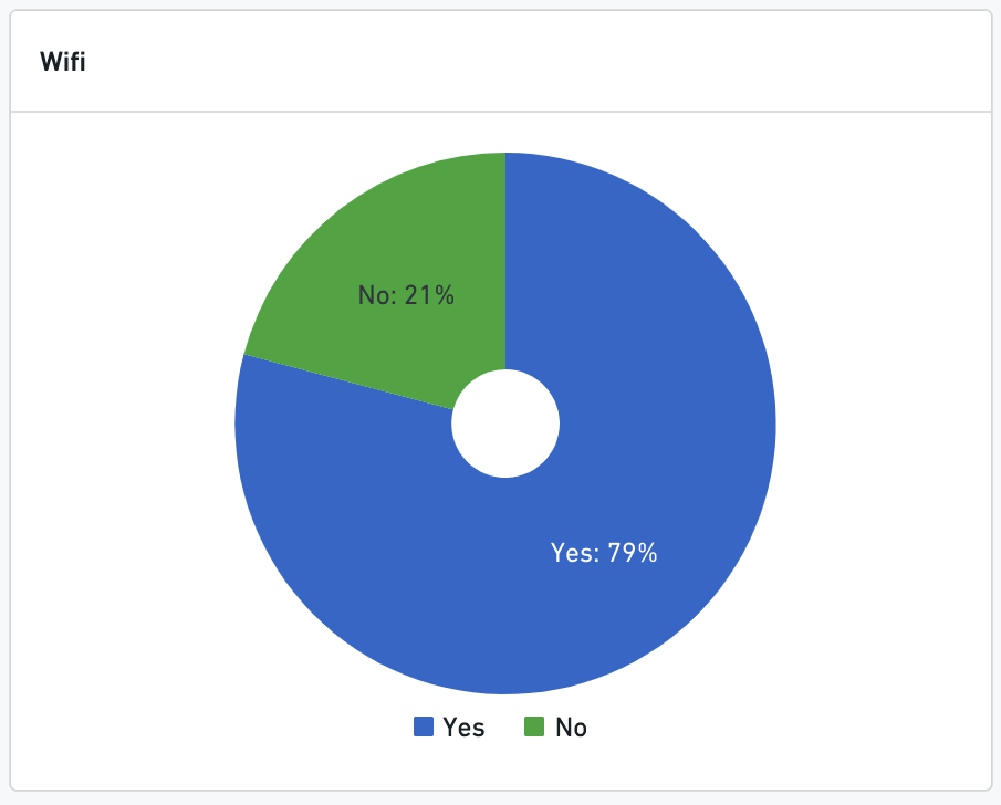
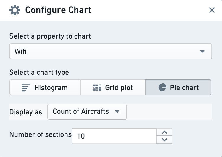
Pie Chart
Non-numeric properties (booleans and strings) can also be displayed using pie charts. Select the Pie Chart option using the chart configuration options.
Histogram
Histograms display bar chart aggregations on numeric or date properties.
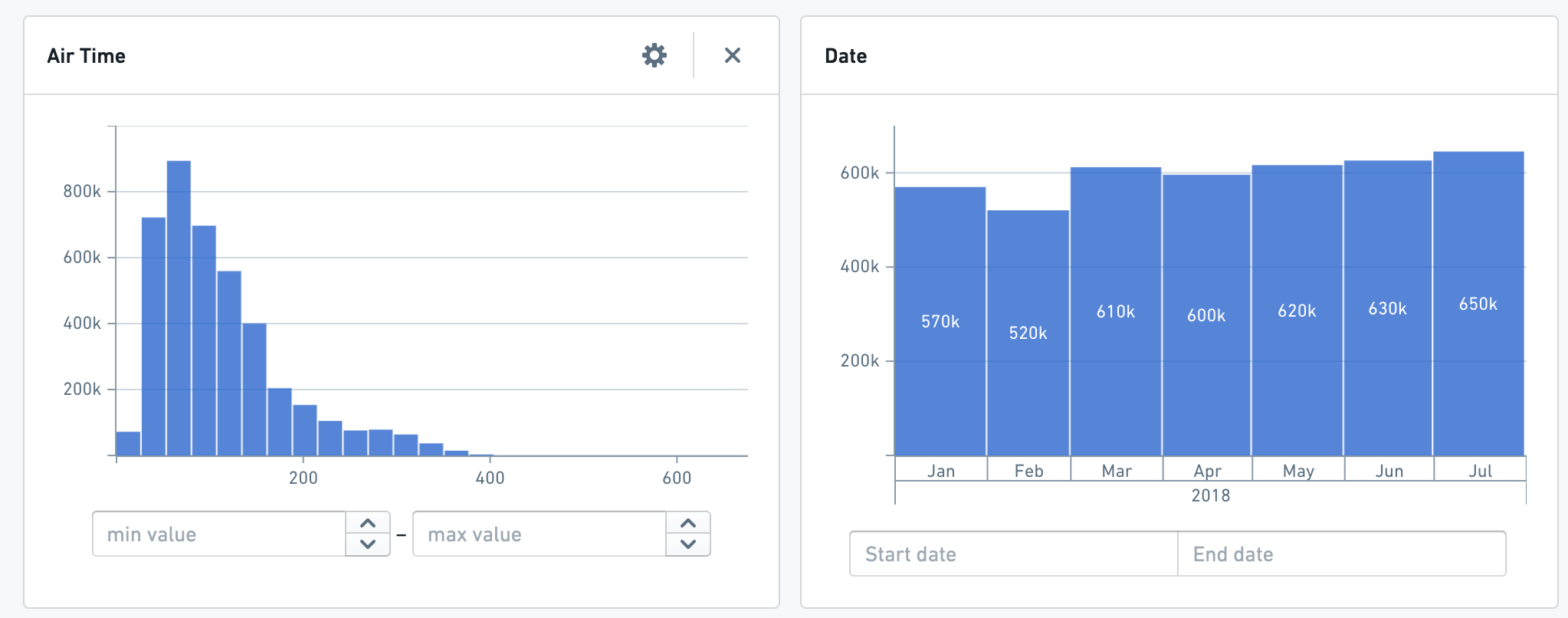
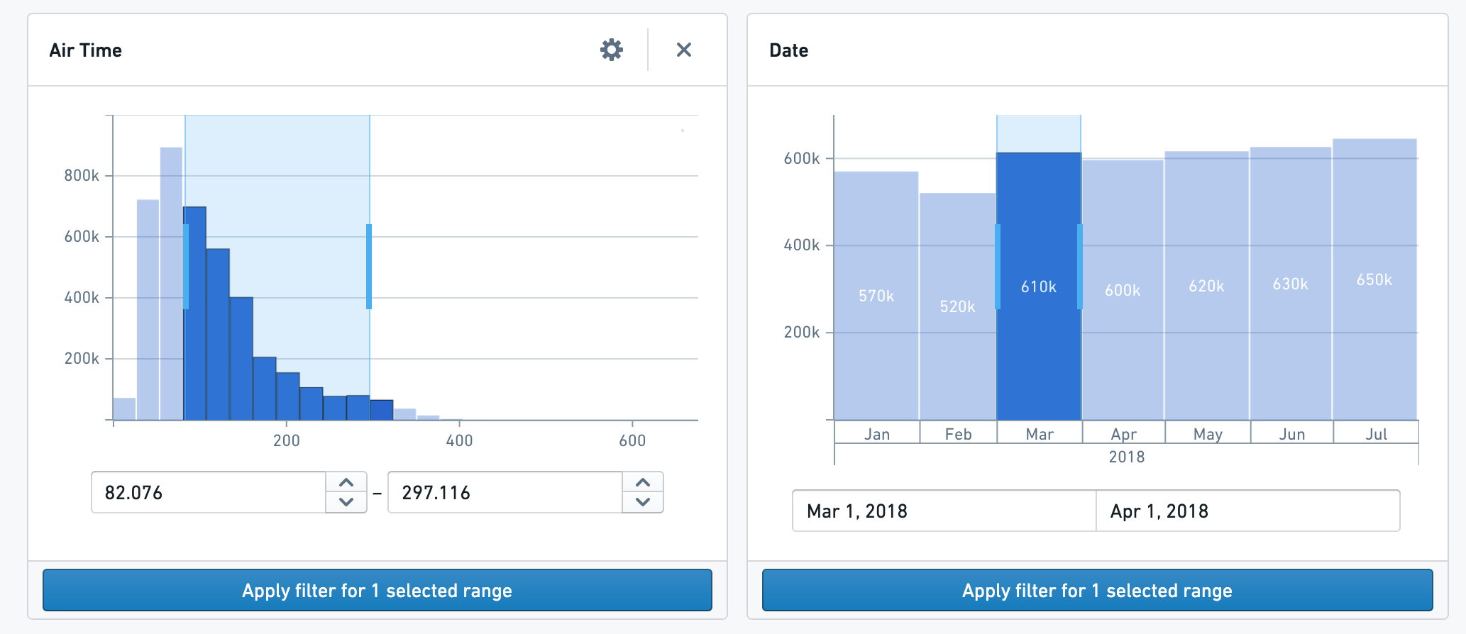
The histogram chart will scale to fit all relevant data and automatically bucket to allow for easier selection. No additional configuration is needed. To filter, either select a particular bucket (pictured left) or click and drag to select a range of your own choosing (pictured right). Edit the range’s start and end points with the inputs at the bottom of the chart.
Grid Plots
Grid plots show color chart of two properties: The selected property on the X-Axis and another Group By property on the Y-Axis.
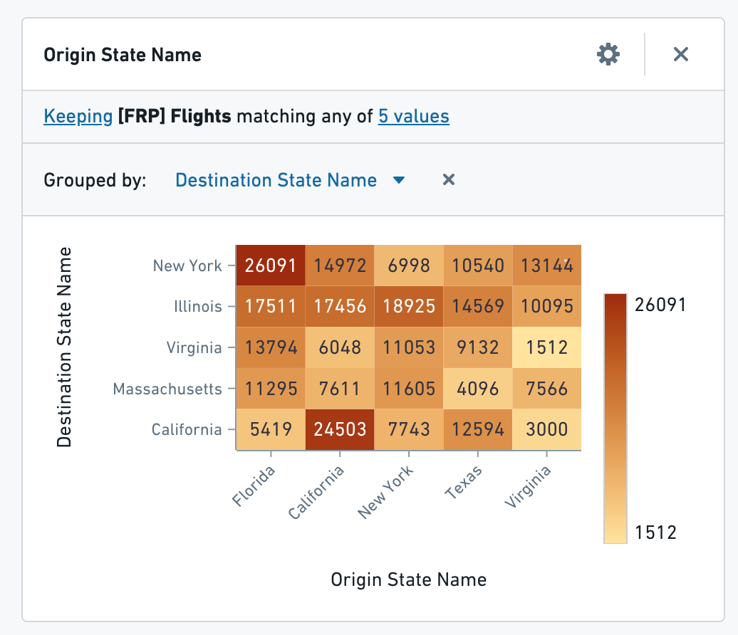
Open configuration for the chart to modify the axes, sort information, and color scale.
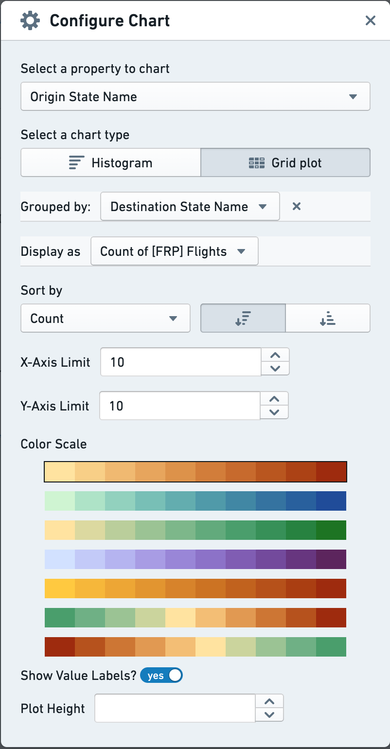
To filter with a Grid Plot, click on a segment of the grid. Hold ctrl or command to click multiple options in a contiguous range.
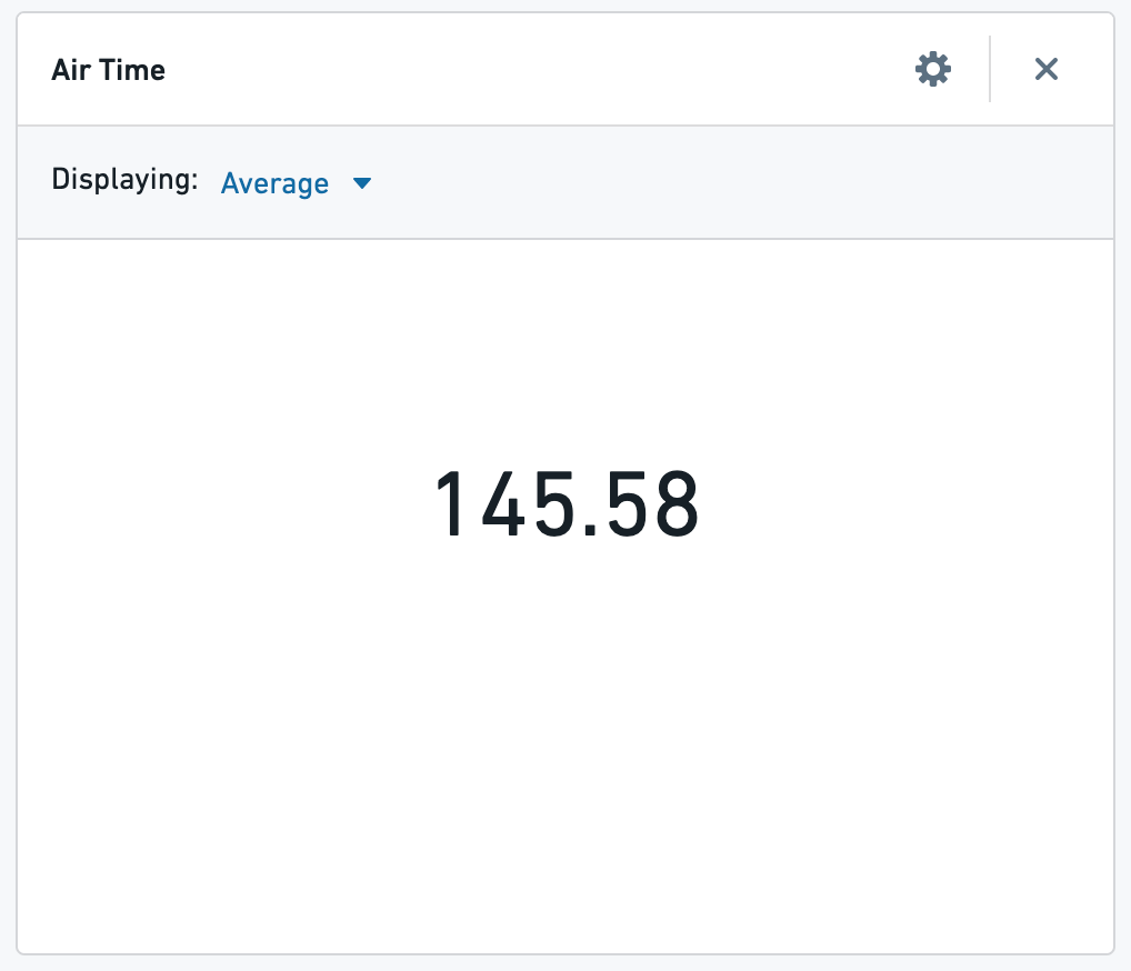
Single Statistic
Single Statistic charts show an aggregate value on one numerical property for a set of objects. Select a property and a type of aggregation (Sum, Average, Min, Max, Count and Unique Count). This chart cannot be used for filtering.
Statistics Table
Statistics tables show aggregates for numeric properties grouped by another property in a sortable table. Available aggregates are Sum, Min, Max, Average, and Count.
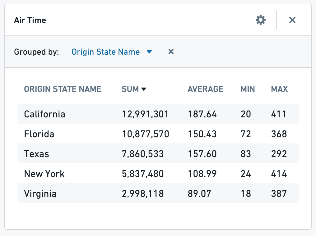
Configuration options include the metrics displayed, the property to group by, and displaying a summary row at the bottom of the table.
To filter, select the row of the desired group by property.
Maps
Cluster Map
The default for any geopoint type property is a Cluster Map with scaled bubbles showing the number of objects, or the result of another aggregation.
Configuration options include the ability to change the type of aggregation performed, and which property that aggregation is on (e.g. instead of the count of airports, show the sum number of the departing flights within each area).
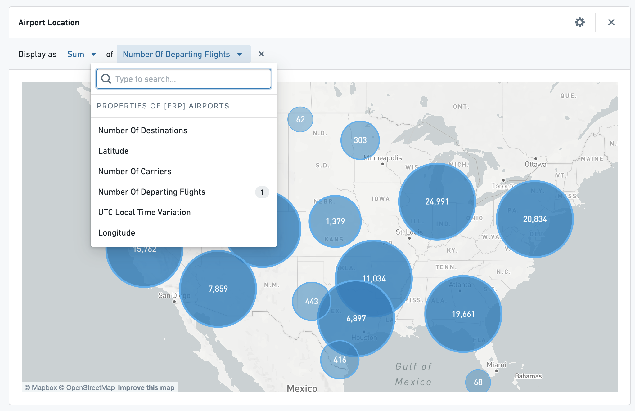
You can filter geospatially by clicking on these bubbles, and then clicking apply filter below the 3map.
Choropleth Map
Some text properties that have been annotated with a typeclass in the ontology may be used to create a choropleth map that looks like the one 3below:
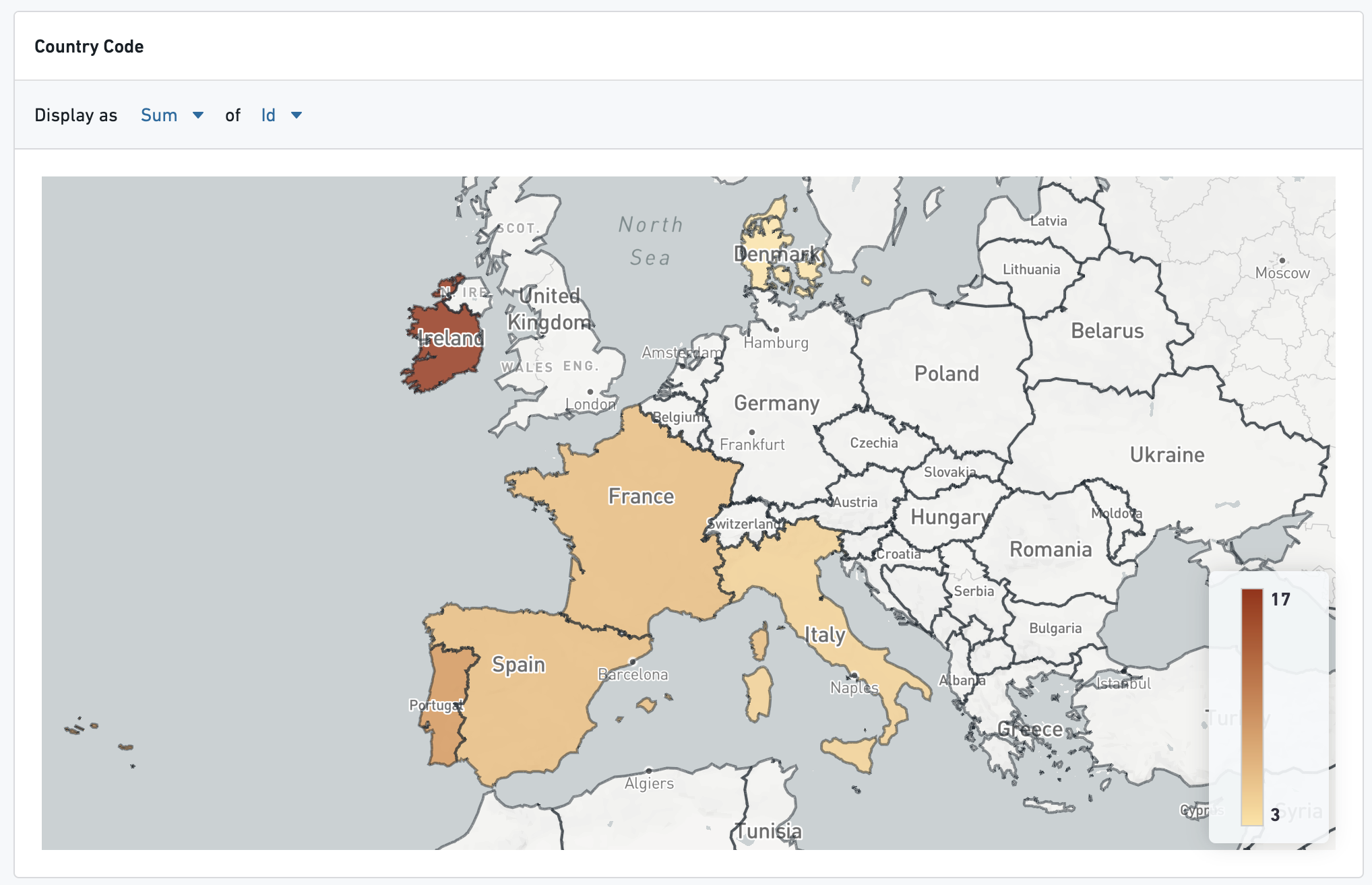
A choropleth can be created for any property type that contains values for geographic regions (e.g. country codes) that can be plotted on a map. The kind of the typeclass necessary is choropleth_map_config_id, and the name depends on what type of region code the property contains. For instance:
- For countries, use
countries - US States →
us_states - US Counties →
us_counties - US Zip Codes →
us_zip_codes
For additional region boundary options, or additional assistance with adding this typeclass, contact your Palantir representative.
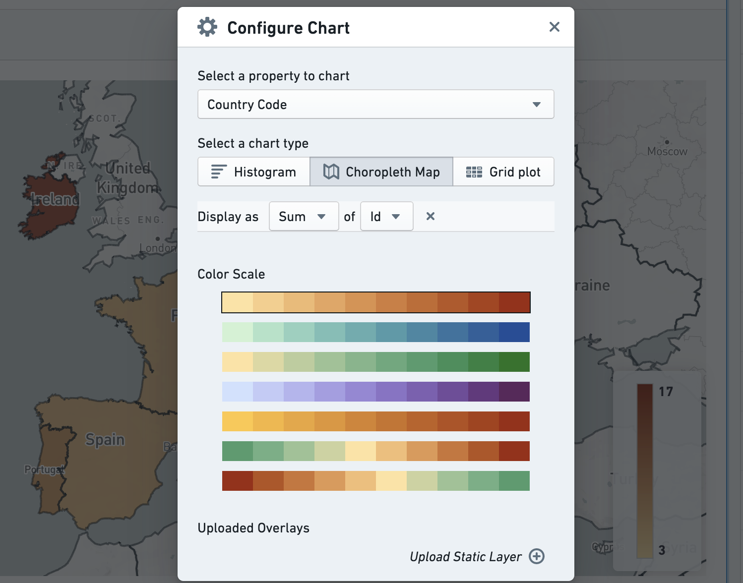
Configuration options include changing the type of aggregation as well as the color scale used:
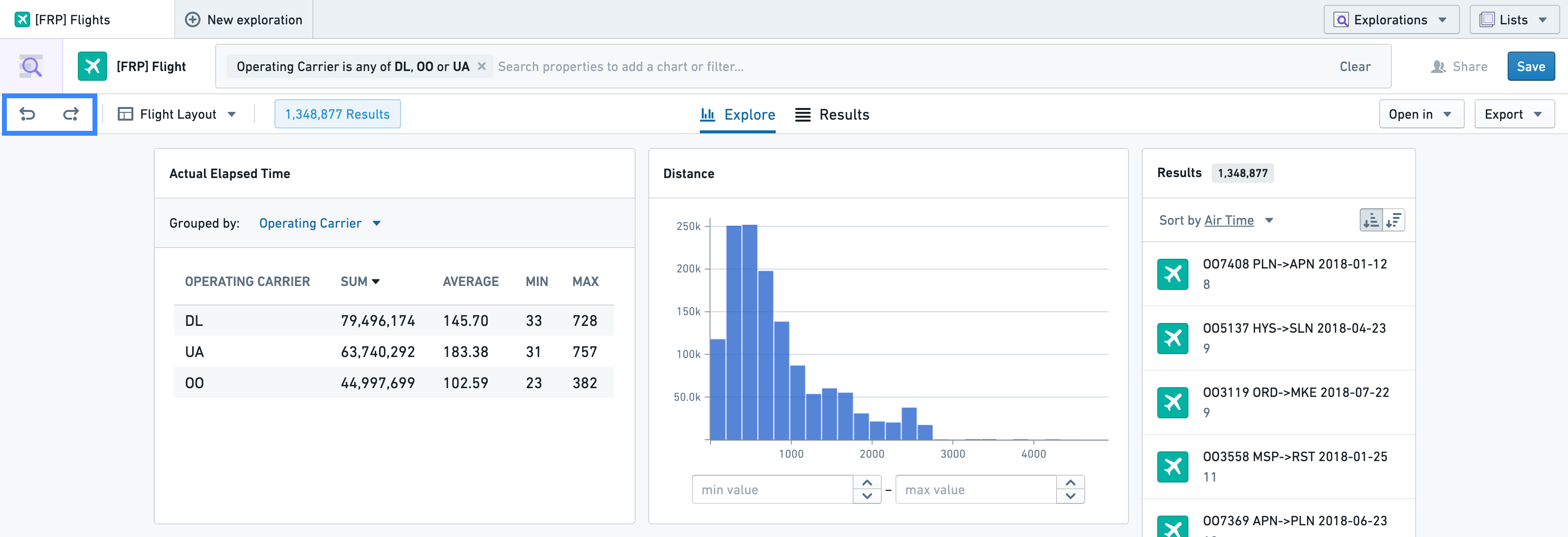
Undoing and redoing changes to your exploration
To undo or redo a change to your exploration, use the buttons on the left side of the perspective bar. Currently, the last 5 exploration states are saved for undo and redo. Actions that can be undone are:
- Editing a filter, either in the search bar or from a chart
- Changing the layout of your charts (adding a new one or reordering existing ones)
- Changing the exploration perspective
- Pivoting the exploration to a linked object type
Saving a Layout
Layouts allow users to create shareable views for a specific object type. The shareable views include charts that have been added, column configurations for the table, and any sorting configuration for the table.
To save a layout, open the layout selector in the top-left corner of the screen (A) and select Save current view (e.g. charts, sorts, etc.) as new layout (B).
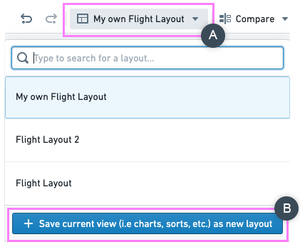
In the resulting pop-up, set the Initial Perspective (C), which controls whether the layout will initially open the Explore tab (the charts) or the Results tab (the table). You can also set the layout as your personal default layout for this object type by ticking the For yourself (D) box under Set as default layout for, which means that this layout will be selected by default whenever you start a new exploration on this object type.
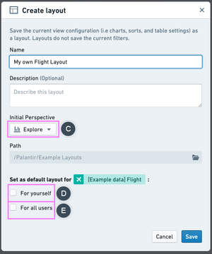
If you are an administrative user, by ticking the For all users checkbox (E) under Set as default layout for you can set a layout as the global default layout for all users.
Note that if an individual user sets their own default layout for an object type, that layout will take precedence over any global default layout which has been set.
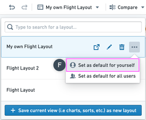
As a user, you can also set an existing layout as your default for a specific object type by using the sub-menu shown below (F):
Preview Panel
On the right-hand side of the exploration view, a list of up to 20 results shows a preview of your exploration’s contents.
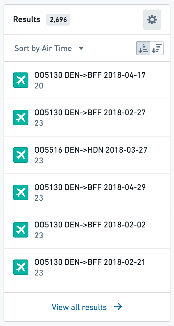
Click a preview card to open the object in an Object View tab. To sort by a single property, use the Sort by option in the preview list subheader. To sort by multiple properties, hover over the header and select the gear icon, pictured here.This opens a dialog to configure sorts by many properties, which are then applied in order.