- Capabilities
- Getting started
- Architecture center
- Platform updates
Text Input
The Text Input widget allows users to enter text values into a form field.
Configuration Options
- Label
- Sets an optional label for the widget. This text is displayed across the top of the widget.
- String value
- Output variable of the widget, storing the user's entered text.
- Placeholder
- Define placeholder text to be displayed in the input field when no text has been inputted by the user.
- Format
- Set the format of the input field to a single line, a multi-line text area, or a Markdown editor.
- Single line
- Event on enter: set event(s) to be triggered when the enter key is pressed
- Text area
- Initial height: set the initial height of the text input area
- Markdown
- Enable a rich text editing experience with a formatting toolbar. Users can compose and format text using Markdown syntax or the toolbar controls. The editor supports toggling between a rich text view and a raw Markdown view. See Markdown mode below for details.
Markdown mode
When the format field is set to Markdown, the Text Input widget provides a rich text editing experience powered by the same editor used in Notepad. This mode is suited for fields where users need to enter formatted text, such as descriptions, notes, or comments.
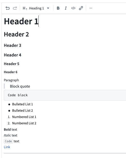
Features
- Formatting toolbar: Apply bold, italic, code, and other formatting using toolbar controls without needing to know Markdown syntax.
- Rich text and raw Markdown views: Toggle between a rich text view (formatted preview with inline editing) and a raw Markdown view (plain text with Markdown syntax).
- Placeholder text: Configure placeholder text that appears when the editor is empty.
- Auto-sizing: Enable the editor to expand automatically based on content length.
- Variable binding: The output string variable stores the content as a Markdown string, which can be consumed by other widgets such as the Markdown widget for display.
Considerations
- Markdown mode does not support event-on-enter triggers (available only in single line mode).
- Content is stored as a Markdown-formatted string in the bound string variable. Other widgets consuming this value should be able to interpret Markdown formatting.