- Capabilities
- Getting started
- Architecture center
- Platform updates
Object List
The Object List widget is used to display object data in either a list or grid. Module builders configuring an Object List widget can:
- Display data on one or multiple object types.
- Choose which property types and linked objects are displayed and in what format.
- Optionally choose a media property to display an image or icon for each object.
- Set initial sorting criteria.
- Display conditional formatting and numerical formatting options configured in the Ontology Manager.
- Hide null properties on a per object basis to produce a more compact display.
- Allow single- or multi-selection within the list.
- Trigger Workshop events upon object selection within the list.
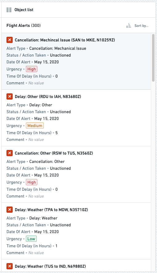
The screenshot below shows an example of a configured Object list widget displaying Flight Alert objects:
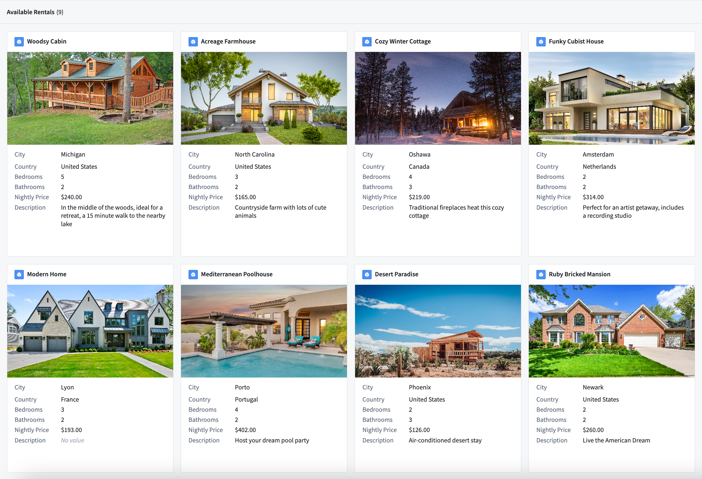
The screenshot below shows an example of an Object list widget displaying objects configured in a grid display with images:
The screenshot below shows an example of an Object list widget displaying objects configured in a list display with icons:
Configuration options
Here is a screenshot of the initial state of a newly added Object List widget alongside its initial configuration panel:
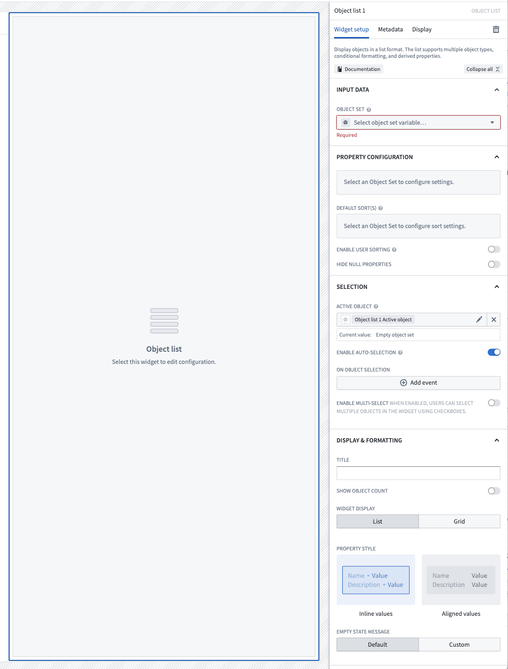
For the Object List widget, the core configuration options are the following:
- Input data
- Object set: This input variable determines the data that will be displayed within the widget. A module builder can either reuse an existing object set variable created elsewhere in this module or define a new object set variable inline. Many of the other configuration options shown below will only be configurable once this object set parameter has been populated.
- Property configuration
- Add media: You can optionally display images alongside object information. More information about media configuration can be found below.
- Add property: Selecting a property here will result in that property being displayed within the list.
- Default sort(s): This setting allows up to one default sort to be applied within the list. Module builders can sort on both visible property types shown within the list or hidden property types not displayed.
- Enable user sorting: If enabled, a subheader will be displayed above the list in which users can change the sorting criteria of the list. User can sort on both visible property types shown within the list or hidden property types not displayed.
- Enable reordering: If enabled and configured, allows users to drag and drop items within the widget to reorder them. Items will only be draggable using the drag handle appearing on the right side of the object card. More information about reordering configuration can be found below.
- Hide null properties: If enabled, null properties will be hidden on a per object basis within the list.
- Selection
- Active object: This is the first of two output variables for this widget and outputs a singleton object set of the currently active / highlighted row. This object set can then be used in downstream widgets within the current module.
- Enable active object auto-selection: By default, the first row in the list is automatically set as the active object at load time. Disabling this setting prevents this and results in an empty Active object at load time.
- Selected objects: This is the second of two output variables for this widget and outputs an object set of the currently checked / selected rows. This object set can the be used in downstream widgets within the current module. Note that this output variable will only be in use and populated if the Enable multi-select toggle is set to true.
- On active object selection: This option enables module builders to configure Workshop events to trigger when a row is selected in the list, such as causing a drawer with a more detailed object view to appear.
- Enable multi-select: If enabled, this toggle allows multiple objects to be checked / selected by users in the list. This selected object set is then output via the Selected objects object set for use in downstream widgets within the current module.
- Display & formatting
- Title: If populated, a sub-header will be displayed above the list with the string title entered here.
- Show object count: If enabled, a sub-header will be displayed above the list with the count of objects contained with the input object set variable displayed.
- Widget display: By default, displays objects in a list, but can also display objects in a grid where the number of rows, size of each object card in the grid, and space between cards in the grid can be specified.
- Property style: By default, properties are displayed inline with their values, but can also be displayed with their values aligned.
- Empty state message: Customize an empty state message when there are no objects for this widget to display.
Media configuration
Configuration options
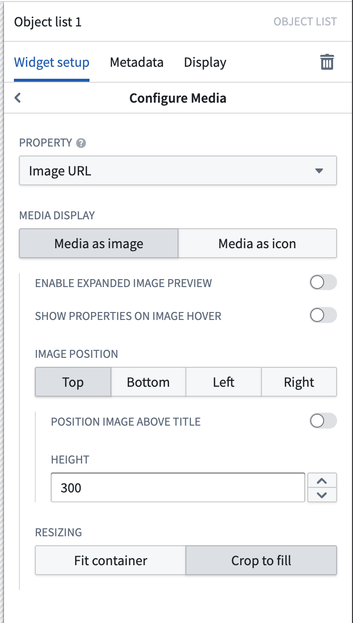
For the Object List widget, the media configuration options are the following:
- Property: This is the property of the object set that contains the images to be displayed. Currently, image URLs, image attachments, and media reference properties are supported.
- Media display: The media chosen can be displayed as a large image, or as an icon to replace the Ontology icon next to the object title.
- Enable expanded image preview: If enabled, the image can be expanded and viewed in full inside of a modal.
- Show properties on image hover: If enabled, hovering will reveal additional properties to be displayed in an overlay on top of the image.
- Image position: Images can be displayed in a variety of locations, and have their height or width controlled to a fixed size.
- Resizing: Images can either be cropped to fill the space, or fit the container in order to show the full complete image without cropping.
Reordering configuration
Builders may configure items within the Object List to be re-orderable by allowing users to drag-and-drop object cards in the widget.
Limitations
- Reordering is currently only supported within a single Object List widget.
- Reordering items in a grid layout is not currently supported.
- When reordering is enabled, the Object List widget will only display the first 500 objects.
Configuration options
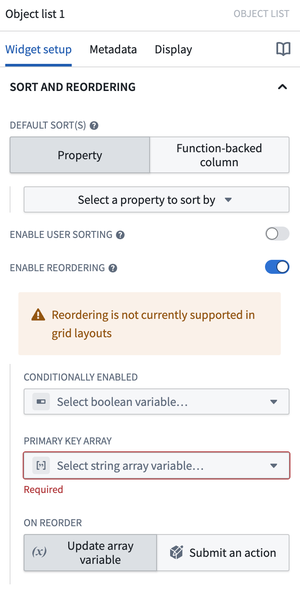
- Conditionally enabled: Set a Boolean variable to determine whether reordering is enabled within the widget.
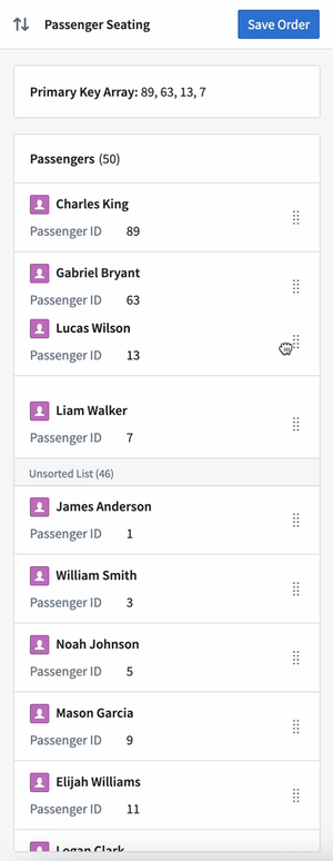
- Primary key array: Set a string array containing the primary keys of the displayed objects. The ordering of the primary keys in the array will determine the order these objects will be displayed in the sorted section of the widget. Any objects with primary keys not in the array will be displayed in the Unsorted list section in the widget below the sorted objects, either in an unsorted fashion or with the default sort applied if configured in the widget.
- If an item is drag-and-dropped from the Unsorted list section, that object's primary key will be added to the primary key array. Similarly, if an item is drag and dropped into the Unsorted list section of the widget, that item's primary key will be removed from the primary key array.
- If the primary key array is empty or if there is no overlap between the displayed objects' primary keys and the contents of the array, a callout will be displayed at the top of the widget prompting users to "Drag and drop unsorted items above to sort".
- If the primary key array contains primary keys of objects that are not currently shown in the widget, for example if filtered out of view, their orders will still be maintained. For example, if your array is ordered
[A, B, C, D]butBis currently filtered out of view from the widget, the visible list will show[A, C, D]. If a user reordersDbetweenAandC, the updated array will be[A, B, D, C]. The only exception is when a user drags an item below the last visible object. In this case, that item will be placed directly after that last visible object.
- On reorder: Builders may choose for either the primary key array to be updated or for an action to be run on reorder of items in the widget.
- Update array variable: When a user reorders an item within the widget, the primary key array will be updated to match.
- Note that updates to the primary key array will not be automatically saved or stored meaning that if a user refreshes or navigates away from the module, any changes to the primary key array will be lost. Builders will need to configure an action that stores the primary key array's new values in order to save updates to the array. Using the Update array variable option in conjunction with a separately configured action, for example in a Button Group widget elsewhere in the module, is a good option if you do not want to trigger an action each time an item is reordered within the widget.
- Submit an action: Configure a Reorder action which will be triggered each time a user reorders an item within the widget.
- A special Reordered array parameter representing the updated primary key array on reorder may be used as an action parameter to save updates to the array.
- Update array variable: When a user reorders an item within the widget, the primary key array will be updated to match.