- Capabilities
- Getting started
- Architecture center
- Platform updates
Widget: Mobile Navigation Bar
The Mobile Navigation Bar widget allows your users to navigate between a few top-level pages on a touch-enabled device. This navigation bar appears at the bottom of a mobile Workshop application for ease of use on a phone. Up to four items can be shown in the navigation bar, and submenus can be configured to surface additional items.
The design and behavior of the Mobile navigation bar is informed by the design guidelines for iOS (Tab Bars ↗) and Android's Material Design (Bottom navigation ↗).

Navigation bar setup
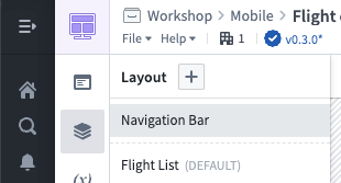
To enable and configure the navigation bar, ensure your module is configured to have a Mobile device type, then select Layout and Navigation Bar on the left side while editing a Workshop module:

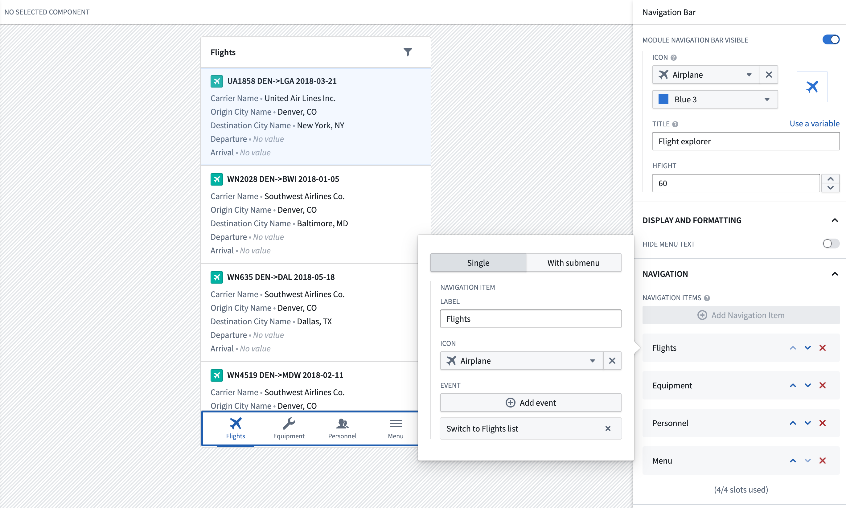
Enable the navigation bar using the Module Navigation Bar Visible switch in the top-right, then add navigation items. Each navigation item includes a label and icon.
Typically, you should configure navigation items to navigate to a page in your application. Select + Add event and select the event to switch to your page.

Behavior
Below, we describe some of the characteristics of how the navigation bar functions in mobile Workshop applications:
-
Always visible. When enabled, the navigation bar is always shown at the bottom of the screen in a mobile application as users navigate between pages. To create focused interfaces that hide the navigation bar, you should use a drawer, which can be configured to cover the whole screen.
-
Stack navigation. When you configure a navigation item to navigate to a specific page, the item will be highlighted in the navigation bar whenever that page is active. Additionally, if a user navigates to another page, the highlight remains active so users have a sense of where they navigated from.
For example, suppose your first navigation item is called Flights and is configured to open a page called Flight list which contains a list of flights. Suppose that when a flight is selected in the list, your application navigates users to another page, called Flight 360, which shows details about the selected flight.
In this case, when users navigate to the Flight 360 page from the Flight list page, the Flights navigation item will still be highlighted in the navigation bar. This helps keep users oriented in your application, and lets users exit the Flight 360 page by selecting Flights in the navigation bar.
Configuration options
Below are the core configuration options for the navigation bar:
- Icon: The icon is shown when this mobile application is embedded in other parts of Foundry, such as in Foundry Carbon.
- Title: The title that should be shown in the browser tab when this application is opened.
- Height: The height of the navigation bar in pixels.
- Hide menu text: Hide text and only show icons for items in the navigation bar.
- Navigation items: Up to four items that should be shown across the bottom in the navigation bar. For each item, you can configure:
- Type: A single item shows a label and icon and executes a Workshop event. A submenu item has a label and icon and shows a list of nested single items when selected.
- Label: The text label shown for the navigation item. Because screen real estate is limited, we recommend labels be a single word or short phrase.
- Icon: The icon shown for the navigation item.
- Event: The Workshop events that are run when the item is selected. Typically, navigation items are configured to navigate to a page in the Workshop module.