- Capabilities
- Getting started
- Architecture center
- Platform updates
Metric Card
The Metric Card widget displays Workshop variable values in a configurable card-like interface. Typically, metric cards are used to highlight key figures in a Workshop module. Module builders configuring a Metric Card widget can:
- Display groups of metrics together.
- Use conditional formatting to call attention to metrics, and help users interpret metric values.
- Style the layout of metrics, so they are displayed as Cards, Tags, or in a List.
- Display time series data, including sparklines showing the history of the time series.
The screenshot below shows how the Metric Card widget can be used in a Workshop module to display statistics on the COVID-19 vaccine rollout for different countries. The examples that follow will also use this example context.

Configuration options
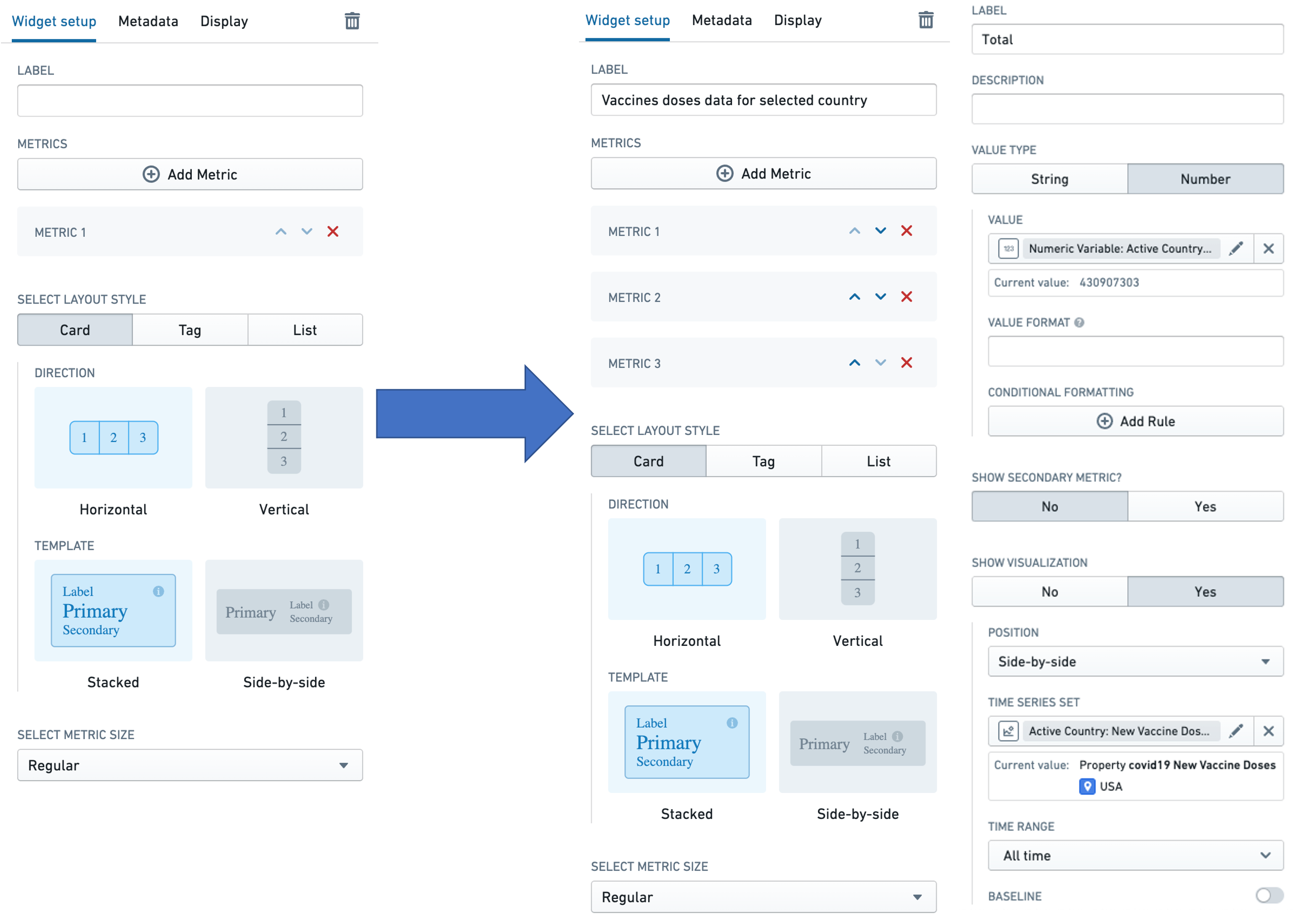
The image below shows the initial state of an unconfigured Metric Card widget, followed by the state of a widget that has been configured to display COVID-19 vaccine rollout metrics.
First, we will walk through the configuration options for the widget, which comprises a group of metrics, as depicted in the first screen to the right of the arrow. Then we will describe the configuration options available for each individual metric, as depicted in the second screen to the right of the arrow.

Widget configuration
For the Metric Card widget, the core configuration options are the following:
-
Label
- Sets an optional label for the Metric card widget. This text is displayed across the top of the widget.
-
Metrics
- The Add Metric button adds a new metric to the Metric card widget.
- The Up and Down direction arrows on the metrics in the list change the order in which the individual metrics are displayed in the widget.
-
Select layout style
- Card
-
Displays the metrics in the widget as cards, as in the example above and the screenshot below. Note that time series visualizations are only supported in this layout style.

-
The Card layout style also lets the user choose the:
- Direction in which the cards are arranged: either horizontal or vertical.
- Template used to arrange data in every card: either stacked or side-by-side.
-
- Tag
-
Displays the metrics in the widget as tags, as in the screenshot below.

-
The Tag layout style lets the user choose the Direction in which the cards are arranged: either horizontal or vertical.
-
- List
-
Displays the metrics in the widget as a list, as in the screenshot below.

-
The List layout style lets the user choose the Template used to arrange data in every card: either stacked or side-by-side.
-
- Card
-
Select metric size
- Sets the display size for every metric in the widget. The options here are Compact, Regular, and Large.
-
Conditional visibility
- Allows you to show or hide the Metric Card widget based on variable values or other conditions. This enables dynamic control over which metrics are displayed to users depending on the current application state.
- Configure conditional visibility by specifying a condition that evaluates to true or false. When the condition evaluates to false, the entire Metric Card widget is hidden from view.
Metric configuration
Each individual metric can be configured using the following options:
- Label
- Sets an optional label for the metric. This text is displayed across the top of the individual metric.
- Description
- Sets optional description text for the metric. This description text is displayed as a tooltip when a user hovers over the i tooltip, as illustrated in the screenshot below.

-
Value type
- Specifies whether the value to be displayed is a String or a Number.
- This section also configures the following options:
- Value: The value used to populate the metric must be backed by a Workshop variable of the corresponding type. So, if the value type is set to String, the user will have to select a string variable to populate the metric. Similarly, if the value type is set to Number, the user will have to select a numeric variable. See Variables for more information on Workshop variables.
- Numeric formatting: This optional configuration is only available for the Number value type. The user can specify a value formatting scheme to display the numeric value of the variable. See Formatting in Workshop for more information on value formatting.
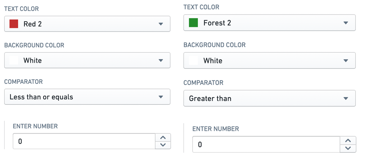
- Conditional formatting: This optional configuration allows the user to apply rule-based formatting to the metric value displayed, as in the example below that displays the metric in red if its value is less than or equal to zero, and in green otherwise. See Formatting in Workshop for more information.

-
Show secondary metric? An optional configuration to display a second metric within the same metric display, under the primary metric. Setting this toggle to
Yesopens a value type configuration for the secondary metric, which mimics the configuration for the primary metric. -
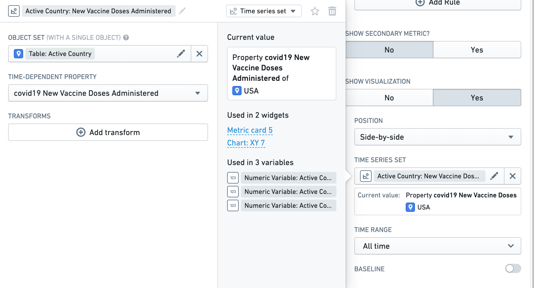
Show visualization? An optional configuration to display a sparkline depicting the history of a time series with the metric. Setting this toggle to
Yesopens a configuration screen with the following options:-
Position: Specifies whether the sparkline should be displayed
Side-by-side(alongside) orStacked(under) with the metric value. -
Time series set: The time series that is to be visualized. This is specified using a
Time series setvariable, as shown in the screenshot below. See Variables for more information on Workshop variables, including time series set variables.

-
Time range: Specifies the time range for which data should be displayed. Preset options include
All time,Last hour,Last day, andLast week, but selectingCustom rangeopens a detailed range selector, where you can specify anExactor aRelativerange. See Time series properties in Workshop for more information on specifying time ranges. -
Baseline: When this parameter is toggled on, a baseline is rendered along with the sparkline to aid with visual interpretation of the trend. See Time series properties in Workshop for more information on specifying baselines.
-
-
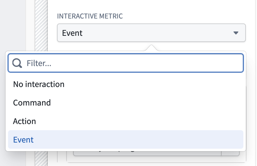
Interactive metric: An optional configuration to trigger a command, action, or event upon card selection. Defaults to No interaction.
