Map
The Map widget displays an object set or object data as a configurable, interactive, geospatial visualization.
These map visualizations are comprised of two types of layers:
- A base layer (also called a tile layer), which provides the background map imagery, and
- Overlay layers, which represent data as points or shapes on top of the base layer.
The Map widget supports map rendering with MapboxGL ↗. If WebGL is not supported in a user’s browser, the Map widget will render with Leaflet ↗.
The Map widget uses Mapbox as the primary source for its base map imagery, and supports an "Internal" style (custom source for base map imagery) for secure networks that cannot proxy Mapbox. To learn more about web map technology, see the Mapbox documentation ↗.
The below screenshot shows an example of configured Map widgets displaying various layer types:
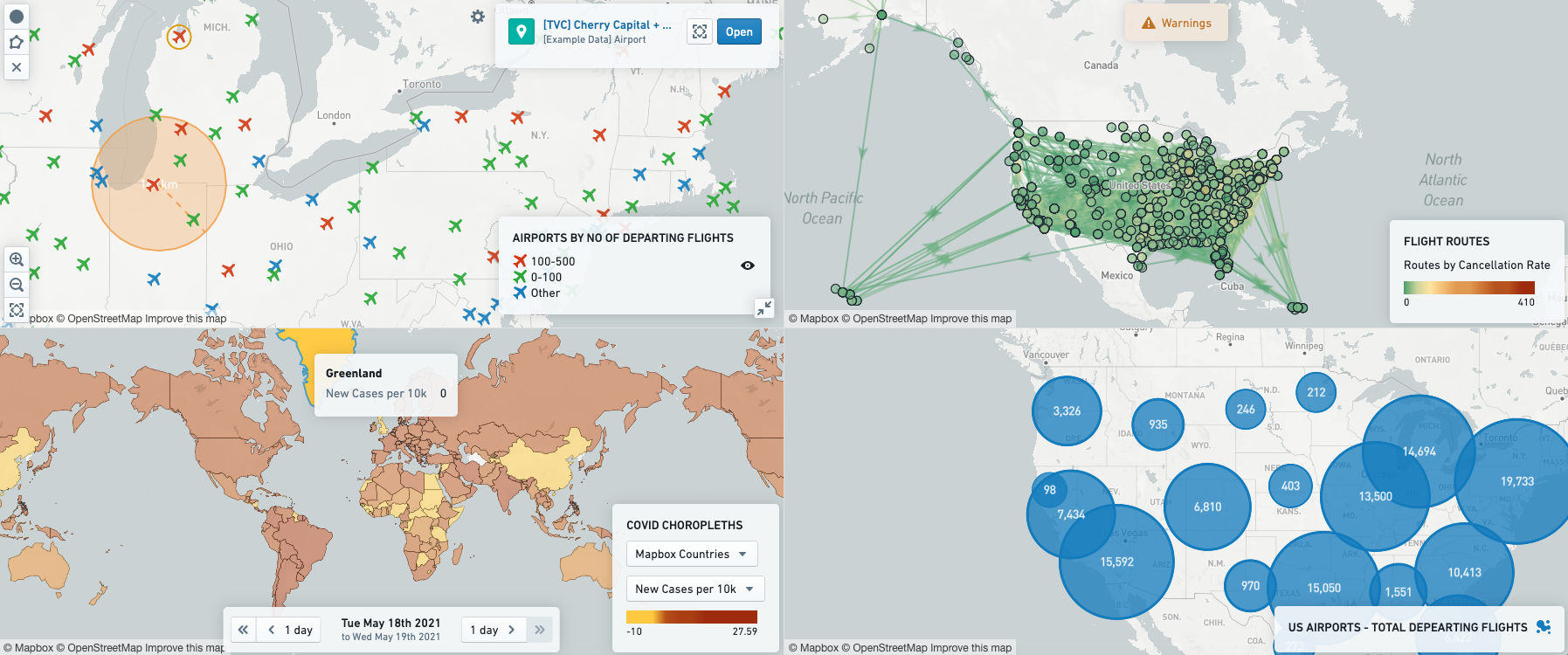
Layer types
In the Map widget, overlay layers represent data as points or shapes on top of a map’s base layer. The Map widget contains the following types of overlay layers:
Point
Point layers use points or markers to represent individual objects on a map, plotted by a geohash property (stored in the form of latitude-longitude pairs). The color, icon type, and size of the points can be styled based on properties of the objects being plotted.
For configuration information, see the configure point layers section below.
Example: A map showing hospital locations as points, colored by the number of available hospital beds.
Cluster
Cluster layers are ideal for larger object sets based on a geohash location property. Clusters are similar to points, except instead of plotting a single marker per object, the objects being plotted are aggregated based on their geographic proximity into clusters, with the size and/or color of the cluster configurable to represent the number of objects within a given area (or some other aggregation function such as the sum or average of a property across the objects within a region).
For configuration information, see the configure cluster layers section below.
Example: A map showing the general geographic distribution of weather stations across the country.
Choropleth
The Map widget’s choropleth layers display regions (such as countries or provinces) that are colored based on some attribute of, or aggregation over, the object(s) represented by that region. This provides a way to visualize variation or patterns across different regions, with the option of seeing how these values change over time.
For configuration information, see the configure choropleth layers section below.
To support custom aggregations of H3 hexagons in Functions, choropleth layers can also be used to map H3 hexagons as individual regions. See the configure choropleth layers for H3 section below.
Example: A map of states, with each state colored by its population density.
Line segment
Line segment layers plot individual objects as a line segment connecting two points.
For configuration information, see the configure line segment layers section below.
Example: A map showing flight routes where the origin airport is connected to the destination airport via a line representing the flight routes.
Static
Static layers display information that cannot be filtered dynamically and comes from a source other than object data. These layers are often most useful in providing background information to contextualize other data layers on the same map. The data for the layer can be provided in GeoJSON ↗ format or through Vector layers.
For configuration information, see the configure static layers section below.
Example: A layer showing the risk of adverse weather events occurring in various areas.
Saved
Saved layers display a map layer that was configured in the Map Layer Editor and saved as an individual resource. These layers can be shared across multiple applications, and are often used to provide background information in a consistent manner across Foundry.
Configuration Options
- Core configuration
- Point layers
- Cluster layers
- Choropleth layers
- Line segment layers
- Static layers
- Aggregated value series
- Non-aggregated value series
- Color controls
- Selection, visibility, and events
- Drawing controls
- Time stepper controls
- Viewport filter controls
Core configuration
Here is an image of a newly added and not yet configured Map widget alongside its configuration panel.
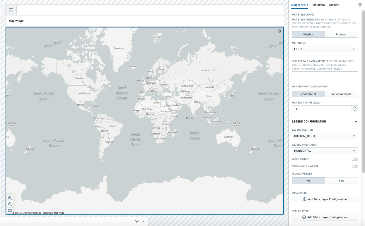
For the Map widget, the core configuration options are as follows:
- Map style
- This setting controls the base map tiles shown. By default, these tiles are loaded from Mapbox (usage is covered by an existing enterprise license). Mapbox’s tiles support several themes, including Light, Dark, Satellite, and others.
- Alternatively, you can select a custom tile source via the Internal setting; for more details on configuring a custom map style/base tile source, contact your Palantir representative.
- Map viewport: You can choose to either have the map automatically zoom to fit the bounds of the visible data, or have a preconfigured viewport used on the initial load of the map.
- Zoom to fit: The map will automatically zoom to fit the bounds of the visible data, and will adjust to accommodate changes in data (for instance, as a result of filtering).
- Max zoom to fit level: This sets the maximum zoom level for the map's auto-zoom.
- Initial viewport: Preconfigured viewport shown on initial load; when using this setting, the map’s viewport will not be reset unless the page or tab is reloaded.
- Zoom to fit: The map will automatically zoom to fit the bounds of the visible data, and will adjust to accommodate changes in data (for instance, as a result of filtering).
- Legend: There are various configuration settings related to the legend, namely:
- Whether to show or hide the legend as a whole
- Position and orientation
- Whether the legend can be collapsed (to save up space on the map)
- Toggle-able layers: Whether end-users should be able to show/hide individual map layers themselves
- Data layers: A data layer is a map layer based on an object set. Data layer types include point, cluster, choropleth, and line. Each of these has type-specific settings, but all data layers share the following configuration options:
- Object set to map: This is the input variable to the data layer and determines the data that will be displayed on the map. This allows a module builder to define a new object set variable or reuse an existing object set variable created elsewhere in a Workshop module.
- Selection, visibility, and events configuration: See the configure selection, visibility, and events section below for more information. Note that these configuration options are displayed towards the bottom of the layer configuration pane.
- Below are more details on the other layer-specific configuration options:
- Static layers: The main difference between data layers and static layers is that static layers do not require an object set to be displayed. As a result, static layers cannot be filtered dynamically. It is possible (but not required) to configure a static layer to have a connection to an object set, such that hovering over a region on the static layer shows details about a corresponding object in the ontology. See the Static layer configuration section for more information.
- Enable drawing shapes on map: This setting determines the ability to draw shapes on the map. This configuration option is revealed in more detail once it is set to
Yes. For more information, see the configure drawing controls section below. - Include time stepper: This setting shows the state of the map at different instance of time/date. This configuration option is revealed in more detail once it is set to
Yes. For more information, see the configure time stepper controls below. - Published View port filters: This setting helps to filter the object set based on the visible boundary of the map in the widget. For more information, see the configure viewport filter controls section below.
- Enable general location search: When enabled, the user will see a search icon in the top left corner of their map to search a location or address anywhere in the world. Users can zoom into the map and set a marker on a given location. The title of the search result and the geopoint data will be stored in a string variable that must be initialized for a marker to show on the map.
- Show user's current location: When enabled, the user's current location will display on the map based on their device's geolocation information. To allow the user to zoom into their current location, enable an extra button to show in the bottom left corner of the map. Note that this setting may not be supported on all devices and browsers.
Configure point layers
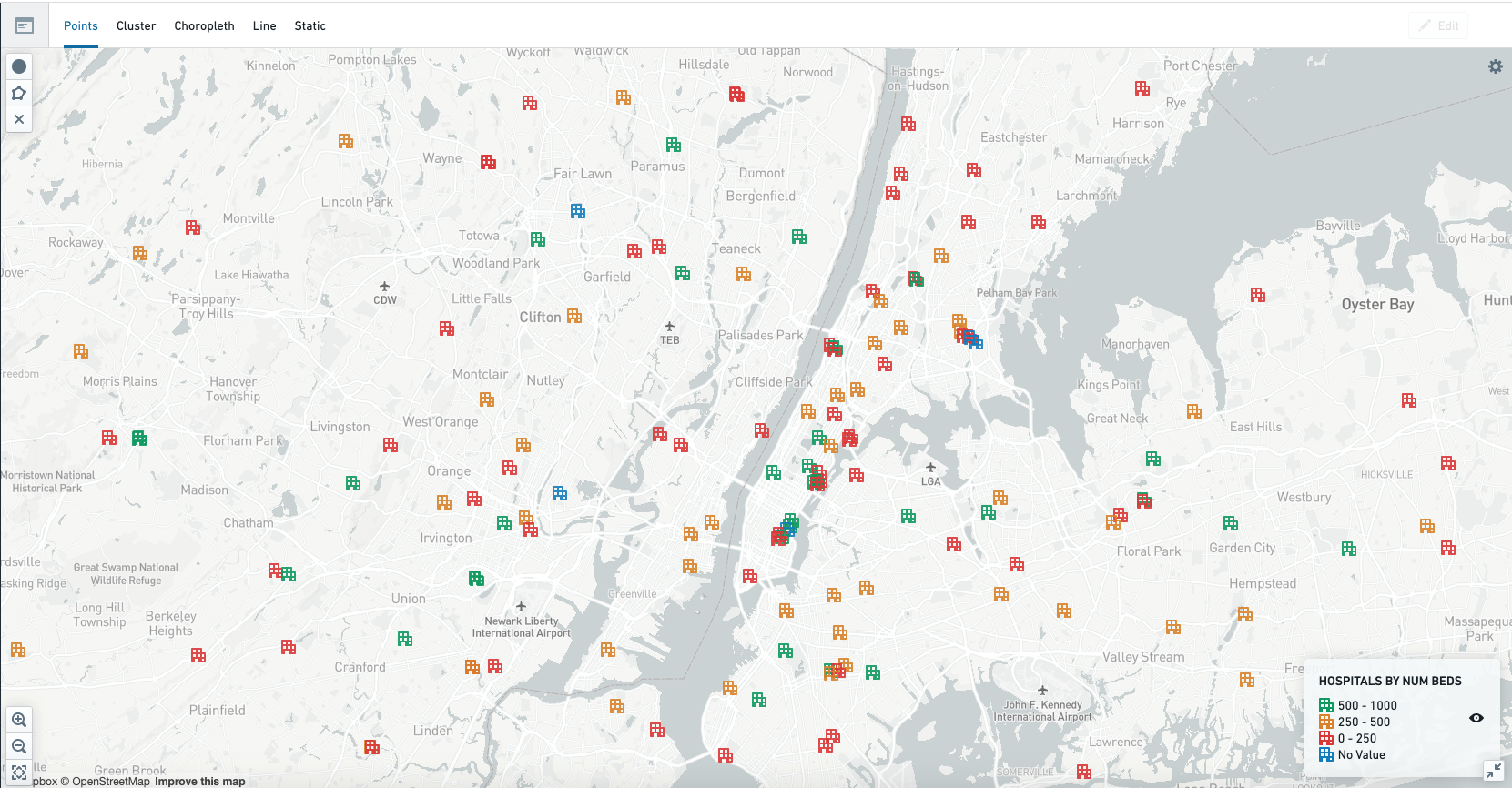
For the Point layer, the main configuration options are as follows:
- Geohash Property: The geohash property type on the object set being mapped that contains the geohash (latitude-longitude pairs) indicating the location of each object in the set.
- Number of Search Result Pages: This determines the number of objects that will be loaded. A maximum of 10,000 objects can be loaded.
- Legend Header: Legend label describing the use case/series.
- Styling: Allows configuring the icon type, color, and size for each point, with each either being set to a static style or to a dynamic data-driven style based on the value of a chosen property on the object that corresponds to each point. For more details on configuration, see the non-aggregated value series configuration and color configuration sections below.
- Properties to display in Object Preview: Tooltips shown on hover/click for each point can show any set of configured properties (such as
prominent,specific, ornone). - Point Connection Config: Allows points to be connected with a line, assuming that the data are sortable. This configuration option is revealed in more detail once it is set to connect with line.
- Sort property type: Property by which to sort points; sort order determines which points to connect with each other.
- Sort order: Order in which to sort points.
- Color: Line color connecting the points.
- Width: Line width connecting the points.
- Stroke: Line stroke connecting the points.
Configure cluster layers
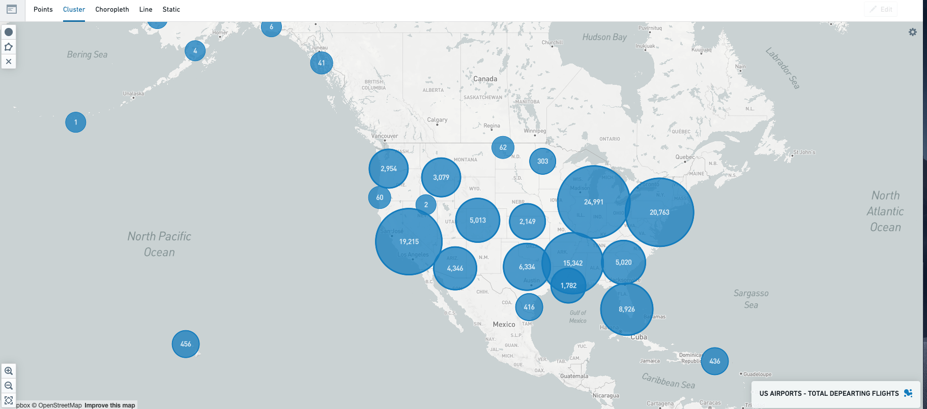
For the Cluster layer, the main configuration options are as follows:
- Geohash Property: The geohash property type on the object set being mapped that contains the geohash (latitude-longitude pairs) indicating the location of each object in the set. Nearby geohash points are taken into account while defining a cluster.
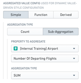
- Aggregation: Allows configuring an aggregation to calculate what value should be shown for each cluster. For example, the screenshot below shows the configuration for a cluster layer displaying the total departing flights from US airports (which would look like the map shown above). See the aggregated value series configuration section below for more details on configuration.
- Size Configuration: Allows defining the cluster size, which can either be of a single size (uniform clusters) or dynamic (scaling based on the values returned from the aggregation configured above).
- Single size: Clusters will be of uniform size.
- Size: Size of clusters. Each cluster will have uniform size.
- Legend label: Label defining the use case/series.
- Auto-scaled by value: Cluster size will be based on the underlying value.
- Scale type: The type of mathematical scale to be used to calculate the value to size clusters (such as Linear, Logarithmic, or Square Root). If your data is very skewed, logarithmic or square root scaling may be more suitable than linear scaling.
- Max lower bound: The highest allowed lower bound for the automatically calculated scale. If there are data values lower than this bound, the scale will extend to include those values.
- Min upper bound: The lowest allowed upper bound for the automatically calculated scale. If there are data values higher than this bound, the scale will extend to include those values.
- Single size: Clusters will be of uniform size.
- Color configuration: Allows defining the color of the clusters. Clusters can either be colored uniformly or colored based on the value. For more configuration details, see the color configuration section below.
- Opacity configuration: Allows defining a single, uniform opacity for the clusters.
- Legend label: Label defining the use case/series, displayed in the legend.
- Value formatter: Allows representing the value in a different format. For example, to represent the values as percentages, set
%as the value formatter. The value specified should be a d3-format string ↗.
Configure choropleth layers
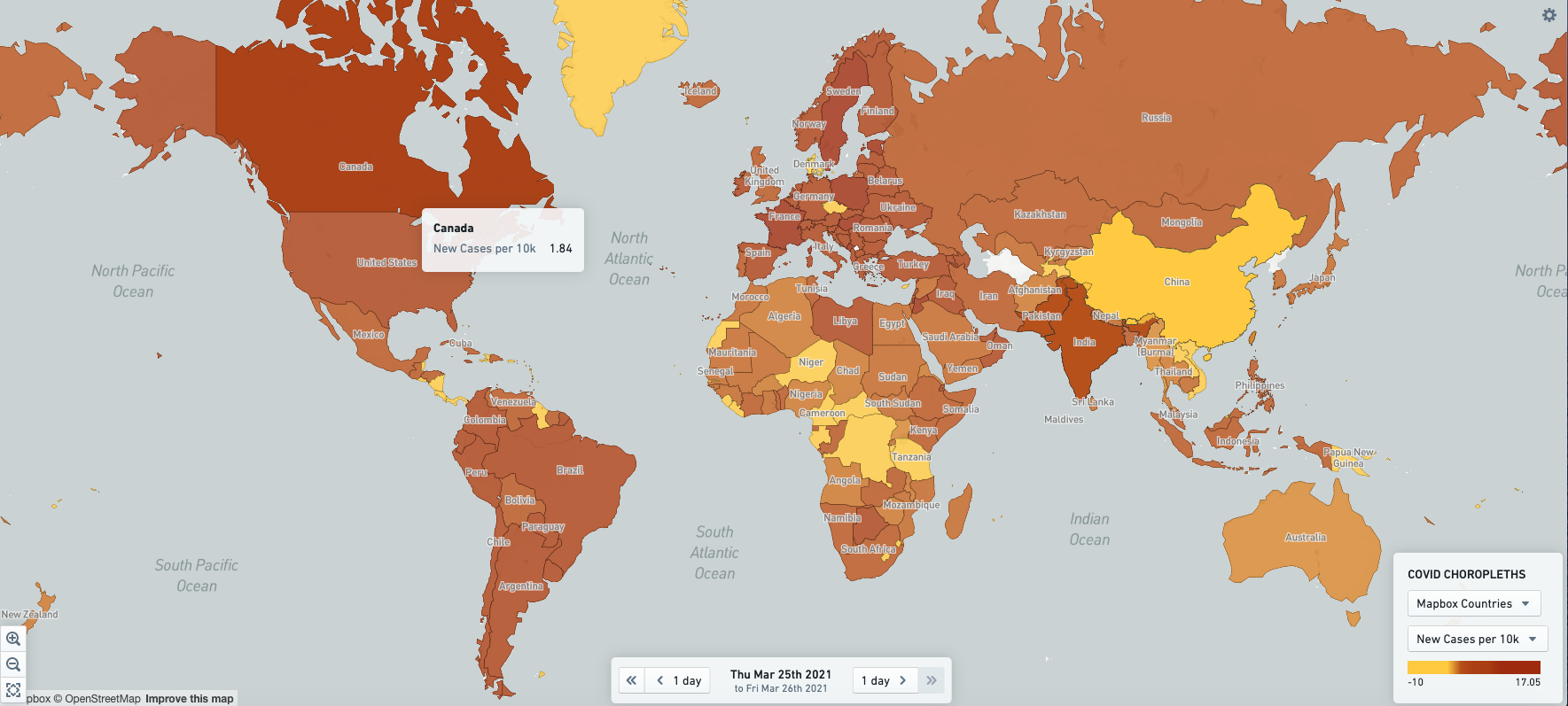
For the Choropleth layer, the main configuration options are as follows:
- Legend Header: This is the header that goes above the series-level legend header for this layer’s legend section. Each series within the layer has the option to provide legend header.
- Choropleth layer configuration: Choropleth and line layers can be either Aggregated or Non-Aggregated. All choropleth layers generally display regions of some kind, such as countries or provinces; the difference between the aggregation types is whether each object in the input object set corresponds to a given region (non-aggregated), or whether one or more objects may be contained within a given region (aggregated).
- Aggregated: Displays regions (such as countries or provinces) that are colored based on an aggregation over the object(s) represented by that region. For example, a map showing cost to volume ratio per country based on a set of input expenses.
- Region ID Property Type: Allows selecting a Region ID property. This is the property upon which the aggregation is performed to calculate the data values in each region. It is critical that the values of this Region ID property exactly match the region IDs for the boundary source selected below.
- Choropleth boundary sources: Allows selecting the boundary source for the layer. Below
choropleth boundary sourceare the details for the three supported sources: Mapbox, GeoJSON, and Vector. - Aggregated value configuration: Allows defining a list of aggregated series where, in each series, the objects being plotted are aggregated based on their region ID. The color of the region is configurable to represent the number of objects for a given region or some other aggregation function, such as the sum or average of a property across the objects within a region. For more configuration details, see the aggregated value series configuration and color configuration sections below.
- Non-Aggregated: Displays regions that are colored based on the property value of the object represented by that region. For example a map with US states, with each state colored by its population density, where population density is a property type on the state object type.
- Region ID Property Type: Allows selecting a Region ID property. This property value is used to uniquely identify each region and is the property that is filtered on if you select "regions". It is critical that the values of this Region ID property match exactly the region IDs for the boundary source selected below.
- Choropleth boundary sources: Allows selecting the boundary source for the layer. Below
choropleth boundary sourceare the details for the three supported sources: Mapbox, GeoJSON, and Vector. - Non-aggregated value configuration: Allows defining list of non-aggregated series where, in each series, the color of the region is configurable to represent a property value of the objects being plotted. For more configuration details, see the non-aggregated value series configuration and color configuration sections below.
- Number of Search Result Pages: This determines the number of objects that will be loaded, where each page is 1000 objects. A maximum of 10,000 objects (10 pages) can be loaded per non-aggregated layer.
- Properties to display in Object Preview: Tooltips shown on hover/click for each point can show any set of configured properties (such as
prominent,specific, ornone).
- Aggregated: Displays regions (such as countries or provinces) that are colored based on an aggregation over the object(s) represented by that region. For example, a map showing cost to volume ratio per country based on a set of input expenses.
Choropleth Boundary Source: To configure a choropleth layer, you must specify the source for the boundaries that will define the regions that are shown. There are several possible sources for boundary data:
- Mapbox Source: This is the easiest method of configuring a choropleth, assuming that you are interested in displaying generic regions around the world (such as countries, states, counties, and so on). This option leverages the use of Mapbox enterprise boundary sets ↗. Learn how to install Mapbox boundary datasets on your Foundry instance.
- Mapbox enterprise boundaries version: Currently, two Mapbox versions (V3 and V4) are supported. We recommend using V4 for the most updated boundaries.
- Mapbox Source Config ID: Allows selecting boundary types and data levels ↗. Mapbox Boundaries data are categorized into five broad types based on the functions the boundaries serve: admin, legislative, locality, postal and stats. Within each boundary type, features are organized into a hierarchy of different numbered levels. Typically, larger-numbered levels will nest under smaller-numbered levels. For example, in the United States, counties (admin level 2) are subdivisions of states (admin level 1), which are subdivisions of the country (admin level 0).
- The region ID property type for the layer must match the required Mapbox feature IDs for whatever boundary level you select. The mappings for these feature ID values are available through an imported dataset that should already exist on the platform. If you are unaware of how to locate these mappings, contact your Palantir representative.
- Worldview: This feature ↗ renders map boundaries for different audiences when multiple versions of boundaries exist; the currently available options are the United States, Japan, India and China.
- Mapbox Source Config ID: Allows selecting boundary types and data levels ↗. Mapbox Boundaries data are categorized into five broad types based on the functions the boundaries serve: admin, legislative, locality, postal and stats. Within each boundary type, features are organized into a hierarchy of different numbered levels. Typically, larger-numbered levels will nest under smaller-numbered levels. For example, in the United States, counties (admin level 2) are subdivisions of states (admin level 1), which are subdivisions of the country (admin level 0).
- Mapbox enterprise boundaries version: Currently, two Mapbox versions (V3 and V4) are supported. We recommend using V4 for the most updated boundaries.
- GeoJSON Source: This option is useful if you have simple, custom regions defined via GeoJSON, or do not have access to the Mapbox APIs from your environment (for instance, due to network restrictions). This option leverages data in GeoJSON ↗ format.
- Aggregated GeoJSON: Allows defining the boundary set in the form of a single GeoJSON file (uploaded to a Project). This option is ideal if the scale in terms of number of shapes or complexity of shapes is generally low, the scale of objects you want to plot is high, and each region may represent one or more objects (and thus the objects are being aggregated).
- GeoJSON source RID: Resource RID of the uploaded GeoJSON file.
- Region ID feature property: Property ID inside of the GeoJSON that contains the ID for each region. These values in the GeoJSON will be what are matched up to the region ID property on the objects (defined above).
- Region display name feature property: Property ID inside of the GeoJSON that contains the display name for each region.
- Non-Aggregated GeoJSON: Allows selecting a geoshape property of the input objects that contains the GeoJSON for each region/object on the map. This option is ideal if the scale of shapes or complexity of shapes is higher, but the object scale is still manageable. Each object can only correspond to one shape and each shape can only correspond to one object.
- GeoJSON geometry property type: Property type defining the GeoJSON geometry (supports either properties of type
geoshapeorstring).
- GeoJSON geometry property type: Property type defining the GeoJSON geometry (supports either properties of type
- Aggregated GeoJSON: Allows defining the boundary set in the form of a single GeoJSON file (uploaded to a Project). This option is ideal if the scale in terms of number of shapes or complexity of shapes is generally low, the scale of objects you want to plot is high, and each region may represent one or more objects (and thus the objects are being aggregated).
- Vector Source: This option is most useful if you have custom boundary definitions that are highly detailed or very high-scale, given the performance benefits that vector sources provide over basic GeoJSON. This option requires the vector source to be hosted via a tile server (can be either internal or external).
- Source URL: Full URL of the tile set, hosted on some tile server.
- Layer name: ID of the vector layer within the given configured tile source.
- Region ID feature property: Property ID inside of each Vector feature that contains the ID for each region. These values in the vector feature will be what are matched up to the region ID property on the objects (defined above).
- Region display name feature property: Property ID inside of each vector feature that contains the display name for each region. This is only supported for aggregated vector sources.
- Min zoom: If the map zoom level is below the min zoom, the tile source will not be queried (and the layer will not display).
- Max zoom: If the map zoom level is above the max zoom, the tile source will not be queried (and the layer will not display).
Configure choropleth layers for H3
To configure choropleth layers for H3 to support custom aggregations to display on the map widget, you will need to configure an object type, e.g. "H3 Hexagon" in Ontology Manager where each object is an H3 hexagon at the desired resolution with properties to uniquely identify each hexagon and its associated GeoJSON shape. An example of the properties for the object type is provided below:
hex_index: a unique identifier for each H3 hexagon. Example value:82f25ffffffffffhex_geojson: GeoJSON geometry of the H3 hexagon. Example value:{"type":"Polygon","coordinates":[[[-114.88722592804382,-74.86647343694071],[-110.43933775312789,-76.04791578897344],[-103.98485051466383,-75.45226049628374],[-103.08914246618076,-73.75952697882984],[-107.50751324842204,-72.74554847287561],[-112.95182804024837,-73.26746640072781],[-114.88722592804382,-74.86647343694071]]]}
The configuration options for the map widget can then be applied as follows:
- Object Set to Map: Provide the object type configured with the H3 hexagons (in our example, "H3 Hexagon")
- Layer Configurations: Select "Choropleth"
- Choropleth Layer Configuraton: Select "Non-aggregated"
- Region ID Property Type: Select the unique identifier for each H3 hexagon (in our example,
hex_index) - Choropleth Boundary Source & Data Configuration: Select "Geojson"
- GeoJSON Geometry Property Type: Select the property containing the GeoJSON geometry, in our example,
hex_geojson
- GeoJSON Geometry Property Type: Select the property containing the GeoJSON geometry, in our example,
- Region ID Property Type: Select the unique identifier for each H3 hexagon (in our example,
- Choropleth Layer Configuraton: Select "Non-aggregated"
You can then configure a Function-backed property using the Non-aggregated value configuration option to aggregate Object Sets inputs by H3 hexagons and display the values in the map widget. For example, the function below would compute the derived COVID test positivity rate per H3 hexagon in the input object set:
Copied!1 2 3 4 5 6 7 8 9 10 11 12 13 14 15 16 17 18 19 20 21 22 23 24 25 26 27 28 29 30 31 32 33 34 35 36 37 38 39 40 41 42 43 44 45import { Function, Double, FunctionsMap} from "@foundry/functions-api"; import { Objects, ObjectSet, CovidPositive, CovidTest, H3Hexagon} from "@foundry/ontology-api"; export class MyFunctions { @Function() public async calculateCovidPositivityRate(hexes: ObjectSet<H3Hexagon>, positives: ObjectSet<CovidPositive>, tests: ObjectSet<CovidTest>): Promise<FunctionsMap<H3Hexagon, Double>> { const map = new FunctionsMap<H3Hexagon, Double>(); // Set max buckets to 6000 to allow aggregations for all H3 hexagons and resolution 2 const max_buckets = {maxBuckets: 6000} const positives_bucketed = await positives .groupBy(positive => positive.hex_index.exactValues(max_buckets)) .count(); // Convert the results to a map to make the lookup more efficient than a bucketed array const positives_hex_map = new Map(); positives_bucketed.buckets.forEach((bucket: any) => { positives_hex_map.set(bucket.key, bucket.value); }); const tests_bucketed = await tests .groupBy(test => test.hex_index.exactValues(max_buckets)) .count(); const tests_hex_map = new Map(); tests_bucketed.buckets.forEach(bucket => { tests_hex_map.set(bucket.key, bucket.value); }); hexes.all().forEach(hex => { const positive_count = positives_hex_map.get(hex.hex_index); const test_count = tests_hex_map.get(hex.hex_index); if ((positive_count !== undefined) && (test_count !== undefined)) { map.set(hex, positive_count/test_count * 100); } }); return map; } }
Note that if you are using H3 hexagon resolution 2, you will need to increase the Number of Search Result Pages to 6 if you want to plot all 5,882 hexagons.
Configure line segment layers
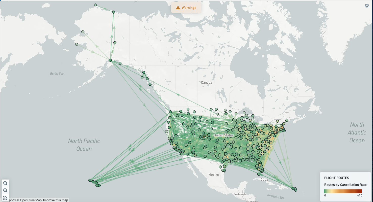
For the Line layer, the main configuration options are as follows:
- Legend Header: Header that goes above the series-level legend header for this layer’s legend section. Each series within the layer has the option to provide legend header.
- Line layer Configuration: Line layers, like choropleths, can be either Aggregated or Non-Aggregated. Line layers display line segments of some kind; the difference between aggregated and non-aggregated layers is whether each object in the input object set corresponds to a given line (non-aggregated), or whether one or more objects may correspond to a given line (aggregated).
- Aggregated: Displays lines that are colored based on an aggregation over the object(s) represented by that line. For example, a map showing the average delay time for all flights along a given route.
- Segment ID Property Type: Allows selecting a Line Segment ID property. This is the property on which the aggregation is performed to calculate the data values for each line shown. It is critical that the values of this Segment ID property exactly match the feature IDs for the line layer source selected below.
- Line layer sources: Allows selecting the line source for the layer. Below
line layer sourceare the details for the two supported sources for aggregated line layers: GeoJSON and Vector. - Aggregated series configuration: Allows defining a list of aggregated series where, in each series, the objects being plotted are aggregated based on their segment ID. The color of the line is configurable to represent the number of objects for a given line or another aggregation function (such as the sum or average of a property across the objects within a line). For more configuration details, see the aggregated value series configuration and color configuration sections below.
- Non-Aggregated: Displays lines that are colored based on the property value of the object represented by that line. For example, a map showing electrical lines, colored by their current operating status
- Segment ID Property Type: Allows selecting a Segment ID property. This property value uniquely identifies each line and is the property that is filtered on if you select "lines". It is critical that the values of this Segment ID property exactly match the feature IDs for the line layer source selected below.
- Line layer sources: Allows selecting the line source for the layer. Below
line layer sourceare the details for the three supported sources: Point-to-Point, GeoJSON, and Vector. - Non-Aggregated series configuration: Allows defining a list of non-aggregated series where, in each series, the color of the line is configurable to represent a property value of the objects being plotted. For more configuration details, see the non-aggregated value series configuration and color configuration sections below.
- Number of Search Result Pages: This determines the number of objects that will be loaded, where each page is 1000 objects. A maximum of 10,000 objects (10 pages) can be loaded per non-aggregated layer.
- Properties to display in Object Preview: Tooltips shown on hover/click for each point can show any set of configured properties (such as
prominent,specific, ornone).
- Aggregated: Displays lines that are colored based on an aggregation over the object(s) represented by that line. For example, a map showing the average delay time for all flights along a given route.
Line Layer Source: Below are the different methods of loading source information to specify how lines are drawn on a line layer:
- Point to point: For each object in the input object set, this draws a straight line between the provided start and end geohash points. Note that this option is only available for non-aggregated line layers.
- GeoJSON Source: This option is useful if you have simple, custom lines defined via GeoJSON, or do not have access to the Mapbox APIs from your environment (for instance, due to network restrictions). This option leverages data in GeoJSON (https://geojson.org/) format.
- Aggregated GeoJSON: Allows defining the line definitions in the form of a single GeoJSON file (uploaded to Foundry). This option is ideal if the scale of the number of lines / complexity of lines is generally low, the scale of object you want to plot is high, and each line may represent one or more objects (and thus the objects are being aggregated).
- GeoJSON source RID: Resource RID of the uploaded GeoJSON file.
- Region ID feature property: Property ID inside of the GeoJSON that contains the ID for each line feature. These values in the GeoJSON will be what are matched up to the segment ID property on the objects (defined above).
- Region display name feature property: Property ID inside of the GeoJSON that contains the display name for each line segment.
- Non-Aggregated GeoJSON: Allows selecting a geoshape property of the input objects that contains the GeoJSON for each line on the map. This option is ideal if the scale of lines or complexity of lines is higher, but the object scale is still manageable. Each object can only correspond to one line, and similarly each line can only correspond to one object.
- GeoJSON geometry property type: Property type defining the GeoJSON geometry (supports either properties of type
geoshapeorstring).
- GeoJSON geometry property type: Property type defining the GeoJSON geometry (supports either properties of type
- Aggregated GeoJSON: Allows defining the line definitions in the form of a single GeoJSON file (uploaded to Foundry). This option is ideal if the scale of the number of lines / complexity of lines is generally low, the scale of object you want to plot is high, and each line may represent one or more objects (and thus the objects are being aggregated).
- Vector Source: This option is most useful if you have custom line definitions that are highly detailed or very high-scale, given the performance benefits that vector sources provide over basic GeoJSON. This option requires the vector source to be hosted via a tile server (can be either internal or external).
- Source URL: Full URL of the tile set, hosted on some tile server.
- Layer name: ID of the vector layer within the given configured tile source.
- Region ID feature property: Property ID inside of each Vector feature that contains the ID for each line. These values in the vector feature will be what are matched up to the segment ID property on the objects (defined above).
- Region display name feature property: Property ID inside of each vector feature that contains the display name for each line. This is only supported for aggregated vector sources.
- Min zoom: If the map zoom level is below the min zoom, the tile source will not be queried (and the layer will not display).
- Max zoom: If the map zoom level is above the max zoom, the tile source will not be queried (and the layer will not display).
Configure static layers
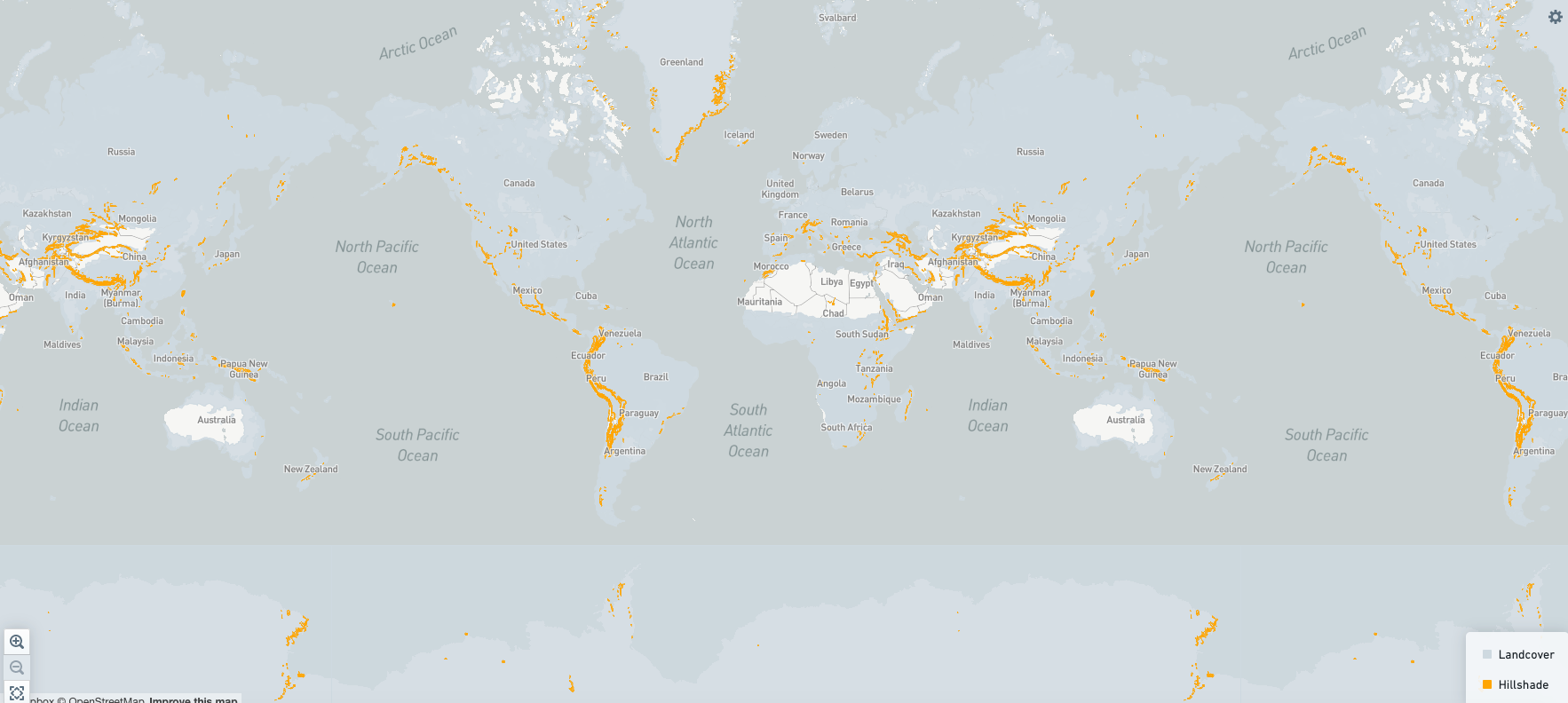
For static layers, the main configuration options are as follows:
- Layer source: Static layers can be sourced from either GeoJSON or vector tilesets.
- GeoJSON source: This option is used for data in GeoJSON ↗ format. Allows defining the boundary set in the form of a single GeoJSON file (uploaded to Foundry).
- Compass RID: Resource RID of the uploaded GeoJSON file.
- Vector source: This option is most useful if you have features that are highly detailed or very high-scale, given the performance benefits that vector sources provide over basic GeoJSON. This option requires the vector source to be hosted via a tile server (can be either internal or external). Multiple layers can be loaded from a single vector tile source.
- Source URL: Full URL of the tile set, hosted on some tile server.
- Layer name: ID of the vector layer within the given configured tile source.
- GeoJSON source: This option is used for data in GeoJSON ↗ format. Allows defining the boundary set in the form of a single GeoJSON file (uploaded to Foundry).
- Region ID config: Allows configuring an ID to uniquely identify each feature in the GeoJSON or vector source. The region ID can either be the intrinsic ID of a feature (that is, the top level ID field on a given feature), or the region ID can be pulled from a given property/attribute of each feature. Configuring a region ID is required for hover and selection interactions; if no region ID is configured, the layer will not be interactive.
- Region label feature attribute ID: This is the property/attribute ID within each feature that contains the label for that feature, which is shown in a tooltip on hover.
- Style: Define the style of the static feature. If the static feature is a polygon, color configuration affects the fill of the polygon. If the static feature is a line, color configuration affects the line color. For more information, see the color configuration section below.
- Object config: This enables you to show objects-backed tooltips on hover for static layers, as well as publishing an object set filter for map selections.
- Region ID property: This is the object and property type used to connect the features on the map to objects in the ontology. A given feature/region on the map will connect to an object in the ontology if the region ID of that feature matches the value of this configured property type.
- Properties to display in Object Preview: Tooltips shown on hover/click for each point can show any set of configured properties (such as
prominent,specific, ornone).
- Selection, visibility, and events configuration: See the configure selection, visibility, and events section below for more information.
Configure aggregated value series
Aggregated value series can be configured in three ways: simple aggregation, function aggregation, and derived aggregation.
- Simple aggregation: Simple aggregation to represent the number of objects or another aggregation function (such as the sum or average of a property across the objects).
- Function aggregation: Aggregated functions should return a map of <locationId, value>. For cluster layers, the location ID would be a geo point or geohash, and for choropleth, it would be the region ID for each region. For example, the function below calculates the cost to volume ratio per country based on a set of input expenses:
Copied!1 2 3 4 5 6 7 8 9 10 11 12 13 14 15@Function() public costToVolume(expenses: ObjectSet<Expense>): FunctionsMap<string, Double> { const map = new FunctionsMap<string, Double>(); const costsPerCountry = expenses .groupBy(expense => expense.countryId.topValues()) .sum(expense => expense.cost); const volumePerCountry = expenses .groupBy(expense => expense.countryId.topValues()) .sum(expense => expense.volume); costsPerCountry.buckets.forEach(bucket => { var volume = volumePerCountry.buckets.find(b => b.key === bucket.key); map.set(bucket.key, bucket.value / volume); }); return map; }
- Derived aggregation: Aggregation represented by a derived formula. Formula should be a basic numeric formula. For example, the percentage of a country that is under the age of 30 can be represented by the formula
(people under 30/ total population).
Configure non-aggregated value series
Non-aggregated value series can be configured in three ways: static property, function-backed property, and time series property.
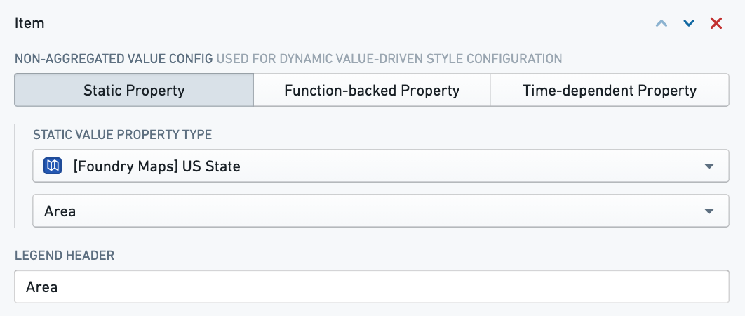
- Static property: Property whose value is needed to represent the data. Below is a screenshot showing the configuration of a static property for a map where US states are colored by area.
- Function-backed property: Non-aggregated functions should return a map of <object, value>. For example, the function below would compute the derived COVID test positivity rate per country in the input object set:
Copied!1 2 3 4 5 6 7 8 9@Function() public countryPositivityRate(countries: ObjectSet<Country>): FunctionsMap<Country, Double> { const positivityRatePerCountry = new FunctionsMap<Country, Double>(); countries.all().forEach(country => { var positivityRate = country.dailyNewCases / country.dailyNewPositiveTests; positivityRatePerCountry.set(country, positivityRate); }); return positivityRatePerCountry; }
- Time series property: Time series properties, including data generated by time series transforms, can be viewed on the Map like regular properties. A time series property is an object property that stores a history of time stamped values. See Time series properties in Workshop for more information.
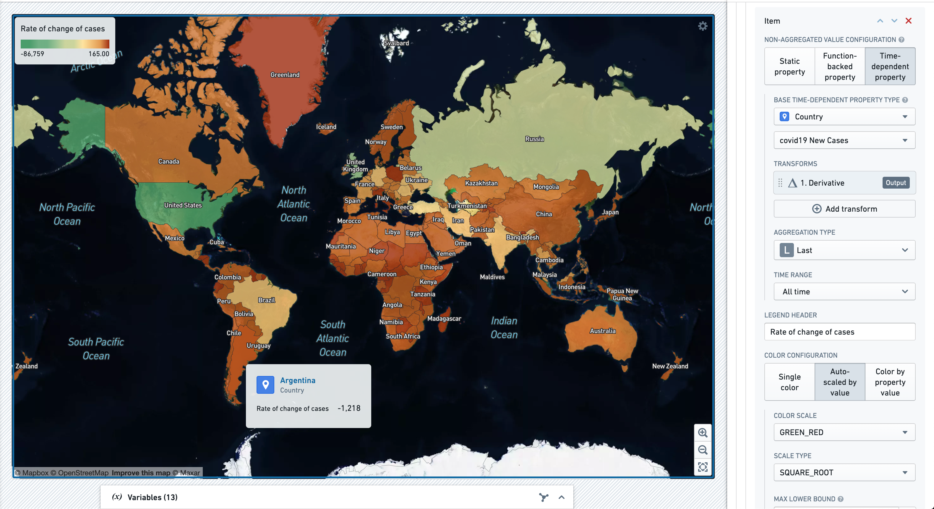
In the example below, the Country object has a time series property COVID19 New Cases, which stores a daily history of new COVID19 cases observed in the country. A time series transform then converts this daily case count into a time series recording the rate of change in cases. Finally, a time series summarizer feeds the Map data layer with the most recent value in this transformed time series; that is, it computes the last known rate of change in case values. The Color Configuration panel styles the map to highlight contrasts between countries in terms of this value. See Time series properties in Workshop for more information on time series transforms and summarizers, and the color configuration section below for more information on configuring color schemes.
Configure color controls
The screenshot below shows configuration options for color configuration.
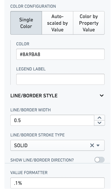
Configuration options for color configuration are as follows:
-
Color configuration: Color can be set in three ways:
- Single color: Allows choosing a single color.
- Color: Color to be shown on map.
- Legend: Legend label describing the use case/series.
- Auto-scaled by value: Shows the color variation based on the value.
- Color scale: Different options for color patterns.
- Scale type: The type of mathematical scale to be used to calculate the value to color buckets (such as Linear, Logarithmic, or Square Root). If your data is very skewed, logarithmic or square root scaling may be more suitable than linear scaling.
- Max lower bound: The highest allowed lower bound for the automatically calculated scale. If there are data values lower than this bound, the scale will extend to include those values.
- Min upper bound: The lowest allowed upper bound for the automatically calculated scale. If there are data values higher than this bound, the scale will extend to include those values
- Legend orientation: Allows configuring legend orientation. Possible orientations are horizontal and vertical.
- Color by property value: Color is set based on the value. Color can be configured based on the exact match of the value or for a range of values.
- Exact value match: Color is shown when the value on map matches the configured value exactly.
- Exact value to match: Value which, when matched exactly with the value on map, shows the below configured color.
- Color: Color shown when the value on map exactly matches the value configured above.
- Legend label: Legend label shown when the value on map exactly matches the value configured above.
- Fallback color: Color shown when the value on map does not match any of the configured values.
- Fallback legend: Legend label to be shown when the value on map does not match any of the configured values.
- Range value match: Color shown when the value on map falls inside the configured value range.
- Minimum value: Lower bound of the range (inclusive).
- Maximum value: Upper bound of the range (inclusive).
- Color: Color shown when the value on map falls inside the configured value range.
- Legend label: Legend label shown when the value on map falls in the range configured above.
- Fallback color: Color shown when the value on map does not fall inside the configured value range.
- Fallback legend: Legend label to be shown when the value on map does not fall inside the configured value range.
- Exact value match: Color is shown when the value on map matches the configured value exactly.
- Single color: Allows choosing a single color.
-
Line border style: Style configuration for the lines shown on line layer or border style for other layer types.
- Line/border width: Width of the lines shown on line layer or width of the border for other layer types.
- Line/border stroke type: Stroke of the lines shown on line layer or width of the border for other layer types.
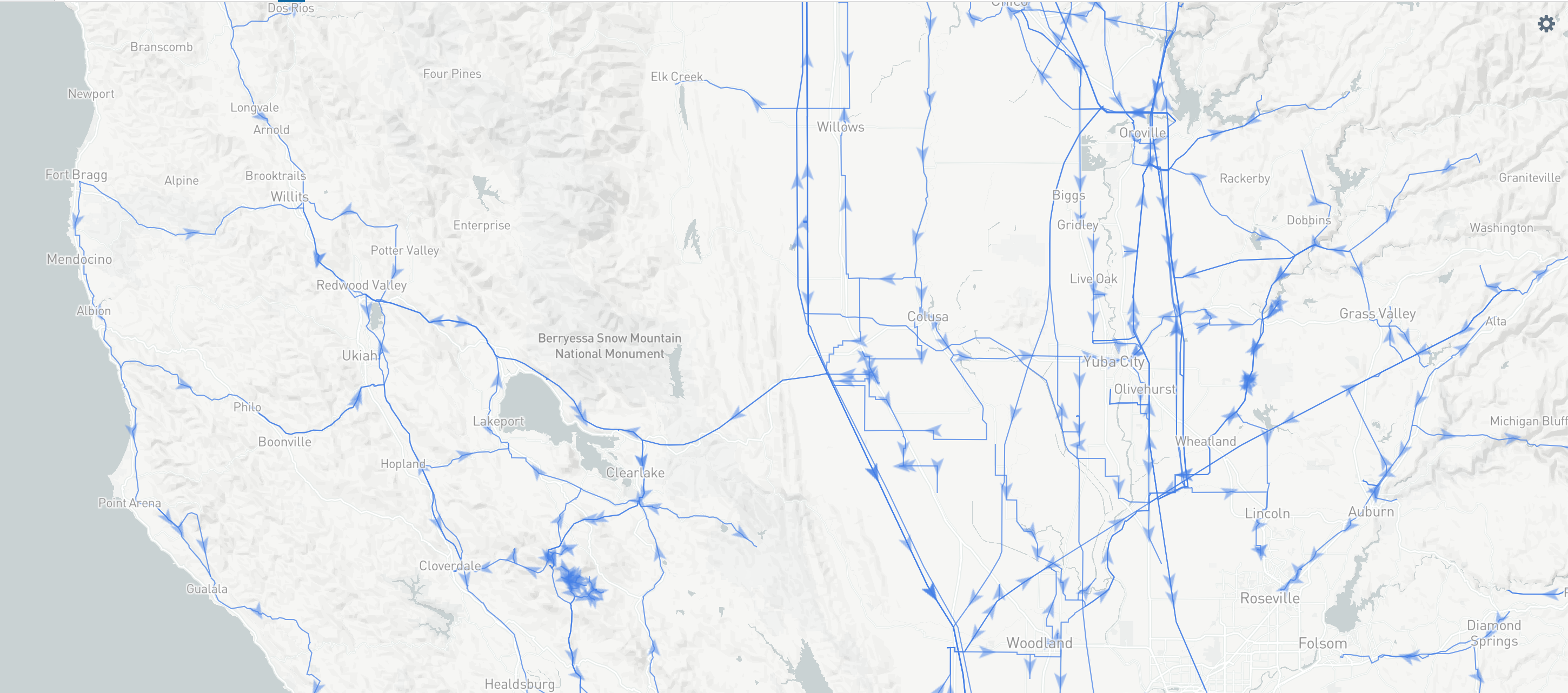
- Show line/border direction: Show the arrow defining the direction of the lines. Below is a screenshot of a map with directions shown on the line.
-
Value formatter: Allows representing the value in a different format. For example, to represent the values as percentages, configure
%as value formatter. The value specified should be a d3-format string ↗.
Configure selection, visibility, and events
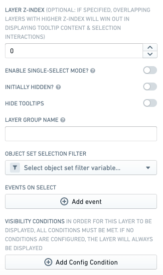
Below are the main configuration options for selection, visibility, and events configuration:
- Layer Z Index: This controls the order in which the overlapping layers appear. Tooltip content and selection interactions will be displayed for the layer with a higher z-index first.
- Enable single select mode: Toggling this to
Truedisables the ability to select multiple objects at once. Each next selection will remove the previous selection. - Initially hidden: Toggling this to
Trueallows the layer to be hidden on the first map load. If the layer is part of a group, then the setting configured for the first layer will be considered. - Layer group name: Allows the layers to be grouped and shown together in a dropdown in the legend.
- Object set selection filter: Filter that is published when a selection is made on the map.
- Events on select: Allows configuring Workshop events (such as causing a drawer to expand) to trigger when a selection is made on the map.
- Visibility conditions: Allows conditional control of the visibility of this layer, based on the status/value of Workshop variables. By default, the layer will always be displayed if no conditions are configured.
Configure drawing controls
The below screenshot shows an example of a configured Map widget displaying different shapes alongside its configuration panel:
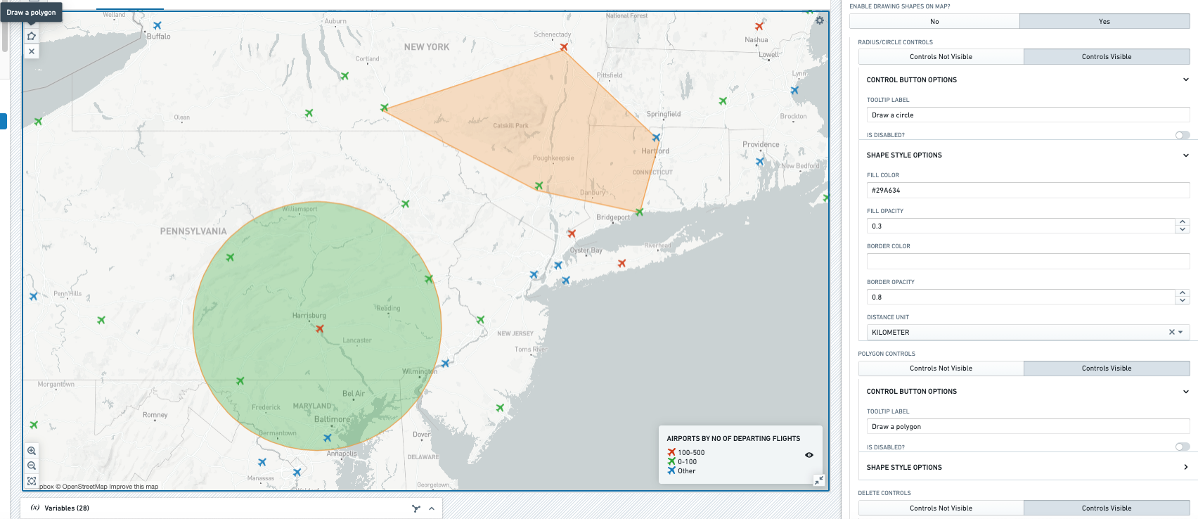
For the drawing controls, the core configuration options are the following:
- Radius/circle controls: Setting the controls to visible allows you to draw a circle shape on the map with radius displayed. To draw a circle, select the circle button from the top left, single-click anywhere on the map to set the center of the circle, release the mouse click, and move the mouse away from the center of the circle.
- Control button options:
- Tooltip label: Provides a label when cursor hovers on the circle button on the top left.
- Is disabled: Setting this to true disables the circle button.
- Shape style options:
- Fill color: Sets the color of the drawn shape. The default color is
#F29D49, which is the hex code for light orange. - Fill opacity: Sets the opacity of the drawn shape from
0to1, where the maximum opacity is1. - Border color: Sets the border color of the drawn shape. The default color is
#F29D49, which is the hex code for light orange. - Border opacity: Sets the border opacity of the drawn shape.
- Distance unit: Unit in which the radius of the circle drawn is displayed. Kilometer, meter, mile, yard, and foot are the available options.
- Fill color: Sets the color of the drawn shape. The default color is
- Control button options:
- Polygon controls: Setting the controls to visible allows you to draw a polygon shape on the map. To draw a polygon, first select the polygon button from the top left and then click on the map. Each click marks a point of the polygon, and the edge will be drawn between two subsequent points.
- Control button options:
- Tooltip label: Provides a label when the cursor hovers on the polygon button on the top left.
- Is disabled: Setting this to true disables the polygon button.
- Shape style options:
- Fill color: Sets the color of the drawn shape. The default color is
#F29D49, which is the hex code for light orange. - Fill opacity: Sets the opacity of the drawn shape from
0to1, where the maximum opacity is1. - Border color: Sets the border color of the drawn shape. The default color is
#F29D49, which is the hex code for light orange. - Border opacity: Sets the border opacity of the drawn shape.
- Distance unit: Kilometer, meter, mile, yard, and foot are the various available options.
- Fill color: Sets the color of the drawn shape. The default color is
- Control button options:
- Delete controls: Setting the controls to visible allows you to delete a drawn shape on the map. To delete a drawn shape, first select the delete button from the top left and then click on the drawn shape.
- Control button options:
- Tooltip label: Provides a label when mouse is hovered on the delete button on the top left.
- Is disabled: Setting this to true disables the delete button.
- Control button options:
- Single draw mode: If enabled, only one shape can be drawn on the map at a time, drawing a new shape will delete the old one.
- Published filters: Outputs an object set filter variable that allows filtering the object set being mapped based on the boundaries of the drawn shape.
- Published drawn geometry: This option allows publishing the geometry of the drawn shape onto a string variable. This enables you to write a drawn shape geometry to a new property.
- Events on draw: This option controls triggering one or more Workshop events when a shape is drawn on the map.
Configure time stepper controls
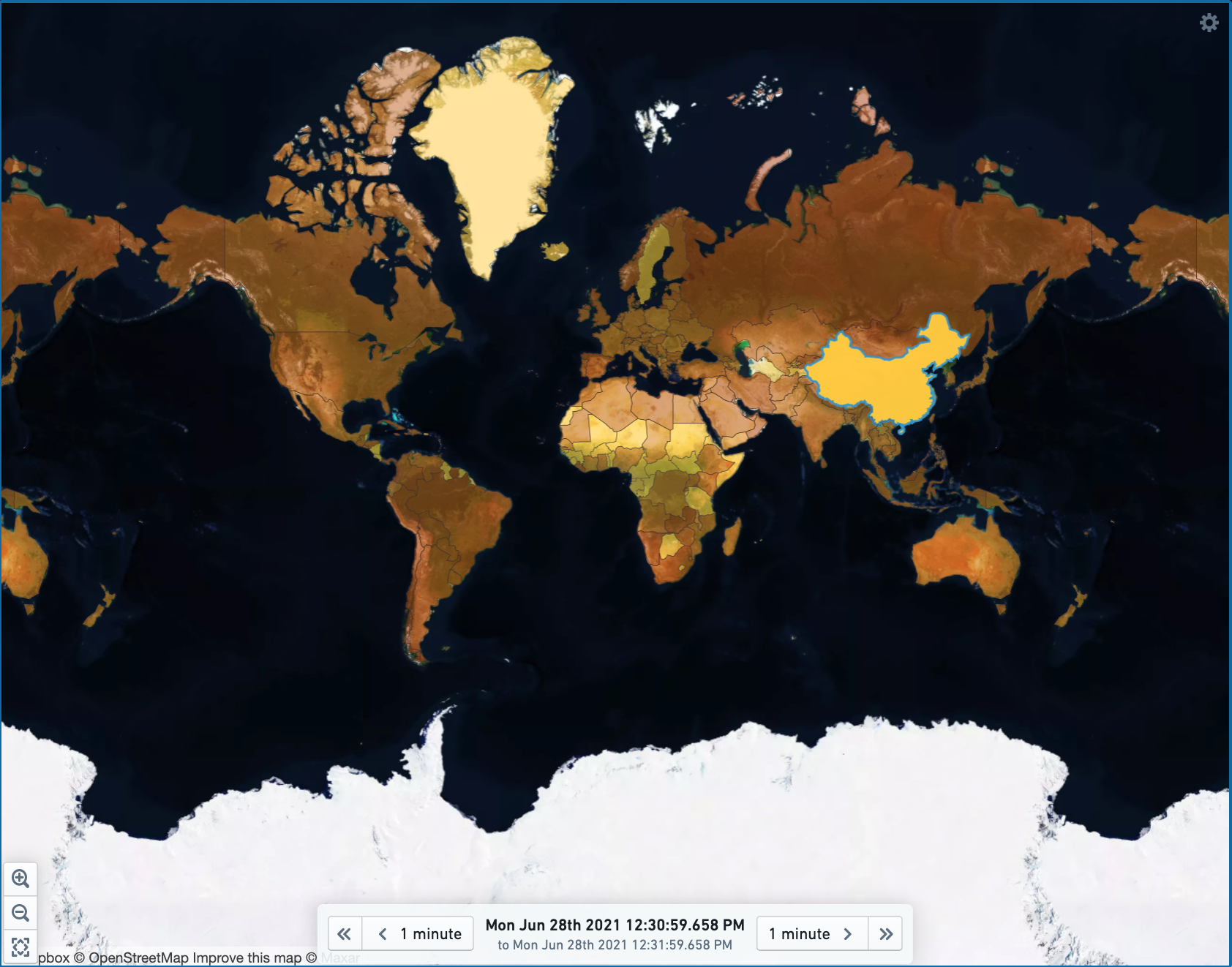
The Map widget has a built-in time stepper that allows users to "step" forward and/or backward in time in order to see how the data on their map changes over time.
The time stepper works by publishing an object set filter (corresponding to the time window selected by the user) to a configured object set filter variable. This filter variable can be used to filter the object set that backs one or more layers shown on the map, in order to return only the objects relevant to that time window.
In order to leverage the time stepper, we recommended that the temporal objects used contain an object with some measurement per some unit of time. Each object should have a date or timestamp property that can be filtered on, such that filtering for a given window of time would allow you to load individual objects (or aggregate the objects in that window) to obtain the data to be displayed on the map.
The below screenshot shows an example map with time stepper configured:
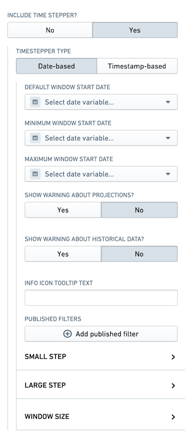
The below screenshot shows configuration options for time stepper controls:
The core configuration options for the time stepper are the following:
- Time stepper type: This option allows setting the time stepper based on either date or timestamp.
- Default window start date (timestamp): Default date (timestamp) when the map widget first loads.
- Minimum window start date (timestamp): Lower bound for the date (timestamp) range user can select.
- Maximum window start date (timestamp): Upper bound for the date (timestamp) range user can select.
- Show warning about projections: Configurable text of an info button displayed when the time stepper is in the future.
- Show warning about historical data: Configurable text of an info button displayed when the time stepper is in the past.
- Info icon tooltip text: Tooltip text to help convey the information to the user.
- Published filter: Outputs an object set filter variable that allows filtering the object set being mapped based on the date (timestamp) range selected in the time stepper.
- Small step: Allows configuring the behavior of the small step. This defines how much the time will be rewind/advanced on clicking the small step.
- Large step: Allows configuring the behavior of the large step. This defines how much the time will be rewind/advanced on clicking the large step.
- Window size: Defines the range of date (timestamp) from the start date. For example for date based time stepper, if start date is 1st Jan and window size is 1 Day, then selected date range will be from 1st Jan to 2nd Jan.
Configure viewport filter controls
The below screenshot shows an example configuration of a viewport filter.
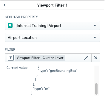
A viewport filter outputs an object set filter variable; this allows filtering of the object set being mapped, based on the visible boundaries of the map in the widget. For example, for a map with airport locations mapped, if a user zoomed to the United States, the viewport filter will produce a filter variable which allows filtering the object set to contain objects only for US airports.
For a choropleth layer to use view port filtering, the object type being mapped needs to have a geohash property; this could be the centroid of the region.