- Capabilities
- Getting started
- Architecture center
- Platform updates
Links
The Links widget is used to display the links relationship between objects and provide exploration into those paths. A module builder configuring a Links widget can:
- Choose the input object set which may contain one or more object types
- Select which specific links are expanded, displayed, sorted upon
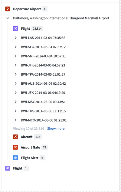
The screenshot below shows an example of a configured Links widget displaying a single Flight Alert’s linked objects. The Flight Alert’s linked Departure Airport has been expanded further in this screenshot to show its links.

Configuration options
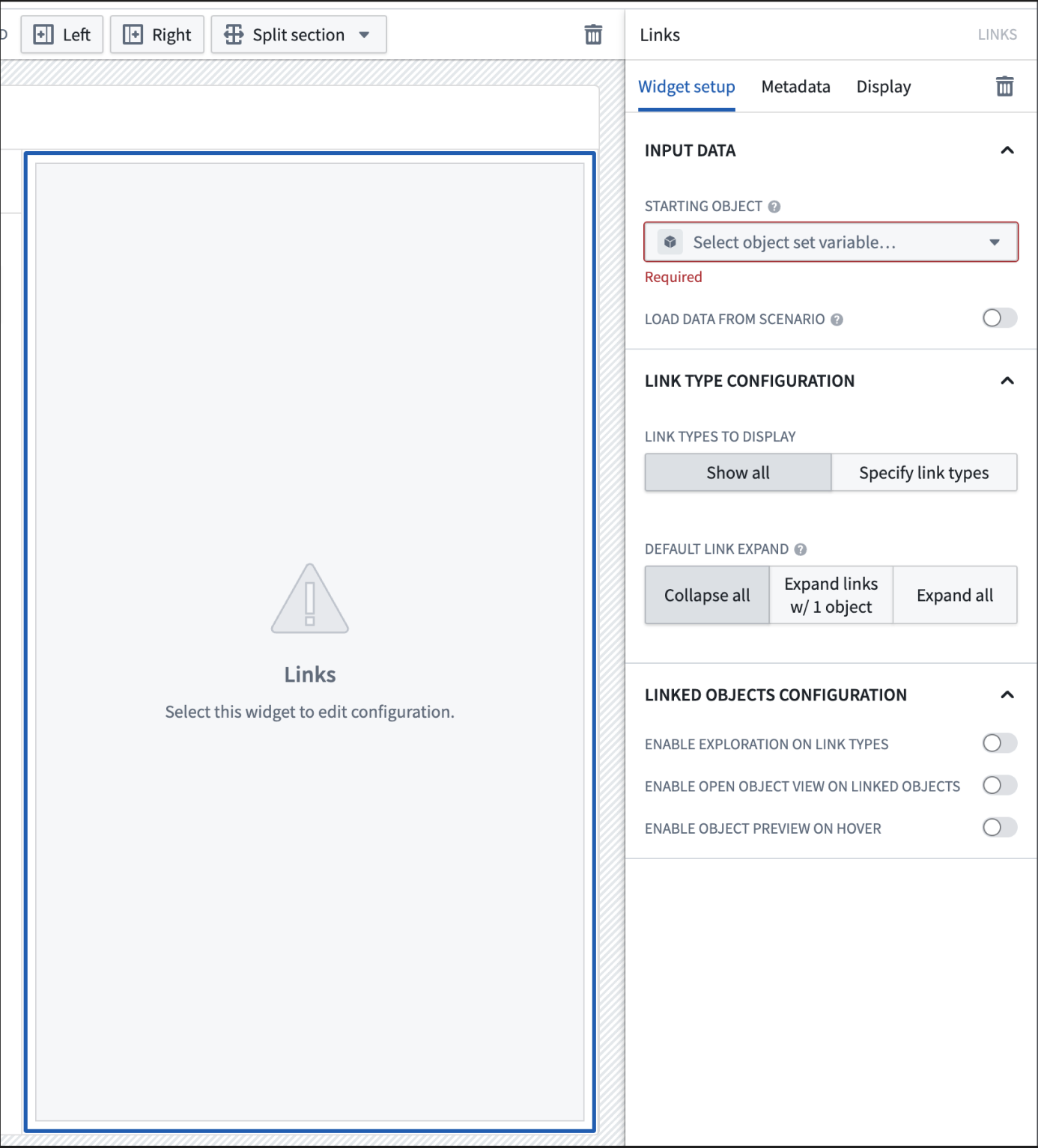
The following image shows the initial state of a Links widget and its configuration panel:

A Links widget has the following configuration options:
- Input data
- Object set: Determine the data that will be displayed within the widget. A module builder can either reuse an existing object set variable created elsewhere in this module or define a new object set variable inline. Selecting an object set here will make certain configuration options below available for configuration.
- Load data from scenario: Enable the use of scenario variables.
- Link type configuration
- Link types to display: By default, all links are shown in the links widget. By choosing “Specify link types“, granular controls and features such as link level sorting can be configured. Additional details are available in the following section, specified link configuration options.
- Default link expand: Specify the number of links that will be auto-expanded by default in the first level.
- Linked objects configuration
-
Enable exploration on link types: At each link type level, enable a button to allow viewing the link type in Object Explorer.

-
Enable open object view on linked objects: For each linked object, enable a button to allow opening the linked object's Object View in Object Explorer.

-
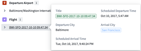
Enable object preview on hover: When hovering over on the title of a linked object, preview the linked object’s properties. By default, the popover includes the linked object’s prominent properties but can be configured for custom properties by specifying links.

-
Specified link configuration options
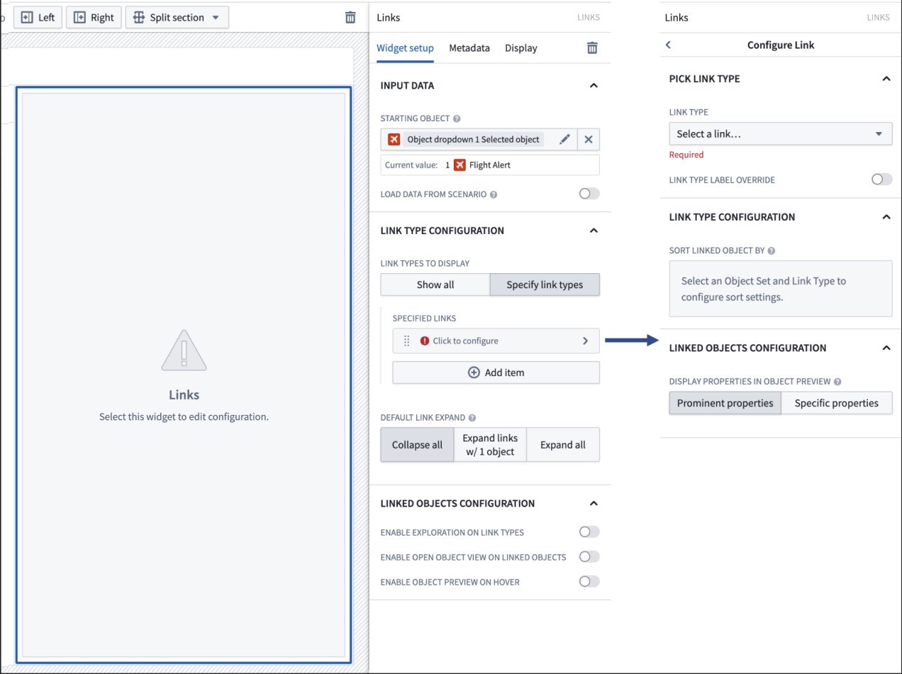
The following image shows the initial state of a Links widget and its configuration panel when Specify link types is selected:

The Links widget's configuration panel options for specified links are the following:
- Pick link type
- Link type: Once a starting object set has been selected, choose the link type from a dropdown to be displayed on the widget.
- Link type label override: The link type’s label can be overridden with a new label for the link type.
- Link type configuration
- Sort linked object by: Once a link type is chosen, a property and sorting direction can be configured.
- Linked objects configuration
- Display properties in object preview: If "Enable object preview on hover" is enabled, the specified link type’s linked objects can be configured to show its prominent properties or specified properties in a preview popover.