- Capabilities
- Getting started
- Architecture center
- Platform updates
Button Group
The Button Group widget allows application builders to add buttons to a Workshop module that can trigger Actions and Workshop events, open URLs, or start an export. Builders configuring a Button Group widget can do the following:
- Choose between the following three button types:
- Inline buttons that provide a single option
- Menu buttons that provide multiple options
- Two-part buttons that contain a primary button alongside an additional menu of options.
- Configure On click for each button to trigger an action, trigger a set of events, open a URL, or begin an export.
- Adjust styling by setting the color, icon, size, and fill options of each button.
- Configure a conditional disabled state or conditional visibility based on the value of a Boolean variable.
The screenshot below shows an example of two rows of configured Button Group widgets and highlights the different button type and display options provided:

Widget configuration options
The screenshot below shows the configuration options available for the Button Group widget:
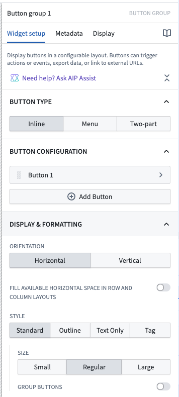
For the Button Group widget, the core configuration options are the following:
- Button type
- This three-way option controls the type of button displayed, with the following choices:
- Inline buttons that provide a single option
- Menu buttons that provide multiple options
- Two-part buttons that contain a primary button alongside an additional menu of options
- This three-way option controls the type of button displayed, with the following choices:
Button configuration options
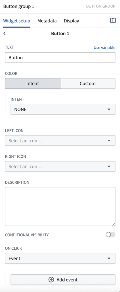
The screenshot below shows the configuration options available for a button within the Button Group widget:
- Add button: Selecting this option adds another button / menu item to this button group.
- Duplicate button: Selecting this option creates a copy of an existing button's configuration, allowing builders to quickly replicate button settings.
- Button text: This parameter sets the display text for a given button or menu item.
- Button color: This configuration controls the coloring of a given button or menu item. You can choose either a preset "intent" with an associated color, or specify a custom color. Intent options and their associated colors include none, primary (blue), success (green), warning (amber), and danger (red). You can use the custom option to pick from a wider variety of color options, including setting a color using a hex code.
- Left icon: This parameter controls the icon displayed to the left of a button / menu item's display text. Set to Blank to not show an icon.
- Right icon: This parameter controls the icon displayed to the right of a button / menu item's display text. Set to Blank to not show an icon.
- Description: This parameter will show up to the user as a tooltip when hovering over the button.
- Conditional visibility: If conditional visibility is toggled on, the following options will be available:
- Boolean variable: This is the variable that will be used to determine the conditional state of the button.
- State if false: This option controls if the button should be disabled or hidden when the selected variable value is false.
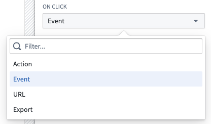
- On click: This option controls what is triggered when a user interacts with a button or menu item. Options include triggering Actions, one or more Workshop events, opening URLs, or starting an export. If multiple Workshop events are configured, updates to variable state may not be complete before the rest of the events run. A full list of On click options can be found below.
- Display & formatting
- Minimal style: If enabled, this option removes the border from a button. If a color has been applied, the background color and text color of the button / menu item will be reversed (for example, a primary-intent button could flip from having a blue background and white text to having a white background and blue text).
- Tag style: If enabled, this option adjusts a given button to have a more narrow tag styling.
- Large style: If enabled, this increases the overall size of a button.
- Fill available horizontal space in row and column layouts: If enabled, this button group will fill the horizontal space of its containing section.
- Scenarios
- When using the button group to create an action, you can choose whether to apply the action to a Scenario or to the Ontology.
- Apply to Scenario: Enable this toggle to apply this action to a Scenario instead of the main Ontology.
- Select Scenario variable: Select the Scenario variable to apply this action to.
- See the Scenarios documentation for more information on Scenarios.
On click
Buttons can trigger actions, layout events, URLs, and different types of exports. Each option is described in detail below.
Actions
Actions allow users to easily create, edit, delete, and link objects in pre-defined ways and can be triggered by Workshop events. As an example, an application builder could configure a Button Group widget within a module to trigger a "Modify Flight Destination" action that allows the user to edit the Destination property on a select Flight object.
Learn more about configuring and exposing Actions within a Workshop module.
For more details on Actions in general, review our action type documentation.
Chaining an event with an action
When configuring a button to trigger an action, you can also configure a Workshop event to occur at a specific point in the action's lifecycle. At the bottom of the widget configuration, select one of the following event trigger options:
- On start of action submission: The configured event occurs when the action submission begins.
- On successful completion of action submission: The configured event occurs after the action has been successfully submitted.
This allows you to chain an action and an event on a single button, enabling workflows such as refreshing data, navigating to another page, or updating variables after an action completes.
Event
Review our events documentation for full details on using events in Workshop.
URL
URL events trigger the opening of specified URLs from within a Workshop module. For example, an application builder could use a URL event to navigate within Foundry and open the Object Explorer application, or designate an external website to open when a user selects a given Button Group widget.
The screenshot below shows an example definition of an external URL event from within a Button Group widget:
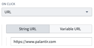
When defining an external URL, include the prefix https://.
Export
Export events take an object set variable as an input and trigger the export of the objects in the object set to either Excel or the user’s clipboard. An application builder may optionally configure a file name and select the set of properties that should be included in the export.
The screenshot below shows an example definition of an Export event from within a Button Group widget:
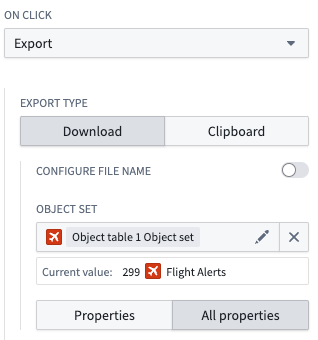
Note that if function-backed columns or linked object columns are included, the export file format will be CSV and not Excel.
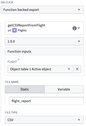
Function-backed export
Function-backed exports take a Function and its inputs, and download the output into a specified file type such as PDF. For a Function to be exportable, its output must be a string. Below is a sample Function-backed export definition from within a Button Group widget:
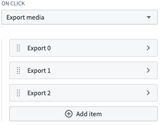
Export media
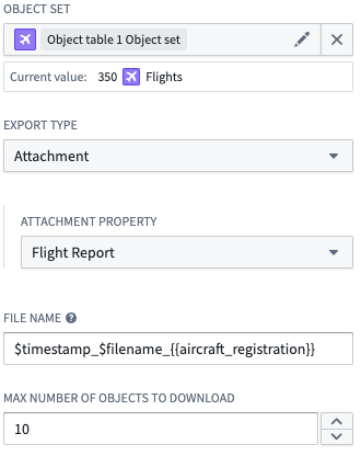
Export media events take a list of exported items and trigger the download of all media associated with those items. To configure an export item, select the object set, type of media, media property, and max number of objects to download. You can configure a custom file name for downloaded media, with substitutions available for the current timestamp, original file name, and non-primary key object property values. If no custom file name is provided, the original file name will be used.
Below is a sample export media event definition from within a Button Group widget:
A sample export item definition is shown below: