- Capabilities
- Getting started
- Architecture center
- Platform updates
Layouts
Workshop layouts allow builders to configure how the user interface of a module is organized. The main layout components of a Workshop module (the header, pages, sections, and overlays) are described in detail in the sections below. Layout elements may be edited by selecting the Layout sidebar panel and selecting the element to configure, or by selecting the element in the main module view.
Header
The header in a Workshop module serves as a persistent toolbar for module-wide titles, tabs, and buttons. When creating a new module, the module header will be visible at the top of the screen:

When the header is selected, the plus (+) signs allow widgets such as tabs and button groups to be added to the header, making them easily accessible across all pages of a Workshop module. If the module header is hidden, it may be selected with the Header option that appears at the top of the list found in the Layout sidebar panel.
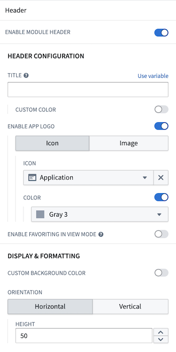
Configuration options
Configuration options provided for a module header include:
- Toggle header visibility.
- Set a title for the header. This title will also be used to set the browser tab or Carbon workspace tab name. If a title is not set, the Workshop module resource name will be used instead.
- Choose a custom color for the title text.
- Enable an application logo by choosing an icon or uploading an image.
- Icon: Choose an icon and an icon color.
- Image: Select an image from your Palantir resources or upload one from your computer.
- Customize the image height.
- Position the image: Choose left, center, or right for horizontal headers; choose top or bottom for vertical headers.
- Toggle the ability for users to favorite the module in view mode.
- Select a background color for the header.
- Choose the header's orientation: horizontal (at the top) or vertical (on the left) of the module.
- Set the header height for horizontal headers.
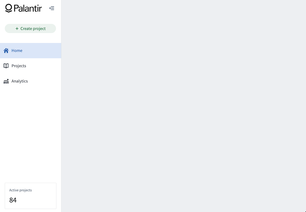
When configured, a horizontal header with a custom image can look like the following example:

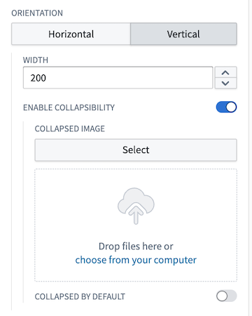
You also have the option to configure a vertical header, which will be displayed on the left side of your module. Once you enable the vertical orientation, several additional settings will become available for customization:
- Set the width of the vertical header.
- Enable collapsibility, with the option to set it as collapsed by default.
- Add a custom image for the collapsed state, either by selecting from your Palantir resources or uploading from your computer.
- To display a collapsed image, you must first set up a header image as outlined above. If you opt for an icon instead, the chosen icon will appear in the collapsed state.
When enabling collapsed headers, the Button Group and Tabs widgets will also have collapsed states that will only show the icons; the text will be dropped in this state. All other widgets will be hidden when a module header is collapsed.
The example below shows a configured vertical module header:
And its collapsed state:
Pages
Pages allow module builders to construct complex, multi-screen applications in Workshop. Each page is a blank canvas on which a module builder can configure a unique set of widgets to support the targeted workflow. Only the module header will persist between pages to provide an overarching toolbar for a given module.
In the example module header shown above, each tab in the Tabs widget could be configured to select a page, with each page configured with a different user workflow.
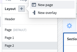
Add a page
Pages can be added from within the Layout panel on the left side of the screen. To add a page, open the Layout panel, then select the plus (+) sign on the top. Next, select the New page option, as shown below:
Once added, the new page will be auto-selected within the Layout panel and you can begin configuring its contents. The below screenshot showcases the default, unconfigured page that is initialized with two vertically divided sections beneath the module-wide header:
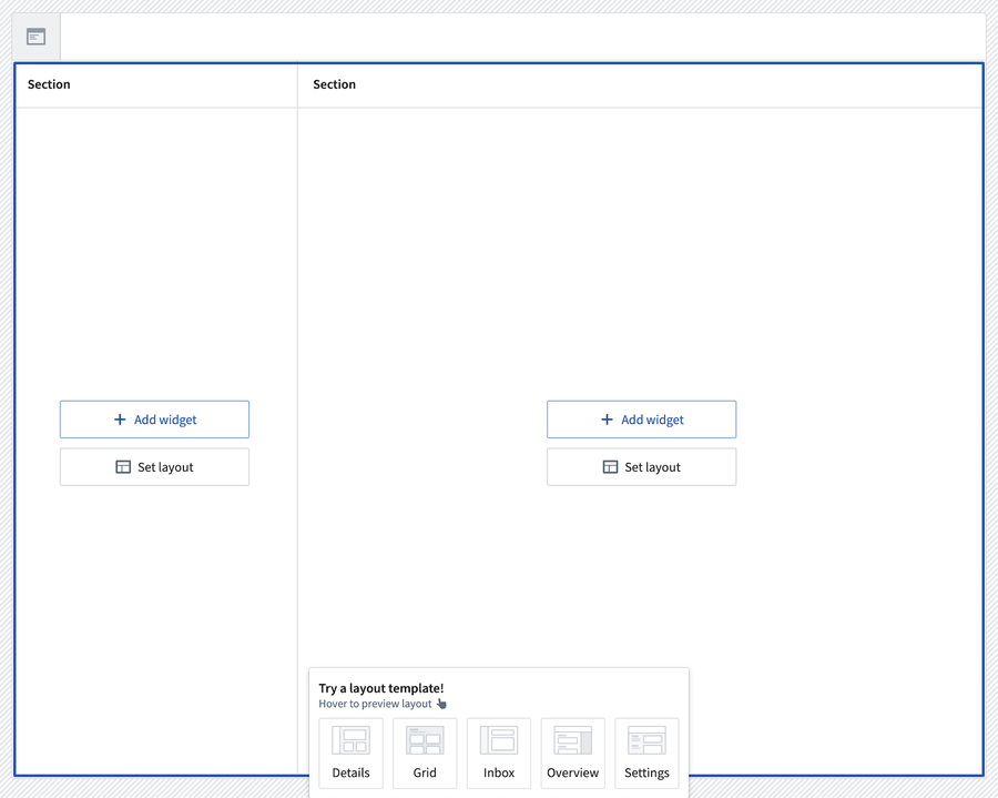
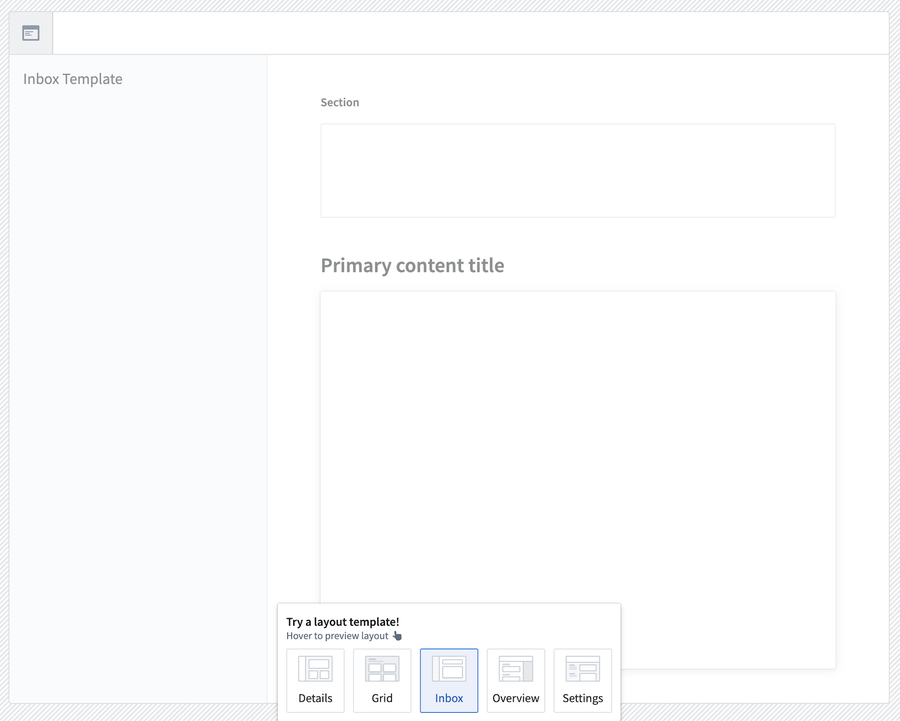
You can also explore other layout templates using the layout template picker at the bottom of the page. You can preview what each layout would look like by hovering over its icon. If you would like to use a template, you can select that icon; the page layout will update to the one you selected.
When editing your application, pages are listed in the order in which they are created. Page order as seen in edit view has no impact on module behavior.
For more detail on how to add content to pages by adding and configuring sections, review the sections documentation below.
Switching pages with Layout events
To navigate users between the pages of a module, a builder can use a Layout event. This can be triggered from within widgets such as the Button Group or Tabs.
Sections
Sections are the components of each page and overlay that allow module builders to subdivide the user interface. Each section is configured to contain one or more widgets, or a layout, which itself may contain one or more sections.
Section layouts
In edit mode, the Add widget and Set layout options appear when you hover over sections in your module layouts. To access available layout options for a section, choose Set layout on any empty section in your module and examine the Layout options as shown below:
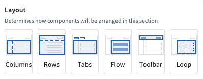
The currently supported Layout options include:
- Columns: Enables sections to be split vertically to effectively create a new column in a module.
- Rows: Enables sections to be split horizontally to effectively create a new row in a module. The Enable scrolling option is available in the Rows layout.
- Tabs: Adds tabs to the top of a section and allows module builders to configure different configurations of widgets within each tab of a section.
- Flow: Turns the current section in a vertically scrolling container to allow module building to configure widgets that stretch beyond the displayed interface of a module.
- Toolbar: Configures sections to function as a horizontal toolbar optimized for smaller widgets like Button Groups or Metric Cards, along with single input widgets.
- Loop: Loop layouts allow a builder to loop over an object set or array, displaying an embedded module for each object in the set or each entry in the array. Learn more in the loop layouts documentation.
Section drop zones
Sections can be configured as drop zones to receive drag payloads from other Workshop components or external applications. This enables cross-application interactivity workflows where users can drag objects onto a section to populate variables or trigger events.
To configure a section as a drop zone, select the section and toggle Drop Handling in the configuration panel. For detailed configuration instructions and information about compatible drag zones, refer to the drag and drop in Workshop documentation.
Conditional visibility indicators
Sections can be configured with conditional visibility to show or hide based on variable values. The layout panel displays icons and tooltips to indicate which sections have conditional visibility enabled, making it easier to identify and manage conditionally visible sections even when they are currently hidden in the module view.
Duplicating sections
Cut, copy, and paste options are available for whole sections and individual widgets within a module, providing tools for a faster module building experience.
When pasting sections or widgets, builders have two options for managing the new section’s or widget’s input variables:
- Paste with same input variable: Paste a new section or widget that reuses the copied section’s or widget’s input variables.
- Paste with duplicate input variables: Pastes a new section or widget that uses newly created input variables that match the copied section’s or widget’s input variables.

Overlays
Overlays may be used when certain sections should only appear when contextually relevant in a workflow. Overlays will appear as a layer on top of the selected page.
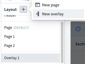
Similarly to pages, you can add overlays rom within the Layout panel on the left side of the screen. To add an overlay, select the (+) sign on the top. Next, select the New overlay option, as shown below:
Configuration options
- Overlay name: This setting determines the name used to refer to this overlay throughout the Workshop editor. Notably, this is relevant in Overlay events.
- Show overlay header: This setting determines if the default overlay header should be shown. The overlay header comes with a default close button and provides the additional configuration options:
- Title: This setting allows a title to be configured that will be shown in the header of the overlay.
- Icon: This setting allows an icon to be selected that will be shown to the left of the title in the header of the overlay.
- Variable based visibility: This setting allows a Boolean variable to be selected which will determine if the overlay should be visible. This setting allows for overlays that are in an initially visible state when the module loads, as well as enabling advanced control over the overlay visibility state. This setting may also be useful when using overlays in combination with embedded modules, as this allows the overlay state to be shared and set between a parent and child module through Set Variable Value events. Layout events which change the overlay visibility state, will update the value of this variable.
- On close: This option allows a Workshop Event to optionally be configured run when the overlay is closed. If Variable based visibility is configured with a Boolean variable that comes from an object property or variable transformation, this event can be used to reset the condition that lead to the overlay being in the open state.
- Close overlay on backdrop click: This toggle determines if the overlay should close as a result of a user selecting the area outside of the overlay.
- Add background behind overlay: This toggle determines if an opque background should be added behind the overlay. This is enabled by default and helps to bring a user's focus to the open overlay.
Overlay types
Currently, Workshop supports two overlay types: drawers and modals. These types are explained in detail below.
Drawers
Drawers are overlays that slide out from the side of the screen. Available configuration options for drawer overlays include the following:
- Position: Choose the right or left position to determine from which side of the screen the drawer will appear.
- Size: Set the width of the drawer.
Modals
Modals are overlays that appear in the center of the screen. Size is the only available configuration option specific to modal overlays.
Style formatting
Workshop offers control over various style formatting settings to give application builders more customizability to the design and feel of their modules. Configuration options include header formatting, background colors, border styles, and more. These options are available at the page, section, and widget levels.
Header formatting
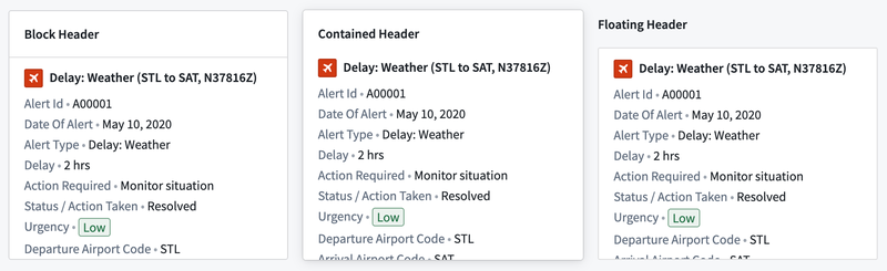
Header formatting options can be added when the header is enabled on a section. There are three available:
- Block: The section header is in its own container above the body.
- Contained: The section header appears to be contained within the body area.
- Floating: The section header appears above the body area and is visually on the background of the parent section.
Background colors
Background colors can be added to pages, sections, and widgets to help visually segment parts of a module. There are five preset shades for both light mode and dark mode, Blueprint colors, and a transparent option available.


In addition to preset shades, you can apply a custom hex color to section and page backgrounds. Select the custom color tile to open the color picker to enter a hex code or choose from Blueprint color shortcuts. Saved colors defined at the module level are also available as background color options for sections and pages.
When a custom background color is applied to a section, widgets within that section automatically switch between light and dark mode based on the brightness of the background, ensuring text and controls remain legible.

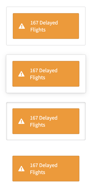
Border styles
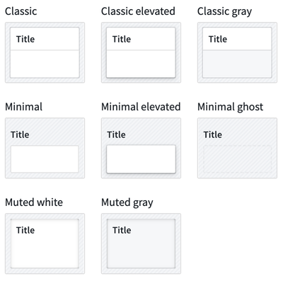
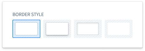
Border styles can be configured on sections and widgets, giving the appearance of different elevation levels within a module. There are four options available:
- Bordered: The standard single outline around the section or widget.
- Outer drop shadow: A shadow outside the border to give the section or widget an elevated appearance.
- Inner shadow: A shadow inside the border to give the section or widget a depressed appearance.
- Borderless: No outline around the section or widget so it blends into the background.
Padding controls
Padding can be configured for pages and sections to set a consistent amount of padding or space around all child components within. Padding adds space between components to provide separation and breathability to the module. There are five options available:
- No padding: The standard option with no padding added around child components.
- Compact: Adds 16 pixels of padding around child components.
- Regular: Adds 24 pixels of top/bottom padding and 48 pixels of left/right padding around child components.
- Large: Adds 40 pixels of top/bottom padding and 62 pixels of left/right padding around child components.
- Custom: Allows custom definitions of padding levels to be set around child components.
Inner section style: Optionally select one of various pre-defined section styles to be applied to all children sections: