- Capabilities
- Getting started
- Architecture center
- Platform updates
Custom styles on widgets
Custom styles on widgets allow users to apply custom CSS on individual widgets. The styles are not shared with other widgets in the application. Custom styles are accessed from the right sidebar when selecting a widget. Navigate to the Styles tab in the sidebar and find the custom styles section at the bottom of the panel.
Custom styles on widgets are a great way to test and develop styles. Set background colors, font sizes, border radius, and more in a quick and easy way. Make changes on a single widget and preview the result in the canvas, without risking to change other parts of the application.
Custom styles can collide with styles from the stylesheets, which can lead to unexpected results. This happens when both try to change the same CSS properties of the same class (for example, stylesheets and custom styles changing the background color of a widget). To avoid these collisions, custom styles should only be used for development and iterations, while the stylesheet is ideal for managing complex styles.
This guide walks you through styling a text widget.
-
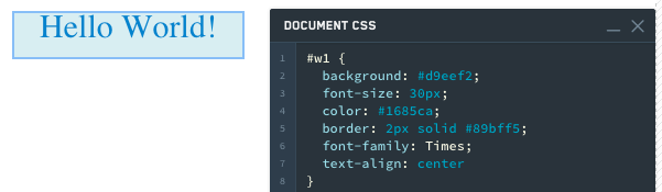
Add a text widget and enter
Hello World. -
Common things to change in a text widget are color, font, alignment and border.
Copied!1 2 3 4 5 6 7 8#w1 { background: #d9eef2; font-size: 30px; color: #1685ca; border: 2px solid #89bff5; font-family: Times; text-align: center }
-
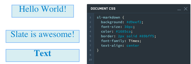
Add another text widget and enter
Slate is awesome. -
Notice that the styling does not apply to this new text widget because we used the selector
#w1to specify that we only wanted these changes to apply to that first widget. We could simply change the CSS to#w1,#w2to have our styling apply to both text widgets. However, what happens when we add another text widget and want the same styling? -
Change the following in the Styles editor:
Copied!1 2 3 4 5 6 7 8sl-markdown { background: #d9eef2; font-size: 30px; color: #1685ca; border: 2px solid #89bff5; font-family: Times; text-align: center }sl-markdownis the element tag, and the code is saying use this styling for all markdown widgets. -
Add a third text widget. Notice that it styles automatically.
-
Finally, keep the current CSS and add CSS for #w1.
Copied!1 2 3 4 5 6 7 8 9 10 11 12 13 14 15 16sl-markdown { background: #d9eef2; font-size: 30px; color: #1685ca; border: 2px solid #89bff5; font-family: Times; text-align: center } #w1 { background: #f1cbd5; font-size: 30px; color: #ca1629; border: 2px solid #eb5c81; font-family: Helvetica; text-align: center }Notice that this correctly styles w1 differently from the other two widgets.
