Design guidelines
Adding appropriate styling to your drop zones is crucial for making them usable and discoverable to users. By styling your drop zones in a consistent manner, you make clear which elements in your application are valid drop zones. In the example below, users would not be aware of this workflow if the drop zones did not provide visual feedback by "lighting up".
Following the recommended styling ensures that users will have a cohesive experience when dragging data between your application and the Palantir platform. This will clarify and improve the user experience, as applying custom styling might add confusion to the different drop zone states and end behaviors.
We provide design standards for the following concepts:
- Drop zones: Show users where to drop their drag payload.
- Toasts: Provide feedback on drop success or failure.
- Dialogs: Provide options for user decisions on where to send dropped data.
Drop zones
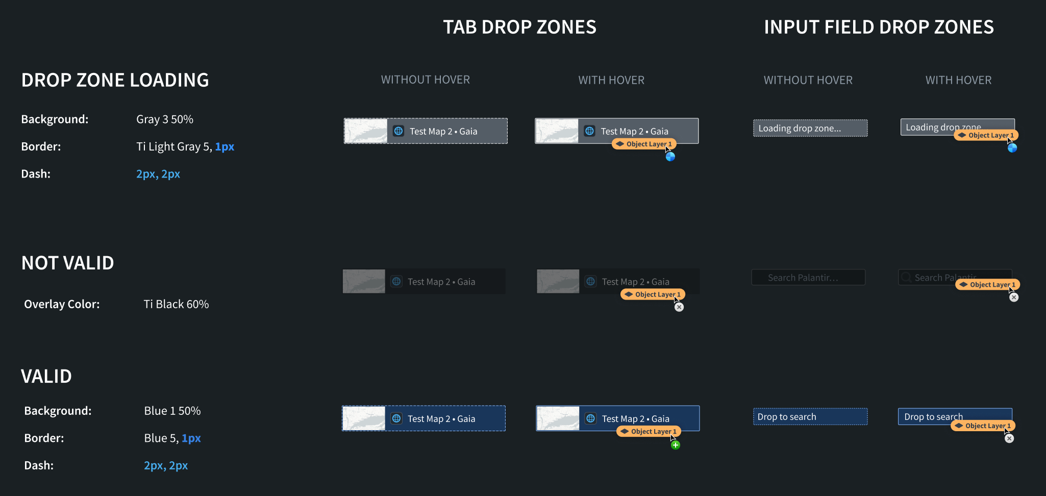
We recommend applying styling for three different states: valid drop, invalid drop, and loading. For all of these states, we recommend applying different styles when the drag payload hovers over the drop zone.
Drop zone states
Valid drop
This style should be applied when your drop zone accepts the current drag payload. For example, if the drop zone accepts the Gotham object media type and the user starts dragging a Gotham object, the "valid drop" styling should be applied to the drop zone.
Invalid drop
This style should be applied when your drop zone does not accept the current drag payload. This lets users know that they cannot drop their current drag payload onto a given drop zone because it does not contain a valid media type. For example, if the drop zone only accepts the Gotham object media type and the drag payload contains the text/html media type, the "invalid drop" styling should be applied to the drop zone.
Loading
This style should be applied if the drop zone has to perform asynchronous work in order to determine whether it accepts the current drag payload. On the Palantir platform, loading styles are applied while data is being enriched.
See below for an overview of our drop zone styles and see the Blueprint documentation ↗️ for recommended colors.
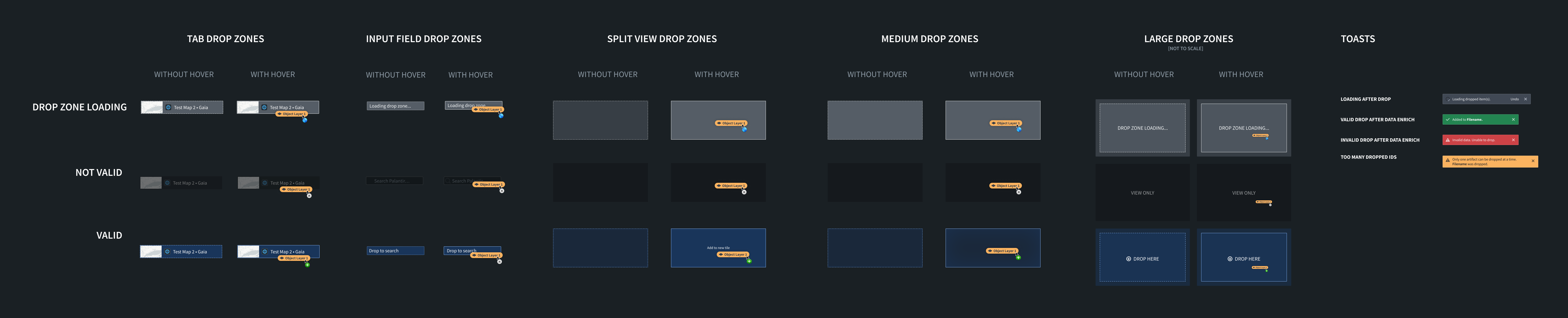
Small drop zones
These styles should be applied to smaller drop zones in your application, such as drop zones in the tab bar or in form input fields.
CSS Snippets
Loading
Copied!1 2 3 4 5 6 7 8.loading-small { background: rgba(143, 153, 168, 0.5); // gray3 50% border: 1px dashed #F6F7F9; // light-gray5 } .loading-small-drag-hover { border: 1px solid #F6F7F9; // light-gray5 }
Not Valid
Copied!1 2 3.not-valid-small { background: rgba(18, 21, 24, 0.6); // black 60% }
Valid
Copied!1 2 3 4 5 6 7 8.valid-small { background: rgba(24, 74, 144, 0.5); // blue1 50% border: 2px dashed #8ABBFF; // blue5 } .valid-small-drag-hover { border: 2px solid #8ABBFF; // blue5 }
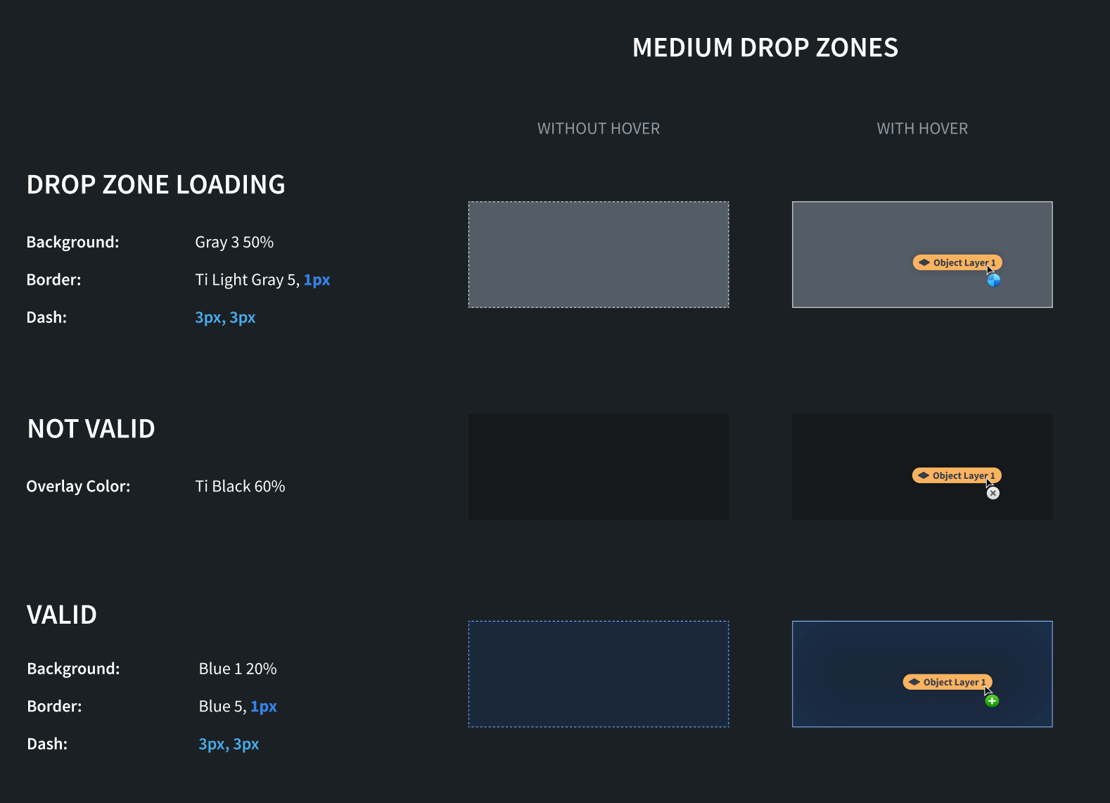
Medium drop zones
These styles should be applied to medium drop zones in your application, such as object cards.
CSS Snippets
Loading
Copied!1 2 3 4 5 6 7 8.loading-medium { background: rgba(143, 153, 168, 0.5); // gray3 50% border: 1px dashed #F6F7F9; // light-gray5 } .loading-medium-drag-hover { border: 1px solid #F6F7F9; // light-gray5 }
Not Valid
Copied!1 2 3.not-valid-medium { background: rgba(18, 21, 24, 0.6); // black 60% }
Valid
Copied!1 2 3 4 5 6 7 8.valid-medium { background: rgba(24, 74, 144, 0.2); // blue1 20% border: 2px dashed #8ABBFF; // blue5 } .valid-medium-drag-hover { border: 2px solid #8ABBFF; // blue5 }
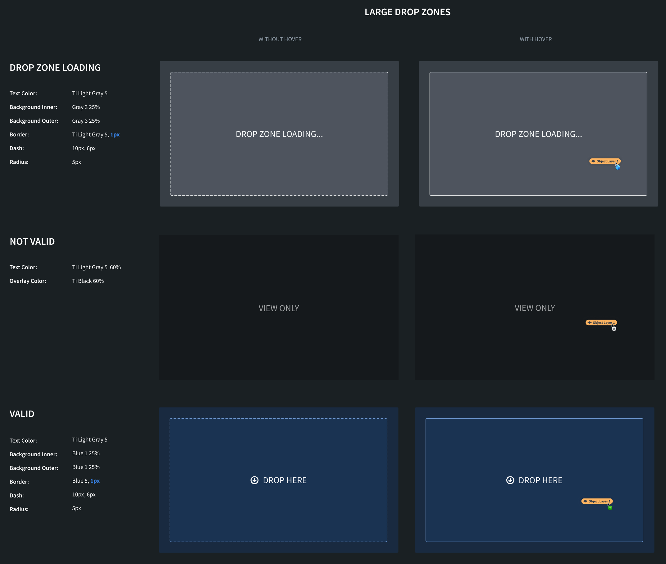
Large drop zones
These styles should be applied to large drop zones in your application, such as an entire map.
CSS Snippets
For large drop zone styles, we apply different inner and outer styles.
Loading
Copied!1 2 3 4 5 6 7 8 9 10 11 12 13 14 15.loading-inner-large { background: rgba(143, 153, 168, 0.25); // gray3 25% border: 3px dashed #F6F8F9; // light-gray5 border-radius: 5px; color: #F6F8F9; light-gray5 } .loading-inner-large-drag-hover { border: 3px solid #F6F8F9; // light-gray5 } .loading-outer-large { background: rgba(143, 153, 168, 0.25); // gray 25% border-radius: 5px; }
Not Valid
Copied!1 2 3 4.not-valid-large { background: rgba(18, 21, 24, 0.6); // black 60% color: rgba(246, 248, 249, 0.6); // light-gray5 60% }
Valid
Copied!1 2 3 4 5 6 7 8 9 10 11 12 13 14 15.valid-inner-large { background: rgba(24, 74, 144, 0.25); // blue1 25% border: 3px dashed #8ABBFF; // blue5 border-radius: 5px; color: #F6F7F9; // light-gray5 } .valid-inner-large-drag-hover { border: 3px solid #8ABBFF; // blue5 } .valid-outer-large { background: rgba(24, 74, 144, 0.25); // blue1 25% border-radius: 5px; }
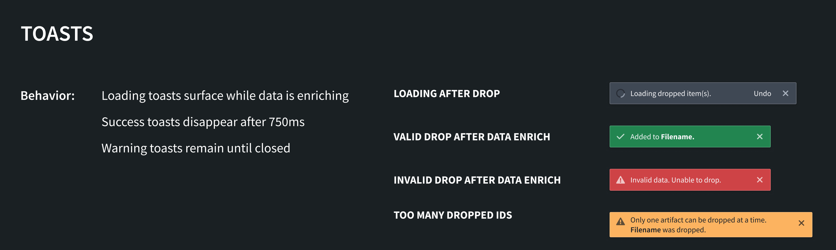
Toasts
We recommend using the following toasts to communicate information about the status of dropped data. You can implement these toasts using the Blueprint toast component ↗️.
Loading after drop
Display this toast if additional processing of dropped data must happen before the application is updated with the transferred data. This may happen if the drop zone needs to enrich the data before something can be done with it.
Valid drop after data enrichment
Display this toast if the drop was valid and the application was able to make use of the dropped data.
Invalid drop after data enrichment
Display this toast if the drop zone initially accepted the drag payload but was unable to use the data after it was dropped.
Too many dropped IDs
Display this toast if the drop zone can only handle one instance of the dropped media type. The application will then only use the first item from the dropped data.
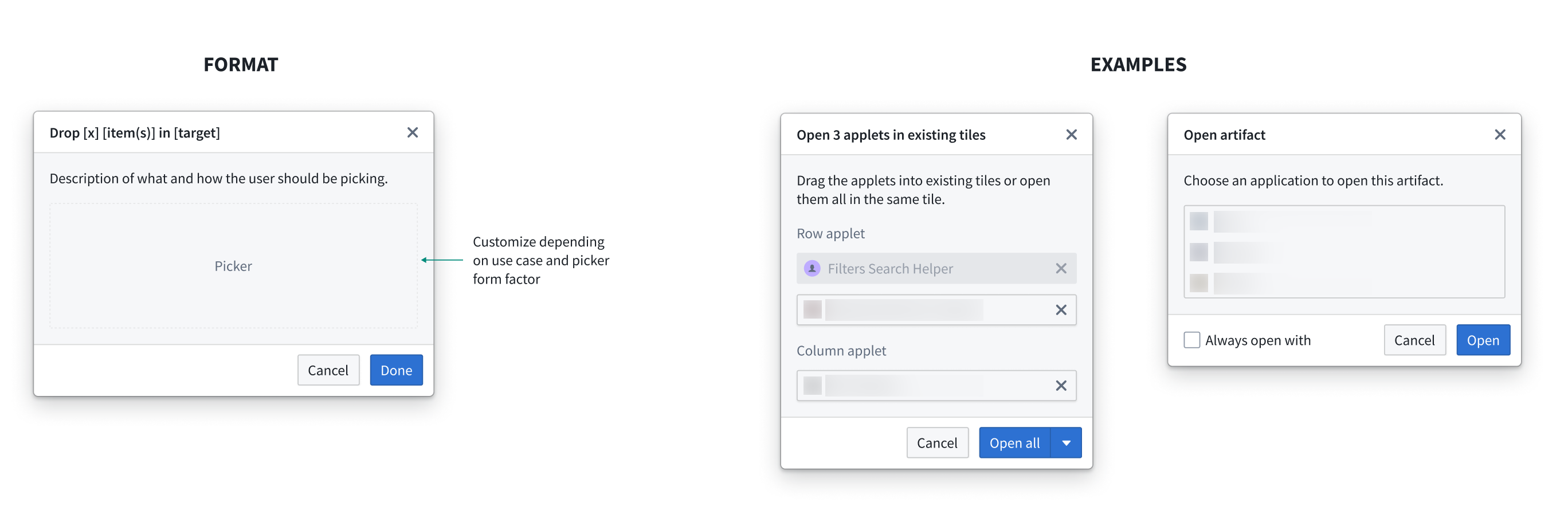
Dialogs
For cases where dropped item(s) require further user decisions and have more than one option, use a dialog prompt as shown below: