- Capabilities
- Getting started
- Architecture center
- Platform updates
Home configuration
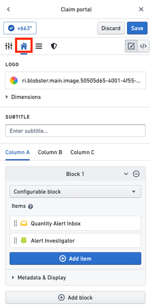
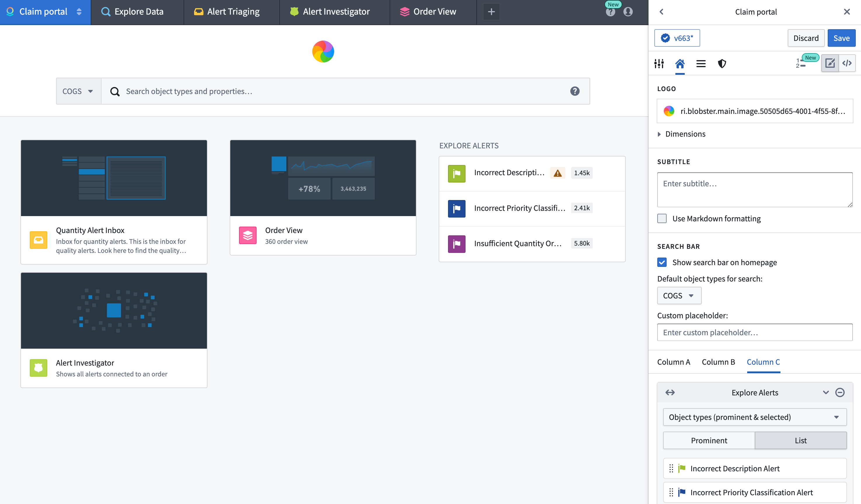
Switch to the Home configuration tab to configure the home page of your workspace. In the Home configuration tab (shown below), you can configure the logo, subtitle, and featured items for a workspace.
Logo
By default, your workspace will have a Palantir logo featured in the top-middle of the Carbon home page. You can display a custom logo that has been uploaded to Foundry by navigating to the Logo section and clicking on Select logo.
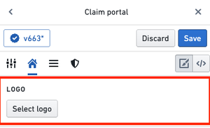
Continue by selecting your image file in a Project. This image file will now replace the default logo in your Carbon workspace.
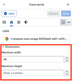
To adjust the size of the logo, expand the Dimensions section, where you can set a maximum width and/or height.
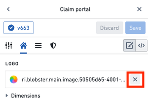
To remove a custom logo, you can hover over the logo preview and select the x icon.
Subtitle
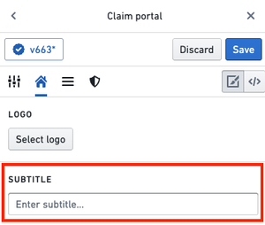
In the Subtitle section, you can add a subtitle to be displayed under the logo on the home page. For instance, you could provide a welcome message or description of the workspace.
Featured items
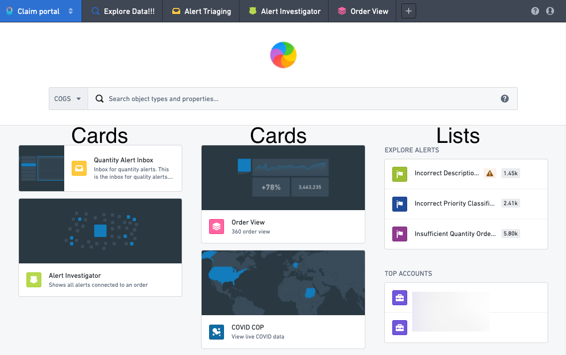
The Carbon workspace can prominently display three columns (labeled A, B, and C) that can contain Featured items. There are various types of Featured items that can be displayed, including objects, object types, saved explorations, and more. We recommend curating the home page to ensure that the workspace features the most useful resources for a user’s work.
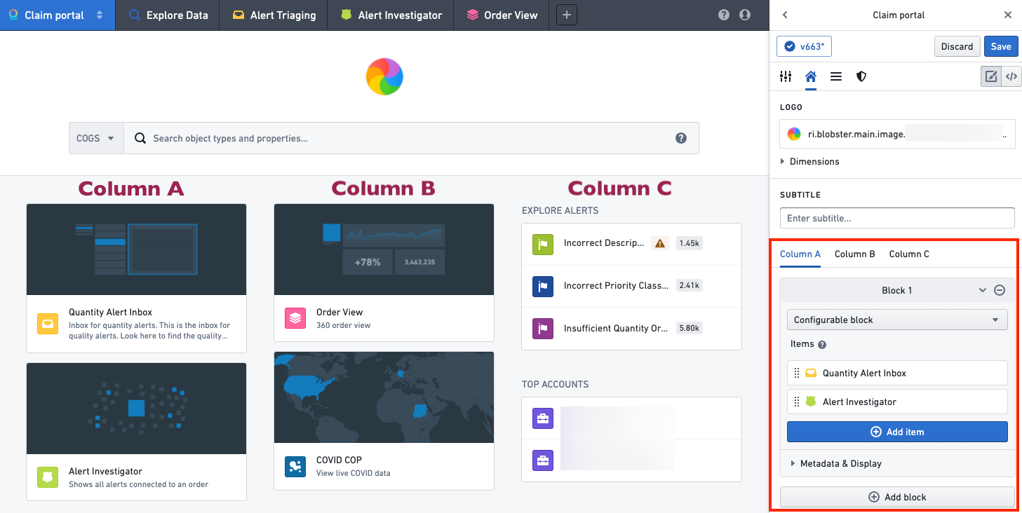
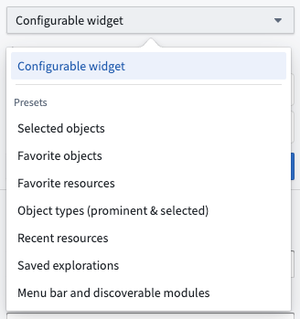
Optionally, columns A, B, and C can contain widgets that group resources together. A widget can be custom configured, or you can select from a list of default options, such as a user's favorite objects or saved explorations.
In a custom configurable widget, each item's appearance can be customized by hovering over the item and selecting the edit icon, which will open an edit dialog.
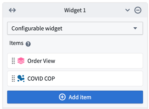
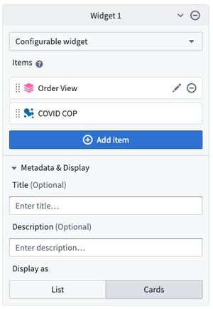
A widget's display can be further configured by adding a title and description and by choosing whether to display the items as a list or as cards. A List display is compact and shows the resource icons along with the name for each element. A Cards display is larger and can include a custom thumbnail image for each element. Cards are generally more useful when there are a small number of items. These options can be configured by expanding the Metadata & Display section in the widget editor.
In the following example, columns A and B each contain one widget displayed as cards, and column C contains two widgets each displayed as a list.
Module-backed home pages
Builders can also configure a module to act as the home page for a workspace. Selecting Replace Home with Compass Resource on the home configuration tab will open a dialog to allow the selection of a module and parameters.
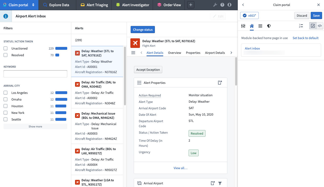
If a module is in use for the home page, builders can reset the workspace to the last configured default home page.
