- Capabilities
- Getting started
- Architecture center
- Platform updates
Simple fields
Foundry Forms is no longer the recommended approach for data entry or writeback workflows on Foundry. Instead, build user input workflows with the Foundry Ontology, representing the relevant data structures as object types and configuring the writeback interaction with Actions. Learn more in the Forms overview documentation.
In a form, simple fields ask for basic input from the respondent. This page discusses the different types of simple fields available in Foundry Forms, excluding Attachments fields.
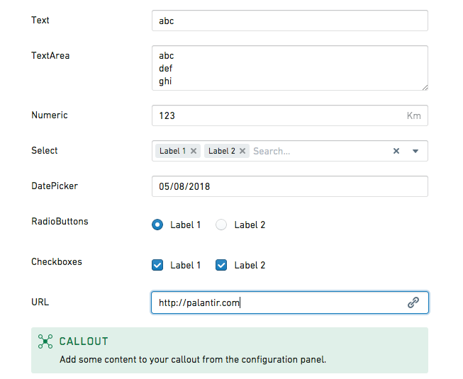
Callout
The callout field highlights important content to the respondent and supports Markdown formatting. Users can configure the following options:
- Create content that references the value of other fields.
- Set a title, background color, and icon.
- Add an image that has been uploaded to Foundry or other sites accessible from Foundry.
The value of a callout field will never write to the backing object type or spreadsheet. If you need to template some text with the value written in a different field, you can use the template field.
Checkboxes
The checkboxes field displays a set of options as checkboxes. Users can configure the following options:
- Provide a list of possible
Valuesalong with their displayedLabels. - Set
Default values. - Display the checkboxes either horizontally or vertically.
Date picker
The date picker field allows respondents to enter a date or timestamp. Users can configure the following options:
- Set a
Time Precision(day, minute, second, or millisecond). - Set a
Recorded formt(the default isYYYY-MM-DDfor dates andYYYY-MM-DDTHH:mm:ss.SSSZZfor timestamps). - Enforce a minimum/maximum date.
- Disable past/future dates.
- Prefill the field with the date of filling.
The default minimum and maximum dates are 25 years from the current date but can be set further in the past or future by changing their configured values. For example, you could enable choosing a date of birth more than 25 years in the past by setting a minimum date in 1900.
In the date picker field, dates are always picked by and displayed to the user according to their timezone. However, when date values are written to the backing spreadsheet or object type, they are always written in UTC to be compatible across timezones.
Dropdown
The dropdown field displays a set of options as a dropdown. Users can configure the following options:
- Provide a list of possible
Valuesalong with their displayedLabels. - Set
Default values. - Allow multiple selections.
- Prefill the field if only one value is available.
- Allow the creation of values other than the ones given.
- Set a
Placeholder. - Use the Code Editor to set
noResultsText: string.
Geocode picker
The geocode picker field allows respondents to enter an address. Using the Code Editor, users can set placeholder: string.
Map picker
The map picker field allows respondents to enter coordinates. Using the Code Editor, users can configure the following options:
- Set
placeholder: string. - Set
location: [double, double]. - Set
initialZoom: double. - Set
displayFormat: "latlng" | "mgrs". - Set
mapboxAccessToken: string. - Set
mapboxStyles: list<string>(view Mapbox documentation ↗).
Numeric
The numeric field allows respondents to enter a number. Users can configure the following options:
- Set a
Default value. - Set a
Unit label(for example,kgorlbs). - Set a
Placeholder. - Show increment/decrement buttons and specify their position.
- Using the Code Editor:
- Set
clampValueOnBlur: boolean. - Set
min: double. - Set
max: double. - Set
stepSize: double. - Set
minorStepSize: double. - Set
majorStepSize: double.
- Set
Radio buttons
The radio buttons field displays a set of options as radio buttons. Users can configure the following options:
- Provide a list of possible
Valuesalong with their displayedLabels. - Set a
Default value. - Display the radio buttons either horizontally or vertically.
Resource picker
The resource picker field allows respondents to select a resource from within Foundry. Users can specify whether respondents are allowed to select folders, datasets, or any resource type.
Slider
The slider field allows respondents to select a number. Users can configure the following options:
- Enforce a minimum/maximum value.
- Set a
Step sizeandLabel step size. - Set a
Unit label(for example,kgorlbs). - Specify how the selected value is labeled.
- Using the Code Editor:
- Set
initialValue: double. - Set
labelPrecision: double. - Set
showTrackFill: boolean.
- Set
Text
The text field allows respondents to enter a single line of text. Users can configure the following options:
- Set a
Default value. - Set a
Placeholder.
Text area
The text area field allows respondents to enter multiple lines of text. Users can configure the following options:
- Set a
Default value. - Set a
Placeholder. - Set the default and maximum number of rows.
URL
The URL field allows respondents to enter hyperlinks. Users can configure the following options:
- Set a
Default value. - Set a
Placeholder. - Display a warning when the format is invalid, and customize the message shown.