- Capabilities
- Getting started
- Architecture center
- Platform updates
Visualize data
In Code Workbook, you can use open-source visualization libraries to display visualizations of your data. These visualizations can then be shared with others, for instance in Notepad documents.
Python Visualizations
In Python, Code Workbook supports visualizations using Matplotlib, Seaborn, and Plotly.
Using Matplotlib and Seaborn
When using Matplotlib, a call to matplotlib.pyplot.show() causes the resulting plot image to be saved in the transform output and returned to the user interface, allowing the creation of customized plots. As with any visualization, you can download this image by right-clicking the transform in the graph and choosing Download image.
Here is an example of a transform that uses Matplotlib to render a visualization:
Copied!1 2 3 4 5 6 7 8 9 10 11 12 13 14 15 16 17 18 19 20 21 22def viz_plot_univariate_distribution_using_histogram(input_dataset): import matplotlib.mlab as mlab import matplotlib.pyplot as plt INPUT_DF = input_dataset SELECTED_COLUMN = "column_to_plot" # Note this should be a numeric column NUM_BINS = number_of_bins # Histogram the selected column bins, counts = INPUT_DF.select(SELECTED_COLUMN).rdd.flatMap(lambda x:x).histogram(NUM_BINS) # Plot the histogram fig, ax = plt.subplots() ax.hist(bins[:-1], bins, weights=counts, density=True) ax.set_xlabel(SELECTED_COLUMN) ax.set_ylabel('Probability density') ax.set_title(r'Histogram of ' + str(SELECTED_COLUMN)) # Tweak spacing to prevent clipping of ylabel fig.tight_layout() plt.show()
When using Seaborn, a data visualization library based on Matplotlib, you must call matplotlib.pyplot.show() to return the image to the frontend.
You can add Seaborn to your environment by editing your profile or by customizing your workbook's environment.
Copied!1 2 3 4 5 6 7 8 9 10 11 12 13 14def seaborn_example(pandas_df): import seaborn as sns import matplotlib.pyplot as plt sns.set_theme() # Create a visualization sns.relplot( data=pandas_df, x="price", y="minimum_nights" ) # This is necessary to capture the plot plt.show()
Copied!1 2 3 4 5 6def seaborn_violinplot(pandas_df): import seaborn as sns import matplotlib.pyplot as plt sns.violinplot(x="col_A", y="col_B", data=pandas_df); plt.show()
By default, the output of Matplotlib and Seaborn visualizations in Code Workbook will be in PNG format. To output Matplotlib and Seaborn visualizations in SVG format, use the following code before your plot:
set_output_image_type('svg')
Or, use a hint for better visibility:
Copied!1 2 3@output_image_type('svg') def chart(input): # create chart here
Plotting with different languages and fonts using Matplotlib
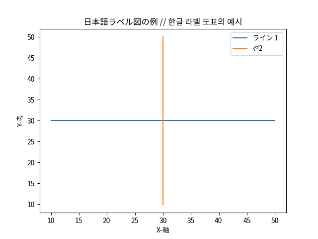
To plot labels and text in languages using non-Roman characters (such as Japanese or Korean) or in non-default fonts using Matplotlib, you must specifically specify which font family you would like Matplotlib to use when rendering images. For more information, refer to the list of available fonts installed by default.
Here is an example of how to specify fonts for Matplotlib:
def japanese_korean_matplotlib_example():
    import matplotlib.mlab as mlab
    import matplotlib.pyplot as plt
    from matplotlib import rcParams
    # Set font family to the Noto Sans CJK font pack
    rcParams['font.family'] = 'Noto Sans CJK JP'
    # create data
    x = [10,20,30,40,50]
    y = [30,30,30,30,30]

    # plot lines
    plt.plot(x, y, label = "ライン1")
    plt.plot(y, x, label = "선2")
    plt.xlabel("X-軸")
    plt.ylabel("Y-축")
    plt.legend()
    plt.title("日本語ラベル図の例 // 한글 라벨 도표의 예시")
    plt.show()

For Matplotlib 2.*, .ttc font files are not detected by Matplotlib automatically. Either upgrade to 3.* or directly add the font filepath to Matplotlib's font manager.
Copied!1 2 3 4from matplotlib import rcParams import matplotlib.font_manager as fm fm.fontManager.ttflist += fm.createFontList(["/usr/share/fonts/opentype/noto/NotoSansCJK-Regular.ttc"]) rcParams['font.family'] = 'Noto Sans CJK JP'</pre>
Using Plotly
Plotly is a visualization library that allows you to create interactive images. To use Plotly, first make sure it is included in your environment.
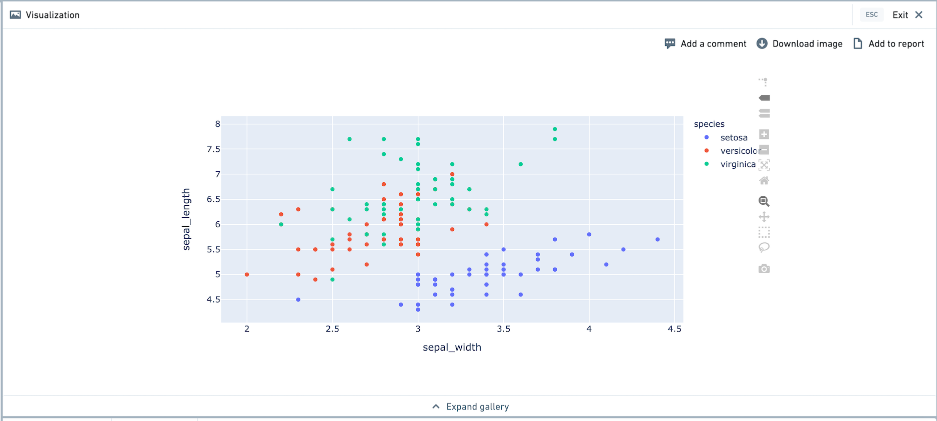
A call to fig.show() causes the resulting plot image to be saved as part of the transform output and returned to the user interface. Here is an example of a transform that uses Plotly to render a visualization, using Plotly Express. Plotly Express comes pre-loaded with the iris dataset.
Copied!1 2 3 4 5def plotly_example(): import plotly.express as px df = px.data.iris() fig = px.scatter(df, x = "sepal_width", y = "sepal_length", color = "species") fig.show()
After running the transform, the Plotly visualization will appear in the visualization tab. We recommend viewing the visualization in full screen mode. You are able to use functionality like zooming in and out, selection on the graph, and so on.

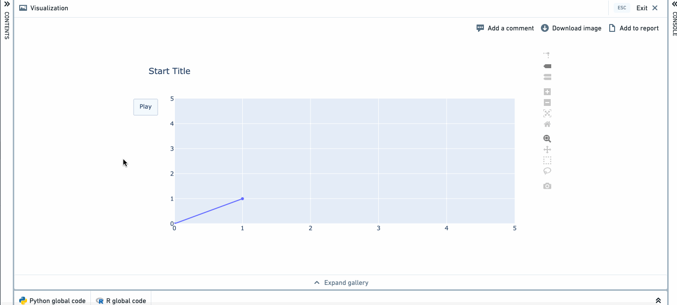
Here is a more complex example, which produces an animated visualization.
Copied!1 2 3 4 5 6 7 8 9 10 11 12 13 14 15 16 17 18 19 20 21def plotly_example_2(): import plotly.graph_objects as go fig = go.Figure( data=[go.Scatter(x=[0, 1], y=[0, 1])], layout=go.Layout( xaxis=dict(range=[0, 5], autorange=False), yaxis=dict(range=[0, 5], autorange=False), title="Start Title", updatemenus=[dict( type="buttons", buttons=[dict(label="Play", method="animate", args=[None])])] ), frames=[go.Frame(data=[go.Scatter(x=[1, 2], y=[1, 2])]), go.Frame(data=[go.Scatter(x=[1, 4], y=[1, 4])]), go.Frame(data=[go.Scatter(x=[3, 4], y=[3, 4])], layout=go.Layout(title_text="End Title"))] ) fig.show()
R Visualizations
In R, Code Workbook supports visualizations using ggplot2 and plotly.

Using ggplot2
Copied!1 2 3 4fare_distribution <- function(titanic_dataset) { hist(titanic_dataset$Fare) return(titanic_dataset) }
Copied!1 2 3 4 5 6 7 8 9 10 11 12 13 14 15 16 17 18 19 20example_ggplot <- function() { library(ggplot2) theme_set(theme_bw()) # pre-set the bw theme data("midwest", package = "ggplot2") # Scatterplot gg <- ggplot(midwest, aes(x=area, y=poptotal)) + geom_point(aes(col=state, size=popdensity)) + geom_smooth(method="loess", se=F) + xlim(c(0, 0.1)) + ylim(c(0, 500000)) + labs(subtitle="Area Vs Population", y="Population", x="Area", title="Scatterplot", caption = "Source: midwest") plot(gg) return(NULL) }
By default, ggplot visualizations will be outputted as PNGs. To produce R ggplot visualizations in SVG format, add a hint using a comment:
Copied!1 2 3 4 5fare_distribution <- function(titanic_dataset) { # image: svg hist(titanic_dataset$Fare) return(titanic_dataset) }
To customize the PNG or SVG output, you can call the png() or svg() function using the built-in graphicsFile variable as filename.
Copied!1 2 3 4 5 6 7 8 9 10 11 12 13unnamed_1 <- function() { png( filename=graphicsFile, width=800, height=400, units="px", pointsize=4, bg="white", res=300, type="cairo") plot(1:10, 1:10) }
Note that if you want to use a custom svg() function, you'll also need to provide a comment hint described above.
Copied!1 2 3 4 5 6 7 8 9 10 11unnamed_1 <- function() { # image: svg svg( filename=graphicsFile, width=5, height=9, pointsize=4, bg="white") plot(1:10, 1:10) }
Using Plotly
Plotly ↗ allows you to make interactive graphs. To use Plotly in R, add the r-plotly package to your environment. Plot graphs with plot() or print() to show them on the frontend. Here's a simple example:
Copied!1 2 3 4 5 6 7 8 9 10 11plotly_example <- function() { library(plotly) scatter_plotly <- plot_ly ( x = rnorm(1000), y = rnorm(1000), mode = "markers", type = "scatter" ) plot(scatter_plotly) }
Plotly limitations
The following notes apply to both Python and R.
- In the console, Plotly visualizations will be converted to images and displayed as PNGs. They will not be interactive. To view an interactive visualization, write the code in a transform.
- When creating Plotly visualizations, visualizations with more than 20,000 points are not recommended due to degraded browser performance. If creating a scatterplot with a large number of points, use
scatterglfor better performance.
Matplotlib limitations
The following limitations on Matplotlib apply to Python.
- Matplotlib is not thread safe. ↗
- When running multiple nodes, Spark will run these computations in parallel. As a result, unintended behavior may be revealed in the form of Matplotlib Runtime Exceptions or visualizations created in incorrect nodes.
- When using multiple Matplotlib visualizations in separate nodes within a single Code Workbook, you must lock each node. You can lock each node with the thread-safe decorator
@synchronous_node_execution, as shown below.
Copied!1 2 3 4 5 6 7 8 9 10 11 12 13 14 15 16 17 18 19import matplotlib.mlab as mlab import matplotlib.pyplot as plt from matplotlib import rcParams @synchronous_node_execution def thread_safe_node(): # Set font family to the Noto Sans CJK font pack rcParams['font.family'] = 'Noto Sans CJK JP' # create data x = [10,20,30,40,50] y = [30,30,30,30,30] # plot lines plt.plot(x, y, label = "ライン1") plt.plot(y, x, label = "선2") plt.xlabel("X-軸") plt.ylabel("Y-축") plt.legend() plt.title("日本語ラベル図の例 // 한글 라벨 도표의 예시") plt.show()