- Capabilities
- Getting started
- Architecture center
- Platform updates
Getting started
In this tutorial, we will run through:
Creating a chart
Since titanic_dataset contains rows (representing passengers) and columns (representing information about the passengers), we can visualize passenger count for a given passenger property (such as Sex or Pclass) using a bar chart. For example, here is a breakdown of passengers by sex:
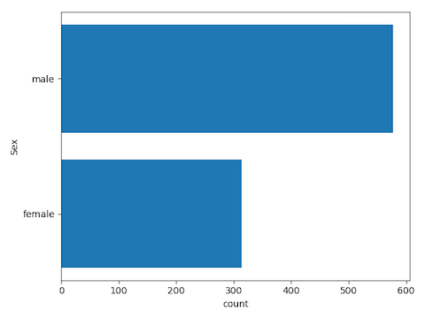
In this example, we’ll create a transform that creates the desired chart. Create a Python transform named bar_chart_of_row_counts and insert the following code:
Copied!1 2 3 4 5 6 7 8 9 10 11 12 13 14 15 16 17 18 19 20 21 22 23 24 25 26 27 28 29 30 31 32 33def bar_chart_of_row_counts(titanic_dataset): import matplotlib.pyplot as plt from pyspark.sql import functions as F import numpy as np input_df = titanic_dataset categorical_column = "Sex" # calculate the counts total = input_df \ .groupBy(categorical_column) \ .agg(F.count("*").alias("count")) \ .orderBy("count") # convert summarized dataset to pandas total_pdf = total.toPandas() # plotting code fig = plt.figure() ax = fig.add_subplot(111) y_pos = np.arange(len(total_pdf[categorical_column])) ax.set_yticks(y_pos) ax.barh(y_pos,total_pdf["count"]) ax.set_yticklabels(total_pdf[categorical_column]) plt.xlabel("count") plt.ylabel(categorical_column) plt.tight_layout() plt.show() # return the aggregated dataframe to save it as a dataset return total
When you run this transform, the chart shown above will appear in your Workbook in the transform node in the graph. You can also jump into a full screen image view by hovering over the chart in the transform node and selecting View Image. This image viewer can also be reached from the contents sidebar and the Visualization tab.
To create the chart as an SVG, use the following code before creating your plot:
Copied!1set_output_image_type('svg')
Or use the decorator for better visibility:
Copied!1 2 3@output_image_type('svg') def bar_chart_of_row_counts(titanic_dataset): # ...
Creating a Template
Next, we’ll convert this transform into a Template so it can be generalized and reused. Click on the Actions button in the top-right of your code editor and click Create template.
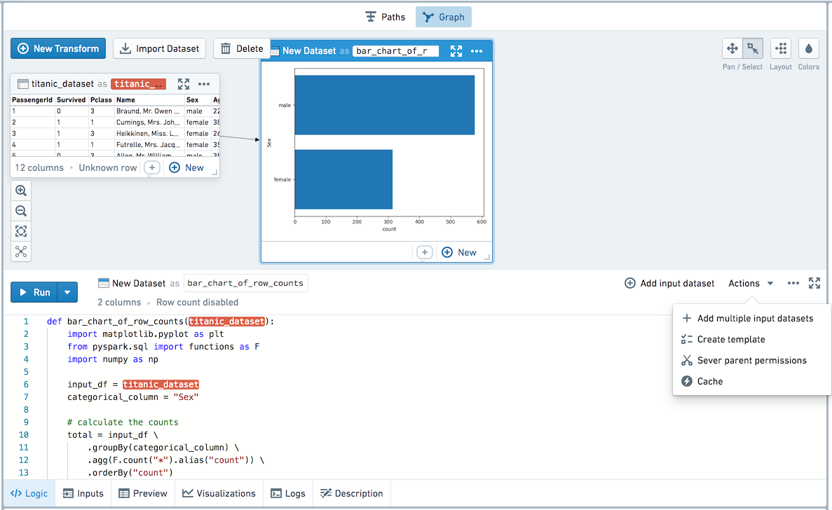
You will now be brought into a template creation view in the full screen editor.
In the Template editor, you can edit the Template’s name, description, and parameters. Let’s name this Template Bar Chart of Row Counts by Categorical Variable, and give it a description as follows: Create a transform with a bar chart of the row counts of 1 categorical column in any input dataset.
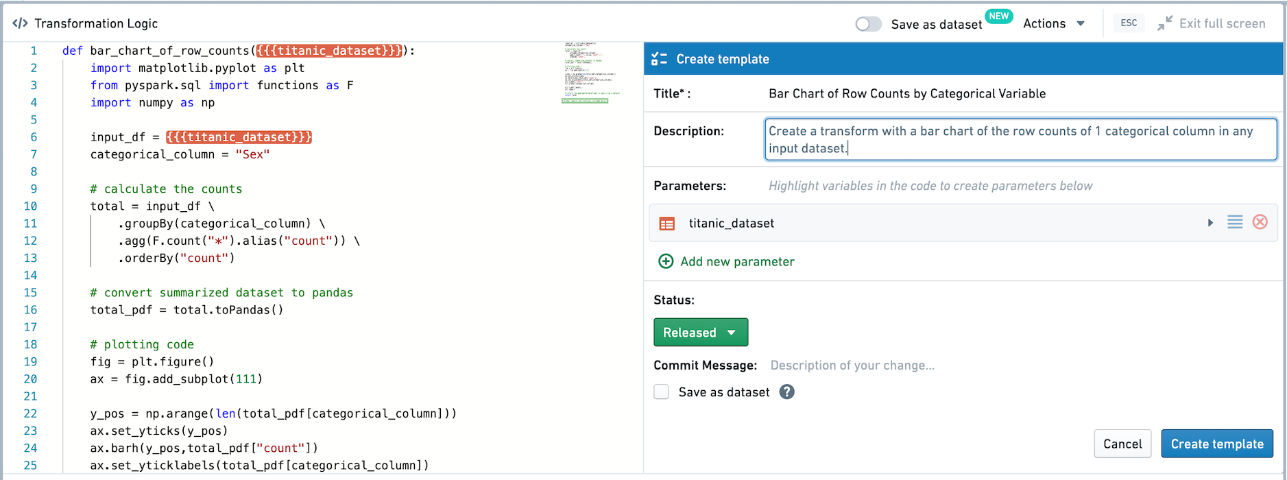
Any input datasets — in this case, just titanic_dataset — are automatically added as parameters of type dataset for the Template. Click on titanic_dataset in the Template editor to change it. Since we want this template to be generic, let’s change the parameter name from titanic_dataset to input_dataset and add a description.
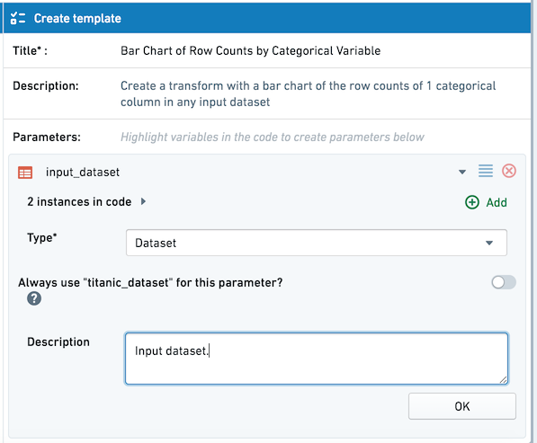
Two instances of {{{input_dataset}}} will be highlighted in the transform code. Next, let’s parameterize the input column. To assign a variable in the code body as an input parameter for the template, click Add new parameter in the top-right of the transform and highlight the appropriate variables in the code. Highlight the string "Sex" as shown below:
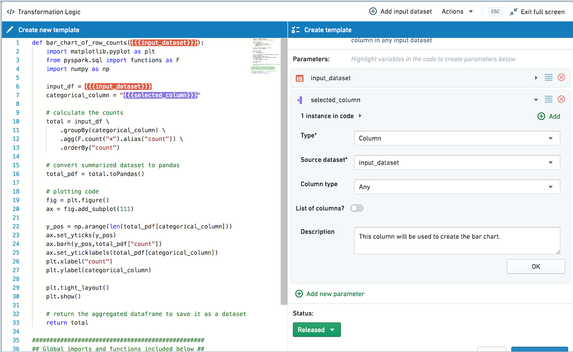
This adds this part of the code as a parameter of type column with the Source Dataset as input_dataset. In the Template editor, edit the param1 parameter name and rename it to selected_column.
In this example code, we defined the column name as a variable at the top of the transform so that we only need to parameterize it once. When you’re templatizing other transforms, you can use the Add button to add more instances of the same parameter.
Next, choose whether this template should be saved as a dataset by default. By checking the Save as dataset box, when added the template will be added as a persisted transform by default. If Save as dataset is left unchecked, the template will be applied as an unpersisted transform by default. In this case, let's choose to Save as Dataset by default as we want to use the output in other applications.
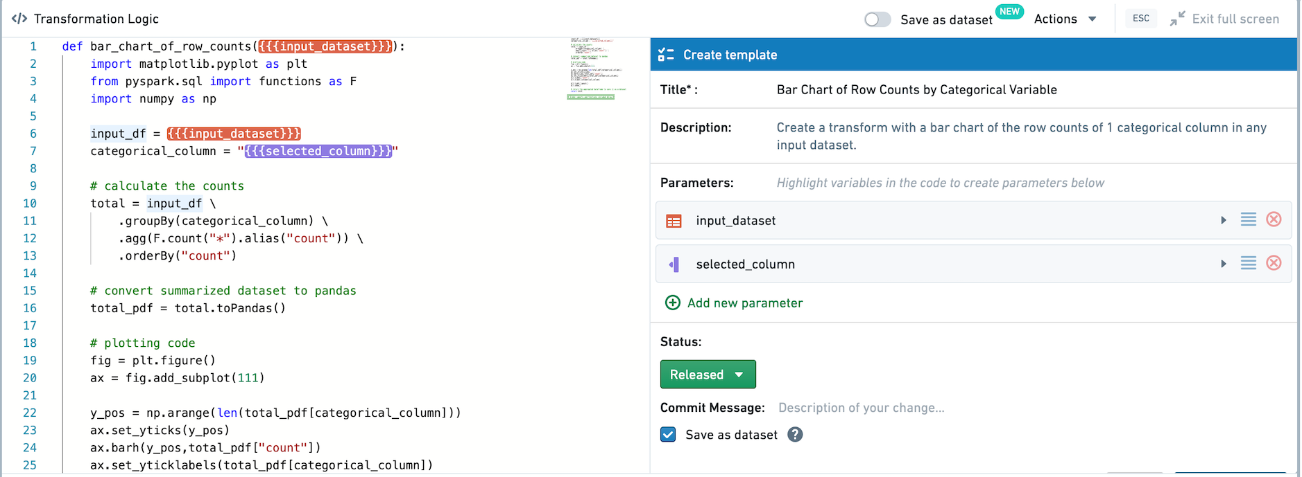
Finally, click the Create template button to create and save the Template. Whenever you create a new Template, you will have to choose a folder to save it in. For this example, you can save the Template in your home folder.
Templates can only be discovered and used by users who have access, so you can save a Template in your home folder while you are still working on it, and move it to a shared folder once you want to promote it for broader use. Templates can also be added to the Data Catalog.
Using Templates
After creating and saving a template, you can use the Template in a point-and-click manner.

To view available templates, click Browse all templates in the transform creation view.
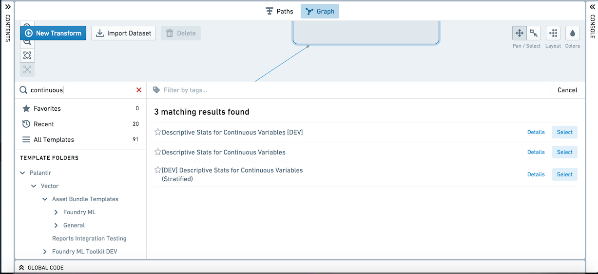
Browse Templates supports searching for templates by name, description, and tags, or browsing based on Favorites, Recently used templates, or the Files structure. To apply a template, click its name and choose "Select". Let’s add the template we just created.
After adding the template to the graph, you can rename the transform and fill out the inputs. Assign the input_dataset parameter by clicking Click here to add dataset and clicking the titanic_dataset in the graph. Now you can select any column as the selected_column parameter to create charts based on that column.
Select Run to compute the transform. For transforms that output a visualization, graph view is the default in the Graph. You can right-click, choose Edit and then Show table view to view the node as a table.
Editing Templates
If you would like to update the code backing a template, click on Actions and then Edit Template to enter the code editor and edit the template.
