10 - Make changes on your new branch
This content is also available at learn.palantir.com ↗ and is presented here for accessibility purposes.
📖 Task Introduction
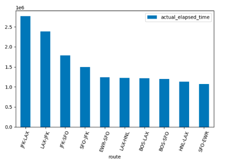
You should now see Branch: test-branch at the top of your workbook. By clicking on the time_by_carrier visualization node, you will see the code appear in the bottom left of your screen. The visualization is currently displaying a plot of the number of minutes spent in flight for the 10 airline carriers that have the largest total number of minutes in flight. We will now update the visualization to show a plot of the minutes spent in flight for the different airline groups, for the 10 routes that have the most total minutes spent in flight.
🔨 Task Instructions
def time_by_carrier(us_freight_flights):
    tf_pdf = us_freight_flights.withColumn('route', F.concat(F.col("origin"), F.lit("-"), F.col("dest"))).toPandas()
    tf_grouped = tf_pdf.groupby('route')['actual_elapsed_time'].sum().to_frame().reset_index()
    # filter to top 10 carriers
    tf_grouped = tf_grouped.sort_values(by=['actual_elapsed_time'], ascending=False).head(10)
    # plot bar chart
    tf_grouped.plot.bar(x='route', y='actual_elapsed_time')
    plt.tight_layout()
    plt.xticks(rotation=70)
    plt.show()
    #return the original dataframe
    return us_freight_flights
- Replace the entire
time_by_carriercode with the block above. - Click Preview to execute your updated transformation.
- Once the transformation has finished running, click on the Visualization tab below the code editor to view the updated plot.