8 - Add code to make a plot
This content is also available at learn.palantir.com ↗ and is presented here for accessibility purposes.
📖 Task Introduction
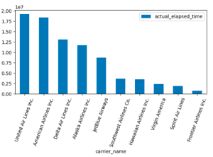
We'll now create a new transformation with code that will use the matplotlib library you imported in the Global Code panel. Our goal will be to make a bar plot of the number of minutes spent in flight by the ten most active airline carriers.
🔨 Task Instructions
def time_by_carrier(us_freight_flights):
    tf_pdf = us_freight_flights.toPandas()
    tf_grouped = tf_pdf.groupby('carrier_name')['actual_elapsed_time'].sum().to_frame().reset_index()
    # filter to top 10 carriers
    tf_grouped = tf_grouped.sort_values(by=['actual_elapsed_time'], ascending=False).head(10)
    # plot bar chart
    tf_grouped.plot.bar(x='carrier_name', y='actual_elapsed_time')
    plt.tight_layout()
    plt.xticks(rotation=70)
    plt.show()
    #return the original dataframe
    return us_freight_flights
-
Replace the entire default code with the code block above.
-
Click Preview to execute the code and create your Matplotlib chart.
-
After the transformation has finished running, click on the Visualizations tab below the code editor to view the generated plot.
-
You can hover over the image and click (+) View image to expand this image for easier viewing.