15 - Line charts & display customization
This content is also available at learn.palantir.com ↗ and is presented here for accessibility purposes.
📖 Task Introduction
In this Task, you'll add a new type of chart, Line Chart, to your Quiver analysis.
🔨 Task Instructions
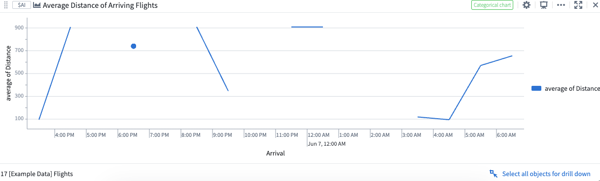
- Select your
Filtered Arriving Flights: JNUwidget and choose theVisualizecategory at the bottom. - Choose the Line chart option from the fly-out window.
- Under
Group Byin the Editor sidebar, in the dropdown menu, select Arrival. - In the
Bucketingdropdown menu to the right of your selected Date property, select Hour. - Find the
Metricdropdown menu and change it fromCounttoAverage. - Click on the
Propertydropdown menu and set it toDistance. - Rename your new chart to
Average Distance of Arriving Flights.