13 - Create a Bar Plot for Departing Flights from JNU
This content is also available at learn.palantir.com ↗ and is presented here for accessibility purposes.
📖 Task Introduction
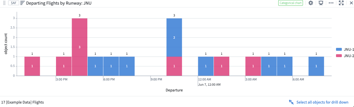
Another way to add a Bar chart is via the Search cards menu. In this task, you will follow similar steps to create a bar plot of Departing Flights at the JNU airport and segment them by Runway so that we can see the total number of flights per runway per day.
🔨 Task Instructions
- From the omnibar near the top of your Quiver analysis, click the
Search cardsbutton. - In the subwindow, search for and select the
Bar chartoption. - Because you added this widget from the omnibar, it's not yet associated with an Object Set. Click on the
Add object set...option in the right sidebar and choose yourFiltered Departing Flights: JNUobject set. - In the right sidebar, search for and select Departure from the list of object properties in the
Group Bydropdown menu. - In the
Bucketingdropdown menu to the right of your selected Date property, select Hour. - In the
Segment Bydropdown menu near the bottom of the Editor sidebar, select Departure Runway (Derived) to segment the bar plot based on to which runway at JNU each flight arrived. - Rename your new bar chart
Departing Flights by Runway: JNU.