11 - Create a Bar Plot for Arriving Flights to JNU
This content is also available at learn.palantir.com ↗ and is presented here for accessibility purposes.
📖 Task Introduction
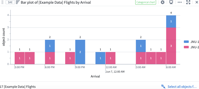
In this task, you will generate a simple bar chart for Arriving Flights at the JNU airport and segment them by Runway so that we can see the total number of flights per runway per day.
🔨 Task Instructions
- Select your
Filtered Arriving Flights: JNUwidget and choose theVisualizecategory at the bottom. - Choose the Bar chart option from the fly-out window.
- In the right sidebar, search for and select Arrival from the list of object properties in the
Group Bydropdown menu. - In the
Bucketingdropdown menu to the right of your selected Date property, select Hour. - In the
Segment Bydropdown menu near the bottom of the Editor sidebar, select Destination Runway (Derived) to segment the bar plot based on to which runway at JNU each flight arrived. - Rename your new bar chart
Arriving Flights by Runway: JNU.