21 - Add charts to the Contour Dashboard
This content is also available at learn.palantir.com ↗ and is presented here for accessibility purposes.
📖 Task Introduction
To this point we've utilized a variety of tools within Contour to manipulate and manifest unique visualizations and analyses to better understand the flight delay conundrum facing our notional aviation company teammates. We are going to transition now to preparing this analysis in a Contour dashboard so we can share it with our colleagues.
🔨 Task Instructions
-
Navigate to your flights path. Scroll to your
Histogramboard and click on theAdd to dashboardbutton at the top of that board.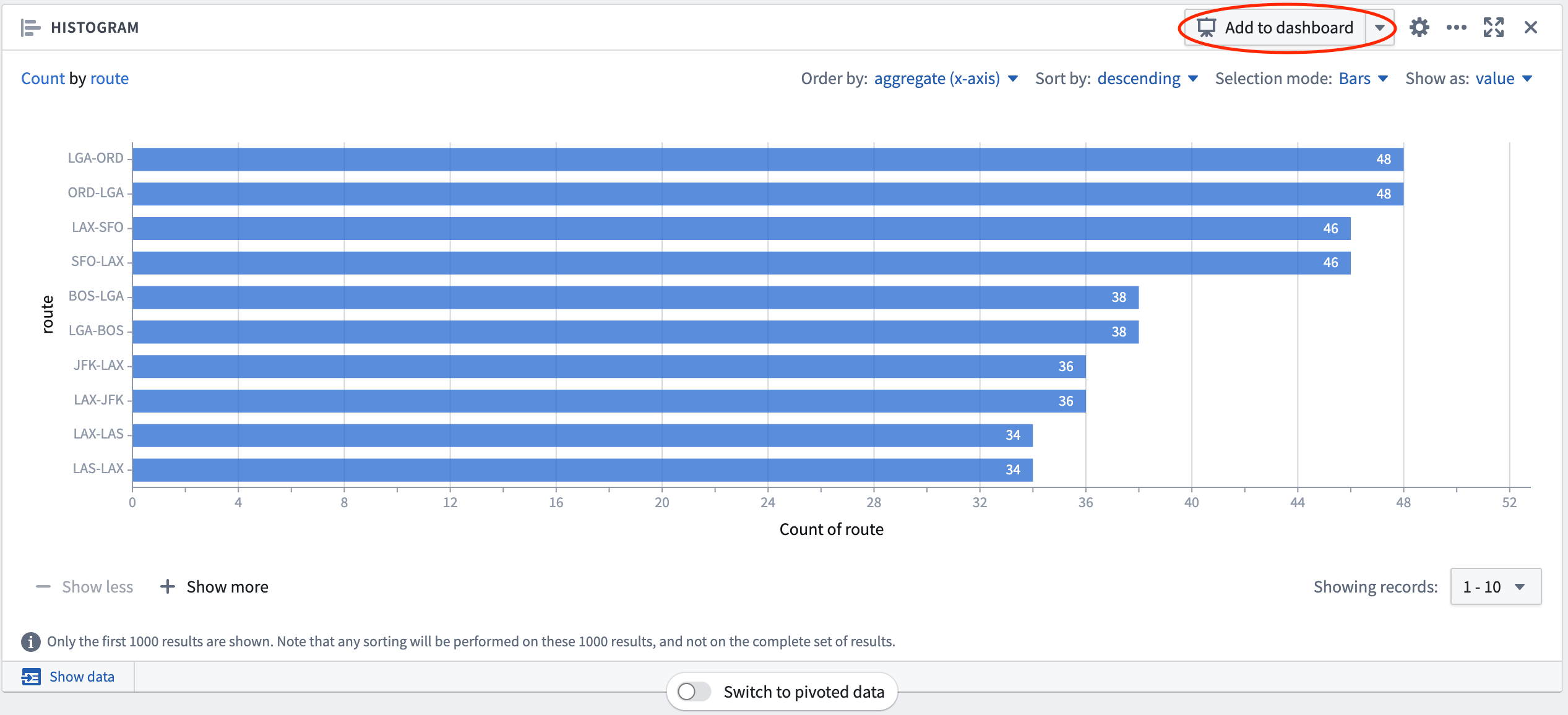
-
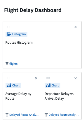
The dashboard preview panel will appear on the left side of your screen. The box in the center of the card in this sidebar allows you to title this board within the dashboard. Title this board
Routes Histogram. -
Click into the text box at the top of the dashboard preview, which says Untitled dashboard. Name the dashboard
Flight Delay Dashboard. -
Navigate to your
Delayed Route Analysispath via the tab at the top of the analysis. -
On the first Chart, the one showing average delays, click the
Add to dashboardbutton. Title this boardAverage Delay by Routein the dashboard preview panel by typing this into the box in the center. -
Add the other Chart board from this path to the dashboard as well by clicking the
Add to dashboardbutton. Title this boardDeparture Delay vs. Arrival Delay. -
Finally, rearrange your dashboard preview by clicking and dragging on the eight
....dots near the top-left corner ofDeparture Delay vs. Arrival Delayto move that card into the same line asAverage Delay by Route.