16 - Exercise Summary
This content is also available at learn.palantir.com ↗ and is presented here for accessibility purposes.
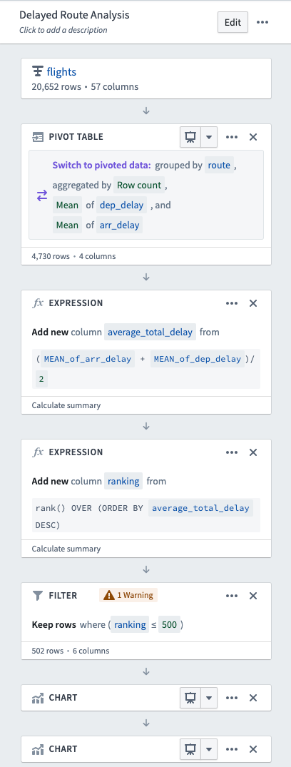
What you built
- A Delayed Flights Analysis path including several boards to visualize and filter the data.
- A Pivot board that takes departure and arrival delays and aggregates averages for both in minutes.
- An Expression board that averages aggregates from your Pivot board and ranks routes by delay average.
- A Filter board that reduces the scope of route to the top 500 based on the Expression board ranking.
- Two Chart boards that visualize average delay by route and departure versus arrival delay to generate insights.
What you learned
- Paths begin with a dataset or analysis from a previous path and drive toward a particular question or valued insight.
- Filter boards allow for customized filters on a particular dataset.
- Chart boards provide opportunities to visualize the work you've completed within a path to generate further insights and questions.