15 - Add a chart showing the departure delay vs. arrival delay
This content is also available at learn.palantir.com ↗ and is presented here for accessibility purposes.
📖 Task Introduction
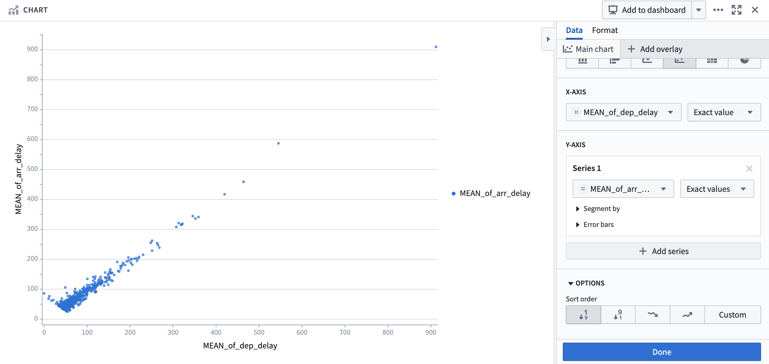
Now that we have created a visualization that illustrates route by average total delay, we are going to add an additional visualization focused on the average departure delay vs. average arrival delay for each route with the intention of providing a different angle for analysis and further insights.
🔨 Task Instructions
- Click on the Visualize board category in the bar at the bottom of your Contour path and select the Chart board.
- Under chart type, choose the 4th icon from the left - scatterplot.
- Within the X axis dropdown, search for and click on
MEAN_of_dep_delay. - Within the Y axis dropdown, search for and click on
MEAN_of_arr_delay. - Click on Compute & save.