20 - Configure the Chart board
This content is also available at learn.palantir.com ↗ and is presented here for accessibility purposes.
📖 Task Introduction
You can use the arrow tab on the right side of the Chart Board to expand or collapse the Chart configuration panel. With the panel expanded, notice the default configuration of the Board. Let's start by selecting the type of chart that we'd like to add.
Under CHART TYPE you will see a variety of chart type icons. Hover over the icons for a brief description of the chart type they represent.
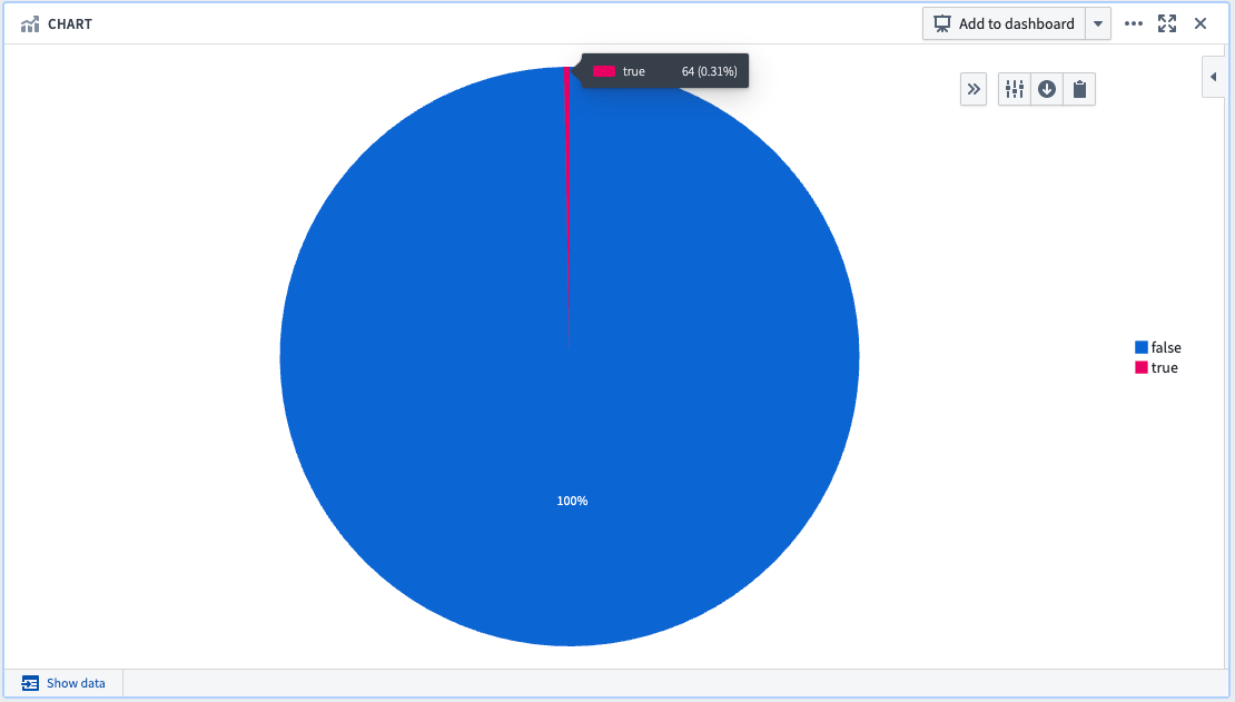
We are going to use a Pie chart to display the percentage of cancelled flights in our dataset.
Note: If you do not see a configuration panel on the right side of your Chart Board, make sure to close the Workspace Sidebar or zoom out in your browser.
🔨 Task Instructions
- Change the chart type to
Pie chart. - Select the
GROUP BYdropdown and change it tocancelled. - Click
Compute & save. You'll note that very few flights were cancelled (if you mouse over the true section you can read that only 64 flights were cancelled, less than 1%)