9 - Configure the Histogram Board
This content is also available at learn.palantir.com ↗ and is presented here for accessibility purposes.
📖 Task Introduction
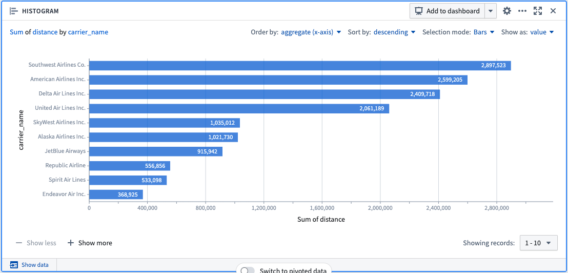
The Histogram Board aggregates the distinct values in a given column and displays the results as a bar chart.
We'll use the Histogram Board to explore the total distance traveled per carrier across our dataset.
After you configure your Histogram using the steps below, only the top ten bars are displayed. To display more values, click + Show More to display up to 50 values. If there are more than 50 values, use the dropdown menu to navigate to other parts of the range.
🔨 Task Instructions
- To set the Y-AXIS of the Histogram, click on
Select columnunder the Y-AXIS section of the Board configuration and choosecarrier_namefrom the dropdown list. - Under the X-AXIS, change the aggregation function from Count to Sum using the dropdown menu.
- To set the X-AXIS of the Histogram, click on
Select columnunder the X-AXIS section of the Board configuration and choosedistancefrom the dropdown list. - Click
compute. Your Board should now resemble the image below.