- Capabilities
- Getting started
- Architecture center
- Platform updates
Visualize experiments
Once published alongside a model version, experiments are immediately available to view and compare on the model page under the Experiments tab.
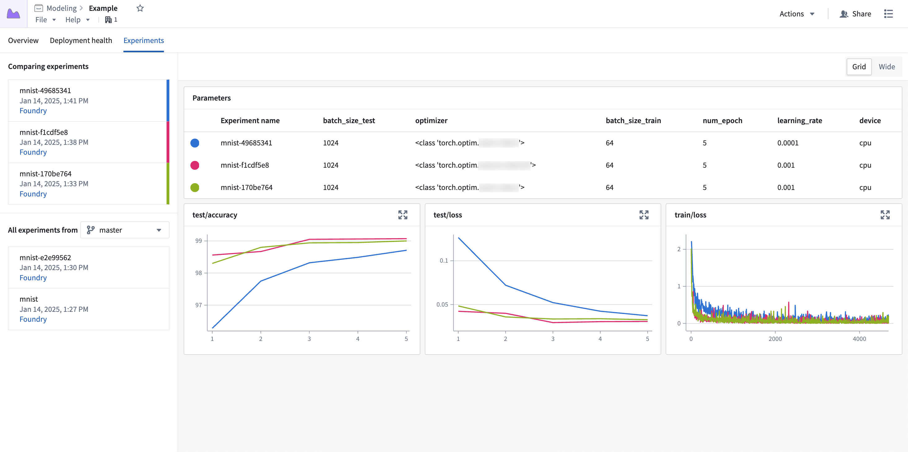
Experiment data is displayed with a hyperparameter table at the top, followed by line charts for each of the metrics. Each row of the hyperparameter table represents a single experiment, with each experiment's metric data overlaid on the charts.
Select experiments
By default, only the latest experiment is selected for visualization. To populate the view with more experiments, select the + icon next to any experiment in the left sidebar.
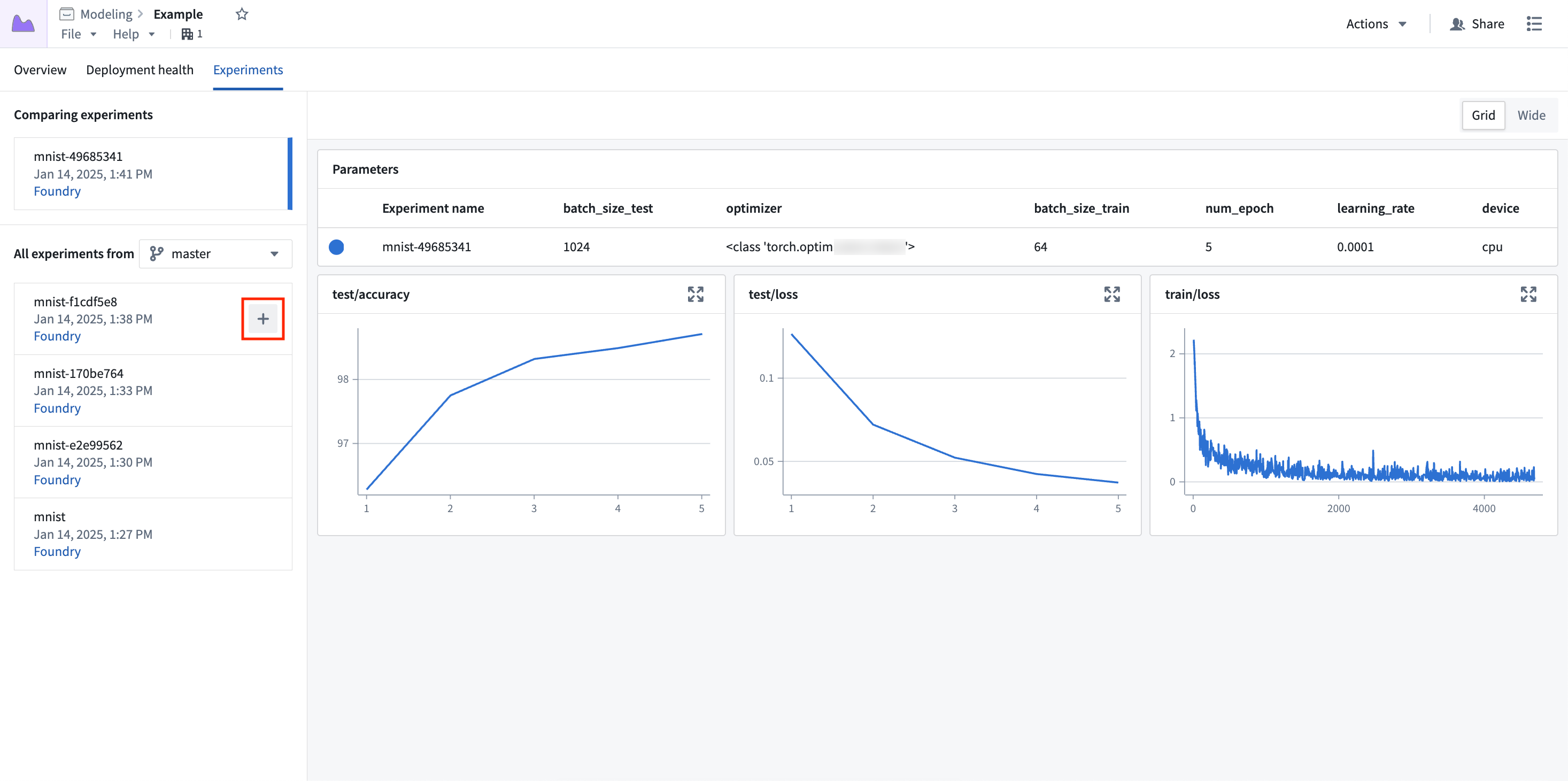
Up to five experiments can be selected for comparison at once.
Expand charts
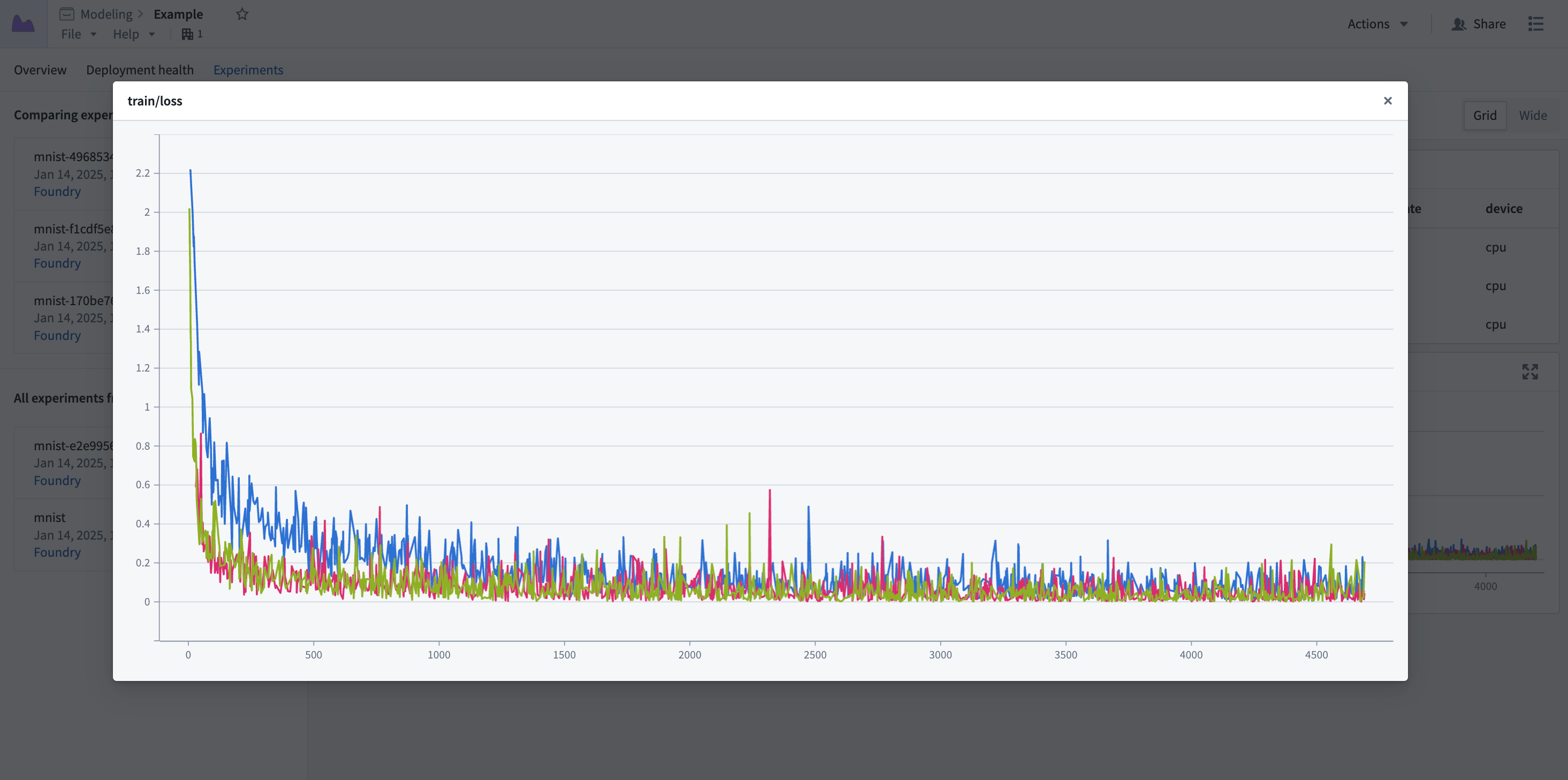
Metric charts can be expanded to a larger view for a more in-depth view of the metric data.
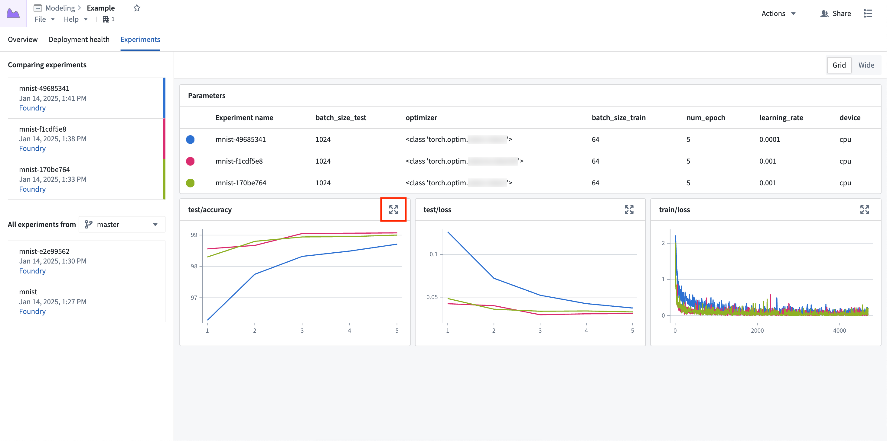
Select the expand button to open the experiment in a pop-up dialog.
Parallel coordinate plot
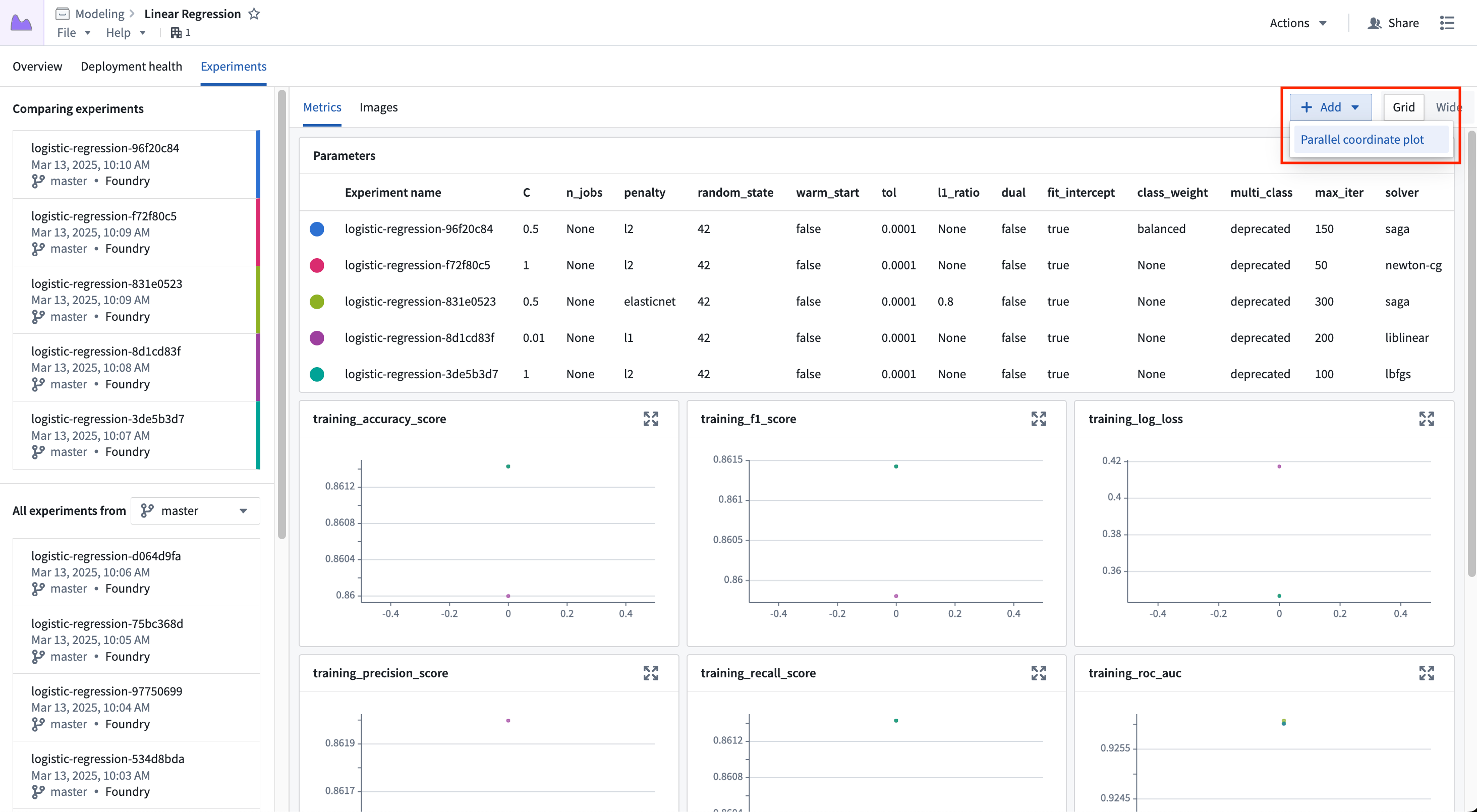
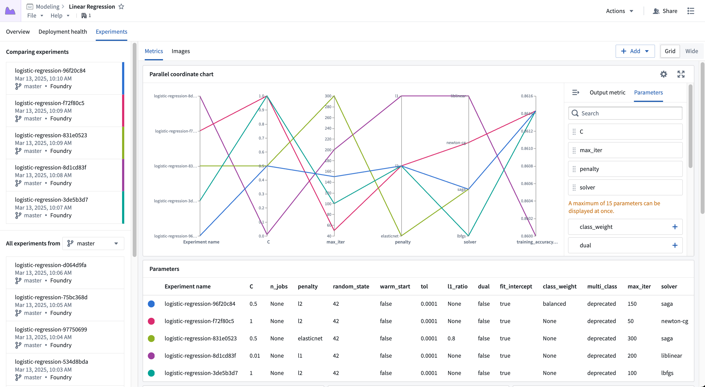
A parallel coordinate plot can help users understand how a change in a parameter value might affect the end result of a training job. To add a parallel coordinate plot to the view, select Add and then Parallel coordinate plot.
Once the new chart has been added, you can configure which parameters to show and what output metric value to render. Any parameter logged to any of the currently selected experiments may be added to the view.
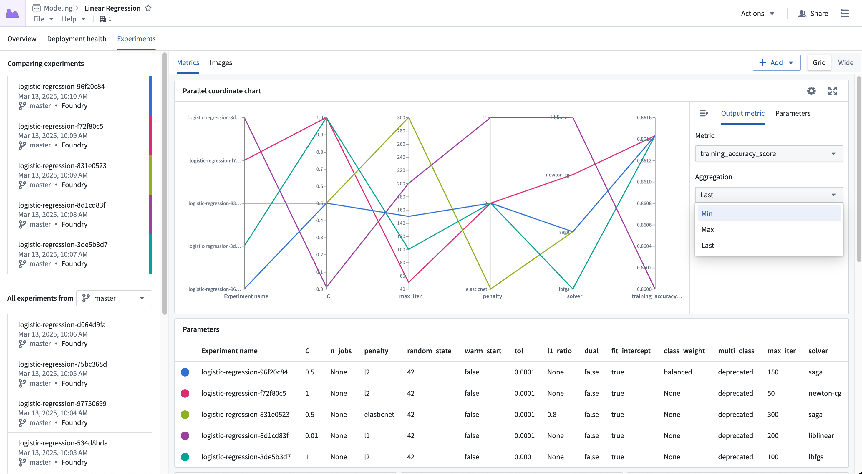
The output metric value is one of the metric series logged to the experiment, where you can choose to view the Last, Min, or Max value.
Images
Images can be viewed on the Images tab; selecting experiments will populate the view with the image series for that experiment.
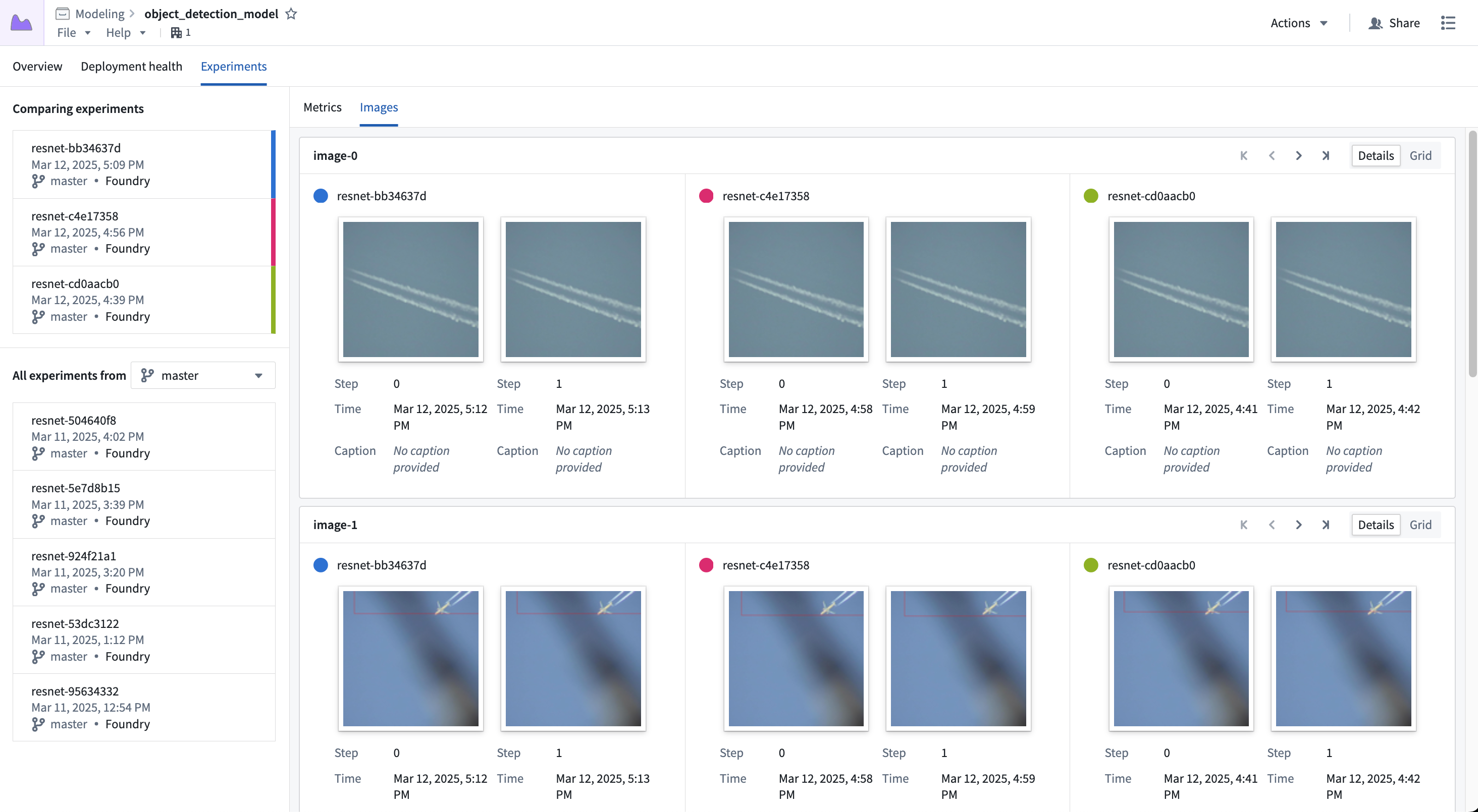
Each card represents a single image series, where each segment of the card represents the series for a given experiment. You can scroll through the images using the controls in the top right, or switch to the Grid view to see more images at once.
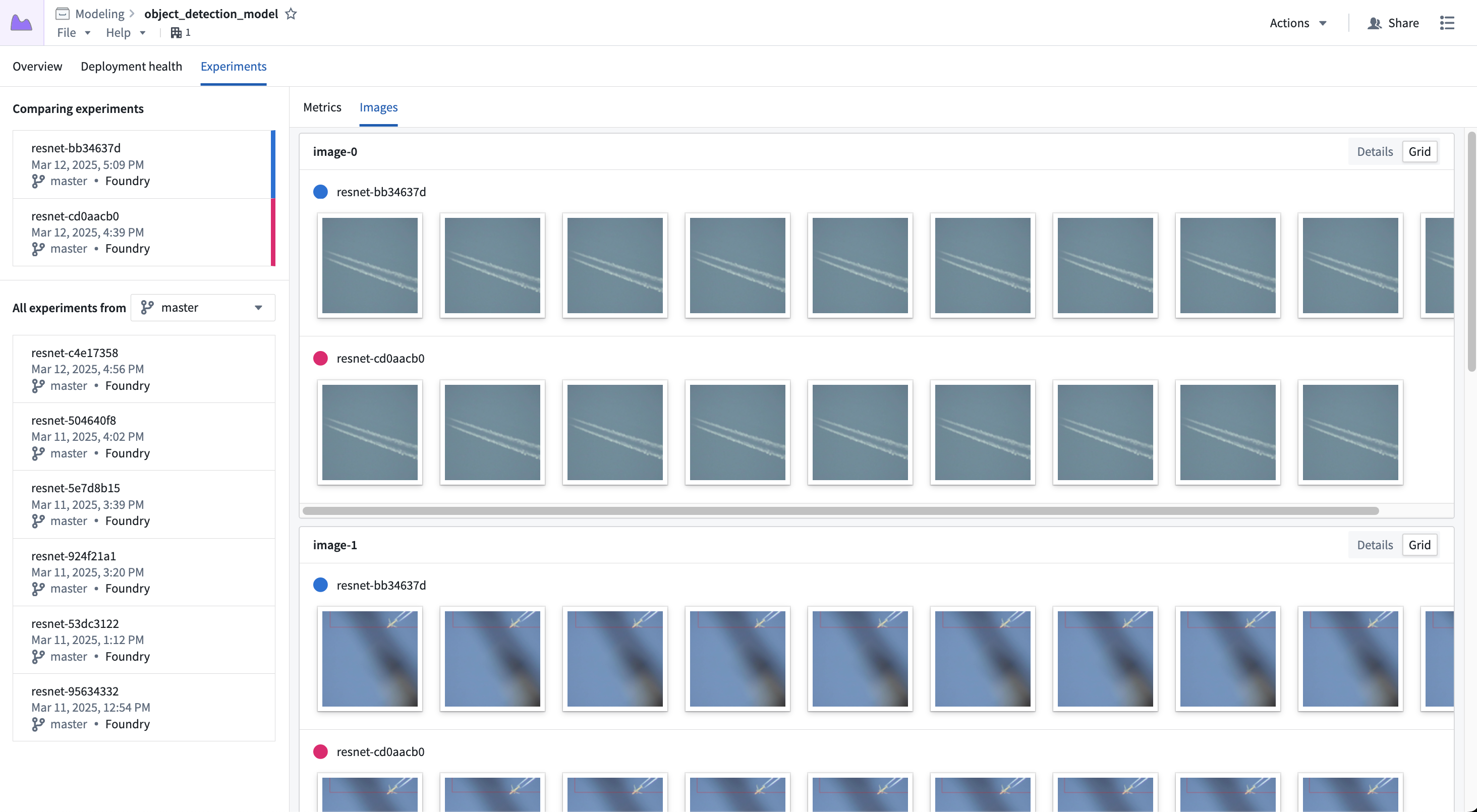
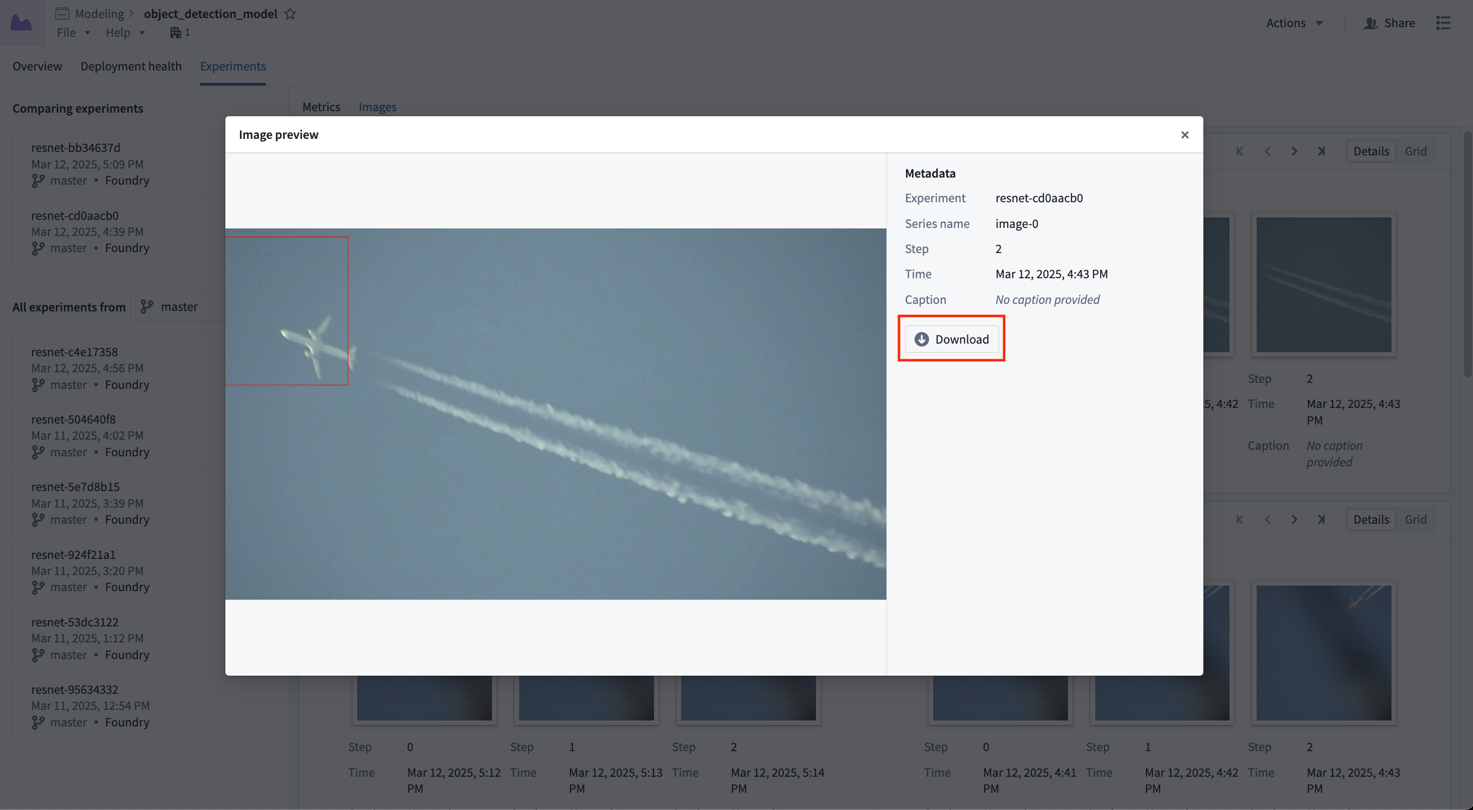
Selecting an image will show a larger view of the image; you can also download the image from this view.
Plots
Plots can be viewed in the Plots tab. Selecting experiments will populate the view with the plot series for that experiment.
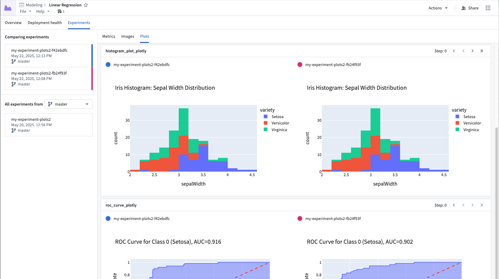
Each card represents a single plot series, where each segment of the card represents the series for a given experiment. You can scroll through the plots using the controls in the top right. Plots are interactive: hover to inspect points, zoom, and pan.
Tables
Tables can be viewed in the Tables tab. If multiple experiments are selected, their tables will be displayed inline.
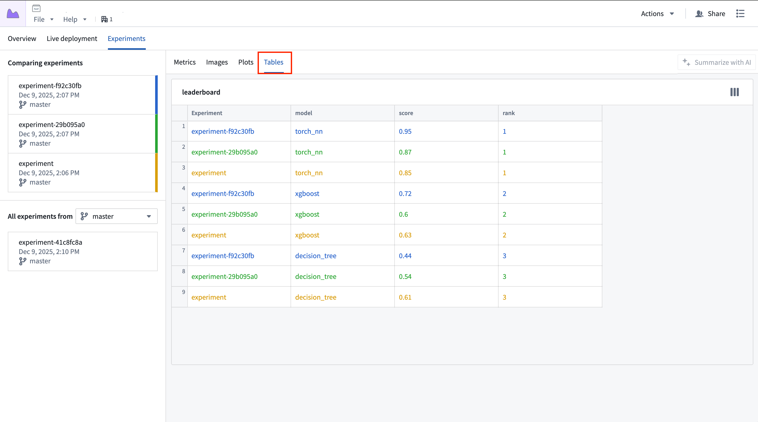
Each card represents a single table, where each experiment's table is displayed inline within the card, color-coded to match the color assigned to the experiment.