- Capabilities
- Getting started
- Architecture center
- Platform updates
Custom modeling objective metric views
One key functionality of a modeling objective is the ability to inspect an individual model's performance on a particular dataset, while also being able to compare those same performance metrics on that same data across different models. It is able to do this by leveraging the metric set and input dataset relationship across model submissions.
This tutorial assumes you already know how to create metric sets with subsets and have already configured automatic model evaluation.
Once you have followed the steps on this page to customize metric views, you can use them in the evaluation dashboard to compare the performance of multiple models. Note that these tabs will not be displayed on the evaluation dashboard unless the advanced setting show pinned tabs in evaluation dashboard is enabled.
Getting started
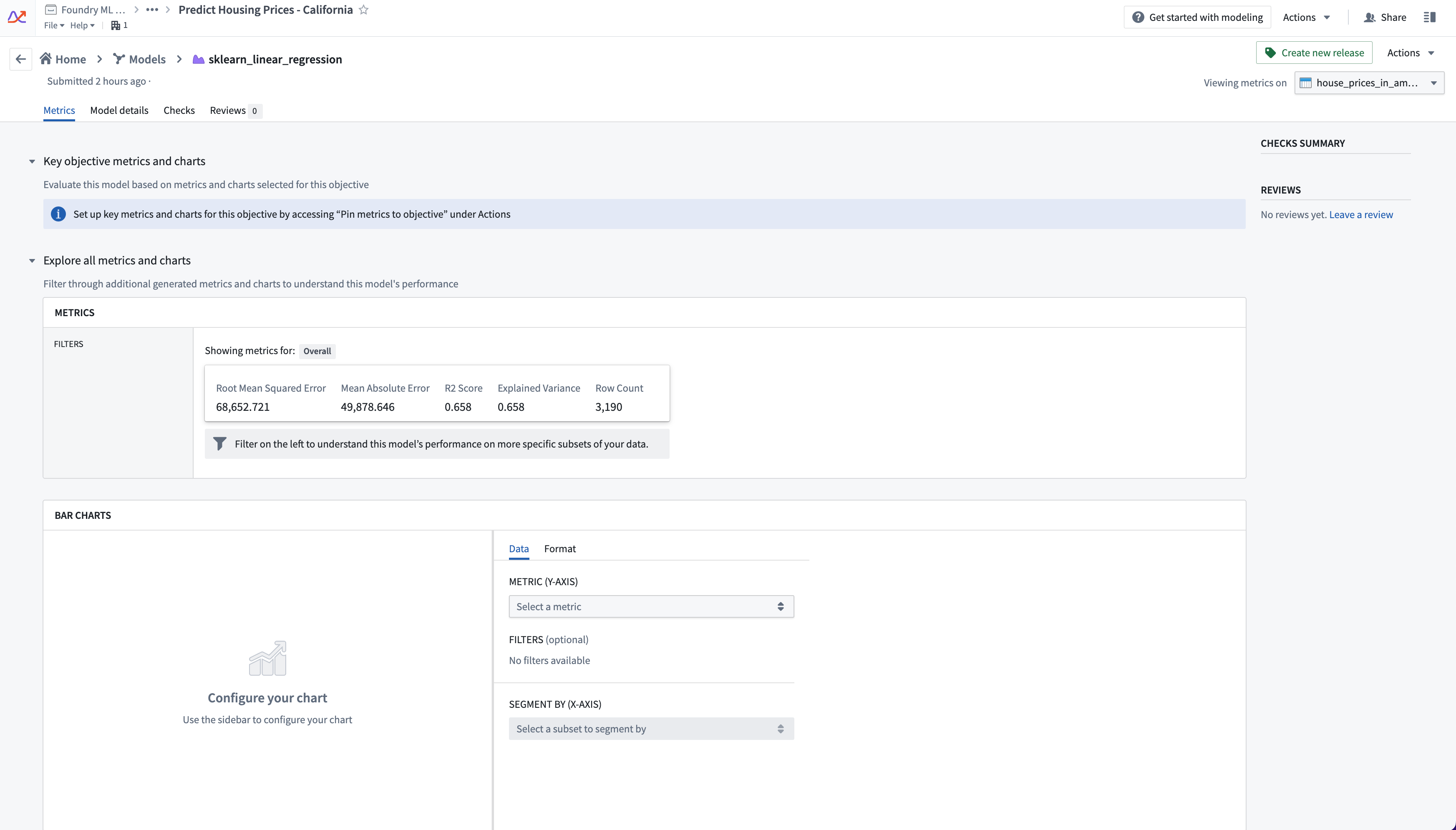
Click on a model submission name to navigate to its individual page. This view is highly customizable depending on the metrics, charts, or images attached to the individual model submissions in the evaluation configuration or in code.
The configuration options available are: pinning metrics, creating tabs, and building charts. The goal of these options is to communicate and categorize information to share across all model submissions and highlight important performance metrics to be compared.
Information configured on one submission's view (i.e custom tabs created or metrics pinned) will also appear as configured for every other submission. Configuration is done on the modeling objective level, not the individual submission level, to create a global dialog for all model submissions.
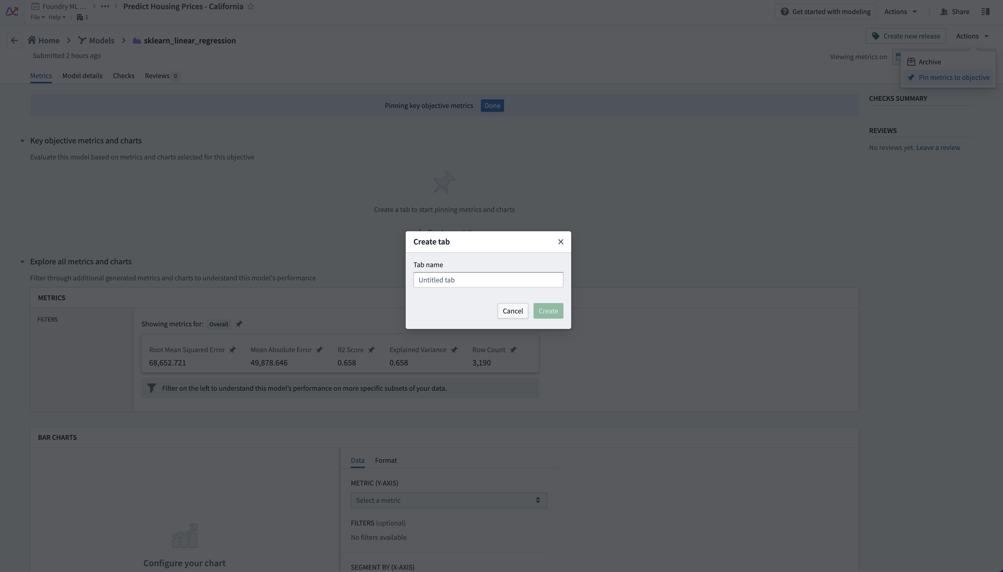
To edit metric views, select the Actions tab on the top right of the page. You will see a number of options depending on your level of access to the objective. Select Pin metrics to objective. Pin icons will appear on all the metrics and charts, and a blue bar at the top of the interface will indicate that you are in edit mode.

As a reminder, the metrics that appear in the Explore all metrics and charts section are dependent on the evaluation dataset and transaction that is selected in the top right.
Creating tabs and pinning metrics
Tabs help organize metrics and charts into meaningful views, which may pertain to different evaluation facets or stakeholders. For example, as in the notional example shown below, a financial modeling group may want to surface metrics broken out by sensitive features.
Under the section Key objective metrics and charts select the + Create new tab option. A dialog will appear giving you the option to name the tab.

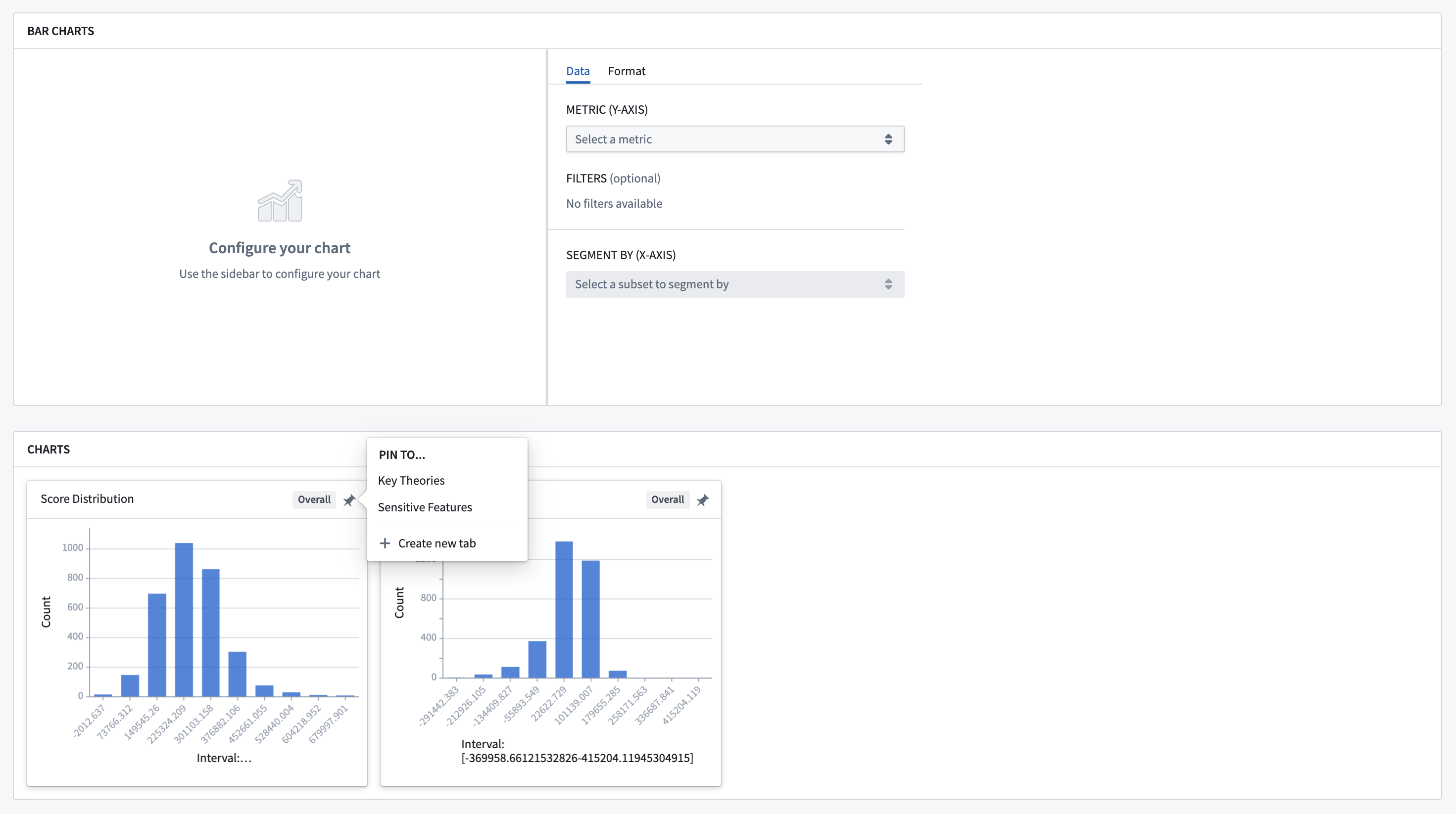
Once you have created a tab, scroll through the metric explorer and charts below and pin statistics, charts, or images by clicking on the pin icon. Any subsets will also be available in the metric explorer automatically.


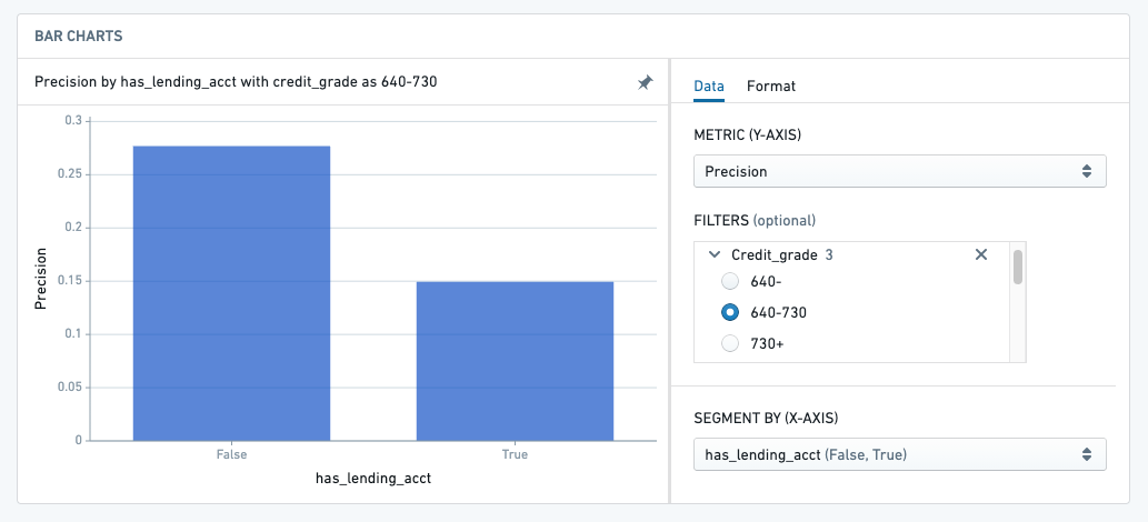
You can create interactive bar charts based on the metrics that are available in the metric explorer, and pin them to the tab as well.

The metrics that are pinned and the tabs that are created are not meant to be static. Configurations should evolve as new data comes in, new feedback is received, and new theories are tested.
Common patterns for tab categories are "Key Metrics/Theories", "Sensitive Features", and "Outlier Information".
When you're satisfied with your configuration across your Input Datasets, select the Done button at the top of the page.
