Announcements
REMINDER: Sign up for the Foundry Newsletter to receive a summary of new products, features, and improvements across the platform directly to your inbox. For more information on how to subscribe, see the Foundry Newsletter and Product Feedback channels announcement.
Share your thoughts about these announcements in our Developer Community Forum ↗.
Media is now supported in TypeScript OSDK and platform APIs [Beta]
Date published: 2025-02-20
We are excited to announce that the TypeScript Ontology SDK and platform APIs now support reading and uploading media to the Ontology. Object types and Actions with media references can now be included in your Ontology SDK application for reading and writing media items. To get started with media in our SDKs, create a new Typescript application in Developer Console. Be sure to choose to create an Ontology SDK, and choose an Ontology containing object types and Action types with media references.
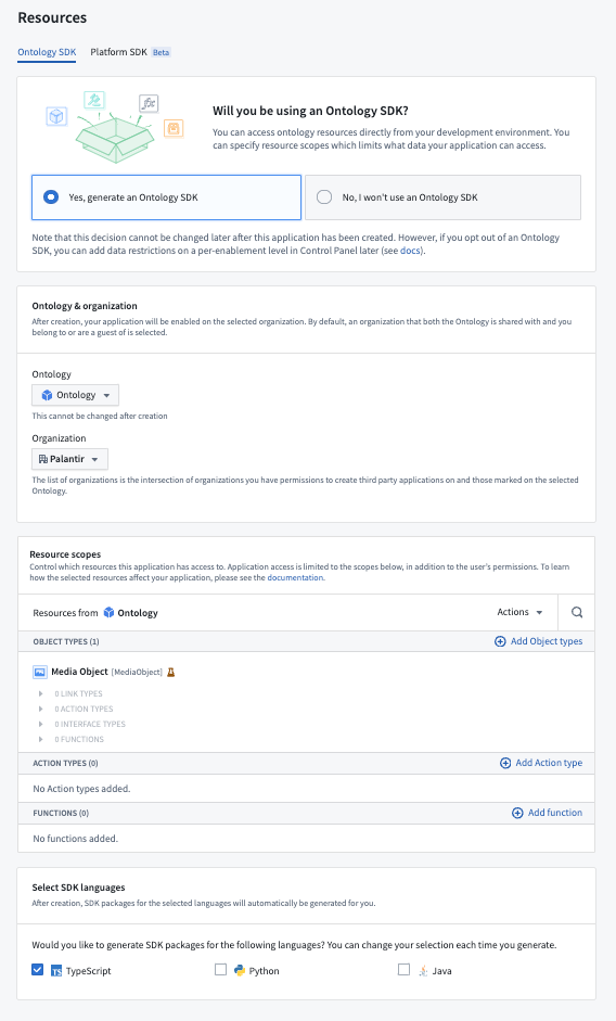
The Resources step when setting up an Ontology SDK application in Developer Console. The selected Ontology contains a Media Object type.
Media support in the Ontology SDK and platform APIs is in a beta state and subject to change during development. To enable media support in Typescript SDKs, navigate to SDK versions from the left side panel of Developer Console, then select Settings in the upper right corner to open the Package settings page. From here, toggle on TypeScript beta features. Doing so will enable any beta features available for TypeScript packages in Developer Console, including media APIs.
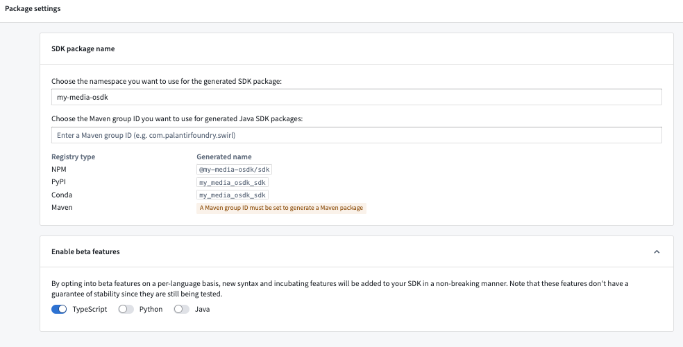
The Package settings page in Developer Console, with TypeScript beta features enabled.
Media calls in TypeScript OSDK
Media support in the TypeScript OSDK includes calls to read and upload media and use uploaded media in Ontology Actions. Examples of these calls are included below.
Read media reference properties
Fetch metadata and contents of your media reference property by calling fetchMetadata() and fetchContents() on the media reference property:
import { OsdkMediaObject } from "@my-media-osdk/sdk";
import { MediaMetadata, MediaReference } from "@osdk/api";
import { Osdk, Result } from "@osdk/client";

const result = await client(OsdkMediaObject).fetchOne("<primaryKey>");

// Fetch metadata of a media property
const mediaMetadata = await result.mediaReference?.fetchMetadata();

// Fetch contents of a media property
const response = await result.mediaReference?.fetchContents();

if (response.ok) {
    const data = await response.blob();
    ...
}
Upload media to the Ontology
To upload media to the Ontology, you must first upload it to a media property of an object type using the method shown below. This returns a MediaReference object, which can then be passed to an Action that accepts media as parameters:
import { __EXPERIMENTAL__NOT_SUPPORTED_YET__createMediaReference } from "@osdk/api/unstable";
import { Result, isOk } from "@osdk/client";
import { MediaReference } from "@osdk/api";

async function uploadMedia() {
    const file = await fetch("file.json");
    const blob = await file.blob();

    // Upload media to an object type with a media property. This returns a media reference that can be passed to
    // a media parameter in an Action.
    return await client(
        __EXPERIMENTAL__NOT_SUPPORTED_YET__createMediaReference,
    ).createMediaReference({
        data: await response.blob(),
        fileName: "myFile",
        objectTypeApi: "MediaObjectTypeApi",
        propertyTypeApi: "MediaPropertyApi",
    });
}

const mediaReference: MediaReference = await uploadMedia();
const actionResult = client(mediaUploadingAction).applyAction({ media_parameter: mediaReference });
Use uploaded media in Actions
Once you have uploaded the media to Palantir, you can use the returned MediaReference to pass to an Action:
import { createMediaObject } from "@my-media-osdk/sdk";
import { MediaReference } from "@osdk/api";

const mediaReference: MediaReference = uploadMedia();
const result = await client(createMediaObject).applyAction(
    {
      "media_reference": mediaReference,
      "path": "value"
    },
    {
      $returnEdits: true,
    }
);
Media calls in platform APIs
View our platform API reference documentation to learn how to read and upload media content.
We want to hear from you
As we continue to develop media support in our platform, we want to hear about your experiences and welcome your feedback. Share your thoughts with Palantir Support channels or our Developer Community ↗ and use the ontology-sdk ↗ tag.
Ontology object and object set inputs are now supported in model adapters [GA]
Date published: 2025-02-20
We are excited to announce that Ontology object and object set inputs are now supported in model adapters. With Ontology object inputs in model adapters, developers can leverage the OSDK to interact with Ontology objects in their model adapter logic. This allows for faster iteration and a closer tie to the Ontology for models developed in platform.
You can define a model adapter with object and object set inputs in the api() class method of a model adapter. After creating an ontology_sdk package in Developer Console or Code Workspaces, you can use the objects in the model adapter as inputs:
from ontology_sdk.ontology.objects import Employee
from ontology_sdk.ontology.object_sets import EmployeeObjectSet

class ObjectsInModelApiAdapter(pm.ModelAdapter):
    ...

    @classmethod
    def api(cls):
        inputs = {
            "object_input": pm.Object(Employee),
            "object_set_input": pm.ObjectSet(EmployeeObjectSet)
        }
        outputs = {
            "param_out": pm.Parameter(type=str)
        }
        return inputs, outputs

    def predict(self, object_input, object_set_input):
        ....
To pass in an object or object set for testing, you can select inputs from the Ontology on the model query page when a direct model deployment is running. You can also publish a function from the left side panel with the Ontology inputs.
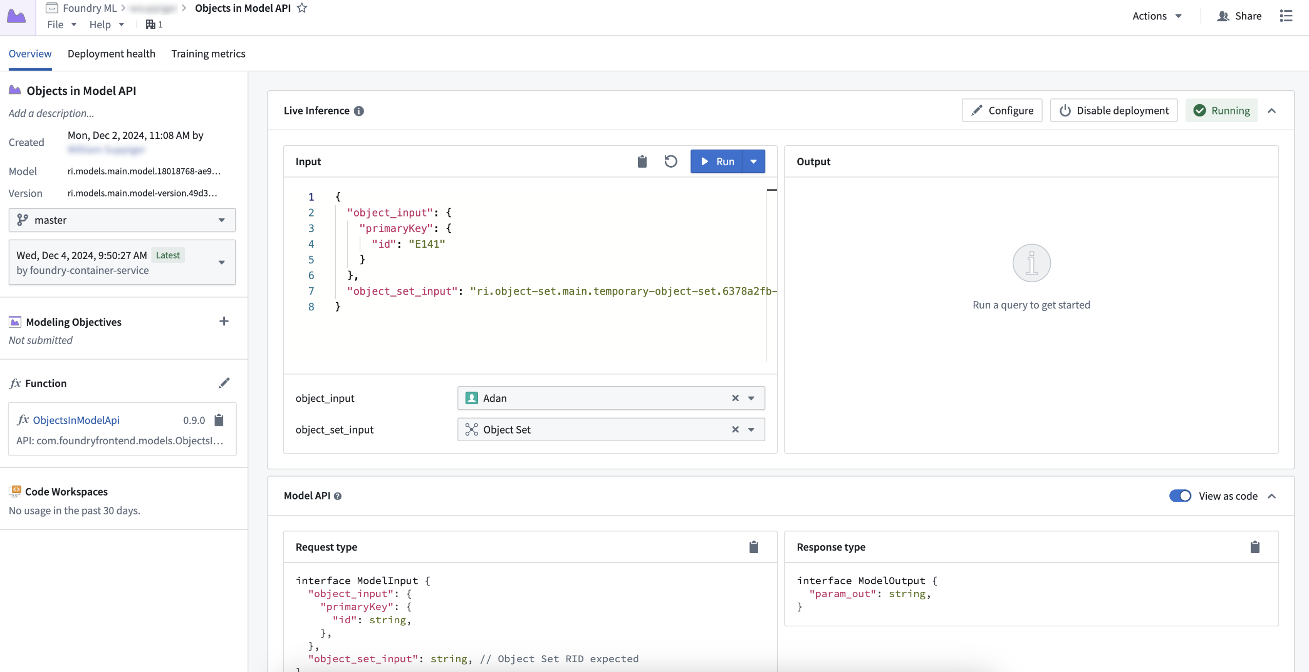
Example object and object set input on the model query page.
You can query functions, objects, and LLMs via the OSDK or platform SDK by usingFoundryClient() in models through the predict or transform method of a model. This allows for pro-code LLM-based workflows where you can interact with the Ontology and use traditional modeling techniques to produce more accurate predictions.
from ontology_sdk import FoundryClient

class ObjectsInModelApiAdapter(pm.ModelAdapter):
    ....

    def predict(self, employee_primary_key):
        client = FoundryClient()
        client_first_name = client.ontology.objects.Employee.get(employee_primary_key).first_name
        ...
Learn more about Ontology object and object set inputs for model adapters.
AIP Assist support for multi-threaded chats and chat history
Date published: 2025-02-20
In the coming weeks, users will be able to create, save, and engage with multiple concurrent chats in AIP Assist. Saved chats will be retained for seven days, allowing you to revisit topics and ensuring continuous access to valuable insights. Multi-threaded chats allow you to interact with different modes or agents simultaneously, so you can switch between chats as you shift contexts and maximize the potential of AIP Assist offerings.
To get started with multi-threaded chats, open the AIP Assist sidebar and select the chat icon on the top right. Here, you can switch between saved chats, or select Add chat to create a new thread. You can also delete chats that are no longer useful, or select the refresh icon to reset the current chat context.
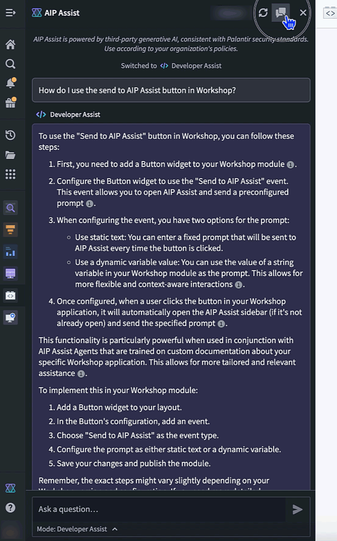
The AIP Assist sidebar, now featuring a chat thread selector with the option to add new chats or delete existing chats.
AIP Assist now tracks multiple conversations while preserving the relevant context, providing the support you need to achieve complex outcomes and optimize your use of AIP Assist capabilities.
Learn more about AIP Assist features and offerings.
Note: AIP feature availability is subject to change and may differ between customers.
Streamlined space settings management in Control Panel
Date published: 2025-02-18
To improve the experience of managing your spaces, we have migrated space management workflows into a set of settings pages in Control Panel. Starting today, you can directly update the following space level settings via the All Settings view:
- Linter configuration: Easily manage your code quality checks.
- Project templates: Access and modify templates with ease.
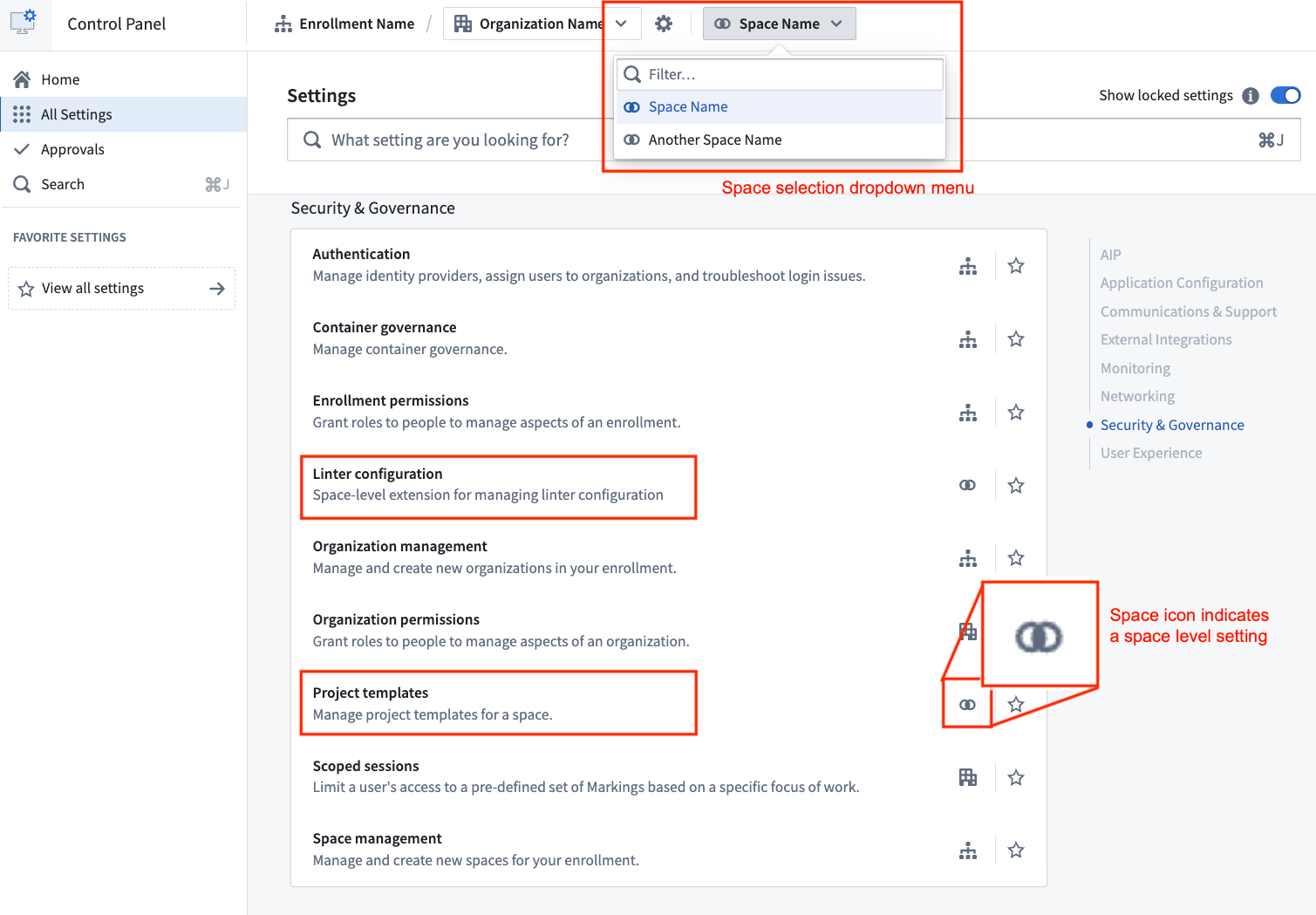
Access Linter configuration and Project templates settings on its own pages in Control Panel.
Additionally, the Spaces tab has been renamed as Space management within Control Panel.
Space management is now a section of its own, allowing a more intuitive configuration experience.
These updates mark the beginning of an ongoing effort to improve space configuration. To access these settings quicker in the future, you can favorite them to save them to your Favorite settings sidebar section. We are actively working to introduce more controls and settings to spaces.
We welcome your feedback on these changes. Share your thoughts with us through Palantir Support channels and on our Developer Community Forum ↗️.
To learn more about these updates and how they can benefit your workflow, review the spaces documentation.
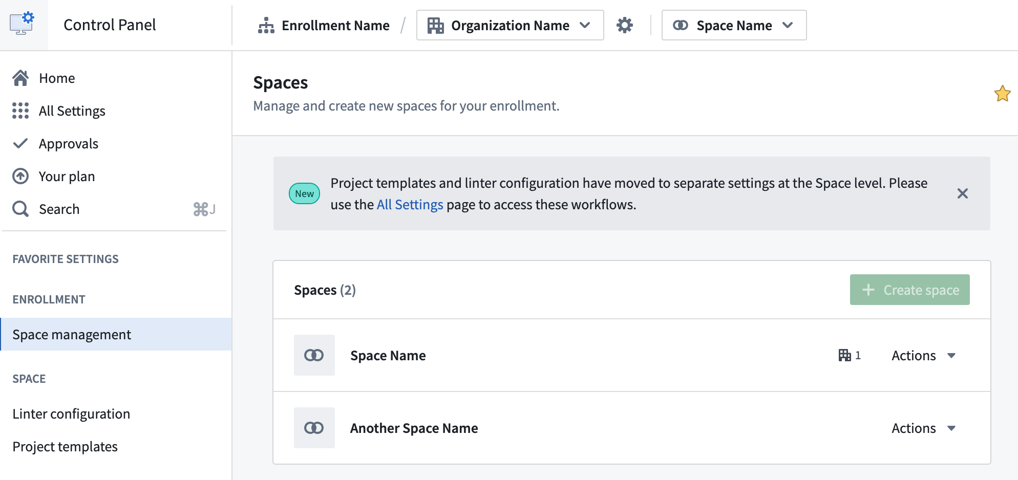
Create new spaces in Control Panel
Date published: 2025-02-18
Enrollment administrators can now create new spaces using the Space management page in Control Panel. Spaces, formerly known as namespaces, are high-level containers for Projects with a shared Ontology and purpose across Organizations. Most Organizations will require only one space for all Projects. However, multiple spaces may be needed to separate sandbox and production environments, or to create a space shared by multiple Organizations.
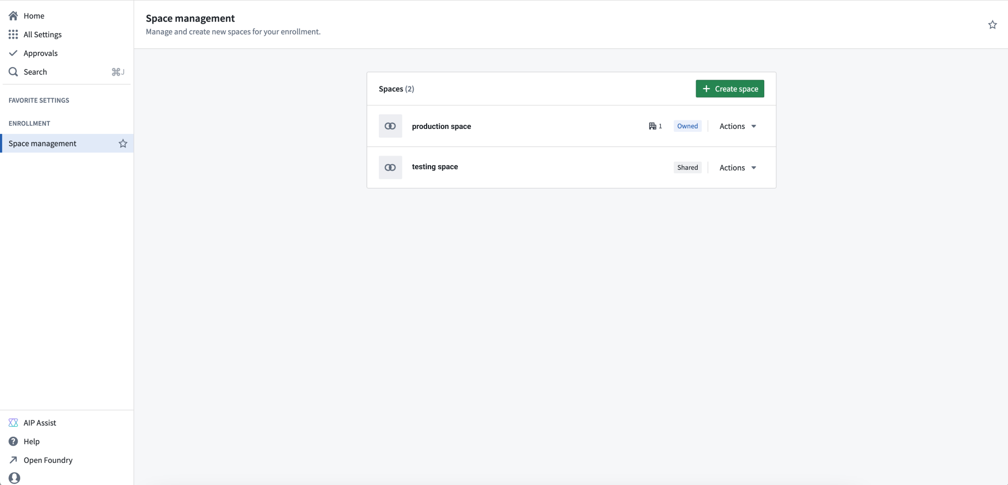
The Space management page in Control Panel.
Administrators can configure new spaces with the following settings:
Access requirements: A space and its contents are protected by Organization requirements. Users must meet the access requirements for at least one of the Organizations to access this space.
Deletion policy: The deletion policy defines when a space and its Projects will be deleted. A deletion policy is constructed with Organizations in a last-out semantic, meaning the space is deleted when all of the Organizations used for the deletion policy have first been deleted.
File system: The file system is where data in the space is stored for all Projects. The file system cannot be modified once set.
Usage account: Usage of resources in the platform are tracked by usage account. This setting decides the default usage account that Projects in the space will use. The usage account can be overridden on a per-Project basis.
Resource queue: Compute resources for a Project are allocated from its resource queue. This setting decides the resource queue used for all projects in the space.
Role set: A Project can only use roles from the role sets allowed for its space. By default, this is the Project defaults role set, but it can be replaced with a custom role set. If a custom role set is used, roles granted on the space will not inherit to Projects.
If you are an enrollment administrator but are not able to create a new space, it may be because your enrollment is not suitable or you have hit a quota limit. Contact Palantir Support for more information about your enrollment.
Diagnose and troubleshoot Workshop application performance with Performance Profiler
Date published: 2025-02-18
Workshop’s Performance Profiler is now generally available, giving builders the ability to capture application performance, diagnose the cause of high load times, and identify optimizations. With Performance Profiler, builders can access Profiler mode for insight into load times and tools to pinpoint performance bottlenecks, empowering builders to implement targeted improvements and create faster, more efficient applications.
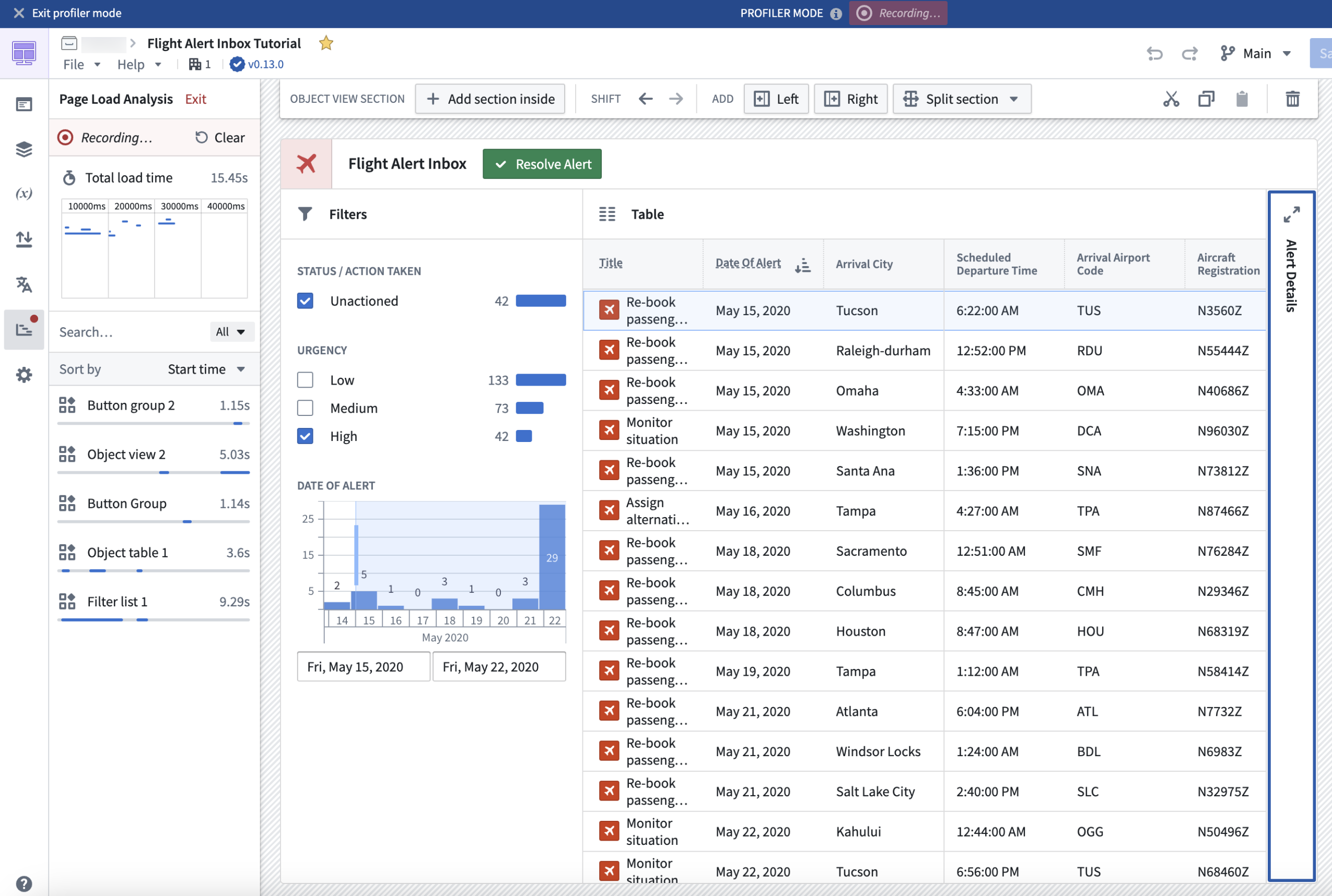
A Workshop application in Profiler mode.
In Profiler mode, load events and the start times of widgets and variables from module initialization will be recorded and displayed. Only widgets and variables that affect the on-screen display are calculated, meaning that not all widgets and variables will be immediately shown in Profiler mode. This mirrors the behavior and performance that users experience in View mode, allowing for more accurate performance profiling.
Builders can interact with a module in Profiler mode in several ways, such as by triggering new layout views to prompt loading of new widgets and variables, or triggering widget reloads or variable recalculations by running Actions, Functions, or events. As new widget and variable load and reload events occur, they will be recorded and viewable to builders within the profiler.
Profiler mode gives builders access to the following values:
- The total module load time
- The timeline view as widgets and variables load or reload
- The breakdown of load time by widgets and variables
These metrics provide builders with a deeper understanding of application behavior, fostering data-driven application development that can help improve the end-user experience.
To learn more about Performance Profiler, visit the documentation.
Synchronize object property edits with support for Ontology Actions in Notepad
Date published: 2025-02-13
Notepad users can now edit object properties directly in Notepad documents with Ontology Actions, making it easier to keep documents in sync with Ontology changes. Ontology Actions allow users to edit object properties with preconfigured inline edits in object card and object property widgets, allowing text properties to be edited and saved to the Ontology without switching between applications.
Object property widgets
To make Ontology edits in Notepad object property widgets, the object property must have configured inline edits. Hover over the property to display a menu that enables editing text properties, modifying the object with Actions, and opening the object in Object Explorer.
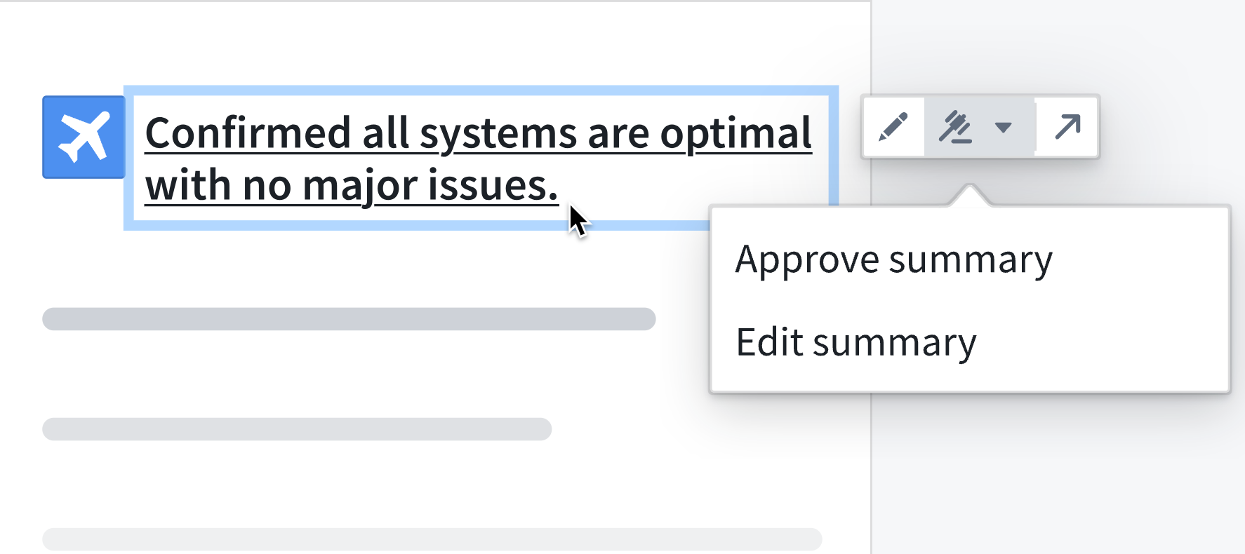
An object property widget, with the option to edit or approve a summary.
Object card widgets
In object card widgets, hover over the widget to display an Actions menu in the top-right corner that enables submitting Actions on the displayed object. Hover over properties with configured inline edits to display the edit option.
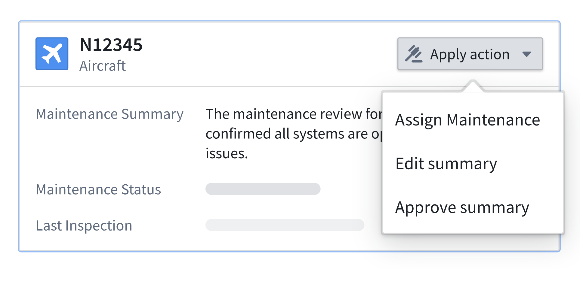
An object card widget, with an Actions menu in the top-right corner.
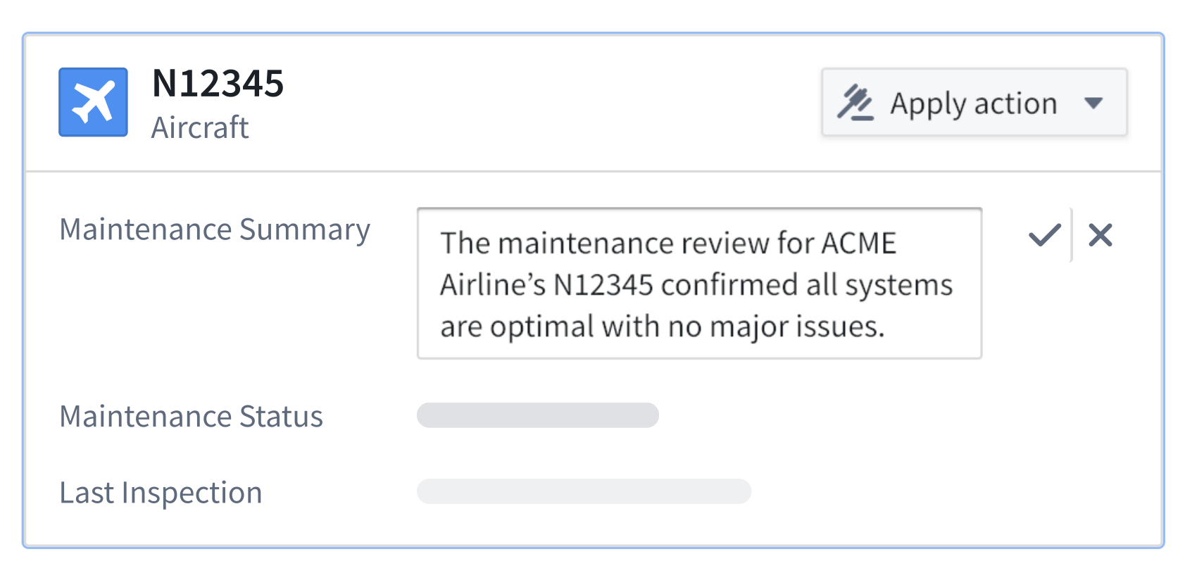
An object card widget displaying an inline summary edit.
Leverage Ontology Actions in Notepad to maintain document coherence with ongoing Ontology updates, ensure real-time synchronization of object property changes, and streamline document workflows.
Learn more about object property and object card widgets in Notepad.
Discover new Foundry and AIP training content on Palantir Learn
Date published: 2025-02-13
We are excited to announce the launch of four new courses on learn.palantir.com ↗️ along with content updates within our training tracks ↗️ for 2025. To help you understand how to navigate training content on Palantir, review our one-page Getting started with Palantir Learn ↗️ guide.
New courses launched in January 2025
- Deep Dive: Data Analysis in Quiver ↗️: Learn how to navigate Quiver for analyzing, transforming, and visualizing data stored in objects.
- Deep Dive: Data Protection Tools in Foundry ↗️: Learn how to use Foundry tools to implement download controls, automate data scans, and obfuscate data.
- Speedrun: Mining Your First Business Process ↗️: Use Foundry's Machinery application to visualize business processes, identify bottlenecks, and create alerts.
- Speedrun: Your First Ontology Function ↗️: Learn how to integrate Typescript-based Functions to pull data from and update Ontology objects via a Workshop application.
Training tracks with new examples, videos, and partner-developed content
We have recently updated the Training Tracks ↗️ on learn.palantir.com ↗️ with the latest courses, use case examples, videos, and partner-developed content available. Use these persona-based collections of training resources as your one-stop shop for all related Foundry training material.
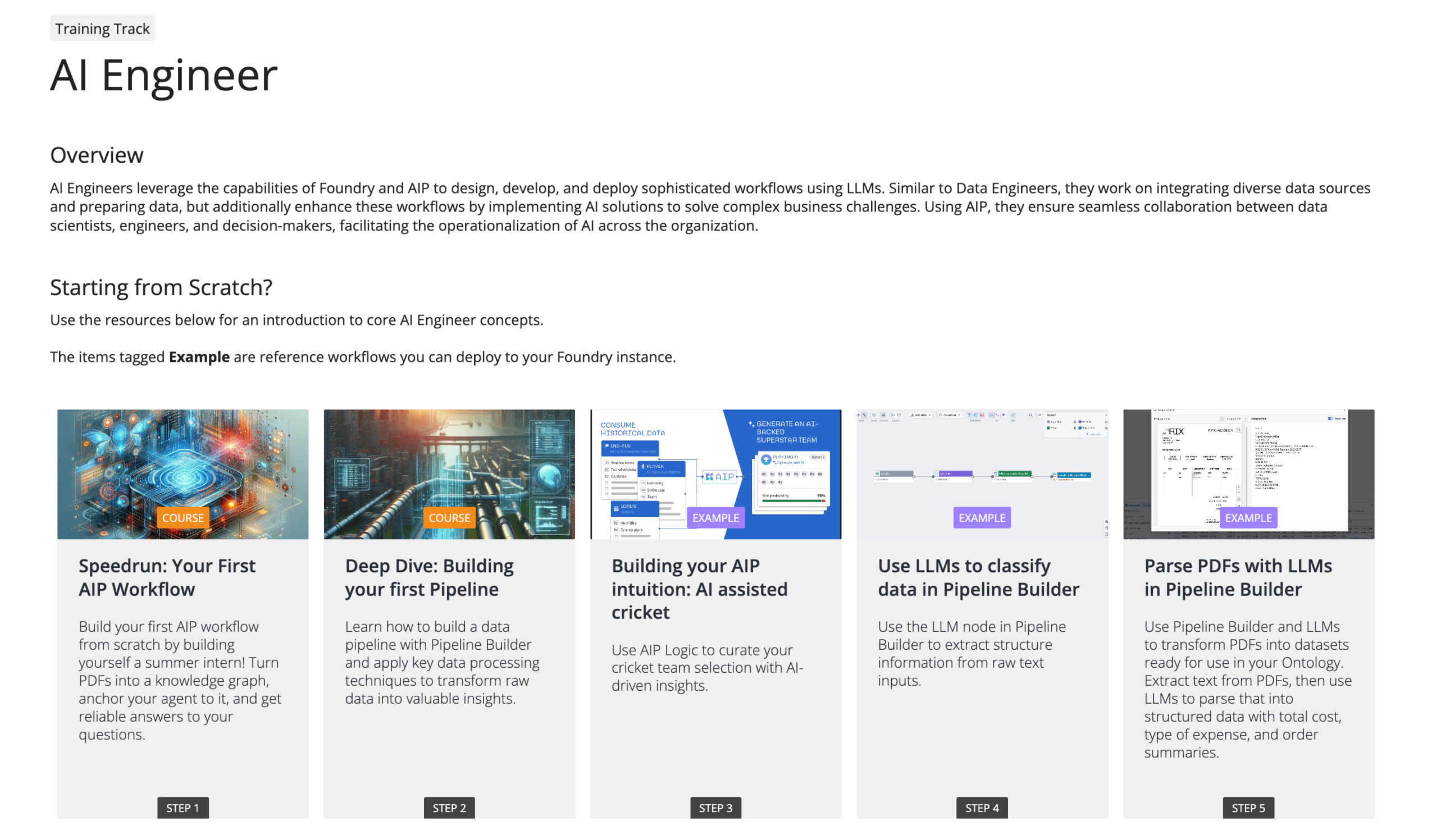
The AI Engineer training track featured on learn.palantir.com.
Get started with the Palantir Learn guide
New to the Palantir training program? Use this one-page guide ↗️ to familiarize yourself with our various training resources and recommended learning program. The guide can be downloaded as a PDF to easily share within your organization.
Look out for more Palantir announcements as we continue to quickly evolve our training program. If you have questions on training content, issues, or suggestions for new content, contact training-feedback@palantir.com ↗️.
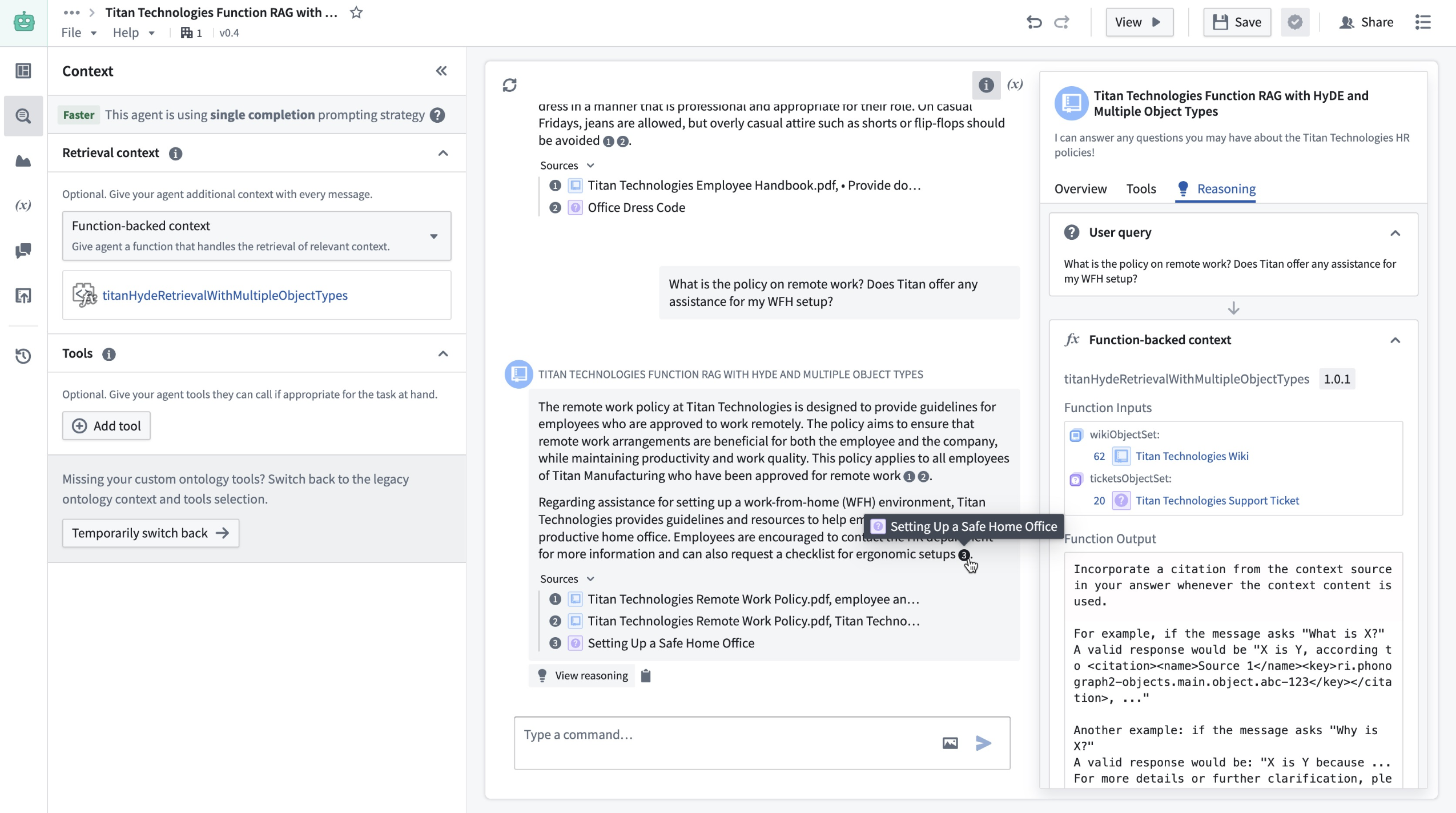
Enable custom retrieval with Function-backed context in AIP Agent Studio [Beta]
Date published: 2025-02-13
AIP Agents now support custom retrieval Functions, a pro-code feature that enables builders to configure their own logic for context retrieval on each query. This is ideal for situations where the retrieval methods provided out-of-the-box through Ontology context or document context do not satisfy a given use case. For example, if a user wants to run a semantic search over multiple Ontology object types, the user can configure a Function for it even though it is not currently supported in AIP Agent Studio.
You can now use Function-backed context to perform custom retrieval on each query in AIP Agent Studio.
Write a custom retrieval Function
Users can write custom retrieval Functions in TypeScript in the Code Repositories application. To do so, navigate to a TypeScript repository and import the AipAgentsContextRetrieval function interface. Then, write a function that satisfies the interface as shown below. Note that the function must have messages as the only required input in order to satisfy the contract.
Copied!1 2 3 4 5 6 7 8 9 10@AipAgentsContextRetrieval() public exampleRetrievalFunction(messages: MessageList): RetrievedContext { let combinedText: string[] = []; messages.forEach((message) => { ' ... }) return { retrievedPrompt: "..." } }
The retrieval Function must output a string, which will be pasted into the LLM system prompt by AIP Agents to answer user queries. After publishing your Function, choose Function-backed context in Agent Studio under the Retrieval context panel to select a Function for retrieval.
You can select the context and a Function for retrieval in Retrieval context.
Application variables in retrieval Functions
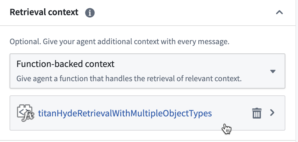
Custom retrieval Functions can also take in the values of application variables on the agent as input. To configure this, add optional arguments to the Function definition. Currently, only string and object set application variables are supported, so the Function input must be one of these types.
Copied!1 2 3 4@AipAgentsContextRetrieval() public movieRetrievalFunction(messages: MessageList, movieTitle?: string, movieSet?: ObjectSet<Movie>): RetrievedContext { ... }
Use the API name for object types. This can be found in Ontology Manager.
You can then set a mapping between the application variables on the agent, and function inputs that match their respective types.
To create application variables, navigate to the application variables panel in Agent Studio.
Custom citations
In addition to support for custom retrieval Functions, AIP Agents now support custom citations. This means that if the LLM responds with citations in a specified format, the AIP Agent frontend will display citation bubbles that enable users to easily verify and explore information sources. With Function-backed context, users can take advantage of this by having their Function return a string that prompts the LLM to write citations in this given format. The supported citation formats are the following:
-
Ontology object citations should be returned in the following format:
<citation><key>ri.phonograph2.object-set...</key></citation>where the
<key></key>tags encapsulate the object RID. Selecting the citation bubble will link to the Object Explorer view for that object. -
Document (PDF) citations should be returned in the following format:
<citation><mediaSetKey>ri.mio.main.media-set...</mediaSetKey><mediaItemKey>ri.mio.main.media-item...</mediaItemKey></citation>Selecting the citation bubble will open a dialog that displays the first page of the document.
-
External URL citations should be returned in the following format:
<citation><name>My Website</name><href>www.mywebsite.com</href></citation>The citation bubble will display the provided name, (for example:
My website) and selecting it will link to the provided URL (for example:www.mywebsite.com).
In this example, the Function accepts a set of document chunks that are represented as Ontology objects. It then conducts a semantic search on these objects and returns the five most relevant ones, formatted according to the citation style mentioned above.
What's next for AIP Agent Studio?
Users will soon also be able to write retrieval Functions in AIP Logic, which offers a walk-up usable interface for developing no-code LLM-powered functions. To take advantage of this in the meantime, we recommend writing a TypeScript function that satisfies the interface and calls the Logic function under the hood.
Learn more about retrieval context in AIP Agent Studio.
Bootstrap development with TypeScript OSDK Templates [Experimental]
Date published: 2025-02-11
OSDK Templates is an experimental feature designed to accelerate and bootstrap development, saving time and reducing setup complexities. Using a customized TypeScript OSDK Template as a preconfigured starting point, developers can rapidly start building projects with built-in OSDK packages. By leveraging OSDK Templates, you can ensure consistency across TypeScript projects, or incorporate essential tools and best practices from the outset.
Use TypeScript OSDK Templates to streamline the following use cases:
- Running a bootcamp or a workshop in which all developers need to bootstrap their code with a preconfigured OSDK application.
- Providing an example for users to kickstart their work.
- Enforcing a set of UI standards for all React projects.
- Providing a React template that uses a shared set of Ontology resources. Review the note on using Ontology resources below.
Build an OSDK Template
To create an OSDK Template, first create a TypeScript Developer Console application and select the option to Bootstrap using VS Code in Foundry under the Start developing section. This will create a repository for your application code, allowing you to develop the application exactly as you intend users to experience it. Be sure to debug and test your application before creating a template.
When you are satisfied with your application code, create a template using the following steps:
- Replace variable instances with handlebars like so:
{{SAMPLE_VARIABLE}}. Sample variables are listed below:
{{FOUNDRY_HOSTNAME}}="yourdomain.palantirfoundry.com" // .env files, .npmrc, foundry.config.json
{{APPLICATION_CLIENT_ID}}="1564cead075af0e23eb1799ac0f6381f" // .env files
{{APPLICATION_PACKAGE_NAME}}="osdk-sample-app-20" // package.json and any code file which references the package
{{APPLICATION_RID}}="ri.third-party-applications.main.application.7ebc94b7-bad3-45a9-a063-d7fc0ccd2873" // foundry.config.json
{{REPOSITORY_RID}}="ri.stemma.main.repository.35d25ea4-973d-4112-a7d3-04c31efa1875" // .npmrc setting.sh
-
Note that your application package should not include
@or a trailing/sdk. The version in thepackage.jsonmust be set tolatestor0.1.0. -
You can also add custom handlebars as input parameters when the package is deployed, as shown below:
{{AGENT_RID}}="ri.aip-agents..agent.f4a3033a-8b8d-4313-a365-3d8d7099fa95"
-
Commit your changes. The CI check will fail at this point, but this is expected behavior.
-
Navigate to Marketplace to create a new product from your repository.
-
Name your product, choose Repository under Add by resource type and select the repository you created. The chosen repository will be displayed under Repositories in the Content section.
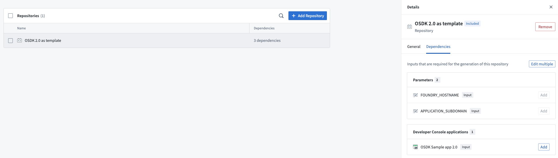
A list of repositories added as dependencies to the template in Marketplace.
- Select + Add Repository on the top right of the Repositories list under Content to include Developer Console as a dependency. We recommend not including Ontology resources in the package for reasons explained below in using Ontology resources.
Your package is now ready to be distributed on Marketplace.
A note on using Ontology resources
OSDK applications use API names to link to Ontology resources, so your code will contain API names from the Ontology used by your template.
For example, the API name of the loaded object types below is Aircraft:
Copied!1const response: Result<PageResult<Osdk.Instance>> = await client(Aircraft).fetchPageWithErrors({ $pageSize: 30 });
We do not recommend including Ontology resources in your package. Marketplace will attempt to install them during deployment and create duplicate Ontology resources with different API names, which will lead code to break.
To avoid this, we recommend one of the following options:
-
If the template application does not need to use Ontology resources, you can build a progressive web application (PWA) template that can work with any Ontology resource. You can also build a React template that adopts customers' design styles for OSDK-backed applications.
-
If users need to access a shared Ontology, they will be prompted to input the necessary Ontology resources during template installation, allowing Ontology resources to be referenced in code.
Distribute packages on Marketplace
Users can find your packaged template in the relevant Marketplace store. When installing the template from Marketplace, a new repository and a linked Developer Console application will be automatically created for the user. When using this package for bootstrapping, the Bootstrap option must be selected during installation. Improvements to user discovery for OSDK Templates are currently in development to facilitate surfacing templates.
We created OSDK Templates to accelerate the initial phases of development and help you focus on building, rather than on setup tasks. We encourage you to share feedback with Palantir Support channels and on our Developer Community ↗️ using the ontology-sdk tag ↗️ .
Learn more about OSDK and Marketplace.
Configure row-level permissions on objects in Pipeline Builder
Date published: 2025-02-06
Row-level permission configuration is now available for objects in Pipeline Builder. Apply row-level permission policies to objects using Restricted Views to ensure users only see the objects they are permitted to access.
Why use Restricted Views?
While Markings and roles provide robust access controls, certain workflows demand more specific permissioning. For example, an Organization might want to ensure that its sales representatives can only view details of customers that are assigned to their branch. Restricted Views offer this additional level of control by limiting dataset access to the rows users are authorized to see.
Set up granular security policies
You can now set up detailed security policies by navigating to the output object and selecting Configure granular security.
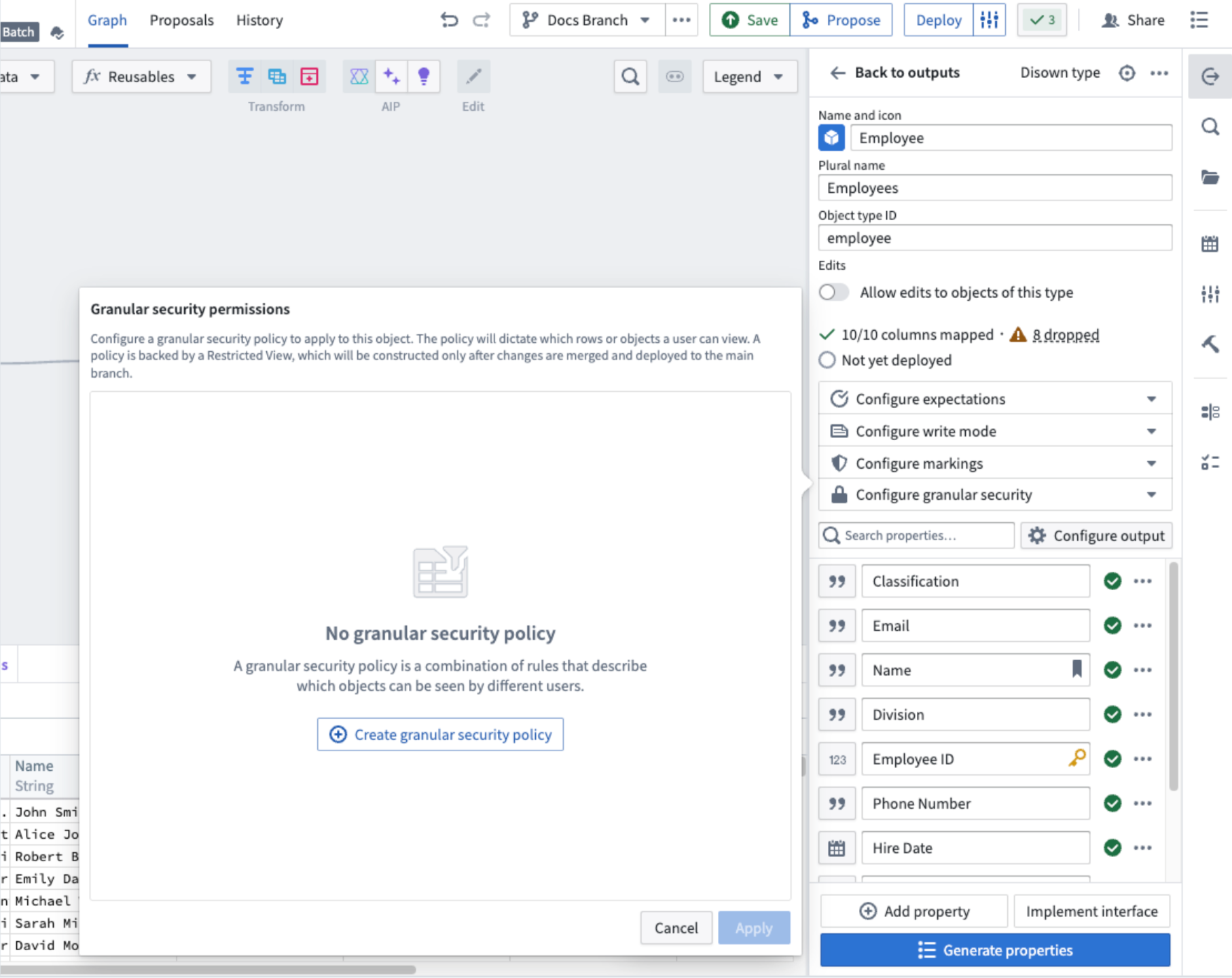
The output object configuration panel in Pipeline Builder, with the option to add granular security permissions.
Then, select Create granular security policy to start configuring your policy.
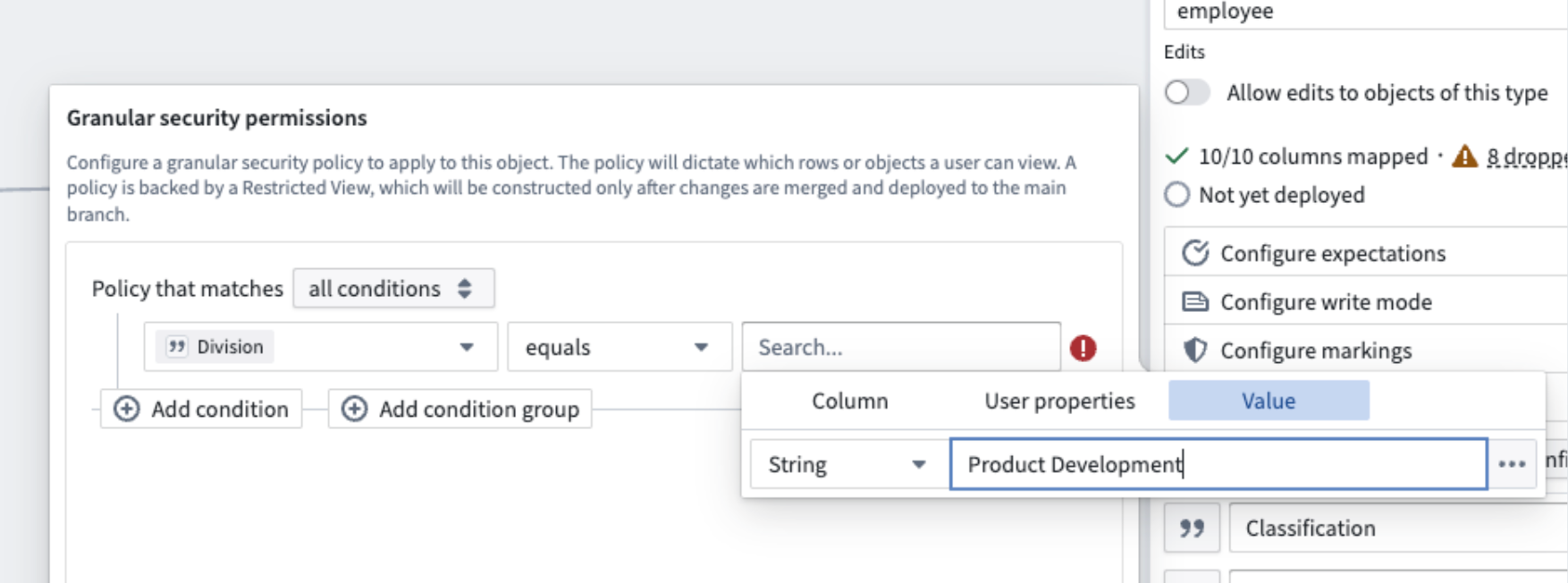
Configure your granular security policy to apply to a specific column, user property, or value condition.
Make sure to save changes and deploy on the main branch so that Restricted Views and their associated security policies take effect.
Share your thoughts with us
With this powerful feature, enhance your access control systems and ensure secure data handling across your projects. Let us know your thoughts through Palantir Support channels and our Developer Community using the pipeline-builder tag.
To further explore Restricted View policies and best practices, refer to our detailed documentation on Restricted View policies.
Workshop feature highlights from 2024
Date published: 2025-02-04
Over the past year, many new features and improvements have been added to Workshop to both increase the point-and-click expressiveness of the application builder toolkit and add powerful, new pro-code extensibility options for developers.
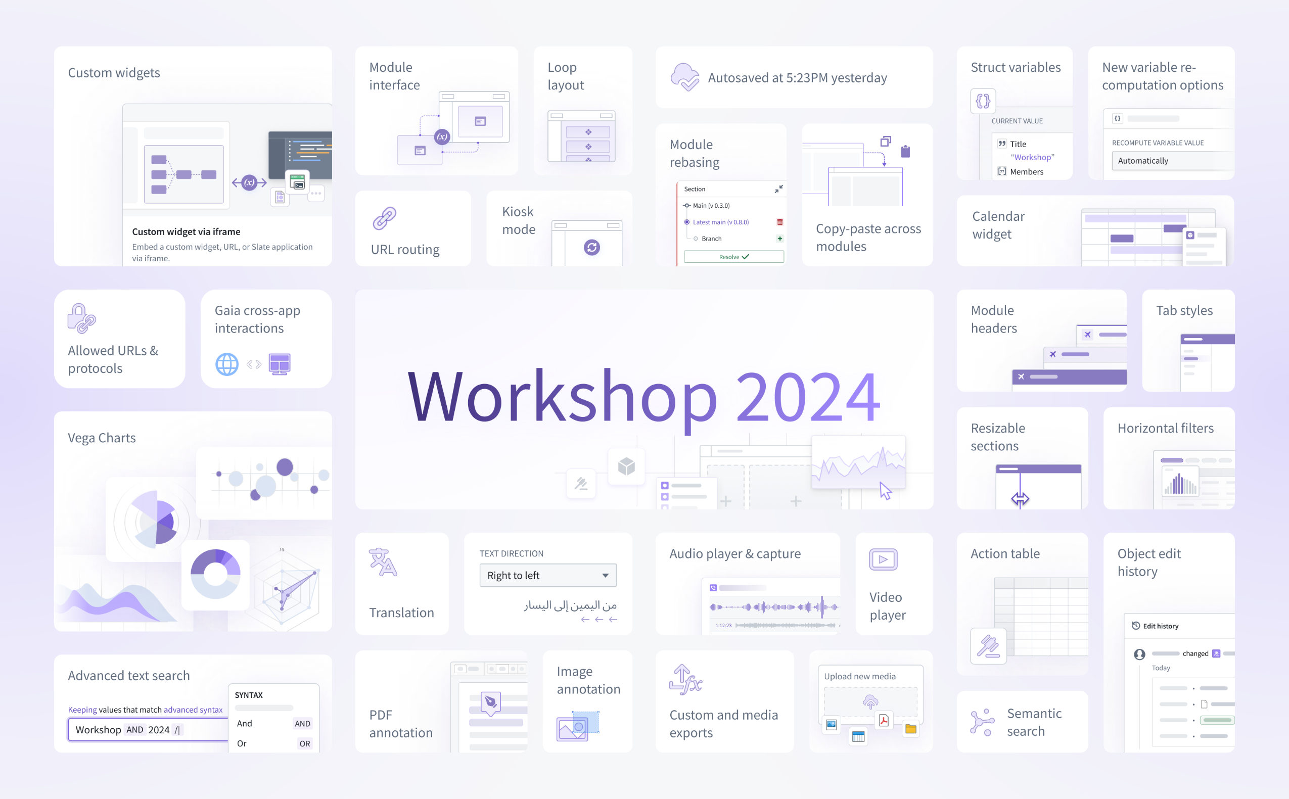
The list below does not cover every recent enhancement to Workshop, but is intended to provide a summary of notable highlights from 2024. For more information on any of these features, review the documentation linked inline below:
- Custom widgets allow developers to embed third-party, custom-built components into Workshop applications for the first time. These custom widgets can share variable state and trigger events with their parent Workshop application to integrate seamlessly with native Workshop features.
- Module interface enables builders to easily configure the input variables accepted of a given module and acts as the effective API for the module.
- URL routing allows builders to serialize variable state and module state into the URL. This enables easier link sharing between users and also helps a module maintain its state on a browser reload.
- Loop layout allows builders to create dynamic, reusable views by looping over an object set and displaying an instance of a custom embedded module per object.
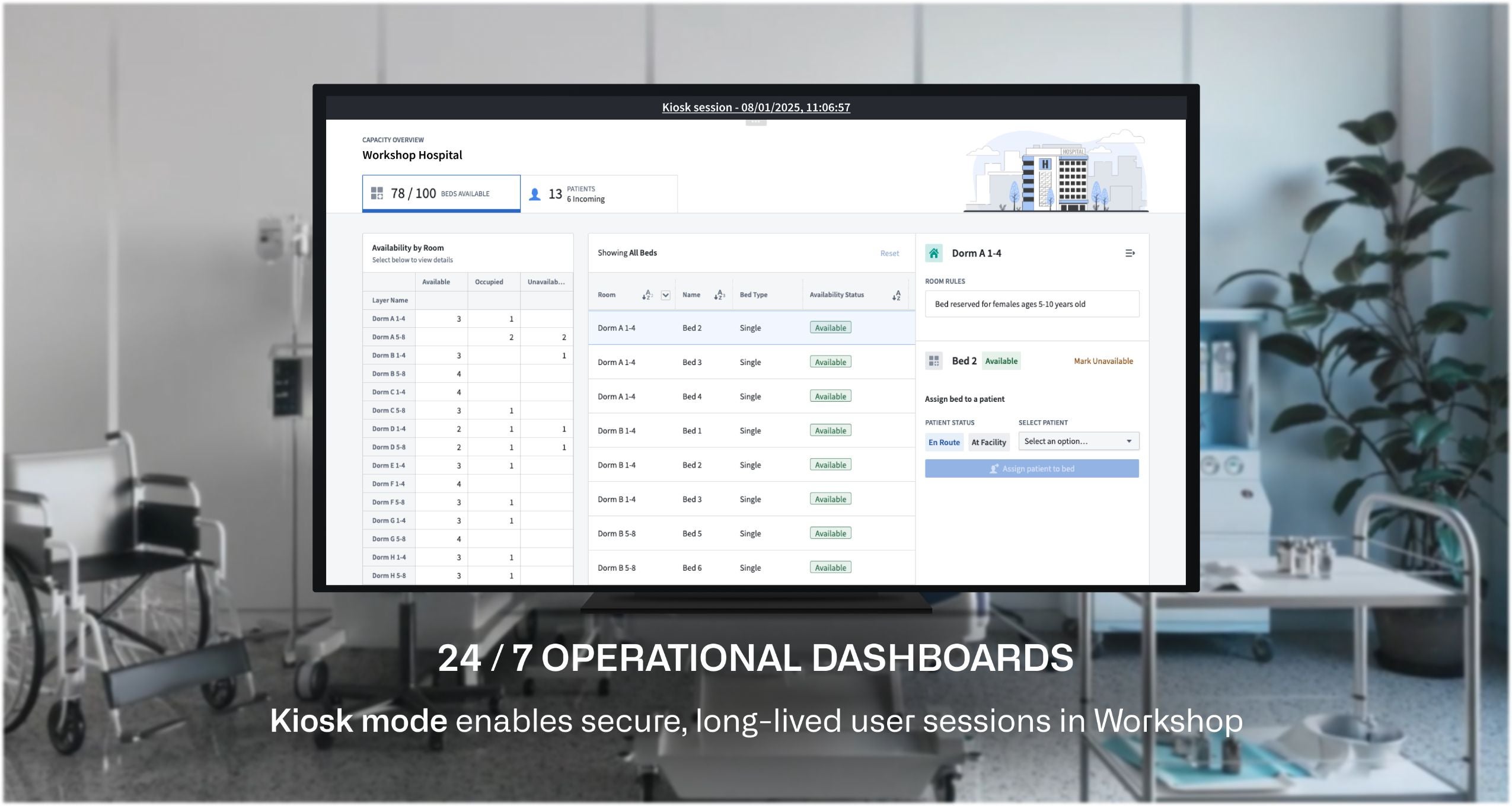
- Kiosk mode enables secure, long-lived user sessions in Workshop. For example, allowlisted applications can be run in Kiosk mode for continuous display on a command center screen, or to enable a shared monitor to display an operational dashboard 24/7.
- Autosave preserves module edits automatically so builders can edit their applications without worrying about unexpectedly losing progress.
- Module rebasing helps builders merge Workshop application updates from main into the local changes they have made within a branch. This feature, alongside branching, unlocks simultaneous collaborative application building in Workshop.
- Copy-paste of components and widgets across modules greatly speeds the application building process by making Workshop configuration more reusable.
- Struct variables are a new composite variable type that can be returned from functions and used by builders to decrease network calls and boost the performance of their Workshop applications.
- New variable re-computation options provide builders more control over on when specific variables in their applications should recalculate; for instance, recalculation can occur automatically, when specifically triggered by an event, or only on initial load.
- The Calendar widget provides a way to visualize date- or timestamp-backed objects (such as work schedules or flight events) within an interactive calendar.
- Allowed URLs and protocols let administrators specify a list of external URLs and schemes to which users can safely navigate without triggering the display of an external link warning.
- Gaia cross-app interactions enable pairing a Gaia map to a Workshop application to seamlessly share state and create powerful geospatial workflow.
- Vega charts allow builders to create fully customizable and interactive visualizations in Workshop using the open-source Vega ↗ and Vega-Lite ↗ grammars.
- Translations give builders the ability to localize Workshop applications into multiple languages, either manually or with the help of AIP Assist-powered translations for enabled enrollments.
- Right-to-left text lets builders adjust text directionality in their applications to accommodate multiple language orientations.
- The Audio player & capture widget enables audio-based workflows and supports the upload and playback of audio files.
- Module headers increase the visualization expressiveness possible in Workshop by providing additional customization, coloring, branding and general styling options for application headers. Both horizontal and vertical module headers are now supported.
- Tab styles offer improved out-of-the-box theming and styling options for the Tabs widget.
- Resizable sections allow users to freely resize parts of a Workshop application while in View mode in order to better customize a module to their needs.
- Horizontal filters within the Filter List widget offer a more compact layout option to one of Workshop’s most popular widgets.
- The Action table lets users create and modify multiple objects via a directly editable, Action-backed table. Uploading of structured data like CSV or XLSX files is also supported to enable faster data import and creation.
- Object edit history widget now supports displaying the edits history (changelog) for objects indexed into Object Storage v2.
- Advanced text search provides more advanced search operations within the Filter List widget, including new search syntax, wildcard operators, and the ability to chain multiple search operations together.
- PDF annotation enables more complex document tagging workflows by allowing users to create, display, and interact with text and area annotations.
- Image annotation powers image tagging workflows by allowing users to tag and capture visual areas of interest.
- Custom and media exports allow builders to configure bespoke, one-click exports that match their desired text output format, such as JSON or CSV. Additional export options for media are also now available.
- Upload new media allows users to upload media to objects as media set-backed properties via Actions.
- Semantic search workflow configuration has been simplified by allowing semantic search filters to be configurable directly within Workshop’s point-and-click Object Set Definition panel.
Exclude groups from access request forms
Date published: 2025-02-04
Project Owners can now exclude specific groups from access request forms. When a group is excluded for a Project, users will not be able to request to join the group.
By default, all groups with a role in a Project appear in the access request form. Excluding groups from access request forms prevents accidental membership requests to groups like administrator groups, while still allowing necessary access through designated Projects.
Excluding groups is a per-Project setting, offering flexibility. A group can be excluded from most Projects but included in specific ones. Users can request access to the group in those specific Projects. If approved, they will gain access to all Projects where the group has a role.
To exclude groups from the access request flow for a Project, navigate to the Access panel > Settings > Project access requests.
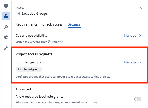
The access requests settings of a selected Project.
Project Owners can select Manage and then select the groups to exclude from the request flow. If you are not an Owner on the Project, you can select View to see which groups are excluded, but you will not be able to make any changes.
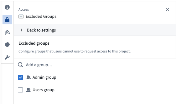
Search for and select groups to exclude from Project access requests.
Learn more about excluding groups from access request forms.
Kiosk mode enables long-lived, read-only display of Workshop applications [GA]
Date published: 2025-02-04
Kiosk mode is now generally available for Workshop applications. Kiosk mode offers builders the ability to launch secure, long-lived, restricted sessions for Workshop applications, allowing them to be safely displayed for extended periods of time. For example, allowlisted applications can be run in Kiosk mode for continuous display on a command center screen, or to enable a shared monitor to display an operational dashboard 24/7.
To ensure safe display of a module when a Workshop application is in Kiosk mode, the module's permissions will be scoped down to only include entities directly accessible within the module and to limit the content viewable within the active session.
Kiosk mode settings may be configured and managed on the Organization level within the Control Panel, allowing administrators to manage:
- Which modules may enable Kiosk mode
- Which group(s) of users may launch Kiosk mode sessions
- The list of all historical and currently active Kiosk mode sessions
To learn more about how to configure and enable Kiosk mode for your Workshop applications, details on how Kiosk mode permission scope is determined, and the restrictions and controls Kiosk mode offers, review our documentation.